Using neutral palettes creates a subtle sophistication and versatile foundation for your space. They evoke calmness, stability, and elegance, making your environment feel balanced and timeless. Neutral tones like beige, gray, and ivory adapt to various styles and easily support new accents or textures. They also promote a peaceful atmosphere that can enhance any mood. If you want to discover how to craft a refined, adaptable interior using neutral hues, there’s more to explore ahead.
Key Takeaways
- Neutral palettes offer a timeless, adaptable foundation that can easily blend with various interior styles and design elements.
- They evoke calmness and stability, creating a soothing environment ideal for relaxation and focus.
- Using neutrals ensures longevity in design, allowing for easy updates with accessories or accents over time.
- Incorporating diverse textures and materials in neutral tones adds warmth, depth, and visual interest to spaces.
- Neutral colors promote balance and harmony, supporting versatile aesthetics while maintaining a sophisticated, subtle look.
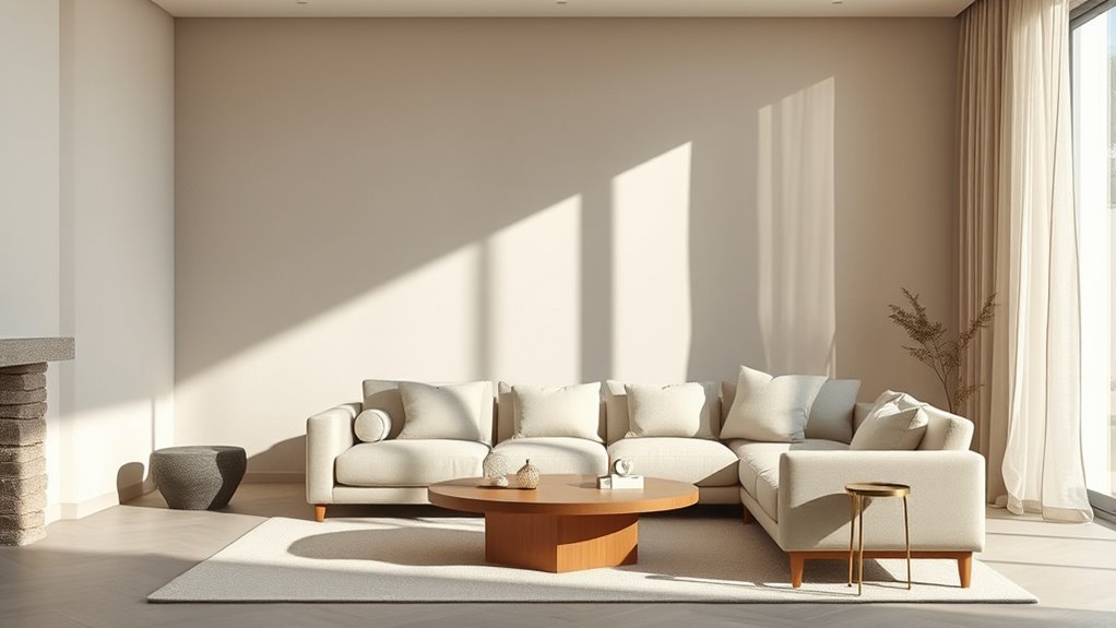
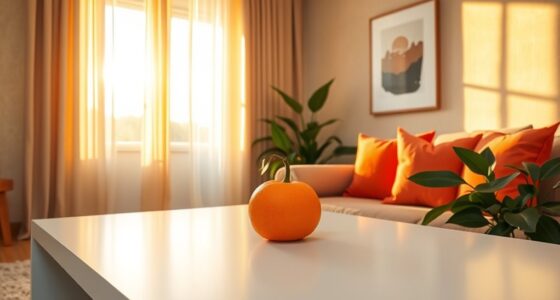
Have you ever wondered why neutral palettes remain a popular choice in design? The answer lies in their timeless appeal and ability to adapt to various styles, making them a versatile foundation for any space. When you opt for neutral colors, you’re tapping into color psychology—the understanding of how hues influence mood and perception. Neutral shades like beige, taupe, gray, and ivory evoke feelings of calmness, stability, and sophistication. They create a soothing environment that’s perfect for unwinding after a busy day or fostering focus in workspaces. These colors aren’t just about aesthetics; they shape the emotional tone of a room, allowing you to feel relaxed and grounded. Additionally, their compatibility with various textures and materials enhances their versatility in design. Interior design trends consistently favor neutral palettes because they serve as a blank canvas that can be dressed up or down. Whether you want a minimalist look, a cozy retreat, or a modern aesthetic, neutrals provide the flexibility to evolve with your style preferences. As trends shift, people increasingly lean toward more subdued, understated color schemes because they promote a sense of balance and harmony. Trends like biophilic design, which emphasizes connection to nature, often incorporate neutral tones to mimic natural elements, creating environments that are both stylish and comforting.
Incorporating neutral palettes also aligns with the desire for longevity in interior design. Unlike bold colors that may go out of fashion quickly, neutral shades tend to withstand changing trends. They’re inherently classic, allowing you to update accessories or accent pieces without overhauling the entire space. This adaptability makes neutrals particularly appealing to those who want a sophisticated look that remains relevant over time. Plus, their subtlety allows other design elements—such as textures, furniture, and artwork—to stand out, adding visual interest without overwhelming the senses. Furthermore, understanding color psychology can help you select neutrals that evoke specific emotions or atmospheres suited to your space.
Using neutral palettes doesn’t mean your space has to feel boring or sterile. When you understand color psychology and stay attuned to interior design trends, you can create layered, inviting environments by playing with different textures, materials, and lighting. Soft fabrics, natural woods, and metallic accents can all enhance a neutral foundation, making your space feel warm and personalized. Ultimately, neutrals offer a sophisticated, versatile backdrop that supports your evolving style while fostering a peaceful, balanced atmosphere. This combination of psychological comfort, trend awareness, and timelessness explains why neutral palettes continue to be a cornerstone of successful interior design.

AUREUO Morandi Acrylic Paint Set – 8 Muted Colors x 0.71 Fl Oz/21ml Tubes, Vintage Neutral Earthy Tones for Canvas Painting, DIY Crafts, Home Decor, Wall Art Non-Toxic Matte Finish
MORANDI COLOR PALETTE: This Acrylic Paint Set features 8 soft, muted shades inspired by the tranquil and sophisticated…
As an affiliate, we earn on qualifying purchases.
As an affiliate, we earn on qualifying purchases.
Frequently Asked Questions
How Do Neutral Palettes Impact Mood and Atmosphere?
Neutral palettes influence your mood and atmosphere by fostering a calm, balanced emotional tone. They make spaces feel more open and spacious, enhancing your sense of spatial perception. When you use neutral colors, you create a soothing environment that promotes relaxation and comfort. Their subtle sophistication helps you feel grounded and centered, making your space versatile for various activities and easily adaptable to different styles and moods.
Can Neutral Colors Be Used in Small Spaces Effectively?
Yes, you can use neutral colors effectively in small spaces. To enhance their impact, create interesting color contrast with darker or lighter shades, and incorporate texture combinations like plush fabrics or rough woods. These elements add depth and dimension, preventing the space from feeling flat. By balancing contrast and textures, you make your small area feel cozy, sophisticated, and visually engaging without overwhelming it with bold colors.
What Are the Best Accent Colors to Pair With Neutrals?
You should choose bold accent options like deep blues, vibrant oranges, or striking reds to pair with neutrals. Complementary color schemes work well, creating visual interest and balance without overwhelming your space. These accents add personality and depth, making your neutral palette pop. Don’t be afraid to experiment with different shades and textures to find the perfect combination that enhances your style and keeps your space feeling fresh and inviting.
How Do Neutral Palettes Influence Interior Lighting?
Neutral palettes influence your interior lighting by enhancing natural light and promoting gentle color reflection. When you use neutral colors, they bounce light around the room, making spaces feel brighter and more open. This reflection helps reduce harsh shadows and creates a soft, welcoming atmosphere. By choosing the right neutrals, you can optimize natural light and guarantee your space feels consistently warm and inviting throughout the day.
Are Neutral Palettes Suitable for Both Modern and Traditional Styles?
They say variety is the spice of life, and neutral palettes prove it true for both modern and traditional styles. You’ll find that with thoughtful color pairing and texture contrast, neutral shades seamlessly blend into any aesthetic. Whether you prefer sleek lines or ornate details, neutrals enhance your space’s versatility. They create a timeless look that adapts effortlessly, making your design both sophisticated and welcoming.
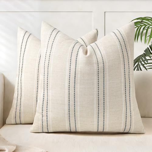
AELS 18×18 Decorative Farmhouse Linen Blend Throw Pillow Covers, Boho Textured Pillow Case, Set of 2, Beige with White & Gray Stitch Yarn Dyed Stripe Cushion Cover for Sofa Living Room (Cover ONLY)
[ Stylish Jacquard Stripes Design ] Striped design goes well with most decorations. The pillow covers from AELS…
As an affiliate, we earn on qualifying purchases.
As an affiliate, we earn on qualifying purchases.
Conclusion
Embracing neutral palettes is like painting with a gentle, timeless hue—they whisper elegance and invite endless creativity. With their subtle charm, you’ll craft spaces that feel as soothing as a calm sea and as versatile as a chameleon. Remember, these colors are your blank canvas, ready to reflect your personality and style. So, let your design journey flow effortlessly, turning simple shades into the masterpiece of your dreams.
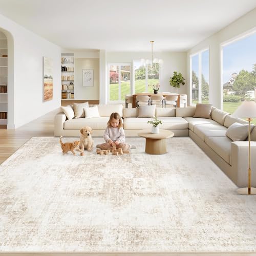
VECARF Area Rug 8×10 Washable Rug, Vintage Boho Medallion Rugs Non-Slip Soft Low Pile Large Distressed Rug Indoor Retro Carpet for Living Room Bedroom Dining Room Office Children's Room(Beige, 8'x10')
SOFTNESS & COMFORT: Step into cloud-like comfort with our 8×10 area rugs—unlike thin, mat-like competitors, ours are crafted…
As an affiliate, we earn on qualifying purchases.
As an affiliate, we earn on qualifying purchases.

ZeeMart Macrame Style Bicolor Stitching Table Runner, 14 x 36 Inch Taupe/Ivory, Boho Beige Table Runners 36 Inches Long, Farmhouse Woven Home Decor
Why Choose us? We have chosen more expensive and better yarn to make this product compared to others,…
As an affiliate, we earn on qualifying purchases.
As an affiliate, we earn on qualifying purchases.