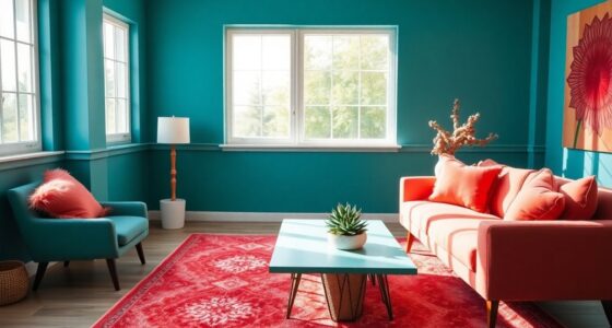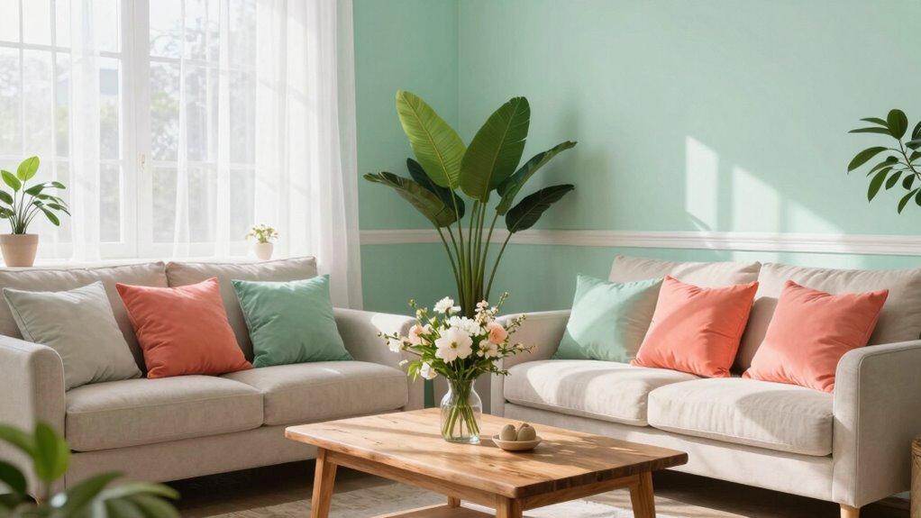

To achieve a fresh late spring look, choose soft, airy hues inspired by nature, like mint, blush pink, or pastel yellow. Pair these with crisp white trims or furniture to keep the space bright and inviting. Add accents in deeper shades like coral or navy to create depth, and incorporate earthy neutrals for balance. Combining these colors promotes a lively yet relaxing atmosphere. Keep exploring for more ideas to refresh your home’s color palette and embrace the seasonal energy.
Key Takeaways
- Use soft pastel walls paired with white trims for a clean, airy late spring look.
- Incorporate muted, nature-inspired tones like beige, taupe, and moss green as versatile backdrops.
- Add accent pieces in deeper shades like coral or navy for contrast and visual interest.
- Combine soft peach or pink sofas with calming green accessories to balance warmth and freshness.
- Incorporate natural elements and sustainable materials to enhance the fresh, eco-friendly vibe.
Are you wondering how to choose the perfect color combinations for your home? Late spring is the ideal time to refresh your space with colors that evoke the vibrant energy of the season. To do this successfully, you need to understand color psychology—the way different hues influence mood and perception—and stay aware of seasonal palette trends that are trending now. These insights can help you select a palette that feels both current and personally uplifting.
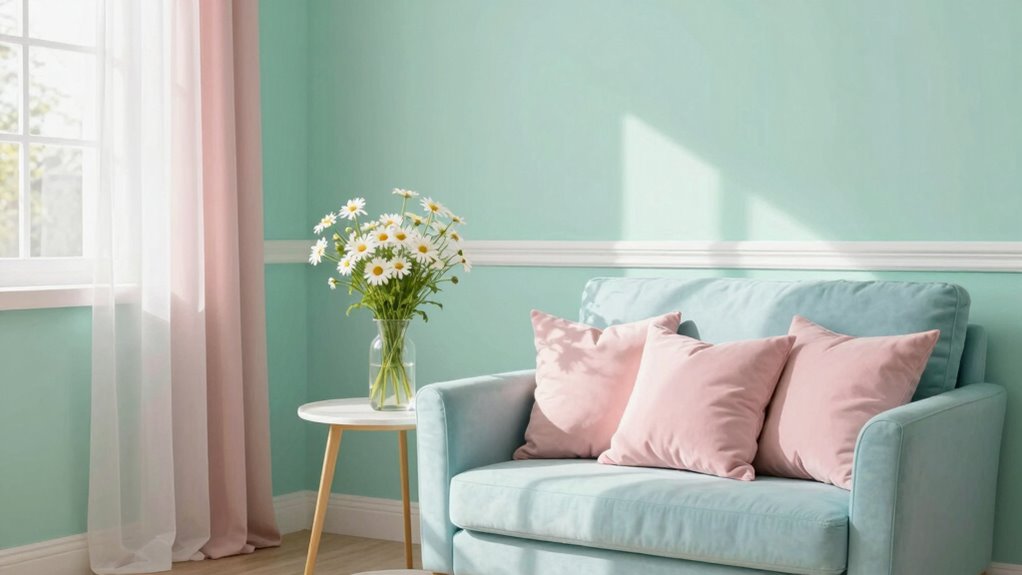
Start by considering soft, airy shades that mirror the blooming landscape outside. Light greens, blush pinks, and gentle blues are popular spring choices because they evoke freshness and renewal. These colors are rooted in color psychology; for instance, green symbolizes growth and tranquility, while pink can create feelings of warmth and comfort. Incorporating these into your home makes spaces feel lively yet calming, perfect for late spring’s transitional vibe. Seasonal palette trends favor these hues because they reflect the natural environment’s evolution, blending seamlessly with the outdoors and bringing that sense of harmony inside.
When selecting your color combinations, think about balance. Pair a pastel wall with crisp white trims or furniture to keep the look clean and bright. Accent pieces like throw pillows, artwork, or rugs in deeper shades of coral or navy can add depth, making the space more dynamic without overwhelming the senses. Remember, the goal is to create a fresh atmosphere that energizes but doesn’t feel chaotic. Using color psychology, you can choose tones that promote positive feelings—like yellow for optimism or soft lavender for relaxation—helping you feel more at ease in your environment. Understanding color psychology can give you deeper insight into how different hues influence mood and behavior, allowing for more intentional decorating choices.
Another tip is to incorporate seasonal palette trends that emphasize contrast and harmony. Earthy neutrals like warm beige or taupe serve as a versatile backdrop, allowing accent colors to pop without clashing. These trends often feature muted tones inspired by nature, which can ground your living space and create a soothing, cohesive look. You might opt for a soft mint wall paired with terracotta accents or a pale peach sofa complemented by moss-green accessories. This approach keeps your home feeling fresh, current, and in tune with the season’s aesthetic shifts. Additionally, understanding biodiversity can inspire you to incorporate natural elements and sustainable materials into your decor, enhancing the overall harmony of your space.

BICERE Large Abstract Grey Green Framed Canvas Wall Art,Watercolor Neutral White Wall Decor,Modern Pastel Wall Painting,Illustrations Artwork for Living Room,Bedroom,Dining Room,Office -16"x24"x3
- Abstract Sage Green Wall Art: Set of three framed abstract artworks
- Eco-Friendly and Durable: Made with thick canvas and high-quality ink
- Multi-Scene Decoration: Suitable for various rooms and styles
As an affiliate, we earn on qualifying purchases.
As an affiliate, we earn on qualifying purchases.
Frequently Asked Questions
How Can I Incorporate Bold Colors Without Overwhelming the Space?
You can incorporate bold colors by using bold accent walls to add drama without overpowering the space. Complement this with vibrant accessories like cushions, artwork, or rugs to bring in pops of color that energize the room. Keep the rest of your decor neutral or muted, so the bold accents stand out without feeling overwhelming. This balanced approach lets you enjoy vibrant hues while maintaining a fresh and inviting atmosphere.
What Are the Best Color Combinations for Small Rooms?
Want to make your small room feel bigger and brighter? Start with a bold accent wall or try color blocking to add depth without overwhelming. Light, neutral shades on the other walls create balance, while pops of color draw the eye. Use strategic placement of darker hues for emphasis, and keep accessories minimal. This clever approach transforms limited space into a lively, inviting area that feels larger and more dynamic.
How Do I Choose Colors That Complement Natural Light?
To choose colors that complement natural light, you should consider the room’s natural light and its color temperature. If your space gets warm, golden sunlight, cool shades like blues and greens balance it well. For cooler, bluish light, opt for warm tones like soft yellows and warm neutrals to create a cozy feel. Test paint samples at different times of day to see how natural light influences their appearance.
Are There Any Color Trends for Late Spring Home Decor?
You’ll find that soft, pastel shades and muted tones are quietly making waves this late spring, subtly inviting calm and refreshment into your space. Color psychology suggests these hues promote relaxation, while cultural influences often favor nature-inspired palettes like blush pinks, soft greens, or gentle blues. Embrace these trends to create a home that feels both on-trend and soothing, effortlessly blending modern style with timeless comfort.
How Can I Update My Home Colors Seasonally?
To update your home seasonally, start with fresh seasonal paint palettes that reflect late spring’s lively vibe. Incorporate window treatment colors that brighten up your space, like soft pastels or vibrant hues, to add a fresh feel. Swap out accessories and textiles to match the new palette, creating a cohesive look. This simple change refreshes your home’s ambiance, making it feel lively, inviting, and perfectly aligned with the season.
Conclusion
As you embrace these fresh color combinations, remember that a well-chosen palette can boost your mood and create a welcoming space. Did you know that homes painted with lighter, cheerful hues tend to increase feelings of happiness by up to 15%? So, don’t hesitate to experiment with these late spring colors—they could transform your home into a vibrant sanctuary. After all, your environment should reflect the lively, uplifting spirit of the season!