
When choosing accent colors, aim for a balanced mix of warm and cool tones to create a harmonious space. Use warm shades like oranges or reds to add energy and coziness, and cool shades like blues or greens to introduce calmness and relaxation. Test different combinations in your space under various lighting to find what feels right. For more tips on mastering this balance and elevating your interior style, keep exploring these ideas.
Key Takeaways
- Use neutral base colors to make warm and cool accents stand out without overwhelming the space.
- Balance warm and cool tones to create visual harmony and prevent the room from feeling chaotic.
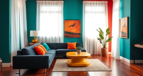
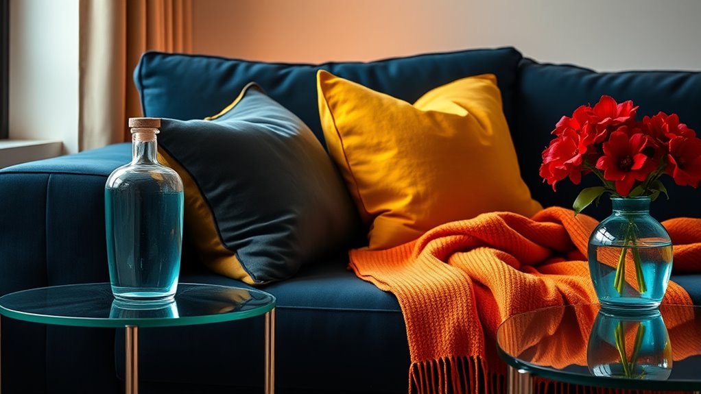
- Incorporate contrasting shades, like blue with orange, to add vibrancy while maintaining harmony.
- Consider the room’s purpose; calming cool tones suit relaxation areas, while warm accents energize social spaces.
- Test color combinations in the actual space under different lighting to ensure the balance enhances mood and style.
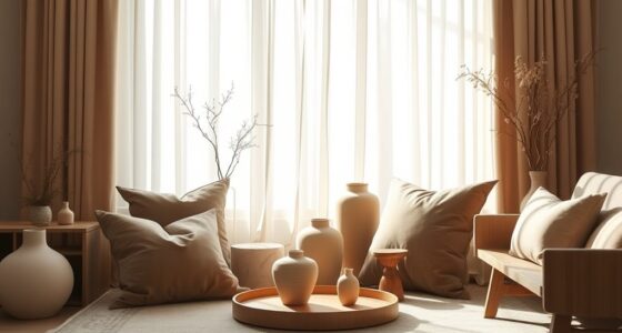
Selecting the right accent colors can transform a room from ordinary to stunning by adding visual interest and personality. When you choose your accents, consider how color harmony plays a essential role in creating a cohesive and inviting space. Color harmony involves selecting shades that complement each other, ensuring your room feels balanced rather than chaotic. Warm tones like reds, oranges, and yellows can energize a space, while cool tones such as blues, greens, and purples tend to soothe and relax. By understanding these relationships, you can mix and match accent colors to produce a harmonious environment that suits your mood and style.
Your choice of accent colors also taps into the powerful domain of color psychology. Colors evoke emotions and influence perceptions, so selecting the right shades can shape how you experience the room daily. For example, a pop of fiery red can stimulate excitement and passion, making it perfect for social areas. Meanwhile, soft blues can foster calmness and focus, ideal for bedrooms or study spaces. When you intentionally pick accent colors based on their psychological effects, you craft a space that not only looks good but also feels right. This awareness helps you avoid mismatched hues that might clash or create visual dissonance, ensuring every element contributes positively to the room’s vibe.
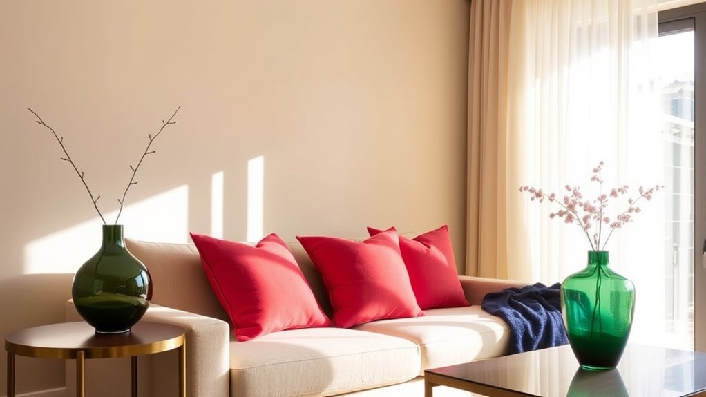
Balancing warm and cool tones is essential in achieving visual harmony and emotional balance. If your room feels too energetic or overwhelming, temper it with cool accents that bring a calming influence. Conversely, if your space seems too quiet or dull, adding warm accents can inject vitality and warmth. Think about the existing color palette and how contrasting or complementing shades can work together. For instance, a cool blue wall can be accented with warm orange cushions or artwork to create a striking yet harmonious effect. Conversely, a warm beige room can benefit from cool green plants or accessories to introduce freshness and calm.
When selecting accent colors, also consider the proportions. Using a dominant neutral base allows your accent colors to shine without overwhelming the space. You don’t need to go overboard; instead, choose a few well-placed accents that enhance your overall design. Pay attention to how these colors interact in different lighting conditions, as natural and artificial light can alter their appearance. Test your choices in the actual space, and don’t hesitate to experiment with different tones until you find the perfect balance that reflects your personality and meets your emotional needs. Ultimately, thoughtful selection of accent colors grounded in color harmony and psychology will make your space both beautiful and meaningful.

MIULEE Teal Orange Decorative Throw Pillow Covers 18×18 Inch Set of 4 Boho Corduroy Striped Cushion Cases Modern Farmhouse Patchwork Pillow Cases for Couch Sofa Bedroom Home Decor
Design with Patchwork Striped: This boho pillow cover uses high quality soft corduroy that fearures a cute and…
As an affiliate, we earn on qualifying purchases.
As an affiliate, we earn on qualifying purchases.
Frequently Asked Questions
How Can I Incorporate Accent Colors Into Small Spaces Effectively?
You can incorporate accent colors into small spaces by strategically placing furniture and wall art accents that highlight your chosen hues. Opt for a bold throw pillow or a vibrant piece of wall art to create focal points without overwhelming the room. Proper furniture placement guarantees the accents stand out, making the space feel lively yet balanced. Keep the accents proportionate to avoid clutter, enhancing the room’s overall harmony.
Are There Specific Accent Color Combinations for Different Interior Styles?
You’ll love how bold your space becomes when you pick accent color combinations tailored to your style! For modern interiors, go for striking complementary color schemes—think navy and orange—creating jaw-dropping contrast. In minimalist spaces, monochromatic accents provide subtle elegance, almost like whispering sophistication. Whether you want vibrant energy or calm serenity, choosing the right accent colors based on your style transforms your space into a masterpiece that’s uniquely you!
How Do Lighting Conditions Affect the Perception of Warm and Cool Tones?
Lighting conditions markedly influence how you perceive warm and cool tones. Natural light enhances the true colors of your accents, making warm tones appear more inviting and cool tones crisper. Artificial lighting, depending on its warmth or coolness, can shift these perceptions, making warm colors feel cozier or cool tones look more vibrant. To get the best sense of your color choices, test your accents under different lighting scenarios.
Can Accent Colors Be Changed Easily Without Repainting?
Yes, you can easily change accent colors without repainting by removing existing accent pieces like pillows, artwork, or decorative accessories. You can also change accent tones through swap-out decor items or using removable wallpaper and decals. These options let you update your space quickly and affordably, giving you flexibility to experiment with different warm and cool tones without the hassle of repainting.
What Are the Best Tools or Resources for Choosing Color Palettes?
You should explore color palette tools like Adobe Color, Coolors, or Canva’s color palette generator to find perfect combinations. These tools help you experiment with warm and cool tones easily. For design inspiration resources, check platforms like Pinterest, Houzz, or design blogs. They offer visual ideas that can guide your choices. Using these resources, you’ll confidently select accent colors that balance warm and cool tones without hassle.
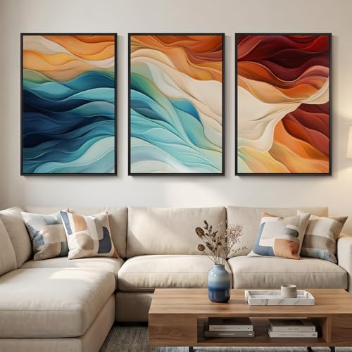
Large Framed Blue Orange Abstract Wall Art for Living Room, Set of 3 Modern Canvas Prints Paintings Artwork for Walls, Minimalist Colorful Bright Pictures for Dining Bedroom Hallway Wall Decor 24×36 In
[Framed Wall Art]: This set of 3 large modern abstract canvas wall art features teal green, deep blue…
As an affiliate, we earn on qualifying purchases.
As an affiliate, we earn on qualifying purchases.
Conclusion
Remember, balancing warm and cool accent colors creates a harmonious space that feels inviting and lively. If you worry about clashing tones, start small—perhaps with a throw pillow or a vase—so you can see how they blend. Imagine walking into a room where cozy reds complement calming blues, making you feel both energized and relaxed. Trust your instincts and experiment; your perfect balance will make your space uniquely yours and truly inviting.
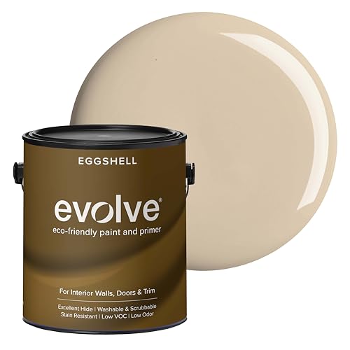
EVOLVE Interior Paint & Primer, Eggshell (Natural Beige), 1 Gallon – One-Coat Coverage, Excellent Hide, Low VOC, Low Odor, Washable Paint for Walls, Doors & Trim
PAINT + PRIMER IN ONE: Evolve’s paint-and-primer formula helps you get great coverage from the start, sealing your…
As an affiliate, we earn on qualifying purchases.
As an affiliate, we earn on qualifying purchases.

Color Wheel Color Mix, Chart Pigment Mix Color for Permanent Eyebrow Lip Hardboard Accessory
FUN: Learn in a fun way. Great for painting, design, interior design, creative craft projects and home decor.
As an affiliate, we earn on qualifying purchases.
As an affiliate, we earn on qualifying purchases.