Color harmony is key to creating balanced and attractive palettes that enhance your design's visual appeal. You can use complementary, analogous, or triadic color schemes to achieve harmony. Experimenting with colors can evoke emotions and strengthen your brand identity. Limiting your palette to 2-6 colors helps avoid clutter and maintains readability. Remember, the right color combinations can greatly impact user experience. Keep exploring different techniques to elevate your designs and discover new possibilities.
Key Takeaways
- Utilize the color wheel to explore complementary, analogous, and triadic schemes for dynamic and balanced color palettes.
- Limit your color palette to 2-6 colors to maintain visual clarity and avoid clutter in design.
- Experiment with contrast to enhance readability, aiming for a contrast ratio of at least 4.5:1 for accessibility.
- Apply color psychology principles to evoke specific emotions and reinforce your brand identity through thoughtful color choices.
- Conduct user testing to gauge audience reactions to color combinations and refine your palette for optimal engagement.
Understanding Color Theory

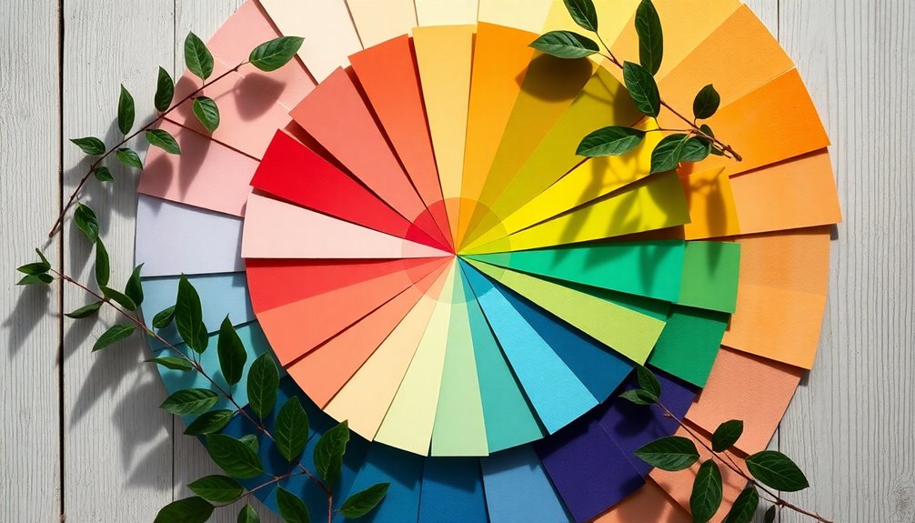
Color theory serves as the foundation for creating visually appealing designs. By understanding the color wheel, you can explore various color schemes, including complementary colors and analogous palettes.
This knowledge helps you achieve color harmony, ensuring that your designs resonate emotionally with viewers. You'll notice how warm and cool colors can evoke different feelings, guiding the viewer's perception of your work.
Experimenting with shades and tints adds depth to your designs, making them more dynamic. A balanced color palette typically consists of 2-6 colors, which promotes visual coherence and effective communication. Additionally, the relationship between art and cultural significance can influence how color choices are perceived in different contexts.
The Color Wheel

The color wheel is your essential guide to understanding primary and secondary colors.
By mixing primary colors like red, blue, and yellow, you create secondary colors such as green, orange, and purple.
You can also explore complementary color relationships by looking at colors directly opposite each other on the wheel for striking visual effects.
Primary and Secondary Colors
Understanding the color wheel can transform how you approach design, as it categorizes colors into primary and secondary groups that form the foundation of all hues. Primary colors—red, blue, and yellow—can't be created by mixing other colors. Secondary colors, like green, orange, and purple, result from mixing equal parts of two primary colors. Mastering these color combinations is essential for creating visually pleasing color palettes. Incorporating color schemes can further enhance the harmony of your decor.
Here's a quick reference table to illustrate:
| Primary Colors | Mixing | Secondary Colors |
|---|---|---|
| Red | Red + Blue = Purple | Green |
| Blue | Red + Yellow = Orange | Orange |
| Yellow | Blue + Yellow = Green | Purple |
Using this color theory, you can craft harmonious color schemes with ease!
Complementary Color Relationships
When you explore complementary color relationships, you'll discover how pairs of opposing colors on the color wheel, like blue and orange, can create striking contrasts that enhance visual appeal.
These complementary colors generate high contrast, adding visual interest to your designs and effectively drawing attention to focal points. While they're attention-grabbing, using them excessively can overwhelm viewers.
Incorporating shades or tints of these colors helps moderate their impact, allowing for balanced palettes. Designers often pair one strong complementary color with neutral tones to achieve a harmonious experience.
This approach is especially suited for youthful and lively projects, but remember to avoid placing complementary colors side by side in text to maintain readability.
Color Harmony Schemes

Color harmony schemes play an essential role in creating visually appealing designs, as they rely on the relationships between colors on the color wheel. You can choose from various schemes like complementary, split complementary, analogous, triadic, and monochromatic. Each offers unique emotional responses and visual balance.
| Color Harmony Scheme | Description |
|---|---|
| Complementary Colors | Opposite colors for high contrast |
| Split Complementary | One base color plus two adjacent complementary |
| Analogous Color Scheme | Adjacent colors for harmony and calm |
| Triadic Color Scheme | Three evenly spaced colors for vibrancy |
| Monochromatic Color | Variations of one color for subtlety |
Using these schemes, you can create an attractive color scheme that balances warm and cool tones effectively.
Tips for Creating Harmonious Color Palettes

When creating harmonious color palettes, consider how color psychology can enhance your design by evoking specific emotions that resonate with your audience.
You should also experiment with contrast to ascertain readability and visual impact, making your message clear and engaging.
Utilize Color Psychology
Understanding how colors influence emotions is essential for creating harmonious color palettes that resonate with your audience. By leveraging color psychology, you can enhance emotional responses and drive user engagement.
Align your color choices with the design message; for instance, use blue for trust and calmness, red for energy and passion, and green for growth and health. Thoughtfully selected color combinations not only guarantee visual appeal but also evoke the desired feelings.
Warm colors like yellow and orange can create cheerful, inviting atmospheres, perfect for brands aiming to uplift. Ultimately, your goal is to craft balanced palettes that effectively communicate your message while tapping into color associations that resonate with your target audience, leading to attractive palettes that capture attention.
Experiment With Contrast
To create truly harmonious color palettes, experimenting with contrast can make a significant difference.
Balancing warm and cool colors adds visual interest and enhances readability. Use high contrast combinations, like dark text on a light background, to improve legibility and emphasize key elements.
When selecting colors, guarantee a contrast ratio of at least 4.5:1 for accessibility, especially for users with visual impairments. Tools like Adobe Color can help you test and visualize different contrast levels in your color palette.
Incorporate shades and tints to add depth while maintaining contrast, preventing overwhelming brightness or darkness. Additionally, understanding HEPA filtration can enhance your design choices by ensuring that your environment supports health and well-being, which is crucial for a harmonious space.
Impact of Color Harmony on UX

Color harmony greatly impacts user experience by creating visually appealing designs that effortlessly guide your attention. When you use balanced color schemes, your interface becomes more engaging and inviting.
High-contrast color combinations enhance readability, making important text and UI elements stand out, which is critical for effective communication. By leveraging color psychology within harmonious palettes, you can evoke specific emotions that reinforce your brand identity and message.
This thoughtful arrangement of colors markedly boosts usability, allowing users to navigate interfaces intuitively. Don't forget that user testing is essential; different audiences may respond uniquely to color choices, influencing their overall interaction experience.
Prioritizing color harmony is a key step in designing successful digital experiences.
How to Achieve Color Harmony

Achieving color harmony in your designs requires a strategic approach that balances aesthetics and functionality. Start by utilizing the color wheel to identify relationships between colors, such as complementary color schemes, which can create visually pleasing palettes.
Experiment with shades (adding black) and tints (adding white) of a chosen color to add depth and variation. Keep in mind color psychology; different hues evoke specific emotions, impacting your design's effectiveness.
To maintain harmony and avoid visual clutter, limit your color palette to 2-6 colors. Finally, leverage design tools like Canva and Adobe Color to explore and extract color combinations from images, enhancing your palette selection process and ensuring a harmonious outcome.
Using Color Harmonies in Design

When you understand how different colors interact on the color wheel, you can effectively apply color harmonies in your designs.
By using these techniques, you'll create aesthetically pleasing outcomes that resonate with your audience. Here are three essential color harmonies to contemplate:
- Complementary Colors: Opposite each other on the wheel, these create high contrast and visual interest.
- Analogous Colors: Located next to each other, these provide a cohesive and harmonious look.
- Triadic Color Schemes: Three evenly spaced colors yield vibrant palettes while maintaining balance.
You can also explore split complementary colors for contrast and monochromatic palettes for a clean aesthetic.
Experimenting with these color harmonies will elevate your design outcomes considerably.
Frequently Asked Questions
What Color Creates Balance and Harmony?
To create balance and harmony, you'll want to contemplate the colors you use.
Complementary colors can grab attention, but they might overwhelm if used too much. If you're looking for a more soothing effect, try analogous colors; they blend beautifully together.
Triadic schemes can also work well, offering vibrant combinations while maintaining harmony.
Ultimately, it's about how these colors interact and evoke emotions, so choose wisely based on the mood you want to convey.
What Are the 4 Types of Harmonious Colour Combinations?
You've got four main types of harmonious color combinations to explore.
First, there are complementary colors, which create striking contrasts.
Then, you can use analogous colors for a serene effect.
Triadic colors offer a vibrant yet balanced palette, while split complementary colors provide versatility with less tension.
Finally, monochromatic colors use different shades of a single hue for a clean, cohesive look.
Experimenting with these can really enhance your designs!
What Are the Colors for Balance and Harmony?
To achieve balance and harmony in your designs, consider using analogous colors like blue, teal, and green for a soothing effect.
You can also use complementary colors, such as orange and blue, for striking contrast.
For a vibrant look, try a triadic scheme with red, yellow, and blue.
If you prefer a cohesive aesthetic, monochromatic schemes with various shades of one color work well.
Don't forget split complementary schemes for dynamic contrast while maintaining balance!
What Is the Harmonious Color Theory?
Harmonious color theory is all about how colors interact and complement each other. It categorizes colors into primary, secondary, and tertiary groups, helping you mix and match effectively.
You'll find various schemes like complementary and monochromatic that guide your choices. Understanding the emotional impact of colors is essential, too, as it influences how your audience perceives your design.
Aim for a balanced palette with 2-6 colors to keep things visually appealing and accessible.
Conclusion
Incorporating color harmony into your designs can transform your work from ordinary to extraordinary. By understanding color theory and utilizing various color schemes, you can create balanced and appealing palettes that enhance user experience. Remember, achieving harmony isn't just about aesthetics; it's about evoking emotions and guiding interactions. So, experiment with different combinations, trust your instincts, and watch as your designs come to life with vibrant, harmonious colors that truly resonate with your audience.


