
To create a color combination chart for your home, start by understanding color theory, including the color wheel and hue relationships. Select your main color and identify complementary shades that enhance it. Use large swatch cards to visualize how colors interact in different lighting. Document your chosen colors and their combinations for future reference. Finally, maintain cohesion by using a consistent palette throughout your spaces. You might discover even more tips to elevate your color choices as you explore further.
Key Takeaways
- Begin by selecting a base color that reflects your personal style and complements existing decor in your home.
- Collect paint swatches and fabric samples to visualize how colors interact and create a cohesive palette.
- Document chosen hues, tints, and shades in a color chart for easy reference and adjustments as needed.
- Use visualization tools like ColorSnap to experiment with different color combinations and see how they work in your space.
- Regularly review and update your color chart to maintain harmony and adapt to any design changes in your home.

Pantone Art Postcard Box: 100 Postcards (Pantone Color Chip Card Set)
PERFECT FOR PANTONE COLOR BOOK FANS: This charming postcard collection features a palette drawn from the Pantone Color…
As an affiliate, we earn on qualifying purchases.
As an affiliate, we earn on qualifying purchases.
Understanding Color Theory Basics

Understanding color theory basics is essential for anyone looking to create an effective color combination chart.
Color theory revolves around the color wheel, which categorizes colors into primary, secondary, and tertiary groups. You'll find that complementary colors, sitting opposite each other, provide high contrast, while analogous colors, located next to each other, offer harmony.
Pay attention to hue, saturation, and value, as these elements affect your color scheme's balance and appeal. Remember, warm colors evoke energy, while cool colors promote calmness.
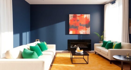
To achieve a cohesive design, apply the 60-30-10 rule: use 60% for a dominant hue, 30% for a secondary color, and 10% for an accent. This approach guarantees visual interest and balance in your space.

The Color Wheel Company Interior Design Wheel interior design color wheel, Multi
Perfect for selecting color combinations for interior decorating
As an affiliate, we earn on qualifying purchases.
As an affiliate, we earn on qualifying purchases.
Selecting Your Main Color

Choosing your main color is a crucial step in creating a color combination chart because it sets the foundation for your entire palette.
Start by selecting a base color that reflects your personal style and complements your home's existing decor. It's best to steer clear of overly dark or saturated tones, as they can overpower your space and make it feel smaller.
Look to the color wheel for inspiration when choosing your base color, ensuring it serves as the cornerstone of your overall color palette. To make it more personal, consider naming your base color, enhancing your emotional connection to the space.

Applying Color Theory to Digital Media and Visualization
As an affiliate, we earn on qualifying purchases.
As an affiliate, we earn on qualifying purchases.
Choosing Complementary Shades

When you're choosing complementary shades, understanding color relationships is key.
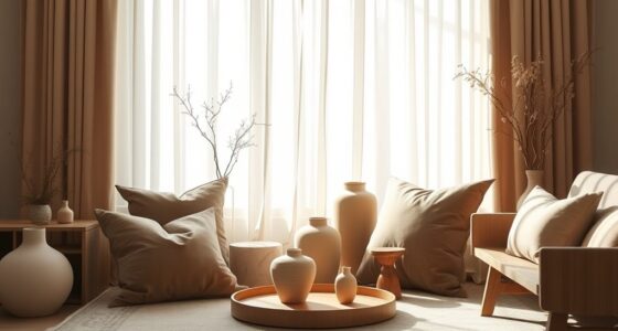
Start by selecting accent colors that enhance your main color while balancing warm and cool tones for a cohesive look.
This approach not only adds vibrancy but also guarantees your space feels harmonious and inviting.
Understanding Color Relationships
To create a striking color palette, it's essential to grasp the concept of complementary colors, which are found directly opposite each other on the color wheel. These colors enhance each other's vibrancy when paired together, making your space visually engaging.
When selecting complementary shades, consider warm vs. cool tones to guarantee they harmonize effectively. A balanced color scheme can create dynamic visual tension, allowing certain elements to stand out while maintaining a cohesive color look.
Experimenting with different tints and shades of your chosen complementary colors adds depth and interest without overwhelming your decor. Limit your palette to one or two dominant colors, using the complementary shade as an accent color for decor items to achieve a successful, cohesive design.
Selecting Accent Colors
Selecting accent colors can greatly impact the overall feel of your space. Aim for two key colors that dominate, ensuring they complement your design and mood.
Utilize complementary color schemes to enhance the visual appeal of your decor. Incorporating neutral tones alongside your accent colors balances the look, preventing it from feeling overwhelming.
Experiment with various shades and tints of your chosen colors to find the perfect depth that reflects your personal style. Accessory items like throw pillows, artwork, and rugs are excellent ways to introduce these accent colors without the commitment of painting entire walls. Additionally, consider the impact of durable materials that withstand moisture when selecting accent pieces for areas like bathrooms.
Balancing Warm and Cool
Using the 60-30-10 rule—60% dominant color, 30% secondary, and 10% accent—can help you create a harmonious space that feels both inviting and balanced. Additionally, incorporating mindful decluttering strategies can greatly enhance the overall ambiance by minimizing distractions and promoting a serene environment.

Magic Palette Color Mixing Guide 11.5 Inch
Please__contact us to solve the problem w/ name: The Color Wheel 5324CW Magic Palette Personal Mixing Guide New…
As an affiliate, we earn on qualifying purchases.
As an affiliate, we earn on qualifying purchases.
Visualizing Colors With Samples

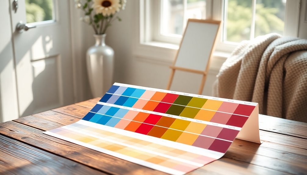
When it comes to visualizing colors, experimenting with large swatch cards can make a significant difference in understanding how hues interact in various lighting and spaces.
Start by collecting paint swatches that resonate with your vision, then pair them with fabric samples or decor items to guarantee a cohesive color palette.
Utilize visualization tools like ColorSnap or Visualize Color to upload photos of your space, generating customized color combinations that fit your style.
Create a color chart to document your selected hues along with their tints and shades, helping you recognize the full range available for your palette.
Regularly review and adjust your color combinations as you add new elements, maintaining harmony in your design flow.
Documenting Your Color Combinations

When you're documenting your color combinations, start by organizing your swatches for easy access.
It helps to keep track of visual inspiration sources and note any experimentation results along the way.
This approach not only streamlines your process but also allows your palette to evolve with your style.
Color Swatch Organization
Creating a well-organized color swatch collection is essential for any design project. Effective color swatch organization helps streamline your interior design process and makes picking colors easier.
Here are some tips to keep your swatches neat and accessible:
- Use labeled folders or binders for categories like wall paints, fabrics, and accessories.
- Photograph your swatches next to their corresponding materials for visual context.
- Document color combinations in a dedicated notebook, noting shades and brand names.
- Explore digital tools or apps to create and manipulate your color palette.
- Regularly update your collection as you experiment with new paint colors and combinations. Additionally, consider incorporating sustainable materials into your designs for an eco-friendly approach.
Visual Inspiration Sources
While finding the right color combinations can be challenging, leveraging visual inspiration sources can considerably streamline the process. Start by creating a Pinterest board to collect images of color palettes that catch your eye. This visual board will help you organize your ideas and refer back to them easily.
Next, use color palette generators like Coolors.co or Adobe Color to visualize your chosen combinations and save them for future use. Don't forget to take photos of your existing decor to match potential palettes.
Collect swatches and paint samples to create a physical color chart, allowing you to see how your colors work together in your space. Additionally, consider incorporating seasonal arrangements that reflect current trends in home decor to further inspire your color choices. Document everything in a dedicated notebook for easy access during shopping.
Documenting Experimentation Results
A well-organized color combination chart is essential for tracking your experimentation results. This document will help you visualize your color palette and guide future decisions.
Include swatches and small paint chips to see how colors interact in different lighting. As you experiment, consider noting:
- The base color and complementary shades
- Emotional responses to each combination
- The intended room for each color pairing
- Inspired materials or decor pieces
- Updates with new combinations over time
Tips for Maintaining Cohesion Throughout Your Home

To maintain a cohesive look throughout your home, focus on establishing a consistent color palette and design elements.
Start by choosing a unified color scheme for your walls, trim, and ceilings to create a seamless visual flow between spaces. Select colors that work together, ensuring they maintain consistency across rooms.
Use a limited number of frame finishes for artwork to establish a cohesive display, and opt for one or two metal finishes for hardware and fixtures to enhance harmony in your decor.
For storage items like baskets and containers, stick to a cohesive color palette to boost organization.
This way, you can utilize colors across multiple spaces without repeating the same palette, showcasing unique designs while achieving a unified look. Additionally, effective preparation can help ensure that your color choices resonate well with the overall design aesthetic.
Frequently Asked Questions
How Do I Create a Color Palette for My Home?
To create a color palette for your home, start by picking a base color that reflects your style.
Experiment with different shades and tints of that color to add depth. Incorporate various hues from the color wheel for a harmonious look.
Keep your final selection limited to 3 to 5 colors, including accents, to maintain coherence.
Use color palette generators and draw inspiration from your decor to fine-tune your choices.
What Is the 60/30/20 Rule in Decorating?
Ever wondered how to make your space feel balanced and inviting? The 60/30/20 rule in decorating is your answer.
It suggests you use 60% of a dominant color for walls or large furniture, 30% for a secondary color in upholstery or curtains, and reserve 10% for accent colors in smaller decor items.
This approach creates harmony and visual interest, so you can enjoy a cohesive look that reflects your style beautifully.
How Do I Choose a Color Combination for My House?
Choosing a color combination for your house starts with picking a base color that reflects your style.
Limit your palette to 3 to 5 colors, focusing on 2 dominant hues and some complementary accents. Experiment with different tints and shades to add depth, ensuring contrast between the lightest and darkest tones.
Look for inspiration in fabrics, art, or nature, and consider how colors interact across open spaces for a harmonious flow throughout your home.
What Is the 60/30/10 Rule in Design?
The 60/30/10 rule in design helps you create a balanced and harmonious color scheme.
You'll use 60% of a dominant color on walls or flooring, setting a cohesive foundation.
Then, add 30% as a secondary color for larger furniture pieces, giving depth without overpowering the dominant hue.
Finally, sprinkle in 10% of an accent color through smaller decor items to add interest and personality.
This approach guarantees your space feels inviting and well-designed.
Conclusion
As you weave your home's color story, let each hue dance together like notes in a symphony. By thoughtfully selecting and documenting your color combinations, you create a harmonious space that resonates with your spirit. Remember, a well-curated palette not only paints your walls but also reflects your personality, transforming your house into a vibrant canvas. So, embrace the journey of color exploration, and watch your home blossom into a sanctuary of warmth and joy.