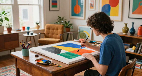

To use color theory in interior design, start by understanding the basics of the color wheel. Choose color schemes that resonate with the mood you want to create, like calming blues for bedrooms or vibrant reds for dining areas. Apply the 60-30-10 rule for balanced proportions, mixing dominant, secondary, and accent colors. Don't forget neutral shades to ground your design. Keep exploring to discover how color choices can transform your space and enhance its atmosphere.
Key Takeaways
- Utilize the color wheel to choose complementary or analogous colors for balanced and visually appealing designs.
- Apply the 60-30-10 rule to ensure dominant, secondary, and accent colors are well proportioned.
- Consider the psychological effects of colors in different spaces to enhance mood and functionality.
- Incorporate neutral colors as a backdrop to allow bold accents to stand out and create cohesion.
- Experiment with different color combinations and assess lighting impacts to refine your design choices.

The Color Wheel Company Interior Design Wheel interior design color wheel, Multi
- Ideal for interior color selection: Perfect for decorating and design
- Suitable for all skill levels: Professionals and amateurs alike
- Extensive color range: Matches every idea
As an affiliate, we earn on qualifying purchases.
As an affiliate, we earn on qualifying purchases.
Understanding the Basics of Color Theory
Color is more than just a visual element; it's a powerful tool in interior design that can shape moods and perceptions. Understanding the basics of color theory helps you harness this power effectively.
At its core, the color wheel categorizes primary colors—red, yellow, and blue—alongside secondary colors like green, orange, and purple. By exploring complementary colors that sit opposite each other and analogous colors that sit next to one another, you can create dynamic color combinations.
Additionally, grasping key properties like hue, saturation, and value is essential. Interior designers use these concepts to evoke specific feelings and craft cohesive environments.
Don't underestimate the influence of neutral colors; they can balance and enhance your chosen palette beautifully.
The Color Wheel and Its Importance

The color wheel serves as a fundamental tool in interior design, offering a visual representation of how colors interact with one another. Developed initially by Sir Isaac Newton, it showcases primary colors—red, blue, and yellow—mixing to create secondary colors like green, orange, and purple.
Understanding this wheel helps you choose complementary colors, which are directly opposite each other, generating striking contrasts.
The color wheel also aids in creating various color schemes, including triadic, which features three evenly spaced colors, and analogous, which consists of colors next to each other.
Exploring Different Color Schemes

When it comes to interior design, exploring different color schemes can dramatically transform your space. Each scheme offers unique benefits, enhancing visual interest and creating focal points.
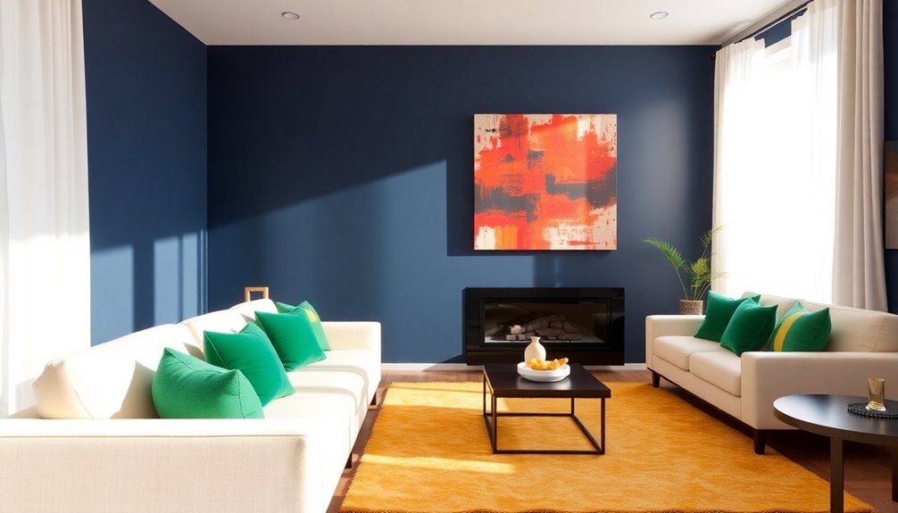
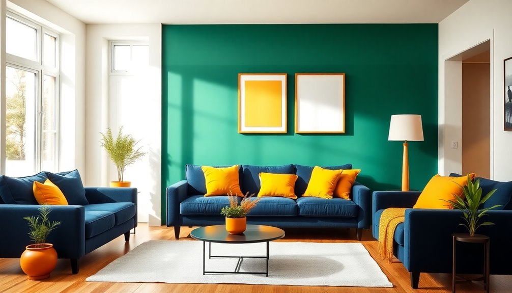
- Complementary colors (e.g., blue and orange) create vibrant contrasts.
- Analogous color schemes (e.g., yellow, yellow-green, and green) provide a harmonious, serene look.
- Triadic color schemes (e.g., red, yellow, and blue) balance contrast with harmony.
- Monochromatic schemes focus on variations of a single color for a cohesive aesthetic.
You might also consider split-complementary schemes, which offer vibrant yet less intense contrasts.
Understanding the psychology of color helps you choose the right color schemes for your space, making it not only beautiful but also emotionally uplifting.
The Psychological Effects of Color

Choosing the right color scheme not only enhances your space visually but also taps into the psychological effects that colors can have on your emotions and behaviors.
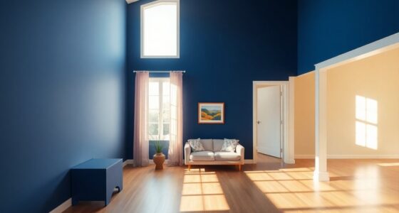
For instance, blue promotes calmness, making it perfect for relaxation spaces like bedrooms and bathrooms. Red ignites energy and passion, great for dining areas. Yellow fosters optimism and happiness, brightening kitchens and playrooms.
Green, symbolizing freshness, creates harmonious environments that enhance concentration, ideal for home offices. Finally, purple adds a touch of creativity and luxury, stimulating imagination in artistic or relaxing spaces.
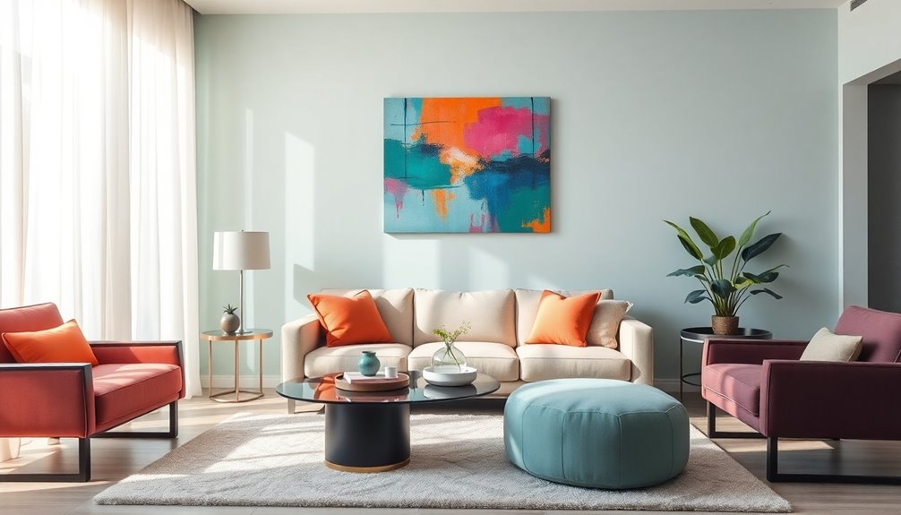
Color Proportions and Their Impact

When it comes to color proportions, the 60-30-10 rule is your best friend.
By allocating 60% to a dominant color, 30% to a secondary hue, and 10% to an accent shade, you can achieve a balanced and visually appealing space.
Balancing Bold Colors
Balancing bold colors in your interior design can transform a space from ordinary to extraordinary.
By mastering color proportions, you can create a visual balance that enhances your environment.
Here's how to effectively incorporate bold colors:
- Use a dominant color to set the tone for the room.
- Pair bold hues with neutral shades for a cohesive look.
- Introduce accent colors to create visual interest without overwhelm.
- Consider patterned furniture to add vibrancy while maintaining harmony.
Additionally, incorporating neutral color palettes can complement the bold colors and create a serene backdrop for your design.
60-30-10 Rule
Mastering how to balance bold colors sets the stage for applying the 60-30-10 rule, a powerful guideline for color proportions in interior design.
According to this rule, 60% of your interior spaces should feature a dominant color that sets the mood, 30% a secondary color that complements it, and 10% an accent color that adds visual appeal.
This proportional guideline prevents vibrant colors from overwhelming the room, ensuring a harmonious design.
When you follow the 60-30-10 rule, you simplify your color selection process, creating cohesive aesthetics.
Remember to evaluate the size and lighting of the room to distribute colors effectively, enhancing both functionality and ambiance while adhering to the principles of color theory.
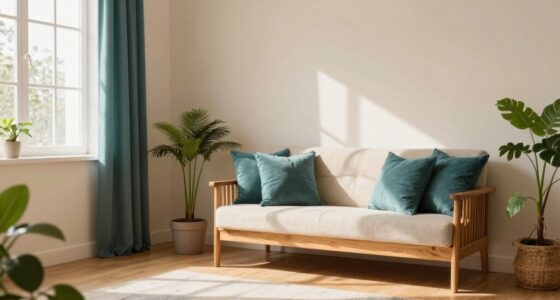
Neutral Colors: The Foundation of Design

Neutral colors are your go-to choice for creating a versatile backdrop that enhances any design style.
By using shades like beige, gray, or taupe, you can easily balance bold decor choices and allow your favorite accents to shine.
This flexibility not only keeps your space looking fresh but also makes updating your decor a breeze. Additionally, incorporating a functional layout can further enhance the effectiveness of neutral palettes by optimizing space usage.
Versatility of Neutral Colors
How can you create a harmonious living space that stands the test of time? By embracing the versatility of neutral colors, you can craft an adaptable backdrop that enhances your home's aesthetic.
Neutral tones bring a calming effect, balancing vibrant colors while allowing your accent colors to shine.
- Use beige or taupe on walls for a timeless appeal.
- Incorporate gray to create an open, airy feel.
- Layer with vibrant pillows and artwork for a rejuvenating pop.
- Mix textures to enhance perception and depth.
These elements work together to create a balanced atmosphere, making your space feel larger and inviting.
With neutral colors, you can easily revitalize your design without committing to permanent choices.
Enhancing Bold Decor Choices
Creating a striking interior doesn't mean you have to shy away from bold decor choices; instead, it's about how you use neutral colors as a foundation.
Neutral colors like whites, beiges, and grays are versatile backdrops that enhance the aesthetic appeal of vibrant decor. By strategically incorporating these colors, you create a calming atmosphere while showcasing your bold elements.
Neutrals serve as foundation elements, promoting cohesion of design and allowing various patterns and colors to integrate seamlessly. Their adaptable palettes guarantee that your bold choices remain stylish and relevant over time.
Embrace the power of color theory to let your bold decor shine against a well-balanced, neutral backdrop. Additionally, consider incorporating natural materials to further enhance the warmth and authenticity of your space.
Practical Tips for Color Selection

When selecting colors for your interior design, understanding the relationships between hues can make all the difference in achieving a cohesive look. Utilize the color wheel to find complementary colors and create visual harmony.
Remember the 60-30-10 rule for balanced distribution:
- 60% dominant color
- 30% secondary color
- 10% accent color
Consider the emotional impact of your choices; calming blues work wonders in relaxation spaces, while energizing yellows can invigorate active areas.
Keep in mind the lighting effects on your colors, as both natural and artificial light can change their appearance.
Finally, incorporate neutral colors to provide a versatile backdrop that allows your bold accents to shine while maintaining a timeless aesthetic.
Real-Life Applications of Color Theory in Design
While choosing colors for your space, real-life applications of color theory can greatly enhance your design. You can use complementary colors, like blue and orange, to create striking visual contrast that highlights focal points.
Implement the 60-30-10 rule for a balanced aesthetic: 60% dominant color, 30% secondary color, and 10% accent color. Monochromatic color schemes work well too, varying tints and tones to establish a harmonious atmosphere in bedrooms or offices.
If you're focusing on commercial design, align your color strategies with branding—warm colors like red and yellow stimulate energy and customer engagement.
Vibrant palettes can also transform dull spaces, leveraging psychological effects to create inviting environments.
Frequently Asked Questions
How Do Interior Designers Use Color Theory?
Interior designers use color theory to create visually appealing and harmonious spaces. They identify relationships between colors, like complementary or analogous schemes, to enhance the room's aesthetic.
By applying the 60-30-10 rule, designers balance colors effectively, ensuring a dominant, secondary, and accent color work together. They also consider the psychological effects of colors, using calming shades in relaxation areas while energizing tones can uplift more active spaces.
This thoughtful approach creates inviting environments.
What Is the 60/30/20 Rule in Decorating?
The 60/30/10 rule in decorating helps you create a balanced and inviting space.
You'll use 60% of a dominant color, typically on walls or large furniture. Next, apply 30% of a secondary color in upholstery or medium-sized decor.
Finally, reserve 10% for accent colors through accessories like pillows or artwork.
This rule simplifies your color choices, ensuring your space feels harmonious and visually appealing without overwhelming your eyes.
What Is the 70/20/10 Color Rule?
The 70/20/10 color rule simplifies color choices in your space.
You'll use 70% of a dominant color for walls or large furniture to create a cohesive backdrop.
Then, choose a secondary color for 20% of the area, like upholstery or curtains, to add depth.
Finally, reserve 10% for accent colors, using them in decor items like cushions or artwork to create visual interest and focal points throughout the room.
How Do You Use Color Theory Effectively?
To use color theory effectively, you start by understanding the color wheel and recognizing complementary, analogous, and triadic schemes.
You can create balance by applying the 60-30-10 rule for color distribution.
Consider the psychological impacts of colors; calming blues are great for relaxation, while vibrant reds energize spaces.
Experiment with shades for depth, and always test your choices under different lighting to see how colors transform throughout the day.
Conclusion
By understanding and applying color theory in your interior design projects, you can create spaces that not only look great but also evoke the desired emotions. Remember to experiment with different color schemes and proportions, and don't underestimate the power of neutral colors as a foundation. With these tips in mind, you'll be well on your way to designing environments that reflect your personality and enhance your well-being. Happy designing!