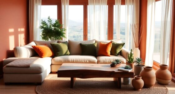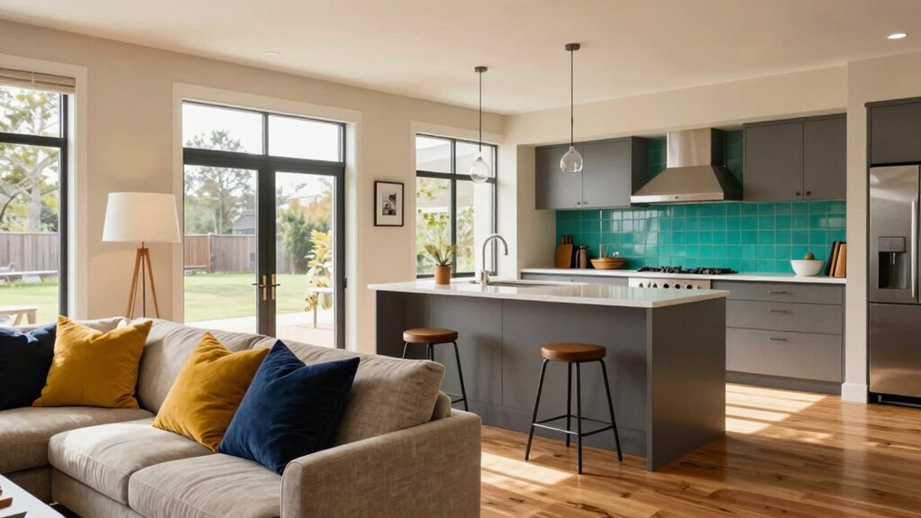

To create a cohesive and inviting open-concept home, choose a unified color palette with subtle variations that reflect your personal style. Use natural tones and region-inspired colors to add calmness and personality. Layer your lighting with natural light and layered fixtures to enhance your hues and moods. Pay attention to undertones and how colors interact with different lighting to guarantee a balanced, harmonious space. Keep exploring to discover even more tips for perfecting your home’s color strategy.

Get furniture and decor delivered free with Prime
- Fast, free delivery on millions of items
- Prime Video, Amazon Music and more included
- Member-only deals all year
Key Takeaways
- Use cohesive, personalized color palettes with subtle variations to ensure harmony and define zones without disrupting openness.
- Coordinate lighting and hues to enhance color perception and create inviting, balanced atmospheres.
- Recognize undertones and employ color psychology to evoke desired moods and support visual harmony.
- Incorporate natural and regional colors inspired by nature for a calming, regionally personalized environment.
- Plan colors to support flow, movement, and personality, making the open space inviting and visually cohesive.
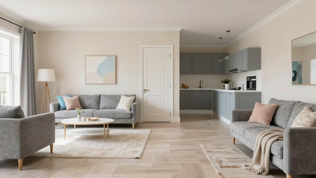
Open-concept homes offer a seamless flow between living spaces, making color choices more impactful than ever. When you design such a space, your color decisions influence the entire environment, so selecting a cohesive palette is crucial. Personalized color palettes allow you to tailor the overall look to reflect your style while maintaining harmony across rooms. Instead of choosing drastically different shades for each area, opt for a unified color theme with subtle variations. For example, a soft beige in the living room can flow smoothly into a warm taupe in the dining area, creating continuity without monotony. This approach helps define distinct zones while preserving the open feel.
Lighting and hue coordination are equally essential in open-concept designs. The way natural and artificial light interacts with your colors can dramatically alter their appearance throughout the day. Bright, sunlit rooms can make cool tones look more vibrant, while darker corners may mute warmer shades. To maximize your space’s visual appeal, select colors that respond well to your lighting conditions. Incorporate layered lighting—such as pendant lights, sconces, and floor lamps—to enhance the hues and create ambiance. When choosing your colors, consider how they will look under different lighting scenarios. For instance, a muted blue may appear soft and calming in natural daylight but can look dull or cold under harsh artificial lighting if not paired thoughtfully. Understanding lighting and hue coordination can help you achieve a balanced and inviting atmosphere. Paying attention to color undertones** allows for even more precise and intentional color choices that harmonize with your lighting setup. Recognizing color psychology** can further help you select shades that evoke the desired mood and atmosphere in your home.
Ultimately, your goal is to create a balanced environment where colors support the flow of movement and conversation. Personalized palettes allow you to infuse your personality, while mindful lighting and hue coordination ensure your choices look intentional and polished. Incorporating biodiversity principles, such as using natural colors inspired by nature, can further enhance the calming effect of your space. Considering environmental influences like natural surroundings or regional color trends can also add a unique touch to your design. With thoughtful planning, your open-concept home becomes a beautiful, inviting space that feels both lively and cohesive—an extension of your personal style expressed through carefully curated color strategies.
As an affiliate, we earn on qualifying purchases.
Frequently Asked Questions
How Can Color Affect the Perceived Size of Open-Concept Spaces?
Color can profoundly influence how large your open-concept space appears. Light, neutral shades reflect more light, making the area feel bigger and more airy, while darker hues create a cozy, intimate vibe. Using color psychology, you can choose calming tones to enhance spaciousness. To maintain visual cohesion, stick to a consistent palette across rooms, which helps your space feel unified and larger than it actually is.
What Are the Best Color Combinations for Maintaining Flow?
You should choose color combinations that create seamless shifts, like soft neutrals or analogous shades, to maintain flow. Using color psychology, opt for calming hues like blues or greens to enhance mood and foster relaxation across your space. Keep consistency in your palette, but add subtle variations to prevent monotony. This approach helps your open-concept home feel cohesive, inviting, and balanced, making every area naturally connect and enhance your overall living experience.
How Do Lighting Choices Influence Color Perception in Open Plans?
Lighting choices can make or break your space, so you want to get it right. Natural light, in particular, enhances color psychology by making hues appear warmer or cooler throughout the day. Bright, well-placed lighting can highlight your color scheme, while dim or poor lighting may dull or distort it. Think of lighting as the paintbrush that brings your color palette to life, ensuring your open plan feels harmonious and inviting.
Can Bold Colors Work in Open-Concept Homes?
Yes, bold colors can work in open-concept homes if you use bold accents strategically. Incorporate them in focal areas like a feature wall or furniture pieces to create visual interest without overwhelming the space. Color psychology plays a role here; vibrant hues can energize or calm a room depending on your choice. Just balance bold accents with neutral tones to maintain harmony and guarantee the space feels inviting.
How to Balance Color Contrast Without Disrupting Harmony?
To balance color contrast without disrupting harmony, you should use color psychology to select shades that evoke positive emotional impacts. Incorporate contrasting colors thoughtfully by pairing bold hues with neutral or muted tones to maintain flow. Use accents or accessories to introduce contrast, ensuring they complement the overall palette. This approach helps you create visual interest while preserving a cohesive, harmonious open-concept space that feels balanced and inviting.
Conclusion
Now that you’ve uncovered these color strategies, imagine the stunning transformation awaiting your open-concept home. Will you choose bold contrasts to create drama, or subtle shades for a seamless flow? The choice is yours, and the possibilities are endless. But remember, the right color scheme can do more than enhance your space—it can redefine your entire living experience. Are you ready to take the leap and bring your vision to life? The perfect palette is just a decision away.
Halloween Picks
halloween
As an affiliate, we earn on qualifying purchases.