
To use butter yellow without making it feel too sweet, balance it with deep, rich hues like navy or forest green, or pair it with cool neutrals such as soft gray or crisp white. Incorporate natural textures like wood or linen to ground the brightness. Use it as an accent rather than a main color and layer different shades for depth. Curious how to create a stylish, balanced look? Keep exploring for more tips.

Get furniture and decor delivered free with Prime
- Fast, free delivery on millions of items
- Prime Video, Amazon Music and more included
- Member-only deals all year
Key Takeaways
- Pair butter yellow with cool neutrals like gray, white, or taupe to tone down brightness and create a sophisticated look.
- Use darker, richer hues such as navy, forest green, or burgundy as accents to balance vibrancy.
- Incorporate natural textures like wood, linen, or jute to ground the cheerful color and add depth.
- Apply butter yellow as an accessory or accent rather than a main color for subtle, stylish impact.
- Layer different shades of yellow and contrasting colors to add complexity without overwhelming the space or outfit.
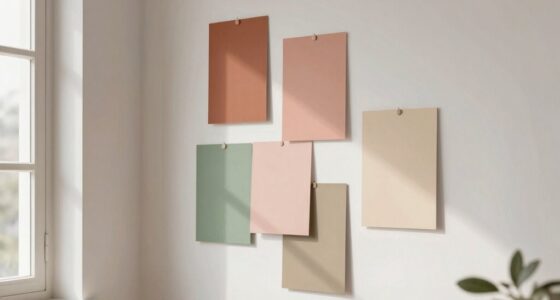
Butter yellow is a vibrant, cheerful hue that can instantly brighten any space or outfit. It’s a color that radiates warmth and positivity, but you might worry about it tipping into overly sweet or juvenile territory. The key to using butter yellow without going too sweet lies in thoughtful color pairing and understanding how it influences mood. When you incorporate butter yellow into your decor or wardrobe, aim to balance its brightness with more subdued or contrasting shades. Pair it with cool neutrals like soft gray, taupe, or crisp white to tone down its intensity while maintaining a fresh look. These combinations create a sophisticated vibe that feels lively yet grounded, preventing the color from feeling overly saccharine.
In your wardrobe, consider integrating butter yellow as an accent rather than the main focus of your outfit. A butter yellow scarf, handbag, or shoes can add a pop of brightness without overwhelming your look. When matched with deep, rich hues like navy, forest green, or burgundy, the yellow acts as a lively highlight that elevates your style without veering into overly sweet territory. This approach boosts your mood, thanks to the cheerful nature of the color, but keeps your overall appearance polished and balanced. You’ll find that these combinations help you feel upbeat and approachable without feeling overly playful or juvenile. Incorporating color pairing strategies can help you master this balance more effectively. Additionally, experimenting with color contrast can further enhance your styling versatility.
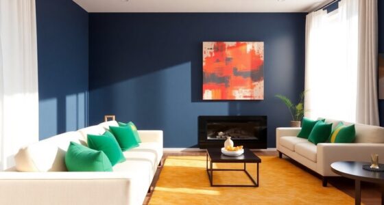
In interior design, butter yellow works beautifully when used as an accent wall or in accessories like cushions, vases, and artwork. To avoid making your space feel too saccharine, combine it with natural textures such as wood, linen, or jute. These elements ground the brightness of the yellow, creating a cozy, inviting atmosphere. Additionally, layering different shades of yellow—like mustard or pastel tones—can add depth and complexity, enhancing the overall mood without making the space feel overly cheerful or cloying. Incorporating natural textures and biodiversity into your decor choices can further enhance the sense of harmony and balance, creating a more dynamic and appealing environment.
As an affiliate, we earn on qualifying purchases.
Frequently Asked Questions
Can Butter Yellow Be Combined With Bold, Dark Colors?
Yes, you can definitely combine butter yellow with bold, dark colors. This creates a striking color contrast that makes your space lively yet balanced. Use dark shades like navy, charcoal, or deep green as your primary colors, then add butter yellow as accent accessories or accents. This blend highlights the yellow’s warmth while grounding your decor, making it both vibrant and sophisticated without feeling overwhelming.
Is Butter Yellow Suitable for Outdoor Decor?
Imagine sunlight streaming through your garden, and butter yellow accents glow warmly against vibrant greens. Yes, butter yellow suits outdoor decor perfectly. It adds a cheerful, inviting touch, especially with seasonal accents like flowers or cushions. Its warm hue taps into positive color psychology, evoking happiness and optimism. Use it on furniture, planters, or accessories to brighten your outdoor space, creating a cozy, lively atmosphere year-round.
How to Prevent Butter Yellow From Looking Outdated?
To prevent butter yellow from looking outdated, you should balance it with vintage charm and modern accents. Incorporate this color through accessories or furniture that blend classic and contemporary styles. Pair butter yellow with neutral shades or bold, current hues to keep it fresh. Regular updates with trendy textiles or artwork also help maintain a modern look. This approach guarantees your space stays stylish and timeless, avoiding an outdated feel.
What Fabrics Pair Best With Butter Yellow?
You should pair butter yellow with rich textile textures like linen, silk, or velvet to create a sophisticated look. These fabrics add depth and elegance, balancing the brightness of the yellow. Incorporate color blocking by combining butter yellow with neutral or contrasting shades to keep the look modern and fresh. This approach prevents the yellow from feeling too sweet or outdated, giving your outfit a stylish, contemporary edge.
Can Butter Yellow Be Used in Minimalist Design?
Yes, butter yellow works well in minimalist design. Its warm hue enhances the space’s simplicity without overwhelming it. You can incorporate butter yellow as interior accents, like throw pillows or small decor pieces, to add a touch of cheerful color. According to color psychology, yellow fosters positivity and energy, making your space inviting. Keep the overall palette neutral to maintain a clean, uncluttered look while infusing warmth with butter yellow elements.
Conclusion
Now that you know how to incorporate butter yellow without overwhelming your palate, it’s clear this hue can brighten any space or dish without going overboard. Be confident in experimenting with subtle accents or bold statements—just don’t put all your eggs in one basket. With a little balance and thoughtful planning, butter yellow can become your secret weapon for adding warmth and charm. Remember, sometimes less is more, and that’s where true style shines.
Halloween Picks
halloween
As an affiliate, we earn on qualifying purchases.