To determine if warm or cool neutrals suit your space, start by testing paint swatches in different lighting conditions. Observe how natural daylight and artificial lights, like LEDs and incandescent, influence their undertones and overall feel. Keep track with photos and notes. Generally, warm neutrals add coziness, while cool neutrals lend a modern, calming vibe. Want to learn how to master this lighting test and choose your perfect neutral? Keep exploring for more tips.
Key Takeaways
- Test neutral paint swatches in different lighting conditions to observe warm or cool undertone shifts.
- Natural daylight reveals true undertones, while artificial lights can enhance warm or cool appearances.
- Take photos of swatches under various lights to compare how they change in tone and mood.
- Warm neutrals appear more inviting under warm lighting; cool neutrals look crisper with cool or neutral lighting.
- The lighting test helps determine which neutral tone best suits your space’s ambiance and lighting environment.
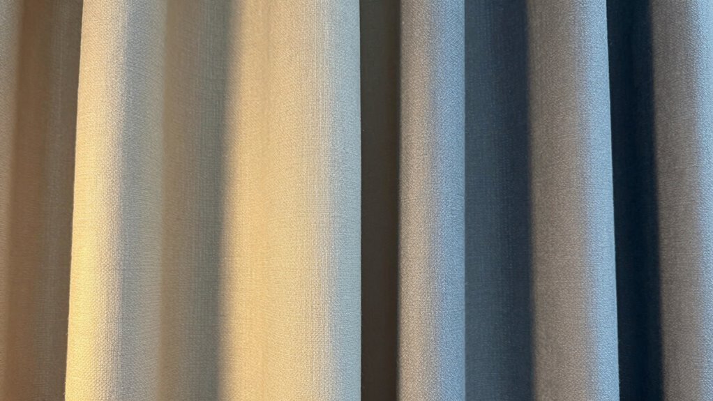
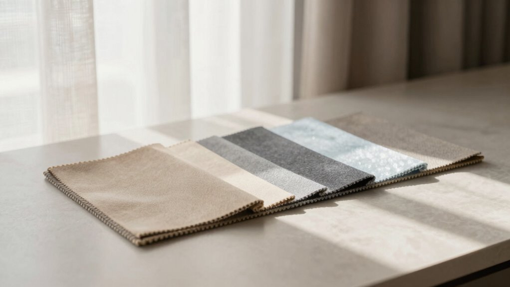
neutral paint swatches for testing lighting
As an affiliate, we earn on qualifying purchases.
As an affiliate, we earn on qualifying purchases.
What Are Warm and Cool Neutrals? Understanding Color, Undertones, and Mood

Have you ever wondered what makes certain neutral colors feel warm or cool? It all comes down to color psychology, paint undertones, and how they influence mood. Warm neutrals, like beige or taupe, often have undertones of red, yellow, or orange, creating a cozy and inviting atmosphere. Cool neutrals, such as gray or greige, usually contain blue, green, or violet undertones, producing a calm and invigorating vibe. Recognizing these undertones helps you understand how different neutrals can change the mood of a space. By understanding color psychology, you can choose neutrals that evoke the right emotions and complement your decor. Whether aiming for warmth or coolness, knowing the subtle undertones makes all the difference in creating your ideal environment. Additionally, digital content exploration can help visualize these color effects in various lighting scenarios. Being aware of lighting conditions is crucial, as different types of light can dramatically alter how neutral colors appear and feel in a room.
LED warm and cool light bulbs
As an affiliate, we earn on qualifying purchases.
As an affiliate, we earn on qualifying purchases.
How Does Lighting Change Neutral Paint Colors? Daylight and Artificial Light Effects

Lighting plays a crucial role in how neutral paint colors appear in your space, often transforming their warmth or coolness throughout the day. Daylight’s changing color temperature can make a cool neutral look crisp in the morning but shift to a softer hue at dusk. Artificial lighting, depending on its type, can also influence how light reflections bounce off your walls, altering perceived undertones. Warm LED bulbs enhance cozy, warm neutrals, while cool LEDs emphasize cooler tones. Here’s a quick comparison:
| Lighting Type | Effect on Neutral Colors |
|---|---|
| Daylight (Natural) | Varies with time; warmer in evening, cooler in morning |
| Warm Artificial Light | Enhances warm undertones, softens overall look |
| Cool Artificial Light | Highlights cool undertones, sharpens contrast |
artificial and natural light testing kit
As an affiliate, we earn on qualifying purchases.
As an affiliate, we earn on qualifying purchases.
How to Test Neutral Wall Colors in Different Lights: Step-by-Step Guide

To accurately see how your neutral wall colors will look under different lighting conditions, it’s essential to test them in various lights before making a final decision. Start by gathering paint swatches of your chosen neutrals and place them in different areas of your space. Observe how they appear in natural daylight, noting the color temperature—warm or cool—that each light source produces. Then, switch to artificial lighting, such as incandescent, LED, or fluorescent bulbs, and compare the shades again. Take photos of the swatches under each lighting condition for reference. This step-by-step process helps you understand how your neutral colors will look throughout the day and night, ensuring you select the perfect hue that complements your lighting environment. Additionally, considering color rendering index (CRI) can help you evaluate how accurately artificial lights display colors in your space. Paying attention to lighting quality can further improve your ability to assess color accuracy and achieve the desired ambiance. Moreover, understanding the presence of microplastics in dust and their impact on indoor air quality can help you create a healthier environment that supports your color choices and overall well-being. Conducting these tests in different lighting situations also allows you to notice color shifts, which can be subtle but important for final selection. Recognizing how lighting conditions influence your perception ensures you make an informed decision.
color temperature light bulbs for home
As an affiliate, we earn on qualifying purchases.
As an affiliate, we earn on qualifying purchases.
Deciding Which Neutral Works Best After Your Lighting Test
| Neutral Type | Best for | Key Feature | |
|---|---|---|---|
| Warm Neutral | Highlighting textiles and accessories | Adds warmth and depth | |
| Cool Neutral | Showcasing modern finishes and textures | Creates crisp, clean look | |
| Balanced Neutral | Versatile, suits various lighting conditions | Offers flexibility | A balanced neutral can adapt to different lighting scenarios, making it a practical choice for many spaces. Its versatility ensures it performs well across various lighting conditions, eliminating the need for frequent adjustments. Additionally, lighting adaptability is a crucial factor when selecting the right neutral for dynamic environments. |
Tips for Using Neutrals Effectively in Your Home Decor
Choosing the right neutral tone can elevate your home decor by creating a cohesive and inviting space. To do this effectively, consider using neutral shades as a backdrop for accent wall ideas that add personality without overwhelming the room. Light warm neutrals can make smaller spaces feel cozy, while cool neutrals bring a modern, airy vibe. When selecting furniture, prioritize color coordination with your walls; for example, pairing warm neutrals with warm-toned furniture creates harmony, while cool neutrals complement sleek, contemporary pieces. Balance is key—incorporate textures and subtle patterns to add depth. Keep your palette consistent to avoid visual clutter. Additionally, understanding smart thermostat setup can help optimize your home’s comfort and energy efficiency, enhancing the overall ambiance. Incorporating lighting techniques that complement your neutral palette can further elevate the space. Using interior design basics such as mood boards and narratives can help you visualize and refine your neutral choices. Implementing color psychology principles can also guide you in selecting neutrals that promote relaxation or productivity, depending on your needs. For example, experimenting with neutral undertones can make a significant difference in achieving the desired mood. With thoughtful neutral choices, your home will look polished, inviting, and effortlessly stylish.
Frequently Asked Questions
Can Warm and Cool Neutrals Be Mixed in the Same Room?
Yes, you can mix warm and cool neutrals in the same room. To maintain color harmony and design consistency, balance the neutrals with thoughtful placement and complementary accents. Use warm neutrals on larger areas like walls or furniture, then add cool neutrals through accessories or smaller decor pieces. This contrast creates visual interest while keeping the overall look cohesive, making your space feel inviting yet dynamic.
How Do I Prevent Neutrals From Looking Dull or Washed Out?
Think of neutrals as a canvas—you don’t want it to fade into dullness. To keep them vibrant, boost color saturation with strategic lighting techniques like layered lighting and warm bulbs. Avoid harsh, direct light that can wash out their richness. Instead, aim for a gentle glow that enhances their depth. This way, your neutrals stay lively and inviting, not dull and washed out, creating a balanced, harmonious space.
Are There Specific Neutrals Better Suited for Small Spaces?
For small spaces, opt for neutral color palettes with light, airy tones like soft beiges, warm grays, or creamy whites. These shades reflect lighting effects to make the space feel larger and more open. Avoid dark neutrals, which can make a room seem cramped. Instead, choose neutrals that brighten the area and enhance natural or artificial light, creating a welcoming, spacious atmosphere.
How Do I Choose Neutrals That Complement My Existing Furnishings?
Imagine your space as a canvas waiting for harmony. To select neutrals that complement your furnishings, focus on your existing color palette coordination and furniture pairing strategies. Choose neutrals that gently echo your current hues, creating a seamless flow. Consider warm neutrals if your furniture has warm tones, or cool neutrals for cooler shades. This thoughtful approach guarantees your room feels cohesive, inviting, and effortlessly styled.
What Are Common Mistakes to Avoid When Selecting Neutrals?
When selecting neutrals, avoid common mistakes like ignoring neutral undertones, which can clash with your furnishings. Always test paint swatches in different lighting to see how they change, and don’t rush your decision. Use paint swatch tips like taping large patches on walls and observing them at different times of day. This helps guarantee your neutral choice complements your space rather than creating unwanted color shifts or mismatched undertones.
Conclusion
Understanding how warm and cool neutrals respond to different lighting can truly transform your space. Did you know that a study found that 85% of people feel more relaxed in rooms with properly tested neutral colors? By testing your neutrals in various lights, you guarantee your home’s ambiance matches your mood and style. So, take the time to experiment—you’ll create a balanced, inviting environment that feels just right, no matter the lighting.