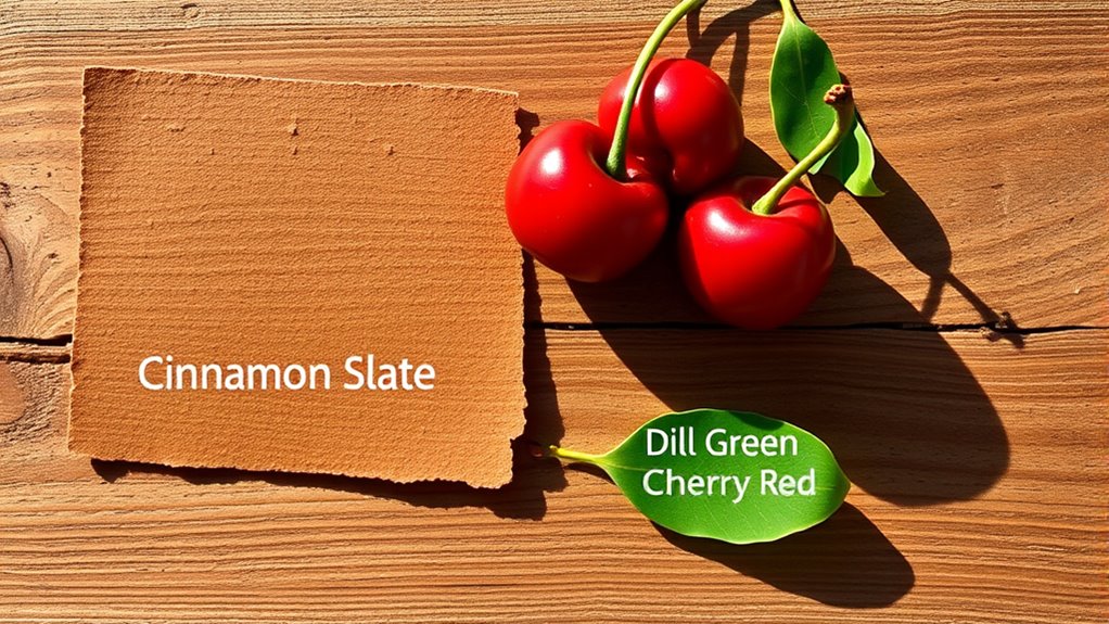

Understanding the color palette of Cinnamon Slate, Cherry Red, and Dill Green helps you create designs that evoke warmth, energy, and freshness. Cinnamon Slate’s earthy tone provides stability and sophistication, while Cherry Red adds vibrancy and excitement. Dill Green introduces a calming, natural touch that balances these bold hues. When you grasp how these colors work together, you can craft visually harmonious compositions. Keep exploring, and you’ll uncover even more ways to make your colors tell a compelling story.
Key Takeaways
- Cinnamon Slate provides a warm, earthy base that adds sophistication and stability to the palette.
- Cherry Red introduces vibrant energy, serving as an eye-catching accent color for contrast.
- Dill Green offers a calming, natural touch that balances the warmth and vibrancy of the other hues.
- The combination creates a harmonious blend of warm, muted, and lively tones, enhancing emotional impact.
- Understanding their relationships helps craft cohesive, emotionally resonant color schemes for diverse design projects.

Color palettes are essential tools for creating visually appealing designs, whether you’re working on graphic art, interior decor, or digital projects. When you select a palette like Cinnamon Slate, Cherry Red, and Dill Green, you’re not just choosing colors; you’re establishing a visual language that influences how viewers perceive your work. Understanding color harmony helps you craft combinations that feel balanced and intentional, while an awareness of the emotional impact of colors ensures your design communicates the right mood or message.
Cinnamon Slate offers a warm, earthy tone that grounds your palette with sophistication and stability. Its muted, reddish-brown hue naturally draws the eye without overwhelming, creating a sense of comfort and reliability. When paired with Cherry Red, a vibrant and energetic shade, you introduce a lively contrast that commands attention and sparks excitement. The key to maintaining harmony here is understanding how these two colors relate—Cinnamon Slate’s subdued warmth balances Cherry Red’s intensity, preventing the design from feeling chaotic or overly aggressive. This balance exemplifies color harmony, where the combination feels cohesive rather than discordant. You can use this harmony intentionally to guide viewers’ focus or evoke specific feelings.
Dill Green complements these warm and passionate tones with its fresh, muted green. It adds a touch of calmness and nature-inspired serenity, softening the overall palette. When combined thoughtfully, Dill Green creates a visual connection that enhances the emotional impact of your colors. The earthy green can evoke feelings of growth, renewal, and tranquility, which offsets the boldness of Cherry Red and the warmth of Cinnamon Slate. Additionally, color psychology plays a vital role in how these hues influence viewer perception, making your palette more effective and engaging. This interplay amplifies the emotional resonance of your design, making it more engaging and memorable.
color palette wall paint Cinnamon Slate Cherry Red Dill Green
As an affiliate, we earn on qualifying purchases.
As an affiliate, we earn on qualifying purchases.
Frequently Asked Questions
How Do These Colors Perform in Different Lighting Conditions?
In different lighting conditions, these colors perform uniquely, affecting your space’s mood. Cinnamon Slate tends to appear warmer or cooler depending on the lighting effects, which can impact color consistency. Cherry Red remains vibrant but might look deeper or brighter in varied light, while Dill Green can shift from fresh to muted tones. To maintain true color appearance, consider testing these shades under different lighting before committing.
Can These Palettes Be Adapted for Digital Versus Print Use?
Did you know that 90% of consumers say color influences their purchase decisions? You can adapt these palettes for digital use by adjusting for screen calibration, ensuring vibrant digital displays. For print fidelity, use CMYK color models to preserve the original hues. By tailoring your approach, you’ll maintain consistent, appealing colors across both digital and print media, making your designs more impactful and professional regardless of the medium.
What Are Complementary Colors for Cinnamon Slate, Cherry Red, and Dill Green?
You can pair cinnamon slate with warm beige or soft creams for a sophisticated look, while cherry red pairs well with mint or forest green for vibrant contrast. Dill green complements earthy browns or mustard yellows for natural harmony. Use pairing techniques like complementary and analogous colors, adjusting for seasonal variations—rich reds and deep greens work well in winter, while lighter shades suit spring and summer.
How Do These Colors Evoke Specific Moods or Emotions?
You’ll find that cinnamon slate brings warmth and stability, evoking feelings of comfort and reliability through color psychology. Cherry red sparks excitement, passion, and energy, creating an emotional impact that grabs attention. Dill green promotes calmness and balance, offering a rejuvenating, soothing vibe. Together, these colors influence your mood by combining warmth, vibrancy, and serenity, making their emotional impact ideal for creating inviting, dynamic, yet harmonious spaces.
Are These Palettes Suitable for All Interior Design Styles?
You’ll find these palettes quite versatile across styles, from modern to rustic, thanks to their balanced hues. Cinnamon Slate adds warmth, Cherry Red brings energy, and Dill Green offers freshness, making them adaptable. Cultural symbolism plays a role too; cherry red often signifies luck in some cultures, while green suggests growth and harmony. So, these palettes can enhance diverse interiors, depending on how you combine and style them.

OLANLY Soft Microfiber Bathroom Toilet Lid Cover, Machine Washable Seat Covers, 17.5×15, Stays in Place Rubber Backing, Fits Most Round, Elongated and Oblong Lids, Accessories Decor, Gray
[HEAVY DENSITY MICROFIBER] The Toilet Lid Cover is made up of 1-inch height premium thick, soft and fluffy…
As an affiliate, we earn on qualifying purchases.
As an affiliate, we earn on qualifying purchases.
Conclusion
Now that you’ve explored cinnamon slate, cherry red, and dill green, you see how color palettes can transform a space or design. Did you know that color can influence mood and behavior up to 75%? Just imagine how choosing the right shades can energize, calm, or inspire. So, next time you pick a palette, remember—your colors do more than look good; they create feelings and experiences.

COLOR MUSE Colorimeter – Mobile Color Matching Tool – Instantly identify closest matching paint colors, products, and digital color values
SIMPLE AND PORTABLE – Scan any flat surface to find the closest matching paint colours and products in…
As an affiliate, we earn on qualifying purchases.
As an affiliate, we earn on qualifying purchases.
Living with Color: Inspiration and How-Tos to Brighten Up Your Home
As an affiliate, we earn on qualifying purchases.
As an affiliate, we earn on qualifying purchases.