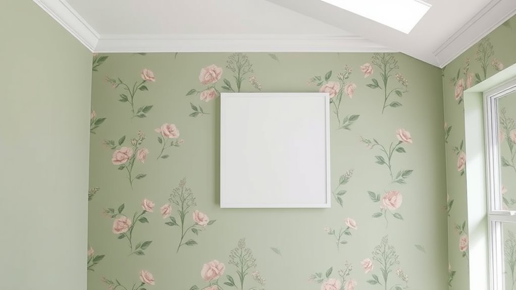

To match paint colors to wallpaper seamlessly, start by using color tools like swatches or apps to identify subtle hues and undertones in your wallpaper. Choose paint shades that complement rather than exactly match the wallpaper’s dominant colors, focusing on creating a balanced palette. Consider the pattern style and size—more intricate patterns often work well with neutral or muted hues. For a polished look, paying attention to finishes and testing colors in your space will help you achieve harmony; from here, you’ll discover even more tips to perfect your space.
Key Takeaways
- Use color swatches, apps, or sample cards to accurately match paint to wallpaper undertones and hues.
- Consider wallpaper pattern complexity; busy patterns suit muted, solid wall colors, while simpler patterns allow bolder contrasts.
- Select paint finishes like matte or eggshell to complement textured wallpaper and create a cohesive look.
- Draw color inspiration from wallpaper patterns for accents or highlight areas, ensuring visual harmony.
- Test paint colors in the actual space under different lighting to ensure seamless integration with wallpaper.
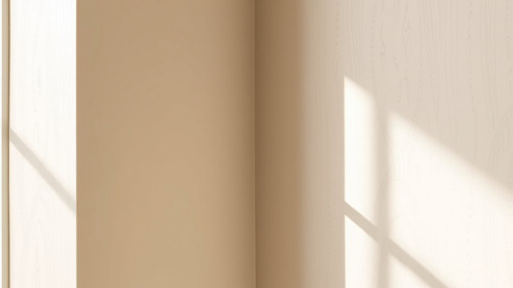
Ever wondered how to create a cohesive look in your space by matching paint colors to wallpaper? Achieving this seamless harmony isn’t just about picking shades that look good side by side; it’s about understanding how color matching techniques and wallpaper pattern coordination work together to elevate your interior design. When you approach this task with a clear strategy, you’ll find that your rooms feel more balanced, inviting, and thoughtfully curated.
Creating a cohesive space by skillfully matching paint colors and wallpaper patterns elevates your interior design with balance and harmony.
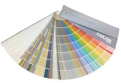
The first step is mastering color matching techniques. Instead of guessing or relying solely on visual similarity, take advantage of tools like color swatches, digital apps, or even paint sample cards. These tools help you identify undertones and subtle hues in your wallpaper that might not be immediately obvious. For example, if your wallpaper features a predominant blue with hints of green, choose a paint color that complements those undertones rather than the surface color alone. This attention to detail prevents your walls from clashing or looking disconnected from the wallpaper, ensuring a harmonious flow. Remember, matching doesn’t mean identical colors; it’s about creating a palette that enhances the wallpaper without overpowering it.
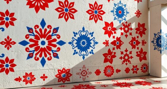
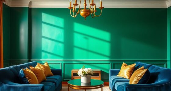
Wallpaper pattern coordination is equally crucial. The size, style, and complexity of the pattern influence your paint choices. For busy, intricate patterns, opt for solid, muted shades that won’t compete visually. Conversely, if your wallpaper has a simpler design or subtle pattern, you can experiment with slightly bolder or contrasting paint colors, but always aim for balance. When selecting these colors, consider the overall mood you want to establish—calming neutrals for a serene space or vibrant hues for energy. You might also pull a color from the wallpaper’s pattern and use it as a highlight or accent on adjacent walls or trim, creating visual continuity. Additionally, understanding resources and tools like color matching apps can greatly enhance your ability to select complementary colors accurately.
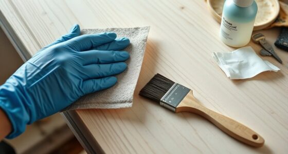
Another key tip is to consider the finish of your paint. Matte or eggshell finishes tend to soften the look, blending well with textured wallpaper, while satin or semi-gloss can highlight certain features or add contrast. Consistent lighting also plays a role; test your chosen colors in the actual space to see how they look under different lighting conditions before making a final decision.
In the end, matching paint colors to wallpaper is an art that combines understanding color theory with a keen eye for patterns. By employing effective color matching techniques and thoughtfully coordinating wallpaper patterns, you can craft a space that feels intentionally designed and visually cohesive. The result isn’t just a room with pretty wallpaper—it’s a harmonious environment that reflects your style and attention to detail.
Sherwin Williams Colors collection Deck Complete Paint Colors
As an affiliate, we earn on qualifying purchases.
As an affiliate, we earn on qualifying purchases.
Frequently Asked Questions
How Do I Choose Paint Colors for Textured Wallpaper?
To select paint colors for textured wallpaper, consider texture considerations by choosing shades that complement or subtly contrast with the wallpaper’s texture. Use paint sample techniques like testing small patches or swatches to see how colors interact with the texture under different lighting. Opt for neutral or muted tones if you want the wallpaper to stand out, or bolder colors for a more dramatic effect. This approach guarantees a cohesive, harmonious look.
Can I Mix Different Wallpaper Patterns With Matching Paint?
Yes, you can mix different wallpaper patterns with matching paint by focusing on pattern coordination and color blending. Choose a unifying color palette to tie the patterns together, ensuring the paint complements each wallpaper without clashing. Use similar shades or subtle variations to create harmony. This approach allows you to combine diverse patterns seamlessly, adding visual interest while maintaining a cohesive look in your space.
What Are the Best Lighting Conditions for Color Matching?
Think of lighting as your paint’s best friend, revealing true colors. You should work in natural light during the day, as it shows the most accurate hues. For evenings or cloudy days, use full-spectrum artificial lighting that mimics daylight. Avoid fluorescent bulbs, which can distort colors. Consistent lighting conditions help you match paint and wallpaper seamlessly, ensuring your room’s palette stays true to your vision.
How Long Should Paint and Wallpaper Be Allowed to Dry Before Matching?
You should wait at least 24 hours for paint and wallpaper to dry completely before matching colors. This drying time guarantees better color consistency and accurate matching. Rushing this process can lead to mismatched shades, especially if the paint or wallpaper is still damp or unevenly dried. To get the best results, check for dryness by gently touching the surface and observing if it feels tacky or cool.
Are There Specific Paint Finishes Recommended for Wallpapered Walls?
Think of your wallpapered walls as a canvas needing the right finish. You should choose a matte or eggshell paint sheen, as they blend seamlessly and hide surface imperfections. Proper surface preparation is key; verify walls are clean and smooth before painting. Avoid high-gloss finishes that highlight flaws. This approach helps your wallpaper and paint work together beautifully, creating a cohesive, polished look that lasts.
Color Max Matching
★ Over 8,000 free puzzles
As an affiliate, we earn on qualifying purchases.
As an affiliate, we earn on qualifying purchases.
Conclusion
By carefully matching paint colors to your wallpaper, you’ll create a seamless, cohesive look that elevates your space. Did you know that homes with well-coordinated color schemes can increase their value by up to 6%? So, take your time, test samples, and trust your eye. When your paint and wallpaper work together harmoniously, you’ll enjoy a stylish, inviting environment that truly feels put together.

White/Off-White Interior Paint – Colonial White, 1 Quart Eggshell Glidden One Coat Paint + Primer
One Coat Coverage – Glidden One Coat Interior Paint & Primer has exceptional hide and stain block which…
As an affiliate, we earn on qualifying purchases.
As an affiliate, we earn on qualifying purchases.

FAVOMOTO 1 Set Paint Sample Cards, Standard 83 Colors Sample Cards Architecture Paint Bulk Collections Fan Deck Paper for Home Design and Decorating
Professional Paint Color Cards Set: This bulk collection of paint colors cards features 83 standardized shades, perfect for…
As an affiliate, we earn on qualifying purchases.
As an affiliate, we earn on qualifying purchases.