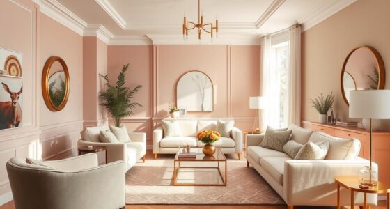

Imagine coming home tired after a long day. The moment you enter your bedroom, the colors around you matter a lot. Have you thought about how the right colors can make everything peaceful? By picking the best colors for sleep, you create a calm haven. You’ll find yourself drifting into sleep easily. Color psychology shows us that soft and muted tones help us relax. On the other hand, bright and bold colors might make us feel awake or anxious. In this article, we will look at how certain colors can make you feel relaxed. This way, you can wake up feeling refreshed and ready for a new day.
Key Takeaways
- Soft and pastel shades create a calming atmosphere, promoting better rest.
- Muted shades of blue, such as “Keepsakes” and “Mountain Stream,” are ideal for sleep comfort.
- Green hues like “Whispering Pine” and “Light Sage” connect you to nature, enhancing relaxation.
- Neutral colors, like beige, provide warmth and versatility in bedroom design.
- Colors to avoid include strong reds and dark tones, which can aggravate anxiety.
Understanding How Color Affects Sleep
Color psychology is important in how our surroundings make us feel and sleep. Some colors calm us, helping us sleep better. Meanwhile, other colors can make us feel excited or stressed, hurting our sleep. Studies show that room colors can change how we feel emotionally. So, it’s key to know how colors affect sleeping.
Blue bedrooms, for example, help us relax. People with blue bedrooms often sleep longer than those without. Blue makes us feel relaxed, safe, and secure, which is good for our hearts and blood pressure. But, warm colors like red and yellow can stir up emotions, messing with our sleep. Red is especially tricky because it’s linked to fear and anger. It can raise our blood pressure and heart rate.
Knowing how colors make us feel helps us pick the right ones for our bedrooms. Dark colors, such as deep blue or black, might make us feel sad or scared. This is not good for sleep. On the other hand, neutral colors like white and beige are calming. They stimulate our brains less than bright colors. With this info, we can choose bedroom colors that improve our sleep.
The Psychology of Color and Sleep
Color psychology can make a big difference in how well you sleep. Colors affect how we feel, either helping us rest or keeping us awake. It’s known that blue and green help us relax by lowering our heart rate and blood pressure.
Using soft whites, creams, or lavenders in a bedroom can make it feel safe and comfortable. This is key for good sleep. Adding colors like sage green or terracotta can help calm your mind.

Bright colors like red and orange, however, might make it hard to sleep. Calm colors have been shown to lower anxiety, making a room better for sleep. Interestingly, most people like their bedrooms to feel relaxing rather than energizing.
Light blue is a favorite for its soothing effects and improving sleep. Light greens, like mint or sage, also add to a calm environment. Light greys make a room feel open and relaxed. Dark greys add a touch of class.
Soft yellow can make a room feel warm and inviting. If you like bright colors, using red in small amounts can work. It’s good to mix bright colors with neutral ones to keep the room comfortable.
Think about trying an accent wall to add a splash of color without it being too much. Testing paint in different lights can help you choose the best color for sleep. The right colors can improve your sleep and overall health.
What Are the Best Bedroom Colors for Sleep
The colors you pick for your bedroom really matter. They help make the room a place where you can rest well. Experts say cool and quiet colors make the best choices for sleep. For example, gentle blue hues come highly recommended. That’s because blue makes the room peaceful. It cools down our brain’s buzz, unlike lively colors such as red.
Next to blue, green is another top pick. Think mint green or sage. They remind us of nature and bring peace. These colors are proven to help us sleep better. Neutrals like white and beige are also great. White keeps things simple and positive. Beige offers a warm, no-fuss space, perfect for relaxing at night.
The following table summarizes the best sleep colors based on preferences and their psychological effects:
| Color | Preference Ranking | Psychological Effect |
|---|---|---|
| Blue | 1 | Calmness and relaxation |
| Green | 2 | Nature-inspired tranquility |
| White | 3 | Brightness and positivity |
| Beige | 4 | Warmth and distraction-free |
| Lavender | 5 | Relaxation with liveliness |

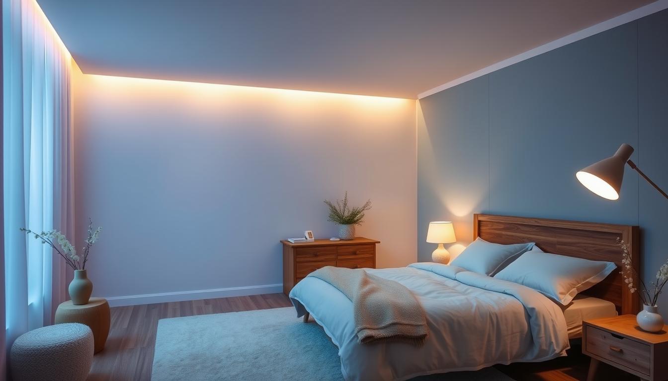
Calming Effects of Blue in the Bedroom
Blue in your bedroom helps you sleep better. It reminds us of the sky and ocean, making us feel calm and safe. This feeling is key for good sleep. Adding blue to your room helps you relax at the end of the day.
Associations with Nature and Serenity
Blue does more than just look nice; it’s good for your mind and mood. It slows you down and helps you feel calm. Light blue shades are especially soothing. They lower stress and help you sleep better. A blue bedroom with cozy sheets makes it easier to unwind and avoid bright colors that keep you awake.
Research on Blue and Sleep Quality
Studies show people in blue rooms sleep nearly 8 hours a night. Blue helps lower your heart rate and blood pressure. These benefits help you sleep better. Research confirms blue’s positive impact on sleep quality. It’s crucial to choose the right colors for your bedroom to sleep well.

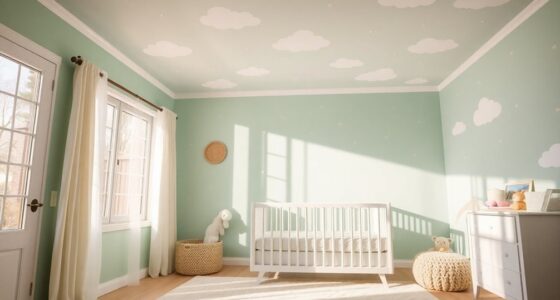
The Soothing Nature of Green
Green reminds us of nature, bringing a fresh and calm feeling. It makes rooms, especially bedrooms, feel comfortable and relaxing. The lushness and openness of green spaces help create a peaceful place perfect for sleeping.
Links to Nature and Relaxation
Green has a calming effect, reducing stress by connecting us with nature. The soft greens in bedrooms make the space calming. Having these colors around can make you feel better and sleep well.
Preferred Shades of Green for Bedrooms
For bedrooms, light greens like mint and sage are great. They make the room relaxing, which is good for both day and night. These colors also make us feel happy, helping us relax and fall asleep easier.

Neutral Choices: White and Beige
Neutral colors like white and beige are key for a perfect sleep spot. They create a calm setting that helps us relax and rest.
Many pick white for their sleep space. It’s loved for making rooms bright and welcoming. Only 25% of people in white rooms struggle to sleep, showing it’s good for rest. White also keeps the room free of distractions, aiding in better sleep.

Beige, on the other hand, has warm vibes. Yet, about one-third of folks in beige rooms find sleep tough. This shows beige is comfy, but not for everyone. Picking just the right beige shade can make the room more relaxing.
- Neutral colors create an inviting atmosphere.
- White reflects light, making spaces feel open.
- Beige brings warmth without overwhelming the senses.
Choosing calm shades like these neutrals is crucial for good sleep. Soft pastels and gentle tones also work well, unlike bright colors. Include touches of white and beige for a serene sleep space.
Avoiding Stimulating Colors: The Case of Red
When making a peaceful bedroom, it’s key to avoid colors that excite. Red is especially tricky. It can bring out feelings of love and energy, but it’s linked to color associations that don’t fit a restful space.
Emotional Responses to Red in the Bedroom
Studies show red might trigger our fight-or-flight response. This makes us more alert, which isn’t good for sleep. The negative effects of red include faster heartbeats and stress. This happens because of what red means to us—like danger or anger.
Here’s a brief on red’s impact in bedrooms:
| Color | Emotional Response | Sleeping Impact |
|---|---|---|
| Red | Fear, Agitation | Increased Alertness, Disrupted Sleep |
| Blue | Calmness, Serenity | Promotes Restful Sleep |
| Green | Relaxation | Encourages Stability |
| Neutral Tones | Cleanliness, Versatility | Supports Restful Environment |

Picking colors that bring calm, not stress, is vital for good sleep. Avoiding red and similar stimulating colors helps create a cozy, restful room for better sleep.
Other Colors to Consider: Silver and Light Orange
When you’re redoing your bedroom, the colors you pick are key. They help set the mood for a good night’s sleep. Silver is a great choice because it brings calm and sophistication. When you add light orange, you make the room welcoming. This mix boosts positivity and warmth.
Positive Attributes of Neutral Tones
Shades like beige and soft tan mix well with silver. They create a calm space. These colors don’t overstimulate, helping your mind relax. Adding light orange brings joy to the room. It keeps things bright without being too much.
Getting the color balance right is crucial. While light orange can be calming, bright orange might be too energizing for good sleep. Silver decor helps keep the vibes chill. It makes sure your bedroom is a peaceful place.

Using silver and light orange can turn your bedroom into a cozy retreat. This combo not only adds to your comfort. It also shows off your style. It creates a living space that’s perfect for resting well.
| Color | Average Sleep Duration | Attributes |
|---|---|---|
| Silver | 7 hours, 28 minutes | Calm, sophisticated, versatile |
| Light Orange | 7 hours, 28 minutes | Cheerful, uplifting, warm |
| Beige | 7 hours, 36 minutes | Non-stimulating, relaxing |
| Tan | 7 hours, 36 minutes | Earthy, nature-inspired |
Understanding the Impact of Color Brightness
The brightness of colors affects how we see our surroundings, mainly in a bedroom. Light shades help create a calm feeling, important for sleep. They make your bedroom better and ensure you sleep well.
Choosing Tones that Promote Calmness
For better sleep, choose colors that make you feel peaceful. Soft pastels and muted tones make your room feel calm. This helps with stress and relaxation. Here are some top choices:
- Light Blue: Known for its calming effect, blue is often linked to peace and quiet.
- Pale Green: This color brings nature to mind and helps with relaxation, perfect for a calming bedroom.
- Soft Lilac: This color is peaceful yet can spark creativity without being too intense.
- Muted Yellow: A softer version of this happy color can lift spirits without being too bold.
Bright colors like red, yellow, and orange can make a room too lively for sleep. They can keep you too alert, making it hard to relax before bed. So, it’s best to choose calming colors for your bedroom.

Colors to Avoid: Dark Colors and Their Associations
Picking the right colors for your bedroom is key to a peaceful setting. Dark colors can bring negative associations affecting your mood and sleep. Knowing how dark color effects work is crucial, especially with unsuitable shades for sleep.
Psycho-emotional Effects of Dark Grey and Brown
Dark grey and brown can make a room feel sad. They can lead to feelings of sadness and worry. So, it’s best to avoid these colors in a bedroom.
Dark brown can also make you feel gloomy. It can make a room seem smaller and more isolated. Grey can cause a sense of despair too.
Compared to brighter colors, dark shades disrupt a calm sleep atmosphere. Your choice of color greatly impacts your relaxation and sleep readiness.

| Color | Negative Associations | Effects on Sleep |
|---|---|---|
| Dark Grey | Gloomy, Sadness | Disrupts peace, increases anxiety |
| Brown | Isolation, Dreariness | Limits relaxation, invokes feelings of confinement |
| Black | Death, Sadness | Creates a heavy atmosphere, unsuitable for restful sleep |
| Dark Shades | Negative emotions, Alienation | Less effectiveness in promoting restful sleep |
Incorporating Soft Colors and Pastels
Turn your bedroom into a peaceful place with soft colors and pastels. These shades make the room welcoming, helping you sleep better and recharge. Think about how light colors can change the feel of your room.
Benefits for Relaxation and Sleep Quality
Pastel pink, soft blues, and muted greens bring comfort and calm. Pastel benefits include better relaxation and sleep. Blue rooms, for example, are linked to longer sleep and feeling refreshed when you wake up.
Color’s impact on our mood is powerful. Light gray can make your bedroom feel balanced and stable. Neutrals like beige and ivory add comfort. They blend well with soft colors, making an overall peaceful space.
Using calming bedroom colors can make even small rooms feel bigger and brighter. Light shades let more natural light in, adding to the room’s peace. Talking to an interior designer can help make sure the colors you pick work well together, creating a tranquil design.

The Role of Accent Colors in Bedroom Design
In creating a serene bedroom, understanding accent colors is key. They highlight and enhance your main colors, making your space more soothing. Adding them can change the whole vibe, creating the perfect color balance.
Soft pastels or muted hues, like pale pinks and blues, are good choices. These colors help you relax after a busy day. Together with neutral shades like cream or beige, they make your room welcoming.
Bedroom design tips advise calm dominant colors. But, brighter shades in small doses work too. For example, a bright orange throw pillow can add excitement without disturbing the calm. This approach works well with relaxing blues or greens.

Keeping color balance is vital with vibrant colors. Too much bright color, like red, can make the room too lively for good rest. It’s best to choose accents that match your main colors but still keep the room peaceful.
The right accent colors can boost your mood and help you relax better, improving sleep. Light curtains in soft yellow or warm lighting can make your space cozier at night.
Best Bedroom Colors for Sleep: A Summary of Findings
Choosing the right bedroom colors is key to good sleep. Soft and soothing colors are the best choice for sleep. Colors like lavender, pink, and baby blue are top picks because they are calming.
Neutral colors like creamy whites and warm beige are great too. They are easy to match with other bedroom items. But jewel tones such as emerald green and sapphire blue also work well. They make your room look rich while still being good for sleep.
However, dark colors like deep grays and browns might not be the best if used too much. They can work if your room gets a lot of sunlight. Bright colors like tangerine and turquoise are lively but can be too much for a bedroom.
Here’s a detailed look into the best and least effective colors for sleep:
| Color Category | Best for Sleep | Potential Drawbacks |
|---|---|---|
| Pastel Colors | Lavender, Baby Blue | May feel too soft in large spaces |
| Neutral Tones | Creamy White, Warm Beige | Can appear bland without accents |
| Earthy Shades | Forest Green, Teal | Risk of heaviness in small rooms |
| Bright Colors | Tangerine, Turquoise | May cause overstimulation |
| Darker Shades | Deep Brown, Dark Grey | Can diminish light and space feeling |
Choosing the right colors for your bedroom can make a big difference in your sleep. Go for calming shades like pale greens and soft blues. Using these colors wisely can make your bedroom peaceful and perfect for sleeping.

Conclusion
Knowing how bedroom colors affect sleep is key to creating a restful space. Almost 70% of Americans don’t get enough sleep each month. So, the color of our rooms can hugely impact our sleep quality.
Choosing calming colors like blue can help you sleep better, for up to 8 hours. Blue creates a peaceful environment, perfect for relaxing and recharging.
Adding shades of green can also make your bedroom more serene. Green is linked to reducing sleep problems and easing stress. The right colors make your room look great and help you sleep better by making it cozy and calm.
Think about how different colors make you feel when picking them for your bedroom. Pastels can soothe, white can purify, and gray adds elegance. Picking the right colors helps you sleep better and wake up refreshed.