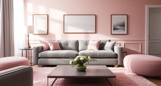

Imagine walking into a room that warmly welcomes you, its colors encircling you like a hug. Your living room isn’t just a place to hang out; it’s your home’s heart. This space speaks your style through the living room color combinations you choose. The right color palette can turn it into a serene haven or a vibrant hub, affecting every emotion and moment inside.
We’ll show you chic living room ideas to step up your interior design. You’ll see how playful colors and calm tones can change your room’s look and feel. Get ready to see how choosing the right colors can make your space mirror your personality.
Key Takeaways
- Your living room’s color scheme plays a vital role in creating the desired atmosphere.
- Neutral shades like White Dove and Stardust are favorites in modern interior design.
- Incorporating pops of color can invigorate and update your living space.
- The balance of bold and neutral tones is essential for creating visual appeal.
- Consider using the 60-30-10 rule to achieve a well-coordinated color scheme.
The Importance of Color Schemes in Your Living Room
A well-chosen color scheme is key to your living room’s look. The right colors can make the room welcoming or calming, depending on what you want. For example, earth tones work well with bold primary colors. This balance affects how you feel in the room.
The 60/30/10 rule helps create a good layout. It suggests using 60% light neutral shades, 30% medium tones, and 10% accents. This helps choose colors and keeps the room in harmony.
Color choices shape how your living room feels. Blue is calming, while red adds energy and is great for entertaining. Choosing the right color sets the room’s mood.
Trying different color schemes lets you express different emotions. A monochromatic scheme uses various shades of one color, changing the look with accessories. An analogous scheme uses neighboring colors for a calm feel.
Complementary colors add excitement and contrast. They make the room stand out. Dark colors can make a room feel smaller and cozier, while light colors make it seem larger.
The colors you pick affect how the room makes you feel. Nearly three-quarters of people think color influences mood. Picking the right palette is crucial for a living room that feels right. With color so important in design, understanding color schemes helps create a space that feels just as good as it looks.
EVOLVE Interior Paint & Primer, Eggshell (Natural Beige), 1 Gallon – One-Coat Coverage, Excellent Hide, Low VOC, Low Odor, Washable Paint for Walls, Doors & Trim
PAINT + PRIMER IN ONE: Evolve’s paint-and-primer formula helps you get great coverage from the start, sealing your…
As an affiliate, we earn on qualifying purchases.
As an affiliate, we earn on qualifying purchases.
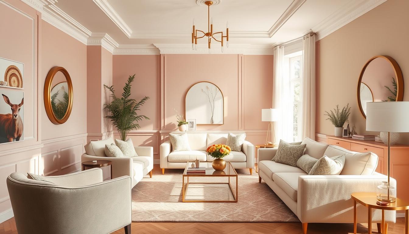
Creating a Cozy Atmosphere with Warm Colors
Warm colors like reds, oranges, and yellows are key for a cozy living room. They make you feel comfortable and welcomed. Choosing the right color combinations makes the room more inviting.
For a cozy feel, include furniture in warm tones. It makes a big difference. Add soft throws or cushions in these colors for extra comfort.
Think about painting your walls in warm shades too. This can make the space feel more together. Warm accents, like art or decor items, tie everything together for a cozy feel.


LANANAS Neutral Couch Throw Pillow Covers 18×18 Inch Set of 4 Decorative Farmhouse Boho Throw Pillows for Living Room, Couch, Bed, Sofa Soft Corduroy Accent Home Decor (Neutral Brown, 18×18 Inch)
COVERS ONLY.
As an affiliate, we earn on qualifying purchases.
As an affiliate, we earn on qualifying purchases.
Tranquil Color Combos for a Relaxing Space
Choosing the right colors for a peaceful living room is key. Soft greens, blues, and gentle neutrals make the room welcoming. These colors are pleasing and help relax the mind through color therapy.
Sage green and pale gray are great for their calming effects. Deep teal is perfect in a study or reading spot. Pale pink works well as a soft background, making brighter decor pop while keeping the mood serene.
For an even cozier feel, pick textured paints. They add warmth, avoiding the cold look of plain white walls. Adding soft furnishings and calm decor turns your room into a peaceful haven.


Der Rose 4 Pack Small Fake Plants Artificial Plants Indoor Office Desk Accessories for Aesthetic Room Decor Blue Bathroom Decor
Package Contains: This package includes 4 Packs faux plants indoor. Each fake plants decor stands at a height…
As an affiliate, we earn on qualifying purchases.
As an affiliate, we earn on qualifying purchases.
Bold and Vibrant Color Combinations
Adding bold colors to your living room makes it bright and inviting. Mixing vibrant colors immediately catches the eye. Using complementary colors can make stunning visuals.
For example, contrasting shades like orange and blue or red and green energize the room. They create energetic focal points.
Using Complementary Colors for Maximum Impact
For a big effect, use complementary colors. These colors are opposite each other on the color wheel. They look brighter together.
Pairing grass-green furniture with bright orange touches is trendy. This mix creates a vibrant but balanced atmosphere.
Accentuating with Bright Accessories
Bright accessories, like pillows, rugs, and art, can enhance your bold colors. They add energy without being too much. Introducing colors like pink or yellow against neutral tones gives a fun, yet elegant feel.
These accents bring depth and personality. They make sure your design feels united.


CwlwGO- Ceramic Vase Set of 3, Small Flower Vases for Home Decoration, Modern Farmhouse Decor, Living Room Kitchen Table Centerpieces, Shelf, Mantel, Fireplace and Entrance Decorations-Multicolor.
【Multi-functional Vases 】These ceramic vase set have different color combinations, suitable for farmhouse, country, cottage, and even modern…
As an affiliate, we earn on qualifying purchases.
As an affiliate, we earn on qualifying purchases.
Neutral Shades and Their Versatility
Neutral colors are key in designing a living room. They offer a solid base for any style. Using shades like beige, gray, and white, you can link your space together beautifully. These colors create a calm setting and let you add patterns for more fun.
Building a Foundation with Neutral Tones
Choosing neutral tones like Antique White (ID 23) or Off White (ID 73) sets a peaceful stage for your room. Favorites such as Even Better Beige (DC-010) and Dove (HDC-MD-21) make rooms feel cozy and inviting. They’re great because you can easily mix them with other colors to change your room’s look.
Combining Patterns for Visual Interest
Adding patterns to neutral backgrounds makes your room exciting without being too much. You could mix creamy mushroom (PPU5-13) pillows with patterned rugs or artwork. This keeps things interesting but lets the calm colors remain the stars.

| Color Name | ID | Description |
|---|---|---|
| Antique White | 23 | Unique shade ideal for warmth |
| Dove | HDC-MD-21 | Creates a peaceful mood |
| Even Better Beige | DC-010 | Warm and versatile |
| Off White | 73 | Excellent for pairing with grays |
| Creamy Mushroom | PPU5-13 | Calming, earthy tone |
| Smokestack | N220-3 | Warm taupe-gray for versatility |
| Spanish Sand | OR-W07 | Rich beige with warm undertones |
Chic Black and White Living Room Ideas
Black and white decor gives a modern living room a fancy touch. It’s a timeless combo that lets you show off your style. By using contrasting colors, you create eye-catching designs that make your space look stylish.
Try adding strong black decorations against white walls for a cool look. Or do it the other way for impact. Adding gold or metallic touches can make it feel more luxurious. Some top picks include:
- Choosing sleek, clean-lined furniture that reflects a minimalist aesthetic.
- Incorporating a contemporary chandelier to enhance the space in the evening.
- Utilizing large windows to maximize natural light during the daytime, creating a bright atmosphere.
- Adding organic accents, such as wooden pieces and indoor plants, to balance the starkness of the black and white decor.
This modern living room is designed with socializing in mind. It’s organized around a coffee table. Every seat in the room gives a good view of what’s happening, making it great for guests.
Here’s a list of decor items for a chic black and white living room:
| Decor Element | Description | Impact on Aesthetic |
|---|---|---|
| Black Accent Chairs | Sleek chairs with clean lines | Add modernity and depth |
| White Sofa | Timeless design with plush seating | Enhances comfort and elegance |
| Metallic Accents | Gold or silver finishes on decor | Increases luxury appeal |
| Intriguing Artwork | Black and white or colorful pieces | Creates a focal point in the room |
| Organic Textures | Wooden furniture and green plants | Adds warmth and balance |

Using different shades of white, off-white, charcoal, and gray makes the room feel calm. With minimalist decor and clean lines, your home will show off elegance. This look is not only beautiful but also trendy in high-end home design.
How Earthy Tones Transform Your Living Room
Earthy colors make your living room feel calm and lively. Using shades like soft browns and bright greens invites a cozy vibe. It makes your space feel like it’s in tune with nature. This not only warms up the room but also connects you to the outdoors, making your home feel even better.
Incorporating Green Hues for a Natural Feel
Shades of light green, like sage and mint, give a fresh, stylish look. They also keep things feeling down-to-earth. You can add these colors to walls or decor to light up your room. Mixing different green shades adds depth. A splash of terracotta or burnt orange brings energy and balances the earthy tones.
The Role of Textures in Earthy Color Schemes
Texture in design makes earthy colors pop. Using natural stuff like wood and stone makes your space look richer and more interesting. Dark wood adds drama, while light wood offers gentle contrast. Big plants like Monstera stand out and connect you to nature. Adding textured rugs or botanical print wallpaper ties the earthy theme together.

| Element | Color/Shade | Purpose |
|---|---|---|
| Wall Colors | Muted Browns (beige, camel, latte) | Create a luxe feel |
| Accent Colors | Light Greens (sage, mint) | Modern yet grounded atmosphere |
| Textures | Natural Woods (rattan, bamboo) | Add detail and interest |
| Plants | Monstera, Areca palms | Enhance natural vibe |
| Wallpaper | Botanical prints | Introduce natural motifs |
Color Combination for Living Room: A Strategic Approach
Creating a beautiful living room color scheme needs careful thought and strategy. By applying a clear color strategy, you can bring balance and harmony to your area. The 60-30-10 rule is a helpful guide for visual appeal. It’s also vital to see how light interacts with your colors, keeping your living room welcoming all day.
The 60-30-10 Rule Explained
The 60-30-10 rule is an easy but effective way to design your living room. According to this rule:
- 60% of the room should have a primary color.
- 30% should use a secondary color.
- 10% should add an accent color.
Pick a main color that shows your personality to start. Then, add a secondary color for depth and an accent color for flair. For 2025, trendy combos include Dark Auburn and Cracked Pepper, with ivory accents for a chic look.
Testing Colors Based on Lighting
Colors can look different depending on the lighting. It’s crucial to check your colors in natural light. You should test them under at least two lighting conditions. Use a 1-foot square paint sample and apply two coats to get true colors. This way, your colors will stay true and attractive all day.
Try out different ideas like “color in the foreground” or “color in the background.” The first option suits lighter rooms and makes updating easy, like painting furniture. Think about how colors feel, like calming blues or lively reds, in your spaces.

| Color Strategy | Characteristics | Best Used In |
|---|---|---|
| Color in the Foreground | Neutral background with vibrant color highlights | Rooms that change often, simple updates |
| Color in the Background | Bold wall colors, big areas | Rooms for deep experiences, bold looks |
Using these tips and knowing how lighting changes colors can really improve your living room. It becomes a place that shows off your taste, making it cozy and inviting.
Pastel Colors for a Soft, Inviting Look
Adding pastel colors to your living space makes it welcoming and relaxing. Colors like soft pink, baby blue, mint green, and sunny yellow are getting more popular. They are moving away from bold colors to softer ones.

These light shades create a calm atmosphere and a flexible design base. You can mix pastels with darker colors like navy or plum for a cozy yet elegant look. This keeps your room from looking too sugary while staying comfy.
- Pastel colors bring calmness and happiness, making you feel good.
- They add color gently, great for those who like simple decor.
- Pastels mix well with different design features, making textures stand out and light reflect beautifully.
Pastels have been loved since the Georgian and Rococo times and were big in the ’50s and ’60s in the U.S. People liked them for their hopeful vibe and calming effect.
Even as trends change, pastels are a constant favorite for spring and summer room looks. They help your living room stay stylish yet emotionally soothing, ideal for both parties and peaceful times.
Mixing Jewel Tones for a Luxurious Feel
Jewel tones can make your living space feel sophisticated yet welcoming. Colors like emerald green, sapphire blue, and ruby red bring a vibrant touch. They create a luxurious look that stands out while keeping things comfortable for the eyes.
Key Jewel Shades to Consider
Choosing the right jewel tones can make your living room feel elegant. Consider these colors for a stylish change:
- Emerald Green: Signifies tranquility and abundance.
- Sapphire Blue: Evokes calmness and depth.
- Ruby Red: Infuses passion and warmth.
- Amethyst: Adds a touch of luxury with its regal vibe.
- Citrine: Brightens spaces with its cheerful, warm glow.
- Deep Turquoise: Brings a refreshing pop that coordinates well with neutrals.
Balancing Jewel Tones with Neutrals
Using jewel tones right means balancing them well. Pair these bold hues with neutral colors to create a soothing background. This lets the vibrant colors stand out without taking over. Here are some ideas to help you balance:
- Begin with a neutral base, like a grey sofa, then add colorful pillows or throws.
- Add metallic accents for a luxurious feel. Gold or silver work great.
- Use bold accessories to highlight certain areas.
- Start with small, colorful items if you’re new to using bold colors.

A well-balanced space feels luxurious yet comfortable. Thoughtfully adding jewel tones can make your living room look stylish and inviting. It’s all about mixing the colors right to create a sophisticated environment.
Innovative Two-Tone Living Room Designs
Using two-tone colors in your living room adds a unique touch. These designs mix colors to define areas while keeping a unified look. They can make your living space more special and inviting.
Try mixing warm and cool colors. Imagine a bright teal with a gentle beige making a beautiful contrast. This method turns an ordinary room into a welcoming and interesting space.

Two-tone designs can also highlight your home’s design. Paint one wall a dark shade to spotlight a fireplace or bookshelf. Use a lighter color next to it. This makes features stand out and beautifies your living area.
- Choose a primary color for larger areas.
- Select a secondary color for accent features.
- Consider using painter’s tape for clean lines between colors.
These two-tone ideas let you show off your style and creativity. Feel free to try different combos. Keep going until you find the perfect one for your room.
Accent Walls: A Simple Way to Add Drama
Accent walls are a great trick to spice up your space. They offer a neat way to bring exciting decor into your home. To make your room pop, just pick the perfect color. It becomes the star of the room, boosting the overall look. The right color match can turn a simple area into something special.
Choosing the Right Color for an Accent Wall
When picking colors for accent walls, look for ones that pop but also fit well with your room’s colors:
- Hunter Green: It’s calming and nature-like, great for living rooms and bedrooms.
- Navy Blue: Works in modern and traditional spaces, adding a cozy vibe.
- Red: Perfect for dining rooms, it gets people talking and eating.
- Brown: Makes any space feel warm and welcoming.
- Light Blue: Brings in natural light, making calm spaces in bedrooms and bathrooms.
- Purple: Deep plum adds a touch of luxury and comfort.
- Black: It brings drama and depth, especially in bright rooms.
Pairing Accent Walls with Complementary Decor
To get a coordinated look, match your accent wall with the right decor. Try these ideas:
- Add decorative molding or wooden accents around your accent wall for extra style.
- Bring in textures like wood paneling or stone finishes to add layers.
- Hang a gallery wall to showcase art or photos against the accent color, making it stand out.
- Place mirrors to reflect more light and make the room feel bigger.

| Color | Ideal Room Type | Effect on Atmosphere |
|---|---|---|
| Hunter Green | Living Room, Bedroom | Nature-inspired calmness |
| Navy Blue | Contemporary, Traditional | Cozy sophistication |
| Red | Dining Room | Stimulates appetite and conversation |
| Brown | Living Room | Warm and inviting |
| Light Blue | Bedroom, Bathroom | Calm and serene |
| Purple | Living Room | Luxury and coziness |
| Black | Any well-lit room | Depth and drama |
Creating a Coastal Vibe with Ocean-Inspired Colors
Using coastal colors can make your living room a calm place inspired by the sea. Light blues to deep navy bring peace. Sandy colors and whites make it look fresh. Mixing these with nature makes your living room welcoming.
Adding textures from the coast makes it better. Think about comfy sofas with covers, wicker chairs, and tables that look like driftwood. These pieces are perfect for a cozy space:
| Furniture Type | Style | Purpose |
|---|---|---|
| Slipcovered Sofas | Light-Colored | Comfort and Practicality |
| Wicker Chairs | Casual | Relaxing Atmosphere |
| Driftwood Coffee Tables | Natural | Organic Aesthetic |
Lights that look nautical light up your room well, like ones with rope or cages. Lamps with sea glass make it cozy. Sheer curtains in light blue or white make it airy.
Add life with fresh flowers in colors that match the sea. White, blue, or coral are great. Plants like palms or succulents add green and clean the air.
Coastal design loves:
- Soft blues (40% preference) and crisp whites (30% popularity)
- Wood and shells (60% common)
- Colors like coral and seafoam green (50% use)

To make a true coastal feel, mix different sea-inspired things. This makes a space that’s calm, welcoming, and stylish.
Modern Farmhouse Color Combinations
The modern farmhouse style blends rustic and contemporary looks, making spaces feel cozy yet chic. Start with a neutral base of soft whites, warm beiges, and light grays. These colors make rooms look bigger and more welcoming.
Accent colors add depth to modern farmhouse designs. Use muted blues, earthy greens, and rustic reds for this effect. Sage green, for instance, is great for kitchen cabinets. It matches well with wood accents and white countertops.

To keep things interesting, add patterns like plaid and floral. Make sure they match your color scheme. This keeps your design unified while letting you mix and match.
Effective use of natural light is key. It brings out the best in your color choices. Large windows and mirrors can make spaces brighter and more open.
For decor, pick light fixtures that fit the farmhouse vibe. Rustic chandeliers and modern pendant lights create the right mood. Choose paint finishes like matte or satin for looks and durability.
In summary, modern farmhouse style is about choosing the right colors for comfort and style. Mix neutral and accent colors with unique patterns. Your space will have the cozy charm of farmhouse design.
Emphasizing Texture with Color Choices
Adding texture in design makes your living room more inviting. It brings in depth and warmth. Choosing the right mix of vibrant fabrics, woods, or metals can uplift your space. Knowing how these materials match your colors is key to a unified look.

Think about the 60-30-10 rule for colors. It means 60% of the room should have a dominant color. 30% should have a secondary color, and 10% should have an accent color. This approach balances the room well. It also lets you highlight different textures with your color choices.
Using a color wheel helps in matching colors. Colors close to each other create a calm look. Opposite colors add vibrancy to your room. For instance, combining navy blue with soft yellows makes for a cozy yet eye-catching space.
- Strategic use of white trim: Helps to bring out both warm and cool colors, adding contrast that showcases textures.
- Ceiling colors: Warm ceiling colors add coziness, perfect for spaces with lots of sunlight.
- Accent walls: Use bold colors to define spaces, but keep lighting in mind to keep things balanced.
In open-concept homes, using different colors can mark separate zones. This works without needing walls. Opting for muted shades in these areas keeps things interesting. It also makes your living space peaceful.
Conclusion
We’ve explored many chic living room styles. Choosing the right colors can really change your room’s feel. Colors like blue and white can calm you, while navy against white feels bold. These colors are great starting points for your home.
Adding these colors to your living room makes it reflect your personality. Using baby pink and emerald green can make small spaces cozy. Meanwhile, black and white create timeless elegance. Take time to see what colors work best for you.
By trying these color mixes, you can make a living room that’s beautiful and feels just right. Experiment with different colors and find your dream living room. It’s all about creating a space where you love to be.