
Using orange in your interior design feels warm and energizing, boosting optimism and encouraging social connection. It sparks enthusiasm and creates inviting spaces that invite conversation and positivity. Pairing orange with calming or complementary hues like blue or teal balances its vibrancy, making your space lively yet harmonious. Whether through feature walls, textiles, or accessories, strategic use of orange can transform your environment into an uplifting haven. Keep exploring to discover ways to harness this vibrant color even more effectively.
Key Takeaways
- Incorporate orange through feature walls or accessories to create a warm, inviting atmosphere that fosters optimism.
- Pair orange with calming shades like blue or teal to balance energy and promote social connection.
- Use muted or earthy orange tones to enhance coziness and encourage relaxed, positive interactions.
- Apply orange in communal spaces to stimulate conversation, enthusiasm, and a sense of well-being.
- Balance vibrant orange accents with neutral hues for a lively yet harmonious environment that boosts mood.

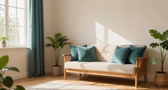
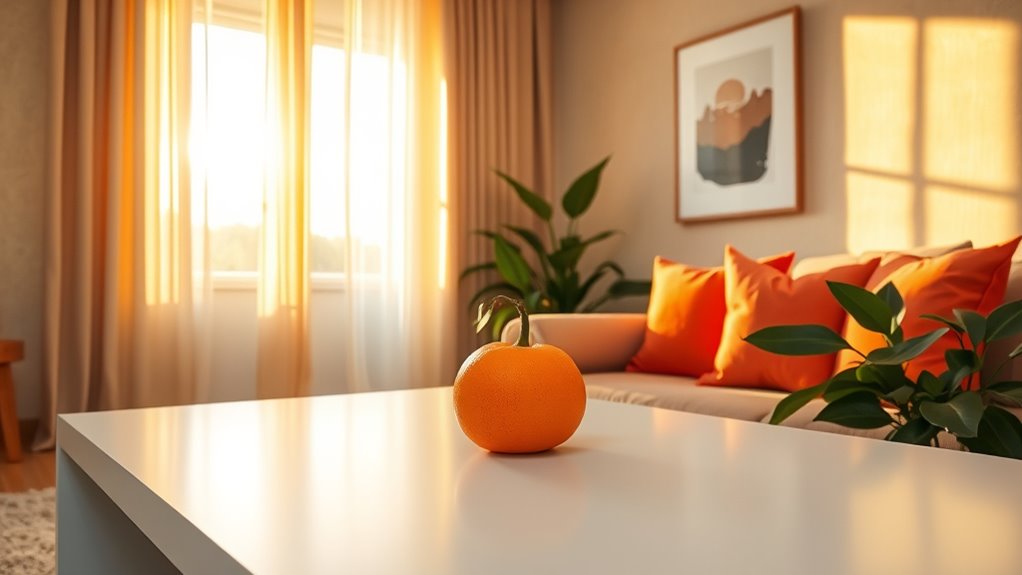
Orange is a bold, energetic color that can instantly transform your interior space. It radiates warmth, enthusiasm, and a welcoming vibe, making it a powerful choice for those looking to boost optimism and foster connection within their homes. When you incorporate orange into your decor, you’re not just adding a splash of color; you’re tapping into its deep roots in color psychology. Orange is associated with creativity, vitality, and social interaction. It encourages conversation and openness, making it ideal for living rooms, kitchens, or communal areas where people gather. Its lively nature can invigorate a space, inspiring positivity and a sense of well-being. Incorporating color psychology principles can help you select shades and combinations that support the mood you want to create. To effectively use orange, consider its relationship with other hues through complementary palettes. Complementary colors sit opposite each other on the color wheel, creating a vibrant contrast that energizes a room without overwhelming it. Pairing orange with shades like blue or teal balances its intensity, providing visual harmony while maintaining the lively spirit. For example, a burnt orange accent wall paired with navy or turquoise accents creates a sophisticated yet playful environment. Alternatively, softer, muted oranges combined with earthy tones like beige, brown, or olive green can evoke a cozy, inviting atmosphere, perfect for spaces meant for relaxation and connection.
You can bring orange into your interior through various elements—be it a feature wall, furniture, textiles, or accent accessories. Think about painting one wall in a rich, warm orange hue to serve as a focal point, or incorporate orange cushions, throws, or vases to add pops of color without overwhelming the space. When choosing your complementary palette, keep in mind the mood you want to cultivate. For energetic, lively settings, bold contrasts work well. If you prefer a calmer, more balanced look, opt for harmonious, muted shades that tone down the vibrancy but still retain the warmth and optimism orange offers.

Rodda Paint CASCADIA ZERO Interior Flat Paint & Primer in One, Quart, Orange you Happy?
PAINT & PRIMER-IN-ONE: Cascadia ZERO is an Ultra-Low VOC, Acrylic Blend Paint & Primer-in-One; save time with less…
As an affiliate, we earn on qualifying purchases.
As an affiliate, we earn on qualifying purchases.
Frequently Asked Questions
How Does Orange Affect Mood Beyond Optimism and Energy?
Orange can influence your mood beyond just boosting optimism and energy by triggering positive psychological effects like warmth and enthusiasm. Its vibrant hue also fosters feelings of comfort and social connection. Cultural associations play a role, as orange symbolizes creativity and vitality in many societies. When used thoughtfully, orange can create a lively, inviting atmosphere that enhances your overall sense of well-being and encourages interaction.
Can Orange Be Used Effectively in Small or Dark Rooms?
Yes, orange accents can work well in small or dark rooms by adding warmth and vibrancy. To optimize space, use orange in accessories like pillows, art, or small furniture pieces, which brighten up the area without overwhelming it. Incorporating mirrors and light-colored walls helps reflect light, making the space feel larger. This way, you create a lively, inviting atmosphere that boosts your mood and energizes the room.
What Are Best Complementary Colors to Pair With Orange?
Pairing orange is like mixing vibrant paints to create harmony; the best complementary colors include blue, teal, and navy, which balance its warmth. Using color pairing techniques, you can create striking contrast or subtle shifts. Consider soft blues for a calming vibe or deep navy for sophistication. These complementary schemes boost energy and connection in your space, making orange stand out beautifully while maintaining visual harmony.
How Can Orange Be Incorporated Into Minimalist Interior Designs?
You can incorporate orange into minimalist interiors by using subtle orange palettes as accents. Opt for minimalist accents like cushions, vases, or artwork in soft, muted orange shades to add warmth without overwhelming the space. Keep the overall design simple and clean, allowing the orange touches to create visual interest and a sense of optimism. This approach maintains the minimalist aesthetic while infusing energy and connection into your home.
Is Orange Suitable for Creating a Calming or Relaxing Environment?
Is orange a calming hue? While often energetic, you can achieve a soothing atmosphere by using its softening effects through gentle color moderation. Pairing muted orange tones with cool neutrals creates a balanced, relaxing space. Think of orange as a warm hug rather than a jarring shout—its inviting quality can foster tranquility when used thoughtfully, making your environment both lively and peaceful.
orange throw pillows for sofa
As an affiliate, we earn on qualifying purchases.
As an affiliate, we earn on qualifying purchases.
Conclusion
So, go ahead, splash some orange around. Who needs boring neutrals when you can boost your mood and impress your guests? Just remember, if your walls turn as fiery as your personality, don’t blame us when everyone’s staring a little too long. But really, isn’t a dash of orange the easiest way to turn any space from meh to marvelous? Embrace the bold — your walls (and your Instagram followers) will thank you!

CEMABT Orange Ceramic Vase Set of 2 for Modern Minimalist Bohemian Decor,Round Matte Donut Vases for Pampas Grass-Perfect for Living Room, Dining Table, Office Bedroom Shelf Decor Entryway, Console
Minimalist style: a clean, simple and elegant look that will blend in with anywhere, which will add more…
As an affiliate, we earn on qualifying purchases.
As an affiliate, we earn on qualifying purchases.
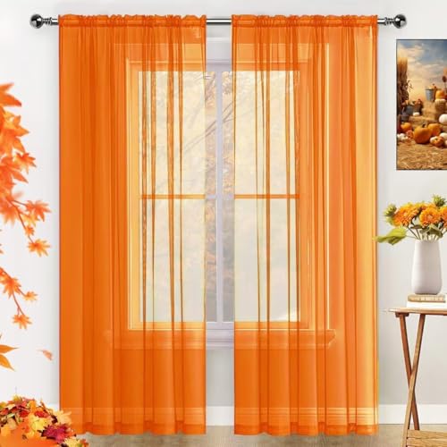
SpaceDresser Basic Rod Pocket Sheer Voile Window Curtain Panels Orange 2 Panels 52 Width 84 Inch Long for Kitchen Bedroom Children Living Room Yard(Orange,52 W x 84 L)
Package Included: SpaceDresser sheer curtains are made of High-Quality polyester fabric, soft to touch. Each pack includes 2…
As an affiliate, we earn on qualifying purchases.
As an affiliate, we earn on qualifying purchases.