
Using cool colors like blue, green, and purple in your interiors can seriously boost your sense of calm and well-being. These hues slow your mental activity, helping to reduce stress and anxiety while promoting focus and emotional stability. They evoke feelings of serenity, trust, and renewal, making your space more inviting and peaceful. Incorporating these colors intentionally can create environments that nurture mental clarity and relaxation—discover how to optimize your space for maximum calmness.
Key Takeaways
- Cool colors like blue, green, and purple induce relaxation, reduce stress, and foster emotional stability in interior spaces.
- These hues slow mental activity, promoting focus and mental clarity, ideal for calming environments.
- Blue symbolizes trust and stability, making it suitable for workspaces and bedrooms to enhance tranquility.
- Green, associated with nature and renewal, creates harmonious spaces that support relaxation and reflection.
- Purple blends calmness with creativity, fostering introspection and a soothing atmosphere for mental well-being.
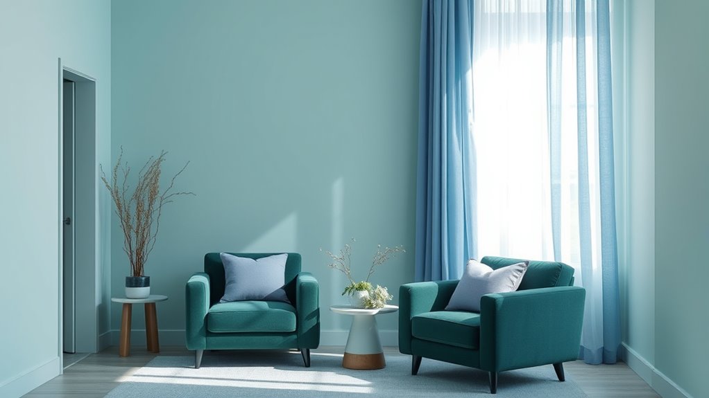
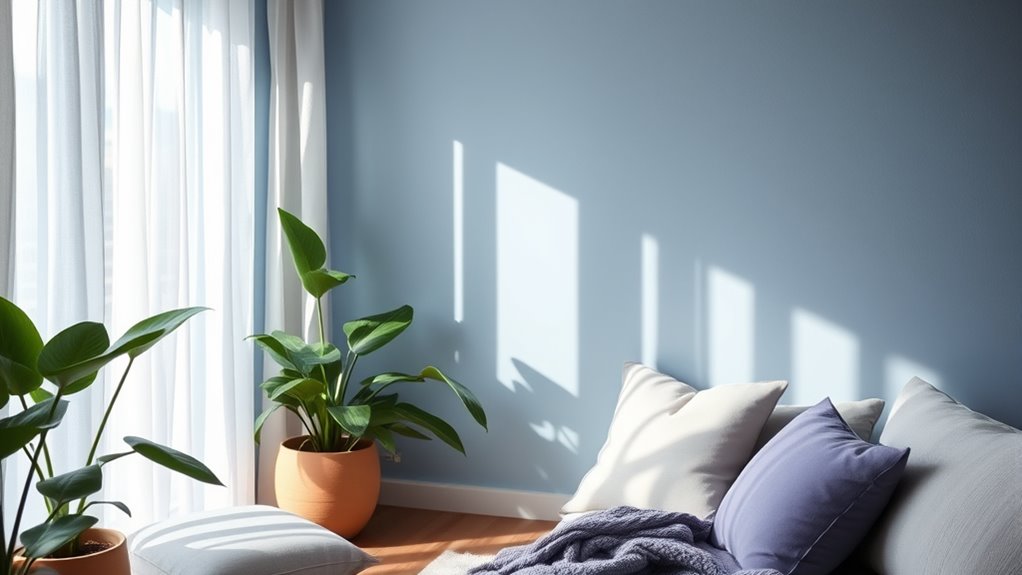
Cool colors like blue, green, and purple have a calming effect on your mind and body, making them popular choices in design and everyday life. When you choose these hues for your space, you’re tapping into their natural association with tranquility and relaxation. An important aspect to ponder is their color temperature; cool colors are classified as having a lower color temperature, which means they tend to evoke feelings of calmness and serenity. This coolness creates a soothing environment that can help reduce stress and promote a sense of peace. Your emotional response to these colors is often positive, as they tend to lower your heart rate and create a feeling of comfort.
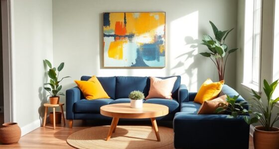
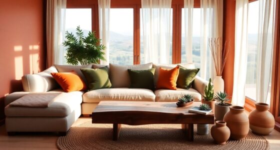
Blue, in particular, is linked to stability and trust, which is why it’s often used in workspaces and bedrooms. When you look at blue tones, your brain associates them with the sky and the ocean, reinforcing their peaceful qualities. Green, on the other hand, is connected to nature and growth. It fosters a sense of balance, renewal, and harmony, making it ideal for spaces meant for relaxation or reflection. Purple, especially softer shades like lavender or lilac, combines the calming qualities of blue with the creativity and spirituality associated with purple. It can inspire introspection and calmness simultaneously.
The emotional response you have to cool colors is deeply rooted in their psychological effects. These hues tend to slow down your mental activity, allowing you to step back from chaos or overstimulation. When you surround yourself with these colors, you might notice a decrease in anxiety and an increase in focus, making them suitable for areas meant for meditation, reading, or unwinding. The soothing nature of these colors can also make social spaces feel more inviting and less tense.
Understanding the relationship between color temperature and emotional response helps you make intentional choices about your environment. Cool colors are more than just visually appealing; they influence how you feel and behave. Whether you’re designing a calm interior or choosing a color palette for relaxation, opting for blue, green, or purple can enhance your well-being. Their natural association with serenity, combined with their calming psychological effects, makes them powerful tools in creating spaces that nurture your mental health and emotional stability. So, when you seek tranquility, embracing these cool hues can be a simple yet effective way to promote calmness in your daily life.

Der Rose 6 Pack Blue Succulents Plants Artificial in Pots Small Fake Plants for Blue Bathroom Bedroom Home Decor Aesthetic Home Decor
Refreshing Blue Decor: Featuring a soft blue color palette and assorted succulent shapes, this set adds a fresh…
As an affiliate, we earn on qualifying purchases.
As an affiliate, we earn on qualifying purchases.
Frequently Asked Questions
How Do Cool Colors Influence Productivity in a Workspace?
Cool colors like blues, greens, and purples positively influence your productivity by promoting calmness and focus. Their psychological effects help reduce stress and mental fatigue, making it easier to concentrate. Through visual perception, these colors create a soothing environment that minimizes distractions. As a result, you’ll find yourself more efficient and motivated in a workspace decorated with cool colors, enhancing your overall performance and well-being.
Can Cool Colors Help Reduce Anxiety in High-Stress Environments?
Like a gentle wave calming rough waters, cool colors can help reduce anxiety in high-stress environments. Through color psychology, you’ll find that blues, greens, and purples evoke an emotional response of tranquility and relaxation. Incorporating these hues creates a soothing atmosphere, helping you stay centered and composed. When stress peaks, cool colors act as a visual retreat, easing tension and fostering a sense of calm.
What Are the Best Accents to Complement Cool Color Schemes?
You should choose accents like complementary metallics—think gold or copper—to add warmth and elegance to your cool color scheme. Contrasting warm hues, such as soft oranges or warm pinks, also work well to create visual interest and balance. These accents bring energy and depth, preventing the space from feeling too cold or sterile. Incorporate them through accessories, artwork, or small furniture pieces to enhance your calming interior.
How Do Cool Colors Affect Sleep Quality in Bedrooms?
Cool colors like blues, greens, and purples can positively impact your sleep quality by promoting relaxation and reducing stress. Their low color temperature helps create a calm environment, making it easier for you to unwind. Incorporating these shades into your bedroom enhances your sleep hygiene, encouraging better rest. Be mindful, though, not to overuse them, as too much cool color can sometimes feel chilly or distant.
Are Cool Colors Suitable for Small or Crowded Spaces?
Ever wondered if cool colors work in small or crowded spaces? They typically do, as they create a sense of calm and help with color contrast, making rooms feel more open. Cool hues like blues and greens can enhance spatial perception, making a room seem larger than it is. So, yes, you can use these colors confidently to make even tiny or busy rooms feel more spacious and inviting.

3pcs Sage Green Abstract Canvas Wall Art Beige and green abstract floral butterfly Posters Prints Modern Abstract Zen Pictures Painting for Living Room Yoga Room Bedroom Decoration Unframed
Sage Green Abstract Canvas Wall Art: Each canvas measures 12×16 inches.No frame included.Soft sage green tones and abstract…
As an affiliate, we earn on qualifying purchases.
As an affiliate, we earn on qualifying purchases.
Conclusion
So, next time you’re choosing paint for your space, remember that cool colors like blues, greens, and purples can turn your home into a tranquil haven—think of it as your personal zen garden, but without the garden gnome. Whether you’re channeling a modern vibe or a vintage retreat, these hues help you relax and recharge. Embrace the calm, and let your walls do the heavy lifting—no need for a crystal ball to predict your peace.

Glidden Total Interior Wall Paint & Primer All-in-One, Eggplant/Purple, Flat, 1 Gallon
Extremely durable interior paint ideal for use on properly prepared interior walls, ceilings or trim composed of new…
As an affiliate, we earn on qualifying purchases.
As an affiliate, we earn on qualifying purchases.

OIYN Smart RGBICW LED Corner Floor Lamp – 16 Million DIY Colors, 68+ Scenes, Music Sync, App & Remote Control, Color-Changing Ambient Lighting for Living Rooms, Bedrooms, and Gaming Rooms
Dynamic RGBICW Color Technology:Unleash your creativity with our RGBICW LED floor lamp, offering customizable colors for each segment…
As an affiliate, we earn on qualifying purchases.
As an affiliate, we earn on qualifying purchases.