
Mood boards and color selection tools help you bring your design ideas to life by visualizing schemes clearly and cohesively. They allow you to experiment with textures, tones, and emotions, so you can see how colors and tactile elements work together. Using these tools guarantees your aesthetic feels balanced and intentional. Keep exploring to discover how they can streamline your decision-making and create a compelling visual story.
Key Takeaways
- Mood boards visually combine textures and colors to communicate overall aesthetic and mood effectively.
- They serve as strategic tools to explore and refine color schemes before finalizing design choices.
- Incorporating texture palettes enhances emotional impact and adds tactile interest to visual schemes.
- Mood boards help assess how colors and textures interact, ensuring cohesive and harmonious design narratives.
- They streamline decision-making by providing a clear visual reference for color and texture selection.
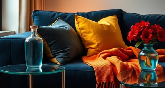
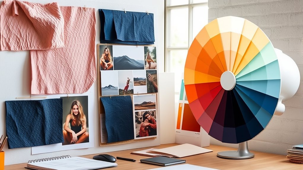
Creating a compelling mood board is an essential step in the design process because it helps you visualize your overall aesthetic and set the foundation for your color palette. When you start assembling your mood board, incorporate a variety of texture palettes to add depth and tactile interest. Textures—whether rough, smooth, matte, or glossy—help convey the feel of a space or product, making your vision more tangible. By selecting textures that complement your color choices, you create a harmonious balance that enhances the emotional impact of your design. For example, pairing soft, plush textiles with warm, earthy tones can evoke comfort, while sleek metals combined with cool blues might suggest modern sophistication.
Incorporate textures and colors thoughtfully to create harmony and evoke emotion in your design.
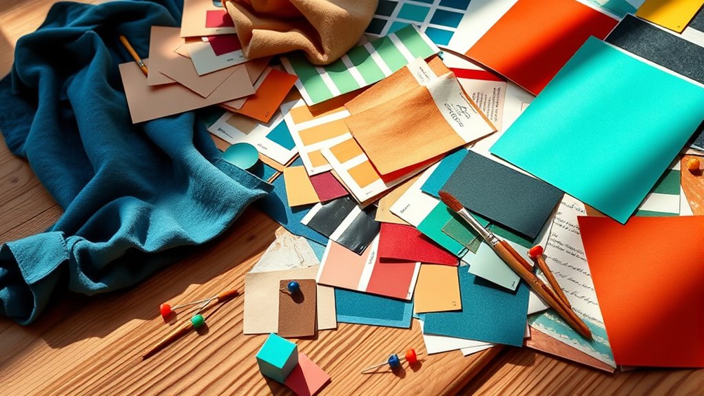
Understanding color psychology is *vital* when choosing your palette. Colors evoke specific emotions and associations, so your selections should align with the mood you want to create. Warm hues like reds and oranges can energize a space, encouraging excitement and warmth, while cooler shades like blues and greens promote calmness and serenity. By integrating color psychology into your mood board, you *guarantee* that your color palette not only looks appealing but also communicates the right message or feeling. This mental map guides your decisions, helping you avoid mismatched colors that might undermine your overall vision.
As you build your mood board, think about how textures and colors interact. A textured fabric in a bold, vibrant color can add visual interest and emotional depth, creating a compelling focal point. Conversely, a subtle texture in muted tones can serve as a calming background. You should also consider your target audience or personal preference—what feels authentic and resonates emotionally? By experimenting with different combinations of textures and colors, you gain a clearer understanding of the mood you want to evoke and the story you want to tell through your design.
In addition, understanding narcissistic traits and how they influence perceptions can help you create a mood board that appeals to your target audience’s emotional sensitivities, ensuring your design resonates deeply. In the end, your mood board isn’t just about selecting pretty images or swatches; it’s a strategic tool that helps you communicate your vision and refine your choices. When you thoughtfully incorporate texture palettes and leverage color psychology, your mood board becomes a powerful visual guide. It *guarantees* that every element, from tactile surfaces to the hues you select, works together cohesively. This clarity will streamline your decision-making process, making it easier to develop a consistent, impactful aesthetic for your project. Ultimately, a well-crafted mood board sets the tone and direction, turning your creative ideas into a cohesive, emotionally resonant design.
Vision Board Book Magazine for Women – 1000+ Diverse Pictures, Quotes, Self-discovery Exercises | Complete Collage Clip Art Supplies Kit for Adults | Ideal for Vision Mood Board Party & Manifestation
1000+ HAND-PICKED IMAGES & QUOTES — Step into the world of elegant vision board creation with over 1,000…
As an affiliate, we earn on qualifying purchases.
As an affiliate, we earn on qualifying purchases.
Frequently Asked Questions
How Do I Choose the Right Mood Board for My Project?
You pick the right mood board for your project by ensuring it reflects your style consistency and draws material inspiration. Focus on selecting images, textures, and colors that align with your overall vision. Consider the mood you want to evoke and gather diverse yet cohesive visuals. This helps you visualize your scheme clearly, maintain style consistency, and stay inspired by relevant materials, making your project more focused and authentic.
What Are the Best Digital Tools for Creating Mood Boards?
You should try digital tools like Canva, Milanote, or Adobe Spark to create mood boards. These platforms let you easily assemble digital collages and gather visual inspiration from various sources. They offer user-friendly interfaces, customizable templates, and collaborative features, making it simple to visualize your schemes effectively. With these tools, you can quickly experiment with colors, textures, and images to find the perfect mood for your project.
How Can I Ensure Color Harmony in My Scheme?
To guarantee color harmony in your scheme, focus on balancing complementary colors, which create vibrant contrasts without clashing. Use color contrast intentionally to highlight key elements and add visual interest. Stick to a cohesive palette by limiting your color choices, and test different combinations in your mood board. This approach helps you achieve a harmonious look that’s both dynamic and pleasing to the eye.
What Are Common Mistakes to Avoid in Color Selection?
You should avoid common mistakes like falling into color clashing, which can create visual chaos, and overusing neutrals, making your scheme dull. Be careful not to choose overly vibrant colors that clash or stick to too many similar shades, causing confusion. Instead, balance bold and subtle tones, and introduce complementary or analogous colors to create harmony. Keep your selections intentional to guarantee a cohesive, visually appealing scheme.
How Do Mood Boards Influence Client Decision-Making?
Mood boards boost client engagement by providing a clear, visual story of your design ideas, making it easier for clients to understand and connect with your vision. They serve as a powerful tool for visual storytelling, allowing clients to see how colors, textures, and elements work together. This collaborative process helps clients feel more confident in their choices, ultimately guiding their decision-making and ensuring the final design aligns with their preferences.

Artist Painting Knives Set – 5 Pieces Painting Knives Stainless Steel Spatula Palette Knife Oil Painting Accessories Color Mixing Set for Oil, Canvas, Acrylic
➡【Premiunm Quality Material】: The Painting Knives is made of stainless steel, good elasticity, can resist all wear and…
As an affiliate, we earn on qualifying purchases.
As an affiliate, we earn on qualifying purchases.
Conclusion
So, after all this talk about mood boards and color choices, you might think you’re fully prepared to create the perfect scheme. Ironically, while these tools help visualize your vision, they can also tempt you into endless tweaking and second-guessing. Remember, no matter how refined your palette, some of the best designs come from trusting your instincts—and knowing that, ultimately, perfection is just a beautiful illusion. Happy designing!

Fcosie Natural Linen Blend Fabric Color Swatches Custom-Made Curains – 37 Colors Available – Color Samples, Linen Swatches
➤【RICH MATERIAL】These elegant curtains are made of 350GSM natural linen blended material with a soft touch feeling. Heavy…
As an affiliate, we earn on qualifying purchases.
As an affiliate, we earn on qualifying purchases.

Applying Color Theory to Digital Media and Visualization
As an affiliate, we earn on qualifying purchases.
As an affiliate, we earn on qualifying purchases.