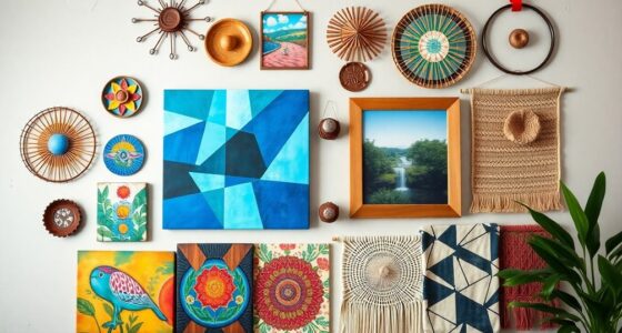
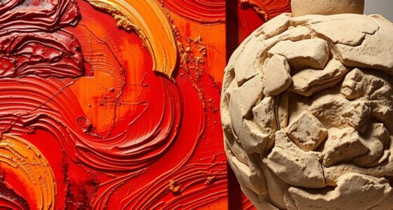
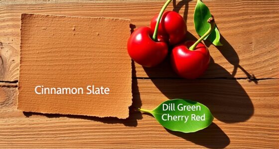
Plaster pink and butter yellow are soft hues that bring warmth and calm to contemporary art, allowing you to explore themes like vulnerability, hope, and emotional depth. These pastel tones challenge stereotypes and inspire personal and cultural narratives through subtle shades and textures. By using these colors, artists create intimate and vibrant visuals that evoke tenderness and optimism. To discover how these hues shape modern expressions further, you’ll uncover how their delicate balance enhances storytelling.
Key Takeaways
- Plaster pink and butter yellow evoke tenderness, hope, and emotional depth in contemporary artworks through soft, pastel shades.
- These hues symbolize warmth, vulnerability, and optimism, fostering intimacy and contemplation in viewers.
- Artists utilize layered textures and subtle gradations of pink and yellow to enhance tactile and emotional resonance.
- The color combination challenges stereotypes, celebrates diversity, and explores themes of identity and renewal.
- Soft hues serve as a storytelling tool, conveying complex emotional and conceptual narratives in contemporary art.

Contemporary art often explores bold color combinations, and pink and yellow are among the most striking. When you look at these hues together, you’re immediately drawn into a space that feels both vibrant and soft, playful yet sophisticated. Understanding how these colors work together involves delving into color theory, which helps artists intentionally create emotional responses and visual harmony. Pink, a shade rooted in red, symbolizes warmth, affection, and vulnerability, while yellow evokes energy, optimism, and clarity. When combined, these hues can produce a sense of harmony that feels both lively and calming, offering a unique canvas for artistic experimentation.
As you explore works that feature plaster pink and butter yellow, you notice how artists harness color theory to craft mood and meaning. Many contemporary artists draw inspiration from past movements, such as minimalism or abstract expressionism, but reinterpret these influences through a fresh lens of pastel shades. For instance, some artists focus on the subtle gradations of pink and yellow to evoke tenderness or hope, making their pieces accessible yet layered with complexity. Their inspiration often stems from personal experiences, cultural references, or even nature’s delicate palettes, like blooming flowers or dawn skies. These sources influence their choices, guiding how they balance these soft hues to communicate emotional depth.
You’ll find that the application of plaster pink and butter yellow isn’t merely about aesthetics; it’s a dialogue between the artist’s intent and the viewer’s perception. By employing these gentle colors, artists invite contemplation and intimacy, encouraging viewers to connect on a deeper level. They may layer the hues with textures or contrasts, emphasizing the tactile quality of the paint or the subtle shifts between shades. This technique amplifies the emotional resonance, making the color choices more than just visual preferences—they become a language that conveys vulnerability, joy, or hope. Furthermore, contemporary artists often explore color symbolism to deepen the narrative conveyed through their soft palettes.
In contemporary art, pink and yellow also serve as a bridge to explore themes of identity, femininity, and renewal. Artists inspired by social movements or personal journeys often use these colors to challenge stereotypes or celebrate diversity. Their inspiration might come from everyday life, fashion, or cultural symbols, but the result is a visual narrative that feels both fresh and meaningful. As you observe these works, you realize that the strategic use of soft hues demonstrates how color can be a powerful tool for storytelling, transforming simple palettes into profound statements. Ultimately, these gentle shades remind you of the delicate balance between strength and vulnerability, which is at the heart of much contemporary art.
Frequently Asked Questions
How Do Pink and Yellow Influence Viewer Emotions?
Pink and yellow evoke positive emotions, creating a cheerful and calming atmosphere. The emotional impact of pastel shades like these often includes feelings of warmth, happiness, and softness. Culturally, pink symbolizes love and compassion, while yellow signifies optimism and energy. As you view these colors, you might feel uplifted, comforted, or inspired, making them powerful tools for conveying gentle, joyful messages in contemporary art.
Are These Hues Traditional or Modern in Art History?
You’ll find that pink and yellow are more modern in art history, with their cultural significance evolving over time. Notably, pastel shades gained popularity during the Art Deco movement, highlighting their modern appeal. While these hues have roots in traditional symbolism—pink for love and yellow for optimism—their recent use reflects contemporary trends emphasizing soft, inviting aesthetics. You’re likely to see these colors as symbols of freshness and warmth today.
Which Artists Are Known for Using Plaster Pink and Butter Yellow?
You’ll find artists like Amy Sherald and Liz Johnson Artur using plaster pink and butter yellow to create striking works within pastel color palettes. These hues reflect contemporary color trends, emphasizing softness and warmth. By embracing these gentle shades, they evoke emotion and modernity, making their art stand out. Their use of plaster pink and butter yellow highlights how artists today incorporate subtle, pastel tones to influence contemporary art’s visual language.
How Do These Colors Affect the Perception of Space?
Color contrast creates mesmerizing contours, subtly shifting your perception of space. When you use plaster pink and butter yellow, soft hues soften sharp edges, making environments feel inviting and intimate. These gentle tones enhance spatial depth by reducing harshness, encouraging your eyes to explore more freely. As a result, you experience a more expansive, airy atmosphere, where the delicate contrast fosters a sense of openness and balance within the space.
Can These Colors Be Combined With Other Palettes Effectively?
You can definitely combine Plaster Pink and Butter Yellow with other palettes effectively by using smart color pairing strategies. Focus on balancing contrast and harmony; pair them with deeper, neutral tones to make the soft hues pop without overwhelming the space. Experiment with complementary or analogous colors to create visual interest. This approach guarantees your color combinations feel cohesive, lively, and well-balanced, enhancing your overall design or artwork.
Conclusion
As you explore the gentle clash of plaster pink and butter yellow, you realize how these soft hues challenge the boldness of contemporary art. They’re delicate whispers amid the loud, vibrant pieces, creating a quiet rebellion that invites reflection. Like a tender secret behind a vibrant mask, these colors remind you that strength often lies in subtlety. Embrace their quiet power—sometimes, the softest shades make the boldest statement.


