
Butter yellow is a sophisticated, neutral hue that brings warmth, calm, and understated elegance to your space. It pairs beautifully with natural materials like wood and stone, creating a cozy yet refined atmosphere. This color embodies quiet luxury, inspiring feelings of positivity and stability. Its versatility makes it suitable for various rooms and design styles, from modern to classic. Keep exploring, and you’ll discover more ways to incorporate this timeless, soothing shade into your interior design.
Key Takeaways
- Butter yellow offers a warm, creamy hue that adds subtle sophistication and a calming glow to interior spaces.
- Its versatile neutral tone complements natural materials and modern design elements for a refined aesthetic.
- The color symbolizes optimism, stability, and quiet confidence, enhancing a serene and luxurious ambiance.
- Matte and gloss finishes in butter yellow create elegant textures suitable for both contemporary and classic styles.
- Incorporating butter yellow fosters a tranquil, inviting environment that exudes understated luxury and refined taste.

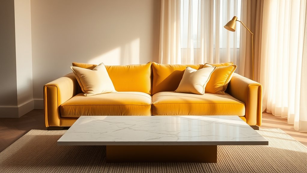
Have you ever noticed how Butter Yellow brings a warm, sunny glow to any space? This soft, creamy hue isn’t just a cheerful color; it carries a rich history of color symbolism that makes it a compelling choice for those seeking quiet luxury. In the sphere of interior design trends, Butter Yellow has gained popularity as a sophisticated neutral that balances brightness with subtlety. Its versatility allows it to serve as a backdrop that enhances other design elements without overpowering them, making it an ideal choice for creating a calm, inviting environment.
Butter Yellow adds warm, sunny sophistication, creating calm, inviting spaces with timeless elegance and quiet luxury.
When you incorporate Butter Yellow into your interior, you tap into its deep symbolism of optimism, energy, and warmth. Unlike bold, vibrant yellows that demand attention, this muted shade exudes understated elegance. It reflects a sense of comfort and stability, which is why many interior designers are now favoring it as part of a modern, neutral palette. Its gentle hue can evoke feelings of tranquility and positivity, making your space not just beautiful but also emotionally nourishing. As color symbolism evolves, Butter Yellow has become a symbol of quiet confidence, blending tradition and contemporary style effortlessly.
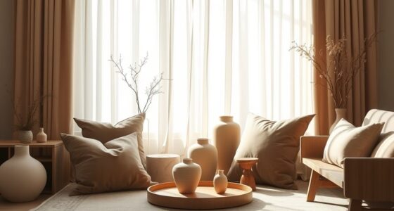
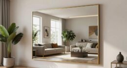
In terms of interior design trends, Butter Yellow aligns perfectly with the move toward more muted, earthy tones that promote serenity and understated luxury. It’s increasingly being used in minimalist spaces, where its subtle warmth adds depth without clutter. This color pairs beautifully with natural materials like wood, linen, and stone, emphasizing a connection to nature and fostering a sense of calm. Incorporating Butter Yellow can subtly brighten a room, providing a touch of sunshine amidst neutral shades like beige, gray, or taupe. Its adaptability makes it suitable for a variety of rooms—whether you’re aiming for a cozy living room, a tranquil bedroom, or a stylish kitchen.
You can also experiment with different textures and finishes to make Butter Yellow stand out. Matte paints create a soft, velvety feel, while gloss finishes add a touch of elegance. When combined with metallic accents or crisp white trim, this hue enhances a sophisticated, high-end look. Its timeless appeal ensures that it remains relevant across interior design trends, offering a neutral yet warm foundation that complements both contemporary and classic styles. Additionally, the popularity of neutral hues continues to grow, making Butter Yellow a versatile choice for current interior aesthetics.
Ultimately, Butter Yellow helps you craft a space that feels both luxurious and inviting—a subtle statement of refined taste. Its combination of color symbolism and current design trends makes it an excellent choice for anyone looking to introduce a quiet, sophisticated glow into their home.
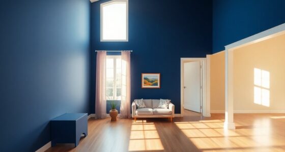
butter yellow matte wall paint
As an affiliate, we earn on qualifying purchases.
As an affiliate, we earn on qualifying purchases.
Frequently Asked Questions
How Does Butter Yellow Compare to Other Neutral Shades?
You’ll find that butter yellow stands out among neutral shades thanks to its unique shade versatility and warm undertone variations. Unlike cooler neutrals, it adds a soft, sophisticated glow to any space or outfit. Its gentle warmth complements various color palettes, making it a versatile choice for quiet luxury. Whether used as an accent or main color, butter yellow’s nuanced undertones create a cozy yet refined atmosphere.
What Are the Best Color Combinations With Butter Yellow?
Ever wonder how to make butter yellow pop? You should pair it with complementary accent colors like navy, charcoal, or rich browns for a striking contrast. Seasonal color pairings also work well—think deep greens or burnt oranges in fall, soft blues or pastel pinks in spring. These combinations highlight butter yellow’s warmth and sophistication, creating a balanced, elegant look perfect for any space or outfit.
Is Butter Yellow Suitable for High-Traffic Areas?
Yes, butter yellow works well in high-traffic areas because of its durability and warm tone. To keep it looking fresh, choose high-quality, washable paint to guarantee good paint durability. Regular maintenance tips like gentle cleaning with a soft cloth can prevent dirt buildup. Its inviting hue creates a cozy atmosphere, making it a smart choice for busy spaces where you want a touch of sophistication without worrying about wear and tear.
How Does Lighting Affect Butter Yellow’s Appearance?
Lighting effects transform butter yellow like a chameleon, shifting its tone from warm and cozy in soft light to brighter and more vibrant in natural or harsh light. You’ll find that the right lighting enhances its subtle sophistication, setting a mood that’s both inviting and elegant. To maximize its quiet luxury, choose lighting that complements its hue, creating a harmonious atmosphere that elevates your space’s overall mood enhancement.
Can Butter Yellow Be Used in Both Modern and Traditional Decor?
Yes, you can definitely use butter yellow in both modern and traditional decor. It adds vintage charm to classic spaces and offers a contemporary appeal in sleek, minimalist settings. This versatile hue effortlessly bridges styles, bringing warmth and sophistication. Whether paired with ornate details or clean lines, butter yellow creates a welcoming atmosphere that enhances your decor’s overall aesthetic, making your space feel both timeless and fresh.
butter yellow gloss finish interior paint
As an affiliate, we earn on qualifying purchases.
As an affiliate, we earn on qualifying purchases.
Conclusion
Embrace butter yellow as your quiet luxury—like a gentle sunrise that soothes your soul without shouting. Its sophisticated hue whispers elegance, turning your space into a warm, welcoming haven. Let this soft, neutral shade wrap around you like a silk scarf, elevating your surroundings with subtle grace. In its calm glow, you’ll find a timeless charm that nurtures serenity and style, making every moment feel like a peaceful morning bathed in tender light.

MAISONARIA Living Room Table Sets of 4, Sliding Doors End Table & TV Stand, Wood Coffee Table with Storage, Fluted TV Stand for Bedroom, Living Room (Natural)
Innovative Modern Design: Boasts a striking vertical ribbed texture that exudes contemporary elegance, combining minimalist aesthetics with a…
As an affiliate, we earn on qualifying purchases.
As an affiliate, we earn on qualifying purchases.
stone accent decor
As an affiliate, we earn on qualifying purchases.
As an affiliate, we earn on qualifying purchases.