
Adjusting color saturation and lightness affects how you perceive space and size in a visual. Higher saturation makes colors more vivid, pulling elements forward and making areas feel closer or more energetic. Lower saturation and increased lightness create a sense of openness, making spaces seem larger and more expansive. Darker tones tend to make areas feel smaller and more enclosed. If you want to master how these elements shape perception, there’s more to explore below.
Key Takeaways
- Higher saturation creates vivid, attention-grabbing colors that make objects appear closer and more prominent.
- Lighter lightness levels make spaces seem larger and more open due to increased perceived brightness.
- Desaturated, muted tones tend to recede, enhancing the sense of depth and spaciousness in a composition.
- Darker shades and low lightness can make areas feel smaller, more enclosed, and less expansive.
- Combining low saturation with high lightness maximizes the perception of size and openness in visual scenes.
Understanding color saturation and lightness is essential for creating visually appealing images and designs. These elements profoundly influence how viewers perceive space, depth, and mood within a composition. When you manipulate color saturation—how vivid or muted colors appear—you can create striking contrasts or subtle shifts that guide the eye and define spatial relationships. Lightness, or the brightness of a color, also plays a critical role, affecting how expansive or confined a space feels. By combining these two aspects thoughtfully, you can craft visuals that feel either open and airy or cozy and intimate.
Manipulating color saturation and lightness shapes perception, mood, and spatial depth in your designs.
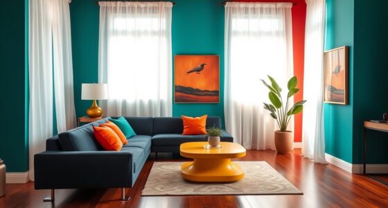
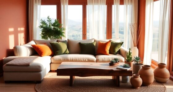
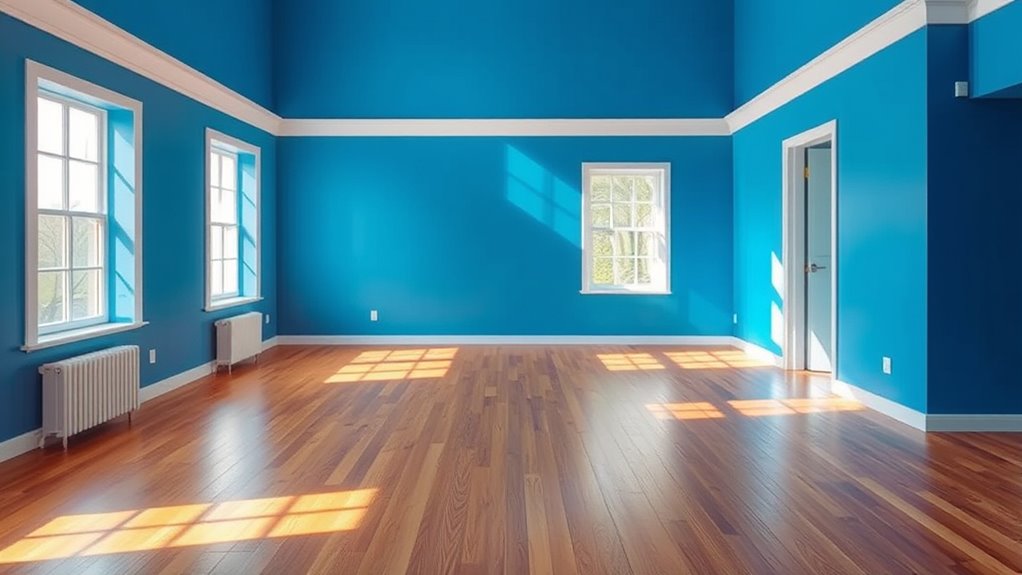
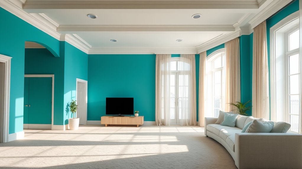
One effective way to explore these concepts is through monochrome palettes, which use varying shades, tints, and tones of a single hue. Monochrome schemes simplify color choices, allowing you to focus on lightness and saturation to shape the perception of space. For instance, lighter shades with high lightness can make an area seem larger and more open, while darker, low-lightness tones tend to make a space feel smaller and more enclosed. Adjusting saturation within a monochrome palette further refines this effect—the more saturated, the more vibrant and intense the space appears, drawing attention and creating a sense of proximity. Conversely, desaturated colors lend a subdued, distant quality, enhancing the feeling of expansiveness or depth.
Color psychology plays an essential role in how saturation and lightness influence perception. Bright, highly saturated colors often evoke energy, excitement, or alertness, making a space feel lively and dynamic. Soft, muted tones tend to promote calmness and serenity, creating a more relaxed and spacious environment. For example, using light, desaturated blues or greens can make a room or image feel more open and tranquil, while vibrant reds or oranges might make it seem smaller and more energetic. When you understand these psychological associations, you can intentionally manipulate saturation and lightness to evoke specific emotional responses and alter the perceived size of a space.
Moreover, understanding the relationship between color saturation and lightness and their impact on perception can help you craft more compelling and emotionally resonant visuals, whether for interior design, artwork, or digital interfaces. Ultimately, mastering the interplay between saturation and lightness empowers you to control how viewers experience your designs. Whether you want to emphasize a tiny detail or create an expansive scene, adjusting these elements allows you to influence perception directly. By thoughtfully employing monochrome palettes and considering the psychological impacts of color, you can craft visual compositions that feel just right—whether spacious or intimate—based on the mood and message you want to convey.

Nordic Homes in Colour: The new Scandi style
As an affiliate, we earn on qualifying purchases.
As an affiliate, we earn on qualifying purchases.
Frequently Asked Questions
How Do Color Saturation and Lightness Influence Interior Room Sizes?
You’ll find that color saturation and lightness greatly influence how spacious a room feels. Bright, light colors with low saturation create a sense of openness, making the space seem larger. Using color psychology, you can choose hues that promote visual harmony and enhance perceived room size. Conversely, saturated, darker colors tend to make a room feel smaller and more intimate. Adjusting these elements helps you design rooms that feel just right.
Can Adjusting Saturation and Lightness Change Perceived Distance in Artwork?
Yes, adjusting saturation and lightness can dramatically alter perceived distance in your artwork. When you boost color intensity and brightness, objects seem closer and more vibrant, while muted tones push things farther away. You hold the power to manipulate depth by fine-tuning color saturation and lightness, creating stunning illusions of space. Your choices in color intensity directly shape how viewers perceive depth and distance, making your art more immersive and emotionally compelling.
Do Cultural Differences Affect How Saturation and Lightness Impact Space Perception?
Yes, cultural differences influence how saturation and lightness affect space perception. Your cultural color preferences shape your perception of brightness, making you interpret saturated or lighter colors differently based on your background. For example, some cultures associate bright colors with closeness, while others see them as distant or vibrant. These cultural nuances alter how you perceive depth and space, emphasizing the importance of context in visual communication.
How Do Lighting Conditions Alter the Effects of Saturation and Lightness?
Did you know that under dim lighting, people perceive space as 20% larger? Lighting conditions profoundly influence how saturation and lightness affect your perception. Lower ambient contrast makes colors appear more subdued, shifting visual focus away from color intensity. Bright lighting enhances contrast, emphasizing saturation and lightness differences. So, when lighting changes, it alters how your brain interprets space, with ambient contrast guiding your visual focus and shaping perceived room size.
Are There Psychological Impacts Linked to High Saturation or Brightness Levels?
High saturation or brightness levels can trigger strong emotional responses, often making you feel energized or overwhelmed. They might also affect your visual comfort, causing eye strain or discomfort if overused. You may find bright, saturated colors stimulating, but too much can lead to stress or fatigue. Balancing these levels helps create a space that feels inviting and comfortable, supporting positive emotional responses without compromising visual comfort.

Pantone Imaging Spectrocolorimeter | Portable Color Measurement Tool | RM200QC
Allows user to build a complete color program and increased quality control
As an affiliate, we earn on qualifying purchases.
As an affiliate, we earn on qualifying purchases.
Conclusion
Understanding how color saturation and lightness affect perceived space is like tuning a camera lens—you can make a room feel larger or cozier with just a few adjustments. By using less saturated and lighter colors, you create an airy, open feel, while bold, saturated hues bring warmth and intimacy. So, next time you want to transform a space, remember, subtle changes in color can have a big impact—like magic in your own home.

DOI-LANEE Feelings Chart 16×12 Inch, Mental Health Poster Hanger Frame, Montessori Emotions Poster Wall and Therapy Office Decor, Psychology Gifts, Set of 2 Preschool Classroom Decor
【Exquisite Size】 This product comes as a set of two pieces, each measuring 12 x 16 inches, and…
As an affiliate, we earn on qualifying purchases.
As an affiliate, we earn on qualifying purchases.

Music Software Bundle for Recording, Editing, Beat Making & Production – DAW, VST Audio Plugins, Sounds for Mac & Windows PC
No Demos, No Subscriptions, it's All Yours for Life. Music Creator has all the tools you need to…
As an affiliate, we earn on qualifying purchases.
As an affiliate, we earn on qualifying purchases.