
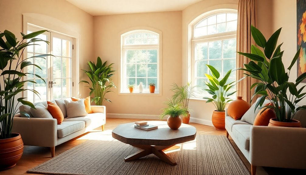
Earth tone color schemes for living rooms can transform your space into a cozy retreat. Consider bold navy paired with warm burnt orange and soft off-white for a striking contrast. Alternatively, opt for calming sage, clay, and ivory to create serenity. You could even mix rust with dusty blue for an autumn-inspired vibe or use soft beige with terracotta to promote tranquility. Each palette offers unique textures and accents that enhance comfort—keep exploring for even more ideas!
Key Takeaways
- Earth tone color schemes often feature warm, muted shades like terracotta, sage, and burnt orange, creating a cozy and inviting atmosphere.
- Pair bold colors, such as navy or emerald, with soft neutrals like off-white or wheat for a balanced and rejuvenating look.
- Incorporate natural materials like wood and stone to reinforce the earthy vibe and enhance the overall design aesthetic.
- Use textured fabrics, such as bouclé or linen, to introduce depth and comfort into your living room decor.
- Add greenery with live plants to complement earth tones and bring a refreshing touch of nature indoors.
Earth Tone Color Palette: Navy, Off-White, Burnt Orange
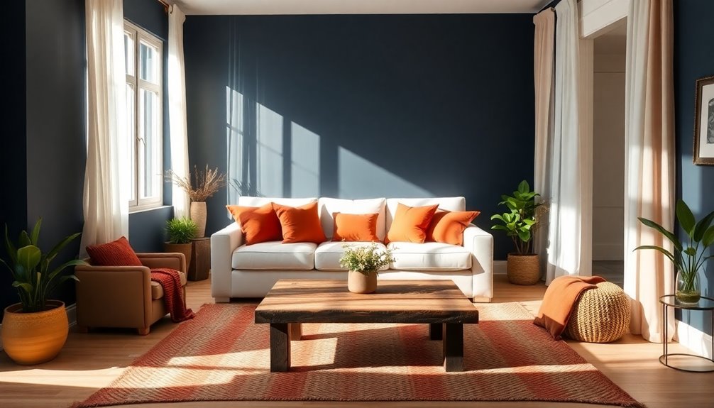
When you want to create a vibrant yet cozy living room, consider the striking combination of navy, off-white, and burnt orange. This color palette delivers a stunning contrast, with navy providing a bold backdrop and burnt orange infusing warmth and energy.
To enhance the earth tones, opt for light wood furniture that adds a natural touch and lightness to the space. Incorporating texture-rich bouclé fabrics introduces depth, making your living room feel inviting.
Brass accents offer a sophisticated flair, elevating the overall design. Don't forget to include live plants for a rejuvenating pop of cool green, perfectly balancing the warm atmosphere. This arrangement of decor fosters a peaceful environment, creating a harmonious and stylish retreat you'll love.
Earth Tone Color Palette: Sage, Clay & Ivory
Creating a soothing living room can be achieved with a palette of sage, clay, and ivory. This earth tone color scheme provides a serene atmosphere, perfect for relaxation.
Sage green acts as a soft, neutral color that harmonizes beautifully with the warm, earthy tones of clay, adding depth to your space. Ivory brightens the room, enhancing natural light and making it feel more open and inviting.
To complement this palette, incorporate natural materials like wood and stone, which reinforce the earthy vibe. Additionally, adding textures such as linen, wool, and terracotta creates a cozy, grounded feel. Implementing efficient storage strategies can further enhance the calming effect of your living space.
With this combination, your earth tone living room will exude comfort and tranquility, making it a perfect retreat.
Earth Tone Color Palette: Rust and Dusty Blue
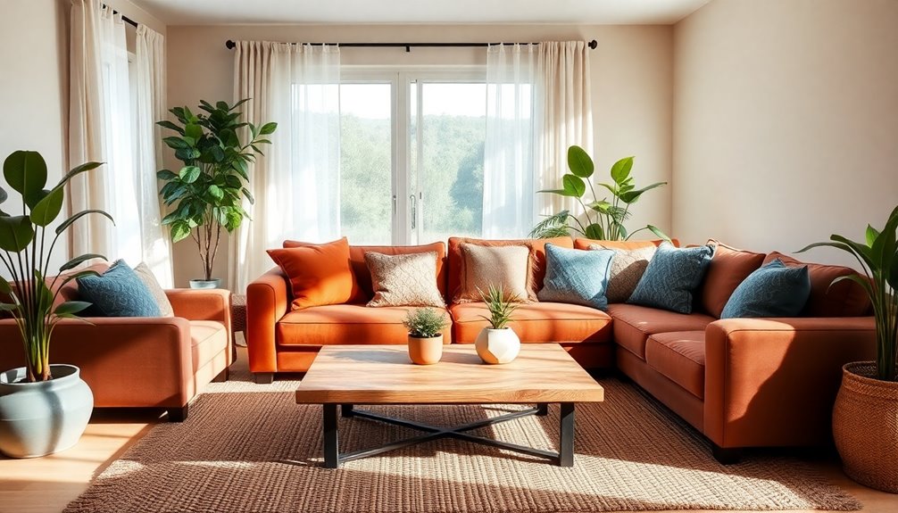
The rust and dusty blue color palette effortlessly combines warmth and tranquility, making it a stunning choice for your living room.
This scheme evokes a cozy atmosphere reminiscent of autumn while providing a soothing contrast. To create a harmonious environment, consider these design tips:
- Use rust on an accent wall or furniture pieces.
- Introduce dusty blue through accessories like pillows and throws.
- Pair with earthy green plants for a natural touch.
- Opt for warm neutral tones in larger furniture to balance the scheme.
Together, these colors foster relaxation and warmth, enhancing your space's inviting vibe.
You'll love how this palette transforms your living room into a stylish retreat.
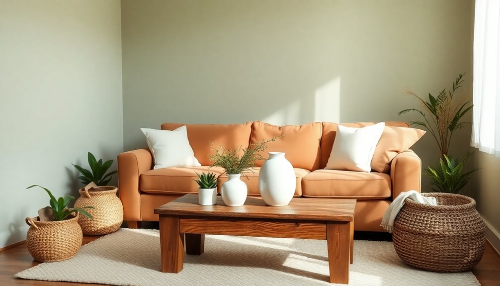
Earth Tone Color Palette: Soft Beige and Terracotta
Soft beige and terracotta come together to craft an inviting living room that balances comfort with style. This palette creates a cozy atmosphere, merging the soothing qualities of soft beige with the earthy vibrancy of terracotta. Soft beige acts as a versatile neutral base, while terracotta adds warmth, reminiscent of natural clay. Together, they enhance the overall warmth of your space and pair beautifully with wooden furniture and woven textiles.
| Color | Effect |
|---|---|
| Soft Beige | Versatile, soothing |
| Terracotta | Earthy, vibrant |
| Combined | Cozy, inviting atmosphere |
| Materials | Natural, warm textures |
This combination suits both modern and traditional designs, promoting a timeless aesthetic that encourages tranquility.
Earth Tone Color Palette: Emerald, British Tan & Wheat

Emerald, British tan, and wheat blend to form a stunning color palette that breathes life into your living room.
This combination of vibrant emerald green and warm brown creates a rejuvenating yet balanced atmosphere, perfect for evoking a timeless, autumnal feel.
Here are some ways to enhance this earth tone palette:
- Use bold wallpaper with patterns for striking visual impact.
- Incorporate leather-bound books for a classic touch.
- Add natural wood accents to complement earthy tones.
- Use soft wheat for furnishings to maintain lightness.
Frequently Asked Questions
What Colors Go Well With Earth Tones?
When you're looking to pair colors with earth tones, consider warm neutrals like cream and beige for a cozy feel.
You can add bold accents like burnt orange or mustard yellow to invigorate the palette.
Deep jewel tones, such as emerald green and navy blue, provide sophistication.
Don't forget metallics like brass and copper for a touch of elegance.
For a softer contrast, try incorporating pastels like dusty blush to maintain a cohesive design.
What Are the Earth Tones for 2024?
For 2024, you'll see a resurgence of rich earth tones like olive green, terracotta, mustard yellow, and burnt orange.
These colors reflect a desire for comfort and a connection to nature. Warm neutrals like taupe and beige will also be popular, providing a soothing backdrop.
Don't forget deep jewel tones like emerald and amethyst, which add sophistication when paired with earthy hues.
Sage green continues to shine as a versatile, calming option.
What Is the Color Rule for Living Rooms?
When you're choosing colors for your living room, it's crucial to follow the color rule, which emphasizes balance.
Start by selecting a dominant color to cover about 60% of the space. Then, add a secondary color for 30% and an accent color for the remaining 10%. This method creates visual harmony and interest.
Incorporating different textures can also enhance the look, making your living room feel warm and inviting.
What Colors Are Trending in Living Rooms in 2024?
In 2024, you're seeing a surge in earthy hues like olive green, rust, and sage, all reflecting a cozy, nature-inspired vibe.
Don't forget the vibrant mustard yellow and burnt orange for those cheerful accents!
Deep teal and navy are perfect for a sophisticated touch, while soft beige and warm taupe remain timeless choices.
Layering these colors with textured finishes and natural materials creates an inviting and stylish space you'll love.
Conclusion
Incorporating earth tone color schemes in your living room can create a warm, inviting atmosphere that connects you to nature. Remember, "home is where the heart is," so choose palettes that resonate with you. Whether you prefer the calming vibes of sage and clay or the boldness of burnt orange, these colors can transform your space into a sanctuary. Embrace these hues, and let your living room reflect your personal style and comfort.