
Fresh pale blue tones create a calming atmosphere that inspires futuristic serenity. These colors evoke tranquility, reduce stress, and promote mental clarity, making them ideal for relaxation spaces or sleek digital designs. They pair well with neutral shades for a modern look and help foster trust and openness in branding. Incorporating these shades can energize your environment and boost focus. If you’re curious about harnessing the power of calming blue, you’ll discover more inspiration ahead.
Key Takeaways
- Pale blue shades evoke tranquility, fostering calm and serenity in futuristic design environments.
- Incorporating fresh blue tones enhances mental clarity and promotes relaxation in modern spaces.
- These calming pale blues are ideal for creating soothing atmospheres in wellness and technology settings.
- In digital design, they convey trustworthiness, approachability, and a forward-thinking, innovative vibe.
- Using fresh blue accents supports a peaceful, harmonious future-focused aesthetic across various applications.
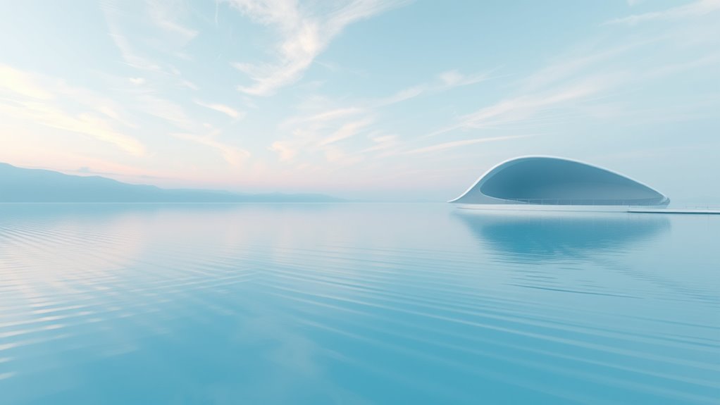
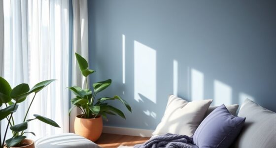
Pale blue hues evoke a sense of tranquility and serenity, making them an ideal choice for creating calming environments. When you incorporate these soft shades into your space or design, you’re tapping into the power of color psychology to influence mood and perception. Pale blues naturally promote feelings of relaxation, peace, and mental clarity. They can transform a room into a sanctuary where stress melts away and focus sharpens. Whether used in personal spaces or professional settings, these hues help foster a sense of calm that’s essential in our fast-paced world.
Pale blue creates calming spaces that promote relaxation, peace, and mental clarity in any environment.
In terms of design applications, pale blue colors are incredibly versatile. They work well as wall colors, accent pieces, or background tones that don’t overwhelm the senses. When you choose pale blue for interior design, you create a soothing atmosphere that encourages relaxation and openness. This is especially beneficial in spaces meant for rest, like bedrooms or meditation zones, where tranquility is key. Pale blue also pairs beautifully with neutral tones such as whites, grays, and beiges, amplifying the sense of calm while maintaining a modern, clean aesthetic. For office environments, incorporating pale blue can improve focus and reduce anxiety, making it a strategic choice for workplaces aiming to boost productivity and well-being.
In the realm of digital and graphic design, pale blue enhances user experience by delivering a sense of clarity and freshness. Websites, apps, and branding that utilize these shades often appear more approachable and trustworthy. When you employ pale blue in your design applications, you evoke feelings of dependability and calmness, helping users feel comfortable and engaged. It’s also a color that symbolizes innovation and a forward-thinking attitude, aligning perfectly with futuristic themes. Using pale blue as a primary or accent color in your digital projects communicates a sense of serenity and professionalism, which can set your brand apart in a crowded market.
Furthermore, pale blue’s association with the future and technology makes it an excellent choice for branding in tech industries, healthcare, or wellness sectors. It suggests openness, clarity, and progress. When you integrate pale blue into your design applications, you’re not just choosing a pretty color; you’re creating an environment that promotes mental well-being and forward-looking innovation. Its calming effect supports the idea of a peaceful, harmonious future where technology enhances quality of life. This connection to trailer music composition underscores its relevance in modern design contexts that aim to inspire trust and a sense of calm. Overall, pale blue’s role in color psychology and design applications underscores its value as a timeless yet contemporary choice for those seeking serenity and a touch of futurism.
Frequently Asked Questions
How Does Fresh Blue Compare to Other Pastel Shades?
Fresh Blue stands out among pastel shades because it offers a modern, calming vibe that’s rooted in recent historical color trends. Unlike softer pinks or warm yellows, it evokes serenity and futuristic elegance. Its cultural associations with technology and tranquility make it versatile for various settings. You’ll find it works well in spaces aiming for a clean, innovative look, giving your environment a fresh, peaceful feel that’s both contemporary and timeless.
Can Fresh Blue Be Used Effectively in Outdoor Settings?
Think of Fresh Blue as a gust of fresh air in your outdoor space. It works beautifully for garden accents and outdoor furniture, creating a soothing, futuristic vibe. Its calming hue stands up well to sunlight and weather, making it versatile for outdoor settings. You’ll find it adds a serene touch that turns your garden into a peaceful retreat, blending modern elegance with natural beauty effortlessly.
What Are Complementary Colors for Fresh Blue?
You can pair fresh blue with warm oranges or golden yellows for vibrant contrast, creating striking visual harmony through complementary colors on the color wheel. Using visual contrast techniques, such as balancing cool and warm tones, enhances the calming effect of the pale blue while making your design stand out. These combinations work well in both outdoor and indoor settings, adding depth and energy to your space.
How Does Lighting Affect the Appearance of Fresh Blue?
Did you know that lighting can change a color’s appearance by up to 30%? When you choose lighting ambiance and adjust the color temperature, fresh blue looks more calming and serene in warm light, while cooler light enhances its futuristic vibe. Bright, natural light makes it vibrant, whereas dim or colored lighting can give it a more muted or surreal feel. Always consider lighting to achieve your desired mood.
Is Fresh Blue Suitable for Commercial or Residential Spaces?
You’ll find decorating with fresh blue highly versatile for both commercial and residential spaces. Its calming, futuristic appeal creates a serene environment that appeals to clients and residents alike. Fresh blue works well in offices, cafes, or living rooms, adding a soothing touch. Its light, airy tone enhances natural light, making spaces feel more open and inviting. So, whether you’re decorating a home or a commercial setting, fresh blue fits beautifully.
Conclusion
Embrace the soothing power of pale blue hues to create a futuristic sanctuary that calms the mind and sparks creativity. Did you know that blue is considered the most popular favorite color worldwide? Its ability to promote relaxation and focus makes it perfect for modern spaces. By incorporating these calming shades, you not only enhance tranquility but also foster productivity. So, immerse yourself in the serene world of fresh blue and transform your environment into a peaceful, inspiring haven.