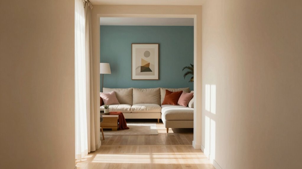

To build a seamless color story, start with a main color for your primary living spaces that sets the tone. Use shades from the same color family with varying intensities to tie rooms together softly. Gradually shift hues along a spectrum for smooth gradations, and consider undertones for harmony. Incorporate accents for variety without breaking the flow. Keep an eye on natural light and how colors interact; you’ll discover easy ways to create a natural flow throughout your home.

Get furniture and decor delivered free with Prime
- Fast, free delivery on millions of items
- Prime Video, Amazon Music and more included
- Member-only deals all year
Key Takeaways
- Start with a main color for central areas and select related hues to create harmony across rooms.
- Use shades and undertones within the same color family for smooth, seamless transitions.
- Gradually shift hues along the spectrum to establish subtle gradients and natural flow.
- Incorporate accent walls or accessories in complementary or contrasting colors to add variety without disrupting cohesion.
- Consider natural light and room size to adjust saturation and brightness, enhancing flow and visual balance.
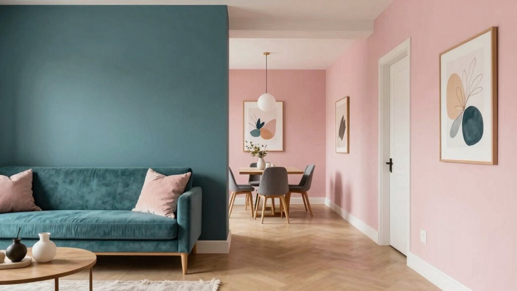
Creating a cohesive color story throughout your home can transform it into a harmonious space that feels thoughtfully designed. When you choose your colors carefully, you’re not just decorating; you’re setting a mood and creating a flow that guides people naturally from room to room. To do this effectively, understanding color psychology is key. Different colors evoke different emotions—blue can promote calm, yellow energizes, and green nurtures. Knowing how these emotions influence your space helps you select paint palettes that reinforce the atmosphere you want in each room. For example, you might opt for soft blues and grays in bedrooms to promote relaxation, while lively yellows in the kitchen can boost energy during meal prep.
Creating a cohesive color story sets a harmonious, inviting mood throughout your home.
Once you’ve grasped the emotional impact of colors, you need to facilitate how your chosen palettes work together across your home. A good starting point is selecting a primary color for your main living areas, then building a palette that complements it for adjoining spaces. If your living room features warm neutrals, you can carry those tones into the dining area with a slightly different hue, creating a seamless flow. Alternatively, if you prefer more contrast, choose shades from the same color family with varying intensities. This approach ensures your home feels unified, even if each room has its own distinct vibe. Understanding color undertones** is essential here, as they influence how colors interact and transition throughout your space. Recognizing color harmony** can further enhance how well your palette integrates across rooms.
When selecting paint palettes, consistency is important, but so is variety. Think about the undertones of your colors—warm or cool—and how they interact with natural light. Warm tones like terracotta or amber can make a space feel cozy, while cooler shades like mint or slate evoke freshness. You can also use accent walls or accessories to introduce pops of color that tie different rooms together without overwhelming the overall transition. Keep in mind that larger rooms can handle deeper, more saturated hues, while smaller spaces benefit from lighter shades that open up the space visually. Additionally, understanding color psychology can help you choose shades that seamlessly blend and maintain the desired flow.
Finally, pay attention to how your colors evolve from one room to the next. You might choose to gradually shift hues along a color spectrum, creating a subtle gradient effect rather than abrupt changes. This technique makes your home’s flow feel natural and intentional. By carefully selecting your paint palettes and considering color psychology, you craft a visual narrative that guides visitors effortlessly through your space, making your home feel cohesive, inviting, and well-designed from room to room.
interior wall paint colors for seamless flow
As an affiliate, we earn on qualifying purchases.
As an affiliate, we earn on qualifying purchases.
Frequently Asked Questions
How Many Colors Should I Include in My Overall Color Story?
You should include about three to five main colors in your overall color story. This allows you to explore color psychology and create a balanced, cohesive look. Use color progression techniques like gradual shades or complementary hues to smoothly shift from one room to the next. Limiting your palette helps maintain harmony, while thoughtful transitions keep the flow seamless, making your space feel unified and inviting.
Can I Mix Different Color Palettes in Adjacent Rooms?
You absolutely can mix different color palettes in adjacent rooms, and it’s one of the most exciting ways to create visual interest—your home becomes a living canvas! Focus on maintaining color harmony by using complementary or analogous shades, and plan your palette shift seamlessly. Think of it like a gentle wave, guiding the eye effortlessly from one room to the next, without jarring contrasts. This approach keeps your space cohesive yet dynamic.
How Do I Incorporate Patterns Without Disrupting the Flow?
To incorporate patterns without disrupting the flow, focus on pattern mixing that maintains visual harmony. Choose patterns with similar color palettes or scales, balancing bold designs with subtle ones. Use accessories or accent walls to introduce varied patterns while keeping core colors consistent across rooms. This approach guarantees your space feels cohesive, even with diverse patterns, creating a seamless visual shift that enhances your overall color story.
What Role Do Accent Pieces Play in Creating a Cohesive Story?
Accent pieces play a pivotal role in pulling your color story together. They add focal accents that highlight your theme and create continuity, serving as subtle yet striking statements. By carefully selecting accents that echo your main colors and motifs, you establish a seamless flow from room to room. These pieces act as accents that anchor your design, ensuring your space feels cohesive, coordinated, and engaging across every corner.
How Do I Update My Color Story for Seasonal Changes?
To update your color story for seasonal changes, start with seasonal color updates by swapping out accent pieces or accessories in warmer or cooler tones. Adjust color intensity by incorporating richer, deeper hues for fall and winter, and lighter, softer shades for spring and summer. You can also add seasonal textiles or artwork that reflect the current season, creating a cohesive and refreshed look that flows seamlessly throughout your home.
Conclusion
Remember, a well-crafted color story creates a seamless flow that unites your home’s spaces. Trust your eye and don’t be afraid to experiment—after all, variety is the spice of life. As the saying goes, “A picture is worth a thousand words,” so let your colors tell a story that feels cohesive yet inviting. When you embrace this approach, your home will feel harmonious, vibrant, and truly yours.
Columbus Day / Indigenous Peoples' Day Picks
long weekend sales
As an affiliate, we earn on qualifying purchases.