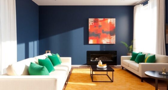

To combine multiple colors in a room, start with a unifying base color like neutral beige. Use the 60:30:10 rule: allocate 60% to your main color, 30% to a secondary hue, and 10% to accent shades. Incorporate varying tones for depth and interest, and choose textiles that reflect your color scheme. Remember to layer textures for a rich feel. If you stay with these principles, you'll create a beautifully harmonious space that feels inviting.
Key Takeaways
- Start with a neutral base color to create a cohesive foundation for your color palette.
- Apply the 60:30:10 rule for balanced distribution, ensuring harmony among main, secondary, and accent colors.
- Use varying shades and tones of the same hue to add depth and visual interest.
- Incorporate textiles and decor to introduce accent colors and enhance the overall aesthetic.
- Mix warm and cool tones to create contrast and enhance the visual appeal of the space.
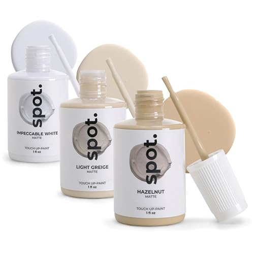
spot. Touch-Up Paint | Matte Finish for Cabinets, Walls, Doors & Furniture | Multi-Tone Beige Repair Kit | Quick-Dry, Self-Priming, Low-Odor, Eco-Friendly | No-Sanding or Primer Needed | 3 Pack
Includes Three Shades to Match 90% of Surfaces: We offer two color shades of Matte Beige and one…
As an affiliate, we earn on qualifying purchases.
As an affiliate, we earn on qualifying purchases.
Selecting a Unifying Color Palette

When you're ready to select a unifying color palette for your room, start with a base color that sets the tone, like a neutral beige or soft gray. This base color serves as a cohesive foundation for your color palette.
Next, incorporate accent colors that complement your base, varying in intensity and shade to maintain visual interest. Consider using an analogous color scheme, pulling from colors adjacent on the color wheel for a soothing effect.
As you decide on your colors, remember the balance of your dominant color, secondary color, and accents. Trim and flooring can act as unifying elements, enhancing flow and connection throughout the space, ensuring your final color scheme feels harmonious and intentional.

The Power of Color: A Beginner’s Guide to Color Combinations in Interior Design: Learn Color Theory, the 60-30-10 Rule, and How to Create Harmonious Color Palettes for Your Home
As an affiliate, we earn on qualifying purchases.
As an affiliate, we earn on qualifying purchases.
Applying the 60:30:10 Rule

Understanding how to apply the 60:30:10 rule can transform your space into a visually appealing environment. This technique helps guarantee your colors work together harmoniously.
Here's how to implement it:
- Main Color (60%): Choose a dominant color to create a cohesive backdrop for your room.
- Secondary Color (30%): Select a complementary color to balance the main hue, enhancing visual harmony.
- Accent Colors (10%): Use these vibrant shades to add interest and highlight key features.
With the 60:30:10 rule, you can make adjustments based on your room's function and desired atmosphere, guaranteeing your color combinations create a welcoming and stylish space. Additionally, consider how color coordination can enhance overall room design for a more polished look.
Embrace this method, and watch your room come to life!

MIULEE Pack of 2 Decorative Throw Pillow Covers 18×18 Inch Soft Boho Striped Textured Corduroy Pillow Covers Modern Farmhouse Home Decor for Couch Bed Sofa Living Room Cream White
Boho Chic & Striped Design: Elevate your home decor with our stylish striped corduroy pillow covers, bringing a…
As an affiliate, we earn on qualifying purchases.
As an affiliate, we earn on qualifying purchases.
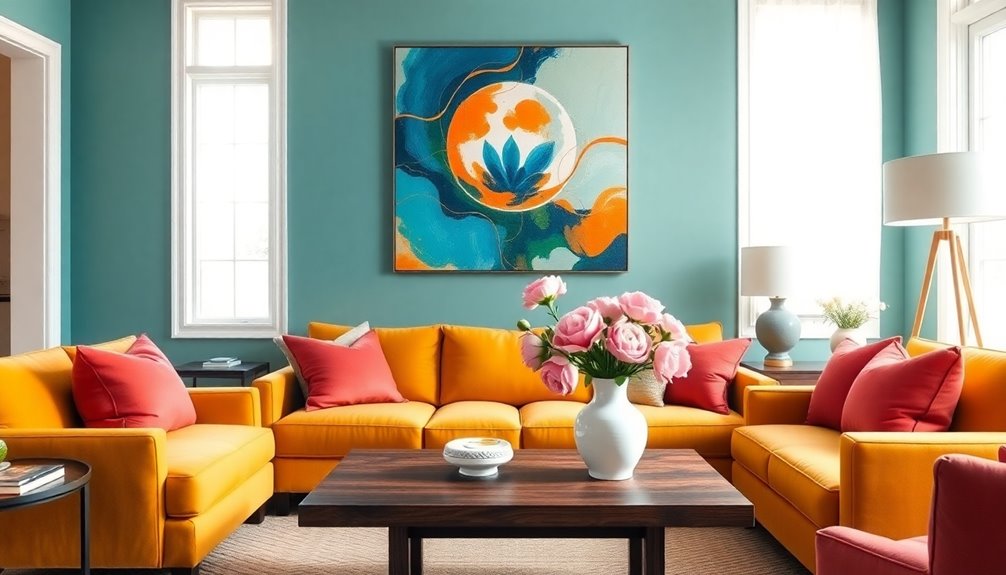
Incorporating Varying Shades and Tones
Incorporating varying shades and tones of a single color can significantly elevate the aesthetic of your room, as it adds depth and visual interest without overwhelming the space. By using lighter and darker values of the same hue, you create a harmonious color palette that enhances visual contrast.
Start with a base color, then introduce two or three additional shades to craft a sophisticated gradient effect. You can also utilize analogous colors from the color wheel for subtle shifts, promoting a serene atmosphere.
Remember to apply the 60:30:10 rule: let 60% of your room showcase the dominant color, 30% serve as a secondary color, and 10% act as an accent color to boost visual interest.

4pcs Artist Blending Sponge Pen Dual Tip Reusable Drawing Art Soft Oil Pastel Blending Tools Washable Sketch Rubbing Sponge Brush for Artist Professional Sketch Drawing Blending Lightening & Highlight
You will get: 4pcs mixed dual tip washable sketch rubbing sponge brush with a dual-end design, featuring 2…
As an affiliate, we earn on qualifying purchases.
As an affiliate, we earn on qualifying purchases.
Utilizing Textiles and Decor
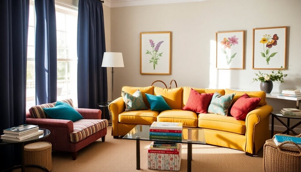
Textiles and decor play an essential role in bringing multiple colors into your room while maintaining a cohesive look.
To achieve harmonious blends, follow these techniques:
- Choose a Dominant Color: Use a dominant color for larger textiles, like your sofa or rug, to set the foundation of your color scheme.
- Incorporate Accent Colors: Add accent colors through smaller items like cushions and throws, ensuring they're either complementary or analogous to enhance visual cohesion.
- Layer Textures: Mix different textures, such as soft cottons with rich velvets, to create depth within your palette.
Remember the 60:30:10 rule: 60% dominant color, 30% secondary, and 10% accent colors for a balanced and inviting space. Additionally, consider using neutral color palettes to create a calming environment, a key aspect of modern farmhouse design.
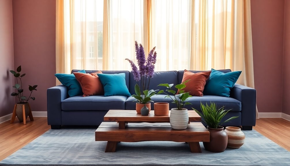
Creating Depth and Interest in the Space

When you want to create depth and interest in a room, mixing warm and cool tones can make a significant difference. By combining colors that work together harmoniously, you enhance visual appeal. Incorporate different values of a single color to establish layers and complexity. Use accent colors on furniture and decor, drawing the eye without overwhelming the space. Follow the 60:30:10 rule for balanced color distribution, ensuring 60% is a dominant color, 30% secondary, and 10% accent. Additionally, adding texture through textiles and patterns enriches your palette, providing depth and visual intrigue. Experimenting with bold colors for accent walls can also bring energy to the room.
| Color Scheme | Description |
|---|---|
| Monochromatic | Variations of one color |
| Complementary | Opposite colors on the wheel |
| Analogous | Colors next to each other |
| Triadic | Three colors evenly spaced |
| Split-complementary | Base color + two adjacent |
Frequently Asked Questions
What Is the Technique of Combining Specific Colors in a Way That Are Harmonious?
To combine specific colors harmoniously, start by choosing a base color that sets the tone.
Use the 60:30:10 rule: allocate 60% of your space to the base, 30% to a secondary color, and 10% for accents.
You can also explore monochromatic shades for a soothing effect or try split complementary colors for added interest.
Balance warm and cool tones to avoid harsh contrasts, creating a cozy and inviting atmosphere in your space.
What Is the 60/30/20 Rule in Decorating?
Imagine a room drenched in a single hue, feeling both overwhelming and bland.
That's where the 60/30/20 rule comes in. You'll want 60% of your space in a dominant color, like your walls.
Then, let 30% take shape with a secondary color in your furniture or fabrics.
Finally, sprinkle in 10% of accent colors through decor and accessories.
This balance creates harmony and keeps your space visually engaging without any one color stealing the show.
What Is the 70/20/10 Color Rule?
The 70/20/10 color rule helps you create a balanced and inviting space.
You'll use 70% of a primary color as a backdrop, setting the tone for the room.
Then, apply a secondary color to cover 20% of the area, often in furniture or curtains, to add contrast.
Finally, sprinkle in an accent color for the remaining 10% through accessories like cushions or artwork, which adds that visual interest and pop.
How Do You Make Colors More Harmonious?
To make colors more harmonious, you can start by choosing analogous colors that sit next to each other on the color wheel. This creates a smooth changeover and a calming vibe.
Incorporate a unifying base color to tie everything together.
Don't forget the 60:30:10 rule—dedicate 60% to your main color, 30% to a secondary, and 10% to an accent.
Finally, play with different shades to add depth and interest without overwhelming the space.
Conclusion
Incorporating multiple colors in a room can feel like crafting a symphony; each hue plays a unique note, contributing to a cohesive masterpiece. Just like a skilled conductor balances the instruments, you can harmonize your colors using a unifying palette and the 60:30:10 rule. Remember, it's all about creating a space that resonates with you. So, take a cue from nature, where every shade blends beautifully, and let your room sing with color!