You’ll notice designers favor soft, sophisticated pastel pairings this spring, blending shades like mint, lavender, and buttery yellow with neutral tones such as white, beige, or gray. They use monochrome schemes and subtle variations in tone to create calm, elegant spaces and stylish outfits. These color combinations are versatile, making everything feel fresh yet timeless. Stick around, and you’ll discover how these quiet palettes are shaping trends across fashion, interiors, and beyond.
Key Takeaways
- Designers are favoring emerging pastel palettes with soft mint, lavender, and buttery yellow for sophisticated, monochrome spring looks.
- Subtle color pairings with neutrals like white and beige create modern, approachable aesthetics across fashion and interiors.
- Monochrome schemes with varied textures add depth, making simple color variations impactful and elegant.
- Layering different shades within a single pastel hue enhances cohesion and visual interest in clothing and spaces.
- The use of nuanced pastel shades supports a calming, versatile, and trend-conscious design approach everywhere.
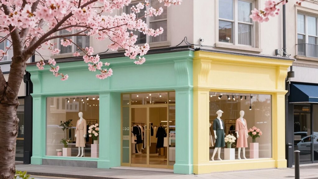
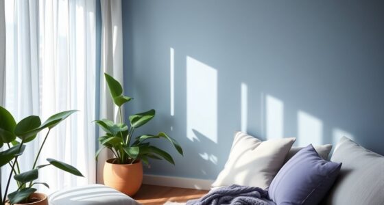
Have you ever wondered how designers create fresh, vibrant looks for spring? It’s all about subtle yet striking color pairings that breathe new life into fashion and decor. One of the biggest trends quietly making its way into every corner is the use of emerging pastel palettes. These aren’t your typical light pinks and baby blues; they’re sophisticated, nuanced shades like soft mint, lavender, and buttery yellow. Designers are blending these gentle colors into monochrome spring schemes that look effortlessly chic. Imagine stepping into a room or slipping into an outfit where shades of one color, like a spectrum of blush pinks or green tones, create a seamless, calming effect. These monochrome schemes are surprisingly versatile, allowing you to mix and match different textures and fabrics while maintaining a cohesive, polished look.
You’ll notice that these emerging pastel palettes aren’t just limited to clothing. They’re dominating interior design, accessories, and even packaging. Designers favor pairing these delicate hues with neutrals—think crisp whites, warm beiges, or cool grays—to enhance their softness without making the palette feel overly sweet or juvenile. The result is a sophisticated, fresh aesthetic that feels both modern and approachable. This color pairing approach is especially popular in spring collections because it captures that fleeting, rejuvenating spirit of the season. It’s about embracing subtlety but also making a statement through delicate contrast and harmony. Additionally, the use of color pairings helps create visual interest and balance within designs, making these palettes a favorite among trend-conscious creators. This approach also aligns with the broader biodiversity principles by promoting a harmonious blend of elements that celebrate nature’s diversity.
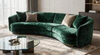
Monochrome spring schemes are particularly appealing because they simplify styling while maximizing visual impact. Instead of juggling multiple bold colors, you focus on variations of a single shade, playing with different intensities and textures. For example, a monochrome look in shades of blush can range from a pale, icy pink to a richer, rose hue, giving depth and interest without overwhelming the senses. This approach lends itself well to layering in fashion, as well as creating cohesive spaces that feel tranquil yet lively. When paired with emerging pastel palettes, monochrome schemes become even more dynamic, as you can explore subtle shifts in tone to craft a look that’s both elegant and vibrant. Understanding these color dynamics is key to achieving a balanced and sophisticated aesthetic in your designs. Moreover, embracing these palettes in different mediums showcases the versatility of these color combinations in various creative fields.
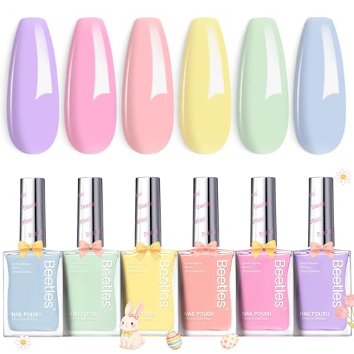
Beetles Pastel Nail Polish Set -6 Colors Pink Blue Yellow Nude Pink Purple Nail Polish Set Quick Dry Finger DIY Air Dry Nail Art Salon Home Pastel Reverie Gift for Women
- Number of Colors: 6 attractive pastel shades
- Drying Time: Dries in 90-120 seconds per coat
- Nail Care Benefits: Strengthens and repairs nails
As an affiliate, we earn on qualifying purchases.
As an affiliate, we earn on qualifying purchases.
Frequently Asked Questions
How Do Color Pairings Influence Seasonal Fashion Trends?
Color pairings influence seasonal fashion trends by tapping into color psychology and cultural symbolism, which evoke specific emotions and meanings. When you wear thoughtfully paired colors, you communicate feelings like calmness or excitement. Designers often consider these elements to create harmonious looks that resonate with current moods and cultural themes. As a result, these combinations shape what people find fashionable, making trends feel both emotionally impactful and culturally relevant.
Are There Specific Color Combinations Suited for Different Skin Tones?
Sure, skin tone matching and color contrast techniques are your best friends when choosing outfits. While some believe specific color combinations suit certain skin tones, fashion’s all about experimentation. You might find that bold contrasts or subtle harmonies work differently on you. Ironically, what’s “best” can be subjective—so don’t shy away from trying unexpected pairings. Ultimately, confidence makes any color combo look stunning, regardless of your skin tone.
What Are the Best Color Pairings for Outdoor Spring Events?
For outdoor spring events, you should embrace spring floral palettes and pastel contrast schemes. Opt for soft, airy colors like blush pink, mint green, and lavender paired with brighter accents such as coral or sunny yellow to create a fresh, lively look. These color combinations not only blend beautifully with blooming surroundings but also keep you looking seasonally stylish and vibrant, perfect for enjoying the outdoor festivities.
How Can Small Brands Incorporate These Color Trends Affordably?
Ever wonder how small brands can stand out with trendy spring colors? You can incorporate these hues affordably by using DIY color matching and affordable palette tips. Mix and match inexpensive fabrics or accessories in the trending shades to create eye-catching visuals. Focus on simple, bold combinations that highlight your brand’s personality. This way, you’ll stay current without breaking the bank, making your brand memorable and vibrant this spring.
Do These Color Combinations Work Across Various Fashion Styles?
Yes, these color combinations work across various fashion styles because they tap into powerful color psychology and cultural symbolism. You can incorporate vibrant or muted shades to evoke emotions or cultural meanings, making your outfits versatile and meaningful. Whether you prefer classic, boho, or edgy styles, these colors adapt well, helping you express your personality while aligning with current trends. Mixing and matching them creates fresh, stylish looks for any occasion.
Conclusion
As you explore these subtle spring color pairings, imagine yourself strolling through a blooming garden, where soft pastels blend effortlessly. Picture a designer choosing a gentle mint green with blush pink for a charming café interior—creating a calm, inviting space. By embracing these quiet yet vibrant combinations, you can transform everyday environments into invigorating, stylish retreats. So, don’t hesitate to experiment with these hues—you’ll be surprised how effortlessly they elevate your space or wardrobe.