TL;DR
Paint and color experts’ 2027 forecasts point to a mix of nature-inspired depth and playful color, including wine reds, mossy greens, grounded roses, warm pastels and periwinkle. These are industry predictions, not a single official palette or a guarantee of what homeowners will choose.
Paint and color experts are forecasting ten home color directions for 2027, with richer, nature-based hues and nostalgic references expected to gain ground. The predictions include wine reds, mossy greens, grounded roses, earthy neutrals, warm pastels and periwinkle, offering homeowners a shift from pale, calming palettes toward more personal and expressive choices.

Get furniture and decor delivered free with Prime
- Fast, free delivery on millions of items
- Prime Video, Amazon Music and more included
- Member-only deals all year
The forecasts come from paint companies and color specialists, rather than a single industry-wide survey. The source material describes a broader move toward saturated tones drawn from natural pigments, plants and minerals, while retaining familiar associations with older homes, textiles and travel memories. The ten categories named are wine, mossy greens, grounded roses, neutral browns, stone-based neutrals, complex blues, warm pastels, earthen oranges, mature yellows and periwinkle.
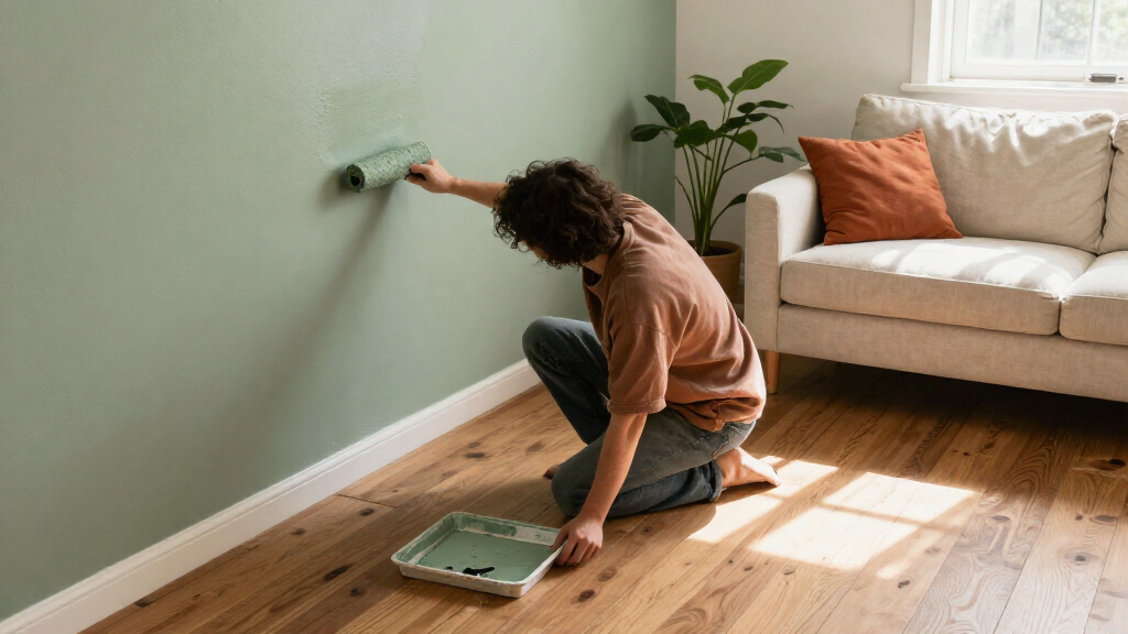
Several brands have attached specific colors to their forecasts. IKEA named Wild Fig, a deep botanical hue with purple and burgundy notes, as its Color of the Year. Benjamin Moore selected Webster Green, described as a mid-tone green with olive undertones, for its Color of the Year and included Townsend Harbor Brown in its Color Trends palette. Behr chose Grounded, a rich olive, as its Color of the Year. Sherwin-Williams’ Colormix Forecast includes colors such as Cordovan, Secret Green and Roycroft Bronze Green.
Other examples show how the forecast extends beyond dark greens and reds. C2 Paint’s Pueblo combines mauve, brown and pink undertones, while the source describes it as shifting in appearance with changing light. The article also identifies warm pastels and unexpected periwinkles as projected standouts, although the provided material does not list particular product names for every category.
A richer mood for home color in 2027
Experts forecast ten directions, from nature-inspired depth to playful pastels. These are predictions, not a confirmed homeowner shift.
The ten directions
The palette spans saturated natural hues, earthy shades and unexpected color.
Brand picks
Three companies named these colors as their individual Color of the Year.
Wild Fig
A deep botanical hue with purple and burgundy notes.
Webster Green
A mid-tone green with olive undertones.
Grounded
A rich olive shade.
What is driving the mood?
Experts connect the forecasts to personal expression, nostalgia and nature.
Color specialists describe growing interest in energetic, playful rooms.
Childhood homes, travel memories, vintage textiles and wood tones inform the palette.
Some experts associate comfort with richer, earthier interiors.
More Color Beyond Pale Neutrals
The forecasts matter to readers planning renovations or choosing paint because they suggest that comfort is being associated with richer, warmer color, not only with light beige and subdued walls. A deeper green or berry red can change the mood of a room, while earthier pinks and browns may offer color without the brightness of a primary shade.
These predictions are also a reminder that a trend list is not a set of instructions. Experts describe color as personal and point to memories and lived experience as sources of inspiration. A homeowner can use the forecast as a guide to available directions—perhaps testing a small area or using a stronger shade in one room—rather than treating a named Color of the Year as a required choice.
Products Worth Considering

Ring Alarm 5-Piece Home Security Kit

Dyson Cyclone V10 Origin Cordless Vacuum

Sonos Five Wireless HiFi Speaker, Black
As an affiliate, we earn on qualifying purchases.
From Calm Rooms to Personal Color
Color marketing manager Emily Kantz of Sherwin-Williams says people are seeking a more personal relationship with the colors around them. She contrasts a long preference for calm, soothing spaces with growing interest in rooms that feel energetic and playful. Her comments frame the forecasts as a change in mood, but they are an expert’s interpretation rather than measured evidence that all homeowners are changing their preferences.
The source links the palette to nostalgia revisited: colors recalled from childhood homes, favorite trips or vintage textiles. It also points to natural materials, including wood tones, as a complement to mossy greens. Andrea Magno, Benjamin Moore’s vice president of brand, color and integrated marketing, describes Webster Green as versatile and rooted in tradition. Behr color head Kayla Kratz similarly says the idea of comfort is shifting toward warmer, earthier interiors.
“If you had to conjure in your mind the perfect mid-tone green, we really felt that this hits the mark.”
— Andrea Magno, vice president of brand, color and integrated marketing at Benjamin Moore
Forecasts Are Not Sales Data
The material presents expert predictions and brand selections, not consumer polling, sales figures or proof that any color will become widely used in 2027. It does not establish how the ten categories were chosen, how many experts contributed to the full list, or whether the forecasts reflect homeowners across different regions and budgets.
Several of the ten trends are named without detailed examples in the supplied material, including neutral browns, stone-based neutrals, complex blues, earthen oranges, mature yellows, warm pastels and periwinkle. It is also unclear how the predictions will compare with actual paint purchases or interior choices once 2027 arrives.
Watch for Choices in 2027
The forecasts will be tested as homeowners, designers and retailers make color choices over the year ahead. Readers considering a repaint can compare samples in the room’s changing light and alongside existing flooring, furniture and wood finishes; the source does not suggest that one palette suits every space.
Further brand releases or later sales and design data could show whether the projected shades gain traction. Until then, the ten directions should be read as a snapshot of expert expectations, with personal preference—not a forecast—deciding what goes on a particular wall.
Key Questions
What are the predicted home color trends for 2027?
The ten categories named in the forecasts are wine, mossy greens, grounded roses, neutral browns, stone-based neutrals, complex blues, warm pastels, earthen oranges, mature yellows and periwinkle.
Which 2027 Color of the Year selections are named?
The source identifies IKEA’s Wild Fig, Benjamin Moore’s Webster Green and Behr’s Grounded as Color of the Year selections. These are individual brands’ choices, not one shared industry selection.
Are these trends confirmed to be what homeowners will choose?
No. They are expert and brand forecasts. The source does not provide consumer polling or sales data confirming that homeowners will adopt these colors widely.
Why are experts forecasting more saturated colors?
Experts quoted in the source connect the palette to interest in personal expression, nostalgia and nature-inspired tones. Those explanations are their interpretations, not proof of a universal shift in preference.
Source: veranda.com