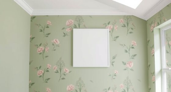
Incorporating deep reds and terracotta tones into your space adds warmth and invites comfort. These colors evoke energy, groundedness, and cultural richness, making your environment feel cozy yet vibrant. Use them as accent walls or paired with neutral shades to create balance. Adding metallic accents can elevate the look. Exploring these hues helps you craft emotionally resonant spaces that feel timeless and welcoming. Keep exploring to discover how to make these colors work perfectly for your home.
Key Takeaways
- Use deep reds or terracotta as accent walls to create focal points and add warmth to living spaces.
- Pair warm hues with neutral tones like beige or soft gray for balanced, inviting interiors.
- Incorporate metallic accents such as gold or bronze to enhance elegance and depth.
- Consider cultural symbolism, like red for luck or terracotta for rustic charm, to add meaningful context.
- Apply these tones thoughtfully to evoke comfort, vitality, and timeless appeal in your design.

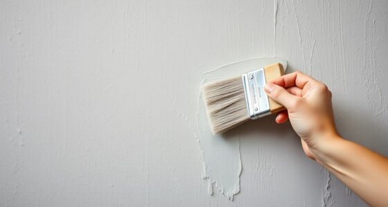
Warm paint colors can instantly make a space feel cozy and inviting. When you choose deep reds and terracotta tones, you’re tapping into a palette that has long been associated with warmth, passion, and comfort. These hues do more than just decorate walls; they influence mood and atmosphere through the principles of color psychology. Reds, for example, are known to evoke feelings of energy and enthusiasm, making them perfect for spaces where you want to encourage conversation and activity. Terracotta, with its earthy undertones, fosters a sense of groundedness and tranquility. Historically, these colors have been used in various cultures to symbolize vitality, prosperity, and protection. Ancient civilizations like the Egyptians and Romans often employed rich reds and clay-like tones in their architecture and art, believing these colors carried spiritual or protective significance. Understanding these historical uses can deepen your appreciation for these hues and inspire you to incorporate them thoughtfully into your home.
When you select deep reds or terracotta shades, you’re not just choosing colors; you’re embracing a visual language that has been powerful for centuries. For instance, in traditional Chinese culture, red symbolizes luck and happiness, which could influence your decision if you want to create a space that feels joyful and welcoming. Similarly, in Mediterranean homes, terracotta tiles and walls evoke a sense of rustic charm and warmth, connecting your space to a rich cultural history. These historical uses show that warm reds and earthy tones have been valued across civilizations for their ability to foster connection and positive energy. Recognizing the cultural significance behind these colors can help you make more intentional choices, ensuring that your space not only looks warm but also resonates with meaning. Additionally, self-understanding through the use of color can enhance your ability to create environments that support your emotional well-being.
In terms of application, consider painting an accent wall with a deep crimson or terracotta shade to anchor your room’s design. Pair these colors with neutral tones like beige, cream, or soft gray to balance the intensity and keep the space feeling inviting rather than overwhelming. You might also incorporate warm metallic accents—like gold or bronze—to enhance the richness of these hues and add a touch of elegance. When you understand the historical significance and psychological effects of these colors, you can confidently use them to create environments that feel both timeless and emotionally resonant. Whether you’re aiming for a cozy living room, a passionate dining space, or a peaceful retreat, deep reds and terracotta tones can transform your home into a sanctuary of warmth and comfort rooted in centuries of cultural tradition.

EVOLVE Interior Paint & Primer, Eggshell (Burgundy), 1 Gallon – One-Coat Coverage, Excellent Hide, Low VOC, Low Odor, Washable Paint for Walls, Doors & Trim
PAINT + PRIMER IN ONE: Evolve’s paint-and-primer formula helps you get great coverage from the start, sealing your…
As an affiliate, we earn on qualifying purchases.
As an affiliate, we earn on qualifying purchases.
Frequently Asked Questions
How Do Warm Tones Affect Room Lighting?
Warm tones, like deep reds and terracotta, create a cozy atmosphere by affecting your room’s color temperature and ambient lighting. They make the space feel warmer and more inviting, especially under softer, ambient lighting. You’ll notice that these tones reflect light differently, reducing harsh shadows and giving the room a gentle glow. This enhances comfort and intimacy, making your space feel welcoming and emotionally engaging.
Can Warm Paint Colors Improve Mood and Energy?
Yes, warm paint colors can boost your mood and energy levels. They have a positive psychological impact, stimulating feelings of comfort, enthusiasm, and motivation. According to color psychology, shades like deep reds and terracotta evoke warmth and excitement, helping you feel more lively and engaged in your space. Using these hues intentionally can create an inviting environment that naturally enhances your emotional well-being and energizes your daily activities.
Are Deep Reds Suitable for Small Spaces?
Deep reds can work in small spaces if you use smart color pairing and paint application techniques. Opt for lighter accents or gloss finishes to reflect more light, making the room feel larger. Apply the deep red on one accent wall or in small areas to add warmth without overwhelming the space. Combining it with neutral shades and using strategic lighting enhances the cozy atmosphere while maintaining a sense of openness.
How Do Warm Tones Complement Different Decor Styles?
Ever wondered how warm tones elevate your decor? They beautifully complement various styles through thoughtful color pairing, creating cozy, inviting spaces. Warm hues like terracotta and deep reds add richness to rustic or bohemian themes, while blending seamlessly with modern minimalism. Cultural symbolism also plays a role, as these colors evoke passion and energy. You can enhance any aesthetic by choosing warm tones that reflect your personality and complement your existing decor.
What Are Some Tips for Balancing Warm and Cool Colors?
To balance warm and cool colors, focus on creating color contrast with your paint choices. Use paint techniques like layering or shading to add depth and harmony. Start with a neutral base, then incorporate warm tones through accents or trim, ensuring they don’t overpower cool hues. Keep a visual balance by comparing the intensity of both, and don’t be afraid to experiment with small patches before committing to larger areas.

Annie Sloan Wall Paint (Riad Terracotta, 4 Fl Oz Tester)
COLORS CRAFTED BY ANNIE SLOAN: Riad Terracotta is a spicy, burnished orange like the warm terracotta tones used…
As an affiliate, we earn on qualifying purchases.
As an affiliate, we earn on qualifying purchases.
Conclusion
As you embrace warm reds and terracotta tones, you’ll find your space feels more inviting and alive. The cozy hues naturally draw people in, creating a sense of comfort that’s hard to resist. It’s no coincidence that these colors evoke warmth and happiness—they just do. So, when you choose these shades, you’re not only adding depth to your walls but also weaving a subtle, comforting rhythm into your everyday life.
GIGIZAZA Gold Velvet Decorative Throw Pillow Covers,18×18 Pillow Covers for Couch Sofa Bed 2 Pack Soft Cushion Covers
Velvet Fabric:Throw pillow covers is made of thick, soft and comfortable polyester velvet fabric, which is durable and…
As an affiliate, we earn on qualifying purchases.
As an affiliate, we earn on qualifying purchases.

LANANAS Neutral Couch Throw Pillow Covers 18×18 Inch Set of 4 Decorative Farmhouse Boho Throw Pillows for Living Room, Couch, Bed, Sofa Soft Corduroy Accent Home Decor (Neutral Brown, 18×18 Inch)
COVERS ONLY.
As an affiliate, we earn on qualifying purchases.
As an affiliate, we earn on qualifying purchases.