TL;DR
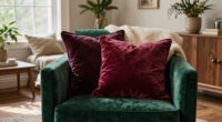
IKEA named Wild Fig, a muted burgundy with warm red, purple and brown undertones, its 2027 Color of the Year. The retailer’s Style Guide places it in four interior trends, offering several ways to use the shade, from patterned textiles to restrained accents.
IKEA named Wild Fig, a muted burgundy with warm purple, red and brown undertones, its 2027 Color of the Year, pairing the announcement with an annual Style Guide that shows how the shade could appear across four interior trends. The choice marks a move away from the retailer’s more vivid 2025 and 2026 selections and reflects its stated focus on homes as places of comfort, calm and personal expression.

Get furniture and decor delivered free with Prime
- Fast, free delivery on millions of items
- Prime Video, Amazon Music and more included
- Member-only deals all year
Wild Fig is described as rich but muted, with an earthy character. IKEA’s previous picks were Electric Blue in 2025 and Rebel Pink in 2026. The new hue is less overtly bright, though the company presents it as bold enough to bring depth and color to a room. Its red-purple-brown mix also sits near other dark, warm shades showing up in interiors, including maroon, oxblood, plum and aubergine.
IKEA Home Furnishing Direction Leader Abbey Stark told Hunker in an interview at DIY Con in Dallas that the color drew inspiration from nature, including flowers and berries. Stark said the company wanted people to feel at peace and surrounded by comfort. IKEA connects that aim to findings from its annual Life at Home survey, which considers the relationship between people, their homes and the world around them. The retailer’s summary of this year’s report emphasizes the home as a steady source of comfort and safety amid a fast-changing world.
In the Style Guide, Wild Fig appears in four trend stories: The New Nostalgia, a lived-in take on midcentury style; Color Block Party, which combines energetic hues; Whimsical Wonder, a layered mix of patterns and textures; and Mindful Minimalism, a quieter palette with selective color. IKEA presents these as forecasts for 2027, not as rules or guarantees about how people will decorate.
Style IKEA’s 2027 Color for a More Comfortable Home
IKEA named Wild Fig, a muted burgundy with warm red, purple and brown undertones, its 2027 Color of the Year. Its Style Guide offers several ways to try the shade without redecorating an entire room.
Five ways to use Wild Fig
Start small and choose the approach that fits your room and existing furnishings.
Layer a pattern
Try a cushion, throw, curtain or rug. Pair one or two patterns, then keep other surfaces simpler.
Mix wood and metal
Set a Wild Fig accent beside wood furniture or a metal lamp for a midcentury-inspired feel.
Balance a brighter hue
Test a small burgundy object or textile beside a brighter accent; no single pairing is required.
Add one warm detail
Use a small accent in a restrained palette, then repeat the shade once to connect the room.
Link what you own
Use Wild Fig to connect existing pieces, mixing nostalgic, patterned or modern details as you like.
Four directions in IKEA’s guide
The trend stories are styling possibilities, not rules or guarantees about how people will decorate.
What the color signals
IKEA describes Wild Fig as earthy and nature-inspired, with enough visual presence to add depth.
- Muted burgundy with warm red, purple and brown undertones
- A move away from the vivid Electric Blue and Rebel Pink selections
- Comfort, calm and personal expression
- A color that can work in both layered and quieter rooms
What the forecast cannot confirm
The guide describes IKEA’s direction, not a universal preference or a guaranteed market trend.
- No survey figures or detailed methodology are provided in the announcement.
- Exact product pairings, availability and further rollout details were not included.
- Wild Fig is an option, not a requirement for every room.
Five Ways to Bring Wild Fig Home
The announcement gives shoppers a specific color and a set of styling directions to work from, without requiring them to redecorate an entire room. The ideas below translate IKEA’s four trend descriptions into five practical approaches. They are interpretations of the guide, not a list of exact product recommendations or a claim that the color will suit every home.
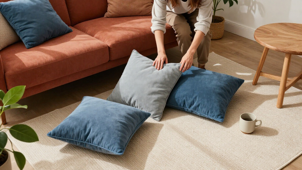
1. Add it through a patterned textile. Use Wild Fig in cushions, a throw, curtains or a rug to bring the color into a room without making it the dominant feature. This fits Whimsical Wonder, where IKEA groups florals, stripes, plaids and varied textures. Choose one or two patterns that share a color or scale, then let other surfaces remain simpler so the layering feels deliberate.
2. Pair it with warm wood and metal. In The New Nostalgia, IKEA points to midcentury silhouettes, mixed wood and metal finishes, geometric patterns and warm 1970s-inspired colors. A Wild Fig accent beside wood furniture and a metal lamp could echo that direction. The shade can provide depth in a print or accessory rather than covering every wall or large surface.
3. Use it as a counterpoint to brighter colors. Color Block Party embraces more energetic combinations. Stark told Hunker that Wild Fig, though more traditional, can take on a modern feel when paired with fun colors. For a measured version, start with a small burgundy object or textile beside a brighter accent, then adjust the balance to the room. IKEA’s description does not specify a single required color pairing.
4. Bring warmth to a restrained room. Mindful Minimalism in the guide is not limited to white and beige: it includes soft color, curated objects and a possible burst of Wild Fig. A small accent against a quieter palette can add visual weight without changing the room’s overall character. Repeating the shade once elsewhere, such as in a book cover or patterned cushion, can help the detail feel connected.
5. Let it anchor a personal mix. IKEA describes its 2027 direction as open to personal expression and experimentation. Use Wild Fig as a link among objects already in a room—perhaps a floral print, a vintage-inspired piece and a contrasting modern accent—rather than trying to reproduce a complete showroom look. The guide’s four aesthetics suggest different routes into the color, so homeowners can choose one or borrow details from more than one.
These are styling options, not prescriptive advice. The retailer has not said that every room needs the color, and its trend forecasts do not establish what will become broadly popular. For readers, the useful takeaway is that Wild Fig can be tested in small, reversible ways before being used on larger surfaces.
Products Worth Considering

Ring Battery Doorbell (2nd Gen) and Floodlight Cam Plus Wired Bundle

Sonos Era 100 Wireless Smart Speaker with Alexa, Black

Dyson Airstrait Styling Brush
As an affiliate, we earn on qualifying purchases.
How IKEA Developed the 2027 Palette
IKEA says its annual Life at Home survey informs its Color of the Year and Style Guide trends. The survey examines how people relate to their homes and changing circumstances. In describing this year’s findings, the company highlights a desire for a home that feels stable and comforting. The guide uses terms including stability, community and comfort-focused living to describe the broader mood behind its forecast.
Stark told Hunker that IKEA sees people becoming more willing to experiment with color and express themselves at home. She also described the company as Scandinavian and said it has embraced bold color. Against that background, Wild Fig is intended to combine an earthy, nature-inspired feel with a stronger visual presence. The Style Guide then places the color in four distinct aesthetics, from nostalgic and patterned rooms to quieter, more minimal settings.
“It really was derived from nature… looking at florals and things like berries.”
— Abbey Stark, IKEA Home Furnishing Direction Leader, speaking to Hunker
What the Color Forecast Cannot Confirm
IKEA’s announcement establishes Wild Fig as its own 2027 Color of the Year and explains how it features in the retailer’s trend guide. It does not show that the shade is a universal preference, that it will dominate the wider home-design market or that every trend will become popular. The supplied announcement also does not provide survey figures or detailed methodology for the Life at Home findings, so readers cannot assess the size or distribution of the reported preferences from this information alone.
The guide describes possible looks rather than listing a fixed set of products, exact color pairings or room-by-room instructions. It remains unclear which IKEA items will use Wild Fig, when they will be available and whether the retailer will publish additional styling details.
Where to Find IKEA’s Styling Details
IKEA’s annual 2027 Style Guide is the next reference for how the company intends to develop Wild Fig across its four aesthetic stories. Shoppers looking to use the color can compare the guide’s examples with existing furnishings and begin with a small textile or accent. Further product availability and any additional rollout details were not included in the announcement described here.
Source: rss
Key Questions
What is IKEA’s 2027 Color of the Year?
Wild Fig, a muted burgundy with warm purple, red and brown undertones, is IKEA’s 2027 Color of the Year.
How does Wild Fig differ from IKEA’s previous picks?
IKEA describes Wild Fig as more earthy and subdued than Electric Blue, its 2025 pick, and Rebel Pink, its 2026 choice.
What are IKEA’s four interior trends for 2027?
The guide names The New Nostalgia, Color Block Party, Whimsical Wonder and Mindful Minimalism. Wild Fig appears in each aesthetic in a different way.
How can I try Wild Fig without repainting?
Start with a cushion, throw, curtain, rug or other small accent. Patterned textiles are one option in IKEA’s Whimsical Wonder direction, while a single accent can add warmth to a quieter room.
Does IKEA’s announcement say which products will come in Wild Fig?
The announcement describes the color and the Style Guide’s four trends, but does not specify which products will use Wild Fig or when they will be available.
Source: hunker.com