Imagine entering a room filled with soft, warm light. The shades of pink there spark joy and nostalgia. Pink isn’t just a color. It’s a memory, a reminder of happy times. It could remind you of childhood or make a bold fashion statement. Pink connects with us deeply, according to designer Patrick Mele. He says pink brings energy and life to any space. This shows that pink fits everyone’s taste. Here, we’ll look at how pink continues to be a timeless choice. We’ll find out which colors work best with pink to enhance our spaces. From gentle pastels to bold contrasts, let’s discover the ideal pink pairings for your style.
Key Takeaways
- Pink is increasingly popular in both fashion and home decor.
- Combining pink with white is a fashionable choice for spring and summer.
- Pink pairs well with gray, enhancing aesthetics in various settings.
- Lavender and pink create serene, feminine vibes.
- Understanding color combinations with pink opens avenues for creativity.
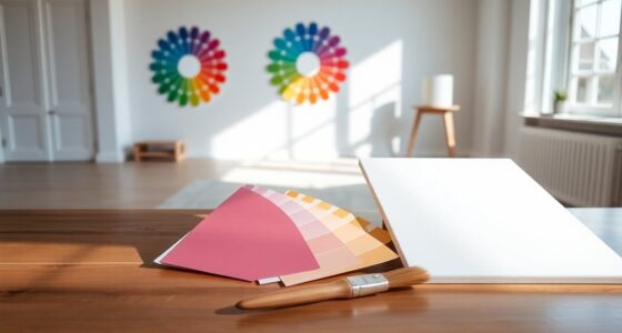
The Versatility of Pink in Design
Pink is not just about looks; it’s very versatile in design. When you’re decorating with pink at home or in fashion, it opens up many possibilities. It fits well with both old and new styles, helping you make a space that truly feels like yours.
There are many shades of pink to choose from. Light pastels or bright magentas can change a room’s feel or your outfit’s mood. For example, the ‘Rose Garden’ palette is perfect for spring and works well all day and night. The ‘Candy Floss’ palette brings energy to eco-friendly rooms.
In the digital world, pink also plays a big role. The ‘Pastel Dreams’ palette makes websites look modern and inviting. For events, ‘Berry Mix’ adds excitement with its beautiful shades. And ‘Neon Vibes’ pushes the envelope in marketing, appealing to those who love originality.
Pink reflects how styles are changing too. In the 2010s, Millennial Pink became a symbol of change and inclusivity, favored by the younger generation. Now, bold combos like hot pink and red are setting new trends in fashion.
| Palette Name | Application | Emotional Impact |
|---|---|---|
| Rose Garden | Fashion | Elegant Transition |
| Candy Floss | Interior Design | Uplifting Energy |
| Pastel Dreams | Web Design | Inviting Engagement |
| Berry Mix | Event Styling | Excitement |
| Neon Vibes | Marketing | Creativity |
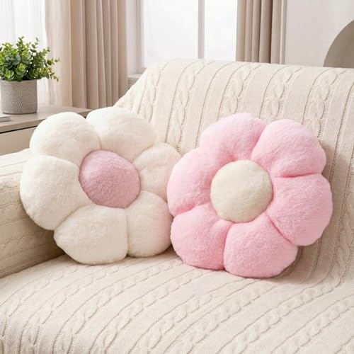
JZNEXD 2 Pcs Pink Throw Pillows Cute Flower Decorative Pillows for Bed
- Cute Daisy Flower Design: Realistically shaped and colorful
- Durable Zipper Closure: Secure and easy to remove
- Soft Plush Material: Warm and comfortable to touch
As an affiliate, we earn on qualifying purchases.
As an affiliate, we earn on qualifying purchases.
Why Pink is a Timeless Color
Pink has a unique spot in design, with a deep history of pink in design reaching back in time. It stands for joy and warmth, blending care and a modern look perfectly. Pink keeps being a top choice in fashion, interiors, and branding because of its flexibility.
Different pink shades offer different vibes. Brown-toned pinks are super easy to use, looking softer under any light. Peachy pinks give off a feminine flair, making any area more comforting. Grey-tinted pinks can seem almost lavender in low light, creating cool visual tricks as the lighting changes.

The iconic pink uses in many places show how flexible it is. Mixing shades can look great, especially with different textures. Stick to a 1:3 mix – one main pink to three other colors – to keep things in harmony without feeling too much.
Design pros suggest pairing pink with neutrals like beige or grey. Light pink with these tones creates gentle, pleasing changes while keeping things peaceful. Always test your paint colors first, to find the right mix of light and shadow.
To wrap up, pink’s timeless appeal is evident in its long history and standout uses. Its power to fit into many design areas shows why it’s loved across generations.
Best Colors That Complement Pink
Exploring colors that go with pink is key to improving your designs. Combining blush pink with slate blue gives a peaceful touch, often seen in cabinetry and decor. If you want contrast, pair bright pink with red-and-white striped furniture. It makes the space lively and fun.
Pink pairs well with earthy shades too. For example, the mix of rose with earth tones by Virginia Toledo and Jessica Geller adds both warmth and elegance. Pairing olive green and white with pink keeps things balanced. It lets pink stand out while maintaining harmony.
Pink’s flexibility shines in eclectic design. Atelier ND mixes eggplant, lavender, and light blue with pink for a vibrant color palette. Adding unique textures, like thin black beside light pink zellige tiles, highlights pink even more.
Pink offers dramatic contrasts as well. Imagine bubblegum pink with lemon yellow accents. This combination fills the room with cheer and energy. Pink and gray is another classic. It brings elegance and balance to modern design.
| Color Combination | Description |
|---|---|
| Blush Pink & Slate Blue | Creates a calming effect, ideal for cabinetry. |
| Pink & Red-White Stripes | Enhances contrast and visual interest. |
| Rose & Earth Tones | Brings unexpected warmth and sophistication. |
| Olive Green & White | Grounds the design while highlighting pink hues. |
| Eggplant, Lavender & Light Blue | Offers versatility and exciting color mixes. |
| Lemon Yellow & Bubblegum Pink | Injects vibrancy and energy into the room. |
| Pink & Gray | A timeless combination that exudes elegance. |

How to Create a Cozy Atmosphere with Pink
Adding cozy pink decor to your home can make it more relaxing and welcoming. Using warm pink tones can make any room feel more comfortable. Many people love having a cozy spot in their home.
To get a warm pink vibe, try these ideas:
- Layered Textiles: Mix soft throws, fluffy pillows, and velvet. These add depth and a pink for comfort feeling.
- Accent Pieces: Use different shades of pink in items like vases or art. They soften the room and make it welcoming.
- Lighting Considerations: Choose lights with a warm glow. These lights make the pink look softer, perfect for relaxing.
- Furniture Choices: Add furniture like blush chairs or light pink tables. They match well with the decor for a cozy feel.

These simple tips can create a warm and inviting space. Pink is versatile and works with many designs, making your home unique. Whether it’s your bedroom or living room, cozy pink decor can turn it into a cozy retreat.
Pink and Chocolate Brown: A Sweet Harmony
The pink and brown combination is a top pick for interior design. Its elegant mix offers a stylish vibe, ideal for creating a cozy atmosphere. Chocolate brown’s deep richness works well with pink’s softer tones, adding warmth and contrast.

To get this look right, try the 60-30-10 rule for color schemes. Use 60% chocolate brown to ground your space. Then, 30% soft pink for a touch of femininity and lightness. The final 10% should introduce an accent color to catch the eye.
“Colors are the smiles of nature.” – Leigh Hunt
There are several great palettes showing this mix works well:
| Palette Name | Colors Used | Best For |
|---|---|---|
| Sweet Mocha | Soft pink (#FFC0CB), Deep brown (#4B3D3A) | Wellness branding |
| Earthy Rose | Muted rose (#D19AAB), Deep brown (#8B4513), Soft pink (#F5E1E1) | Cozy makeovers |
| Blush & Cocoa | Soft pink (#FFC0CB), Deep brown (#5C4033) | Interior decor |
Adding different textures, like matte and glossy, to these colors makes your space more interesting. Test the palettes in various lights to see what looks best. This way, you can make welcoming areas that show off pink and brown’s warmth and harmony.
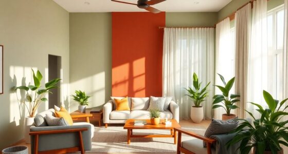
Creating Drama with Pink and Burnt Red
Bringing pink and burnt red together adds an exciting vibe to any space. This mix is a bold choice, immediately grabbing anyone’s focus. Pink and burnt red also bring warmth and depth, making places like bedrooms or studies feel welcoming.

Burnt red is cherished for its deep roots and connection to warmth. It is perfect for making spaces feel comfortable. It is believed in Feng Shui that a red bedroom can attract good fortune. Adding shades of pink balances the red’s intensity, creating a cozy setting. Light-filled rooms complement vermilion tones beautifully, enhancing the room’s overall feel.
- Utilize light pink with deep red for a playful contrast.
- Pair textured fabrics, such as velvets, to enhance the luxurious feel.
- Incorporate metallic elements for a touch of glamour alongside these bold color pairings.
The history of colors like vermilion shows the depth achieved in thoughtful design. A detailed color scheme can transform a room’s look. Using top-notch paints and wallpapers, like those from Farrow & Ball, makes your space stand out.
Bringing Vibrancy with Pink and Marigold Yellow
Pink and marigold yellow bring a lively energy to any room. They catch the eye and spread happiness all around. Think of gardens in full bloom, how these shades mirror nature’s beauty and add warmth and joy to your space.
To mix pink and marigold yellow in your place, use decor items in these colors. Dining chairs, table cloths, and pillows are perfect for this. The striking contrast makes any room welcoming and vibrant.
Adding different shades of pink and marigold adds depth. This colorful mix keeps people interested and makes your space feel lively. In shops and wellness areas, these bright colors lift spirits and help draw in customers.

Let the happiness of pink and marigold yellow guide your decorating. These colors create a positive environment. They make people want to gather and brighten daily life.
Soft Gray: A Sophisticated Pink Pairing
Soft gray and pink make a classy and flexible mix. This pink and gray pairing brings a perfect balance. It makes pink warmer with gray’s calm vibe. In design, soft gray is a stylish background that lets pink stand out without taking over.
Using Soft Gray in Kids’ Spaces
Soft gray looks great in kids’ rooms, offering a palette that grows with them. It changes from playful to mature designs smoothly. By adding gray for sophistication, you get a fun yet classy look. It works for both tiny tots and teens. Here are some ideas:
- Pale pink furniture with gray walls.
- Blush pink bedding with gray pillows and curtains.
- Pink art on a soft gray wall.
Contemporary Combinations for Modern Homes
The soft gray in decor adds elegance and freshness to modern homes. Try these ideas to mix this chic color scheme into your place:
- Gray cabinets and blush pink backsplash in kitchens.
- A pink sofa with gray chairs in the living room.
- Pink patterned wallpaper with gray interiors for wow effect.

Mixing in other colors like green and white with pink and gray gives a fresh look. This pink and gray mix is timeless and works with many design styles. The gray for sophistication stands out, showing why it’s still a favorite for its beauty and versatility.
| Room Type | Pink Element | Gray Element |
|---|---|---|
| Living Room | Pale pink sofa | Charcoal gray accent chairs |
| Children’s Room | Blush pink bedding | Soft gray walls |
| Kitchen | Blush pink backsplashes | Dark gray cabinetry |
| Bathroom | Millennial pink bath accessories | Light gray tiles |
Bold Statements: Pink and Emerald Combinations
Explore the rich blend of hot pink and emerald green. It’s a stunning mix that adds excitement to any room. From lounges to trendy bars, this daring decor idea brings an opulent feel. The deep emerald green and bright pink mix catches the eye, sparking creativity and boldness.
For a luxurious vibe, add fabrics and artworks in these amazing colors. Want to make pink and emerald green work in your space? Follow these tips:
- Choose a neutral backdrop to let the colors pop. Use a lot of white or grey, aiming for 70% neutral and 30% color.
- Bring in potted plants and hanging ferns for a natural look and clean air.
- Add unique accessories, like pink faucets or emerald green handles, to catch the eye and set your style.
- Artwork in pink and green pulls the room together. It makes the color theme look intentional.
- Pick towels and rugs in pink and emerald to keep the comfort and color harmony.
Embracing pink and emerald green means keeping up with trends that value being unique and creative. This fresh combo draws in young people, making it great for different spaces like bedrooms, kitchens, and closets.

Earthy Tones: The Pink and Olive Connection
The pink and olive color pairing makes rooms feel calm, perfect for places like bedrooms. It combines earthy tones, making spaces feel balanced and tranquil. This mixture looks good and brings peace to any area.
Olive green matches well with light pinks, suggesting a connection to nature. This mix makes areas warm and welcoming. By choosing earthy shades, a room with olive and pink touches becomes a relaxing retreat.

Olive drab is often seen in military gear, showing its versatility in design. It’s part of a shift towards natural color schemes in decor. Choosing pink and olive adds a friendly yet elegant touch to spaces.
Using pink and olive in your decorating can be both functional and cozy. This combo is becoming popular as people look for green and sustainable options. Layer these colors to make your spaces feel calming and inviting.
Juicy Complements: Pink and Orange
Mixing pink and orange creates a cheerful atmosphere, perfect for summer. This combo brings out joy and playfulness, ideal for lively decorations. It often results in a warm, peachy color known as coral.
The contrast between pink and orange sparks creativity in designs. Using more pink gives a soft coral shade. More orange, however, makes a bold tangerine tone that energizes spaces.
Pink varies from light to hot to dusty, pairing well with vibrant oranges. These shades create a fresh and harmonious blend. They make any space feel alive.
These colors boost the look and feel of your decor. Peach creates a welcoming vibe, while tangerine adds excitement. They are great for places like kitchens and playrooms where warmth is key.

| Color | Characteristics | Common Uses |
|---|---|---|
| Light Pink | Soft, delicate | Bedrooms, nurseries |
| Hot Pink | Vibrant, energetic | Party decor, feature walls |
| Peach | Warm, inviting | Living rooms, kitchens |
| Tangerine | Bright, cheerful | Outdoor spaces, summer events |
| Burgundy | Rich, sophisticated | Accent pieces, formal settings |
Layers of pink and orange add depth to decor. Two shades create a warm and cozy feel. Let sunlight enhance your space, making it a lively summer retreat.
Classic Design with Pink and Baby Blue
The pink and baby blue mix is famous for its comforting and calming effect. It brings a special charm to any room. This combo is perfect for making living areas and kids’ rooms lovely and peaceful.

Balance Between Feminine and Serene Tones
The mix of pink and baby blue is just right. It combines pink’s softness with the calm of baby blue. People love the cozy and welcoming feel it brings to spaces, making it a top pick for designers.
Many are updating their rooms with this mix. They explore different shades like navy and soft blue for a fresh look. This trend has caught on, with lots of people looking for home decor ideas that use these colors. The possibilities are endless for creating inviting rooms.
- Utilize pink and baby blue in soft furnishings for a cozy ambiance.
- Incorporate floral or patterned accents to enrich classic decor.
- Transform children’s spaces with playful touches and soothing palettes.
- Blend with warm neutrals for a balanced aesthetic.
Pink and baby blue are getting more popular in interior design. Design pros are using these colors more, thanks to their timeless beauty. It looks like this trend will stick around for a long time, keeping spaces feeling calm and inviting.
Unexpected Pairing: Pink and Lavender
Pink and lavender together make a space feel magical. Both colors help people feel calm, perfect for peaceful rooms. They work well in bedrooms or sitting areas, creating a relaxing vibe.
When these colors mix, they create a surprising yet lovely combination. They seem very different but look great together, making a room feel soft and romantic. Adding pink cushions or throws with lavender curtains can make the room more interesting and relaxing.
You can use these colors in many ways like on walls, in fabrics, or with accessories. Lavender comes in 11 different pairings, showing its flexibility to match with pink. Try various shades to find just the right look.

Mixing lavender and white can give off an Art Deco feel, while pink brings warmth. Lavender also goes well with beige, offering a new twist on classic neutrals. Combining these colors thoughtfully can freshen up your space and make it welcoming.
| Color Combination | Effect |
|---|---|
| Pink and Lavender | Soft romantic ambiance |
| Lavender and White | Art Deco elegance |
| Lavender and Beige | Fresh and balanced feel |
| Lavender and Gold | Classical and feminine touch |
| Lavender and Green | Comfort and trendiness |
Trying pink and lavender together can boost creativity in decorating. This combo leads to a calm and soothing decor. It helps create a place that’s both unique and cozy. Whether going light or bold, this color pair will enhance your home beautifully.
Creating a Cozy Lounge with Pink and Hazel
Pink and hazel make a warm, inviting mix for any lounge. This combo makes rooms cozy and welcoming. It’s perfect for cozy lounge ideas.
These warm colors create perfect retreats. Pink’s soft blush, paired with hazel’s earthy tones, makes lounges more appealing. It’s great for modern spaces and promotes relaxation.

Different shades of pink and hazel can inspire your design. Here are some ideas:
- Accent Walls: Paint one wall blush pink and the others in hazel for contrast.
- Textiles: Add soft pink throws and cushions to hazel furniture.
- Artwork: Select prints that feature both colors for extra interest.
Current trends favor muted colors in living rooms. Hazel’s earth tones balance pink’s liveliness well. This choice works for relaxing and socializing. By using these colors, your space will feel like home.
Mixing Hues: Pink and Peach for Warmth
Mixing pink and peach makes a space warm and welcoming. This combo fits perfectly in many designs, like home decor or branding. You can make your space look better by using different textures and finishes.
Choose soft or glossy materials to add fun or elegance. Pink and peach together make any area feel inviting.
Using Different Finishes for Depth
To make a place look warmer, try these ideas:
- Layering textures: Add plush pillows, soft blankets, and shiny curtains for depth and fun.
- Utilizing contrasting finishes: Mix matte and shiny looks, like a matte peach wall with shiny pink decorations.
- Incorporating diverse materials: Bring in wood, metal, and fabric in furniture and decor for a rich experience.
Pink and peach together bring happiness, making spaces feel good. They work well in homes and branding, bringing a calm but lively vibe. They’re also popular in fashion for warmer clothing colors.

| Color | Hex Code | Usage |
|---|---|---|
| Soft Pink | #FFB3C1 | Used prominently in home decor and branding. |
| Vibrant Coral | #FF6F61 | Great for creating focal points in design projects. |
| Peach Tone 1 | #FFB3A0 | Often paired with pink for warmth in marketing materials. |
| Peach Tone 2 | #F7D3B5 | Ideal for creating soft, inviting living spaces. |
Using pink and peach together makes any place feel like a cozy retreat. Putting these colors in different finishes can light up a space. This approach is great for personal and business projects alike.
Understanding the Colour Combination with Pink
When we study pink in color theory, we find it full of emotions. Pink is famous for symbolizing femininity and love. Yet, it plays a big role in design, too. From calming light pinks to exciting bright pinks, its range is key in color combos.
Using pink wisely in designs can lift your work. Soft pink with white makes things feel romantic. A bold mix of ultra pink and black looks modern. Colors like lime green add a fun pop against pink, pulling in the viewer’s eye.
Hot pink’s RGB is (255,105,180), and baby pink is (244,194,194). These shades impact designs a lot. Brands like Victoria’s Secret use pinks to shape their image.

Different cultures see pink differently. In the West, it’s often tied to femininity. But, some Asian cultures link it to good health. Knowing this can make your pink designs more impactful.
| Shade | Hex Code | RGB Value |
|---|---|---|
| Hot Pink | #FF69B4 | (255, 105, 180) |
| Baby Pink | #F4C2C2 | (244, 194, 194) |
| Rosy Pink | #E9967A | (233, 150, 122) |
| Nude Pink | #FFDAB9 | (255, 218, 185) |
| Bright Magenta | #FF00FF | (255, 0, 255) |
| Light Pink | #FFC0CB | (255, 192, 203) |
Adverts and brands use different pinks to stand out. As fashion welcomes pink for everyone, its use gets more creative. This changes old views on colors.
Conclusion
When we talk about pink color pairings, we see how important this bright color is in many designs. Think about your own choosing color schemes. Pink isn’t just for girls; it’s very flexible. It mixes well with white, black, grey, and green. This lets you create many styles, from modern to gothic. So, pink works well for any event.
Looking ahead to 2024, the 12 colors that go well with pink are becoming popular in fashion and home decor. We’re seeing new mixes, like pink and orange for summer, or soft pinks and lavenders for spring. This shows people like both bold and gentle colors. When you pick colors, use your style as a guide. Trying out different final thoughts on color combos can show you special mixes that show who you are.
Pink’s real magic is how it makes us feel—it brings out feelings of warmth and love. It’s getting more and more popular in design. This means you can feel good about using pink and its matching colors in your designs. Let the beauty of pink inspire you. Create spaces and clothes that show your style. Enjoy discovering all the ways you can use color.
FAQ
What are the best color pairings with pink?
White, gray, lavender, and emerald green go well with pink. Each color combo can set a different feel, making your space beautiful.
How does pink versatility apply in design?
Pink can fit into classic, modern, or eclectic design styles. It works great in home decor, fashion, or event styling, offering a pink shade for every taste.
Why is pink considered a timeless color in design?
Pink is often linked to feelings of warmth and happiness. It stays popular over time because it can adapt to changing trends.
How can I create a cozy atmosphere using pink?
Use soft fabrics, layered textiles, and accent pieces in pink for coziness. Warm pink shades make intimate spaces welcoming.
Can pink be paired with darker colors?
Yes, pink looks stunning with dark colors like chocolate brown and burnt red. This mix adds elegance and drama to any room.
What is the effect of combining pink and marigold yellow?
Pink and marigold yellow together brighten up spaces with lively energy. They remind people of sunny places and beautiful sunsets.
How does soft gray contribute to pink decor?
Soft gray calms down the pink, adding warmth and a structured look. This pairing is great for kid’s rooms and modern decor.
Why is the pairing of pink and olive green popular?
Pink and olive green offer a calm, natural look, perfect for making cozy places like bedrooms and reading corners.
What decor items work well with pink and orange combinations?
Accent pillows, wall colors, and table linens in pink and orange make a place lively, perfect for a fun summer atmosphere.
How can pink and lavender be used in design spaces?
Pink and lavender set up a calm area, great for bedrooms or quiet places. Choosing these colors for fabrics and decor helps relax while keeping things fresh.
What role does color theory play in designing with pink?
Color theory helps pick out colors that go well with pink, creating a balanced design. It guides in mixing colors smartly in different settings.