
Imagine walking into a room that truly feels like yours. A place that shows your style and dreams. The choice of color in a room is very important. It sets the mood, makes an atmosphere, and turns a house into your home. Looking ahead to 2025, let’s see what new interior paint colors we can look forward to. We’ll see everything from warm deep ruby reds to calming earthy tones. Each color tells a story in your space. Let’s dive into the paint trends of 2025. These trends could change your home and let your personal style shine with every paint stroke.
Key Takeaways
- Explore Benjamin Moore’s Cinnamon Slate as a combination of heathered plum and velvety brown.
- Discover the ongoing popularity of deeper shades such as Valspar’s Encore 8002 45-G.
- Consider the warmth of earthy tones like Truffle and Caramelized for inviting spaces.
- Warm neutrals are gaining traction, with Little Greene’s Mochi leading the way.
- Embrace bold colors like Glidden’s Purple Basil to express individuality in your home.
Introduction to 2025 Paint Trends
As 2025 nears, we see a shift in 2025 paint trends. This is exciting for anyone wanting to add personal touches to their home. These trends focus on warm, cozy colors that connect us to nature. This creates welcoming spaces. Expect earthy tones and moody colors to remain popular, offering fresh options for updating your home.
The interior design colors 2025 are getting brighter. The Colormix® Forecast shows this with key colors. White Snow SW 9541, for example, is super bright with a reflectance value of 90. Chartreuse SW 0073 is popping up everywhere, signaling vibrant trends. And Bosc Pear SW 6390 introduces lush, organic hues.
Mauve Finery SW 6282 leads the 2025 Color Capsule with its botanical beauty. Sunbleached SW 9585 is a flexible neutral that works well across many spaces. These trends aren’t just about color. They also embrace textures like limewash and Italian Plaster, perfect for cozy bedrooms and luxe bathrooms.
Learning about interior design colors 2025 sets the stage for a stylish and welcoming home makeover.

PRESTIGE Paints Interior Paint and Primer In One, 1-Gallon, Flat, Comparable Match of Benjamin Moore* Cinnamon 'N Spice*
Prestige Paints has created a comparable Color based on Color specifications of the original Color using industry leading…
As an affiliate, we earn on qualifying purchases.
As an affiliate, we earn on qualifying purchases.
Cinnamon Slate: The Color of the Year
Benjamin Moore has chosen Cinnamon Slate 2113-40 as the 2025 Color of the Year. This unique color combines the shades of weathered plum and rich brown. It’s perfect for many styles, used as an accent or for a full makeover.
The 2025 color trends include Cinnamon Slate and nine other complementary colors. You’ll find colors like Sea Salt CSP-95, Tissue Pink 1163, and Stained Glass CSP-685. These colors inspire creativity in decorating, letting you mix and match for the right look.
Think about the impact of Cinnamon Slate in your space. Pair it with Glacier White OC-37 on wainscoting for stunning contrast. This beautiful color makes any room modern and welcoming.


Magnolia Home by Joanna Gaines Classic Interior Wall, Ceiling, Trim Paint and Primer, Eggshell Finish, 1 Gallon – SILVERADO SAGE
DURABLE FINISH: Ensures a long-lasting finish that stands the test of time. Ideal for interior walls, ceilings, bedrooms,…
As an affiliate, we earn on qualifying purchases.
As an affiliate, we earn on qualifying purchases.
Color Trends 2025 Palette
The color trends for 2025 bring a variety of welcoming shades. These colors make your living spaces flow together effortlessly. You’ll spot colors like Cinnamon Slate, Rosepine, Ashwood Moss, Tissue Pink, and Chowning’s Tan. Each color has special undertones that highlight the decor and mood of any room. The chosen colors for 2025 aim to create a cozy, comfortable, and adaptable environment.
Key Hues to Explore
Check out these eye-catching colors:
- Cinnamon Slate 2113-40: A comforting mix of plum and brown. It’s perfect as a strong focal point.
- Rosepine 461: A fun pink that lights up a room, great for accent walls.
- Ashwood Moss 1484: A soft green that brings peace and calm.
- Tissue Pink 1163: A warm, tender color that welcomes everyone.
- Chowning’s Tan CW-195: A cozy neutral that sets a comfy mood.
How to Use These Colors in Your Home
Here are some tips for using the 2025 color trends at home:
- Create a matching look by using different shades from the palette.
- Mix different colors for a lively effect. For example, match Cinnamon Slate with lighter colors like Tissue Pink for a vibrant feel.
- These colors are perfect for small rooms. They make areas like powder rooms or guest bedrooms feel comfy without cramping the style.
- Include these colors in various parts of your decor. Try them on walls, ceilings, or as accent details.
Don’t miss out on this year’s beautiful color selections. Also, check out deals for paint samples. Find your inspiration with the BEHR® 2025 Color Trends Palette. It offers 16 captivating shades for you to discover. Let these 2025 color trends inspire your creative side.

| Color Name | Hex Code | Description |
|---|---|---|
| Cinnamon Slate | #A74C4D | A rich blend of heathered plum and velvety brown. |
| Rosepine | #D8B7C4 | A playful and cheerful pink. |
| Ashwood Moss | #A5B79A | A calming muted green. |
| Tissue Pink | #EAB8C7 | A soft hue evoking warmth and comfort. |
| Chowning’s Tan | #C9B59A | A warm tan ideal for creating cozy spaces. |
EVOLVE Interior Paint & Primer, Eggshell (Ivy Green), 1 Gallon – One-Coat Coverage, Excellent Hide, Low VOC, Low Odor, Washable Paint for Walls, Doors & Trim
PAINT + PRIMER IN ONE: Evolve’s paint-and-primer formula helps you get great coverage from the start, sealing your…
As an affiliate, we earn on qualifying purchases.
As an affiliate, we earn on qualifying purchases.
Moody Paint Colors on the Rise
The trend of moody paint colors is becoming more popular as 2025 nears. These colors add a deep, rich vibe, making any space look dramatic. They are perfect for making dining areas or lounges feel cozy and welcoming.
Creating Dramatic Spaces
Adding moody paint colors to your home can make any room look better. Choose deep, warm colors to make spaces feel intimate. For example, Hot Cocoa by Sherwin-Williams, a chocolatey-mauve, gives a cozy yet elegant feeling. These colors are great for places where you relax or hang out with friends, especially in a bold dramatic interior design 2025 plan.
Popular Moody Shades
- Deep Purple: Dark plum shades are now a hit in bedrooms and lounges.
- Pitch Black by Farrow & Ball: Works well in both bright and cozy rooms.
- Mossy Gold: A rich mix of green, gold, and brown, great for different uses.
- Berry tones: Reds like garnet and wine are popular for their warm, dramatic vibe.
- Light Green shades: These nature-inspired colors add peace to any space.
- Creamy White: Sherwin-Williams’ Shoji White brings warmth and richness.

There’s a shift in interior design towards warm, moody colors, moving away from cool, minimalist ones. Pick these rich, inviting colors to show off your style and personality. With moody colors leading the trend, 2025 looks to be a year full of creativity.

Wall Textured Paint, Cover up Wall Surface Defects (White)
Rich Textures: Comes with a dedicated texture roller, eliminating the need for other tools. Easily create unique artistic…
As an affiliate, we earn on qualifying purchases.
As an affiliate, we earn on qualifying purchases.
Earthy Hues Continue Their Popularity
Many people love earthy paint colors because they feel warm and comfy. Looking into 2025, we will see more natural tones like soft browns, muted greens, and light stone colors. These colors make our homes feel calm and cozy.
The Allure of Natural Tones
Earthy tones are getting popular as they make spaces feel safe and close to nature. Designers see a shift towards warm neutrals and rich tones. This change shows a love for colors that make us feel snug.
Integrating Earthy Hues in Modern Design
Adding earthy colors to your home is easy and can change its look. You can paint accent walls with these tones. Combine these colors with furniture and art that have a natural vibe. Here are some ideas:
- Create a statement wall with a rich chocolate brown or deep terracotta.
- Choose muted green furniture with soft beige walls for a nice feel.
- Use color blocking to separate areas with different earthy tones.

In 2025, we’ll see lots of earthy tones, from light beiges to dark browns. These colors make spaces look nice and give us a peaceful place to relax.
| Color Example | Hex Code | Suggested Use |
|---|---|---|
| Soft Beige | #F5F5DC | Walls or ceilings |
| Muted Green | #A8B400 | Furniture or accents |
| Dusty Terracotta | #C77B50 | Accent walls |
| Deep Brown | #7B3F00 | Furniture or flooring |
These earthy colors will make your home feel natural. Whether you pick bold or soft shades, they’ll bring nature into your space.
Green Is Queen: A Lasting Trend
Looking ahead to 2025, green paint colors are staying on top in interior design. These shades bring a fresh, natural feel, ideal for today’s homes. People love these lively, earthy colors because they make both inside and outside spaces look great.
Shades of Green to Consider
In 2025, a few green hues are especially popular for their style and charm. Let’s look at some colors that can make your home more beautiful:
- Eucalyptus – This gentle green gives any room a peaceful vibe.
- Olive – Olive green is deep and classy, great for cabinets and walls.
- Dill Green – Bright and loved by all, dill green is a top pick.
- Mint – Mint green adds light and a soothing feel to spaces.
These green colors not only connect with nature but also mix well with different colors and textures. Adding these trendy green hues to your home will keep it fashionable and timeless.

Pretty In Pink: A Shift in Popularity
In 2025, we will see more pink paint colors, especially subtle ones. These light pinks are great neutrals. They add warmth and allow for many design ideas. Adding these pinks to your home makes it welcoming but not too bold.
Subtle Pinks and Mauves as Neutrals
Designers are choosing soft pinks and mauves more often for elegant colors. These colors work well with many styles. Let’s talk about ways to use these beautiful shades:
- Accent Walls: Use dusty rose or blush pink for an accent wall for a gentle highlight.
- Pairing with Jewel Tones: Match mauve with rich jewel tones for a deluxe look.
- Textiles and Accessories: Add pink tones with cushions, curtains, or art to refresh your room.
Deeper, more detailed pinks are becoming popular to enhance home design. Colors like Farrow & Ball’s Peignoir or Paint & Paper Library’s Plaster V create comfy and stylish spaces. The new trend for neutral pinks in 2025 offers a fun way to try out these shades.

| Color Name | Type | Characteristics |
|---|---|---|
| Peignoir | Mauve | Cozy warmth with sophisticated undertones |
| Plaster V | Dusty Rose | Mid-tone sophistication |
| Blush Pink | Soft Pink | Light and airy ambiance |
| Terracotta | Peachy Pink | Bold warmth, ranges from burnt orange to peach |
Complementary Colors for Unique Spaces
Using complementary paint colors can make your indoor spaces look amazing. They create a balance and catch the eye. For 2025, think about how colors like deep greens and soft pinks can look together. They’re not just nice to look at but also make your room feel better.
Try mixing olive with blush tones for a peaceful feeling. This is great for living rooms or bedrooms. When you’re planning your space, use these colors to pick out fabrics and furniture. Look at colors like Truffle Brown and Mauve Finery. They add deep shades without making the room feel too busy.

Check out this table for color ideas that could inspire your next project:
| Primary Color | Complementary Color | Recommended Space |
|---|---|---|
| Deep Green | Soft Pink | Living Room |
| Olive | Blush | Bedroom |
| Dusty Blue | Chartreuse | Kitchen |
| Eggplant Purple | Golden Yellow | Office |
| Dusty Red | Cream | Dining Room |
These color mix suggestions for 2025 will help you create cozy places. Using complementary colors lets you make spaces that are both beautiful and balanced. This reflects your personal style.
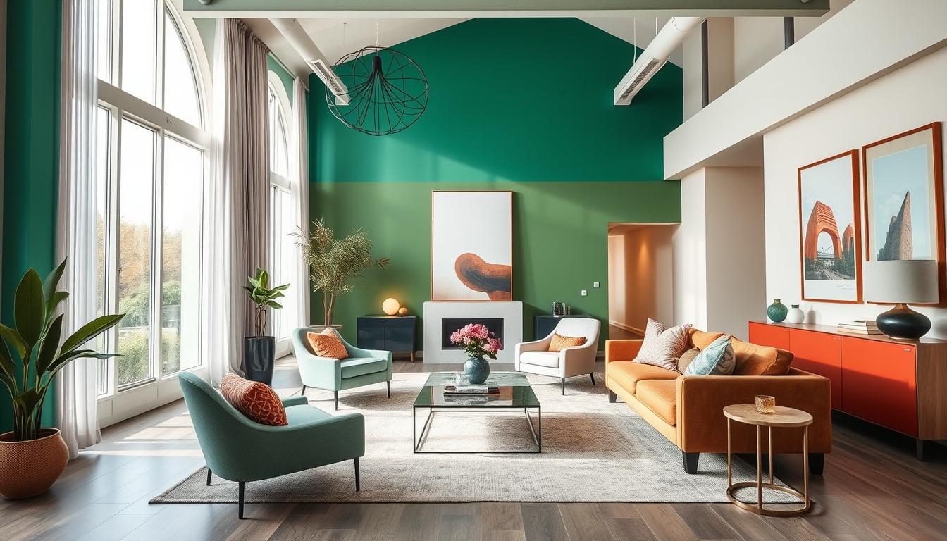
Color-Drenched Spaces Make A Statement
Bold interior design trends for 2025 highlight the power of color-drenched spaces. Using vibrant colors on multiple surfaces changes your home’s feel. It looks stunning and changes how you feel inside the space.
Incorporating Vibrant Colors
Color drenching is becoming popular. It means using one color on many surfaces to make the room seem bigger. This method adds emotional depth. For instance, deep berry colors can make any room pop.
Choosing your colors is key. Deep tones can make spaces cozy, while lighter ones can make them seem bigger. Color washing adds to this effect, too.
- Calming colors like blues and greens are great for bedrooms and offices.
- Energizing colors like reds and yellows are perfect for spaces like living rooms or kitchens.
The Sherwin-Williams Paint Color Palette for 2025 offers many options for color-drenching. Mixing paint finishes can add depth and texture to your design.
Explore creative uses of colors. Bright colors can make kids’ rooms fun. Sage green in bedrooms can be soothing. Bold colors in entryways make them welcoming.
Double drenching uses different shades of the same color for a unified look. It creates a stylish look without relying on white ceilings or baseboards.

Color drenching is leading to bold, creative designs. Mixing patterns, textures, and colors lets your style shine. Every room can make a statement.
Women’s Touch: Feminine and Fresh Colors
Feminine paint colors are becoming popular in the decor world as 2025 approaches. They bring a new, soft elegance, updating what we think of as feminine. These 2025 design shades not only make your space more lively but also cozy and full of charm.
Classic Colors with a Modern Twist
The latest trends mix timeless elegance with modern style in various colors:
- Soft Lavenders: These calm shades are great for a peaceful bedroom vibe.
- Updated Pinks: A fresh version of pink that adds energy, ideal for living spaces and kids’ rooms.
- Ochres: Warm and sophisticated, ochres are great against neutral settings.

These shades match well with skin tones, soft pastels, and eco greens seen in Spring and Summer 2025 fashion. This trend aims for inclusivity in decor, making spaces feel welcoming and good for your mental health.
Experts suggest mixing these feminine colors with stronger ones for a balanced and timeless feel. Adding these fresh design trends from 2025 can brighten up your place. It also helps connect with nature and bring soothing vibes into your home.
Warmth in Interior Design: Top Color Choices
The interior design scene for 2025 is embracing warm colors. As minimalism becomes less popular, rich and inviting tones are in. These tones make spaces feel cozy and welcoming.
Deep Burgundy is a top pick, known for its warmth and elegance. Mocha Mousse, the Color of the Year, adds a soft brown touch that invites warmth. Moody purples like plum are also becoming popular, bringing depth to any room.
Earthy colors like olive, ochre, and burnt red are also big in 2025. They connect us to nature and create calming environments. Pairing them with warm neutrals like Sherwin-Williams’ Bosc Pear or Benjamin Moore’s Rosepine meets modern design needs.
The trend of “color drenching” is getting popular too. It involves using matching shades on walls and furniture to increase warmth and coziness.

Top paint brands are showcasing colors that fit this comfy, homey style. STAINMASTER’s Truffle and Behr’s Rumors are among the warm hues available. Even rich navy blues like Valspar’s Encore can make a room feel restful.
Looking ahead to 2025, consider how warm colors can make your home more inviting. These colors add layers of comfort to your living spaces. By choosing warmer tones, you make your space not just beautiful, but also a real haven.
Subtle and Sophisticated Color Options
In the interior design world, subtle paint colors are now more popular. They bring elegance and a calm vibe. Looking ahead to 2025, we see colors like soft blush and nude standing out. They add warmth and sophistication, perfect for different areas.
The Power of Blush and Nude Hues
Adding blush and nude colors to your home can make it feel like a sophisticated retreat. They’re great as backgrounds, making bold decor stand out more. Here are some ideas to try:
- Accent walls in blush create a warm focal point, ideal for living rooms.
- Nude shades in bedrooms can invoke peacefulness, enhancing relaxation.
- Blush tones combined with gold accents can add a touch of glam while maintaining softness.

Using these subtle colors, you can make your spaces welcoming and stylish. With the 2025 trend for sophisticated neutrals growing, choosing these colors lets you create places that reflect your style and life.
Popular Shades of Blue for 2025
In 2025, different blues will be big in interior design. Deep denim and light tranquil blues will be everywhere. These colors bring peace and spark creativity, perfect for home offices and chill spots.
Integrating Blue into Your Space
Add blue to your 2025 design to make your home look amazing. Here’s how to bring these beautiful blues inside:
- Accent Walls: A bold blue accent wall can be an eye-catcher.
- Complementary Decor: Mix blue with neutral furniture for a welcoming vibe.
- Mix and Match: Use various blue shades for more interest.
- Soft Textiles: Pillows, curtains, or rugs in blue let you try out the color easily.
Dusty blues and calm shades are in trend, making spaces feel fresh and welcoming. Blue fits many styles, from modern to rustic.

Conclusion
In 2025, paint trends are shaping up to make your home reflect your unique style and the latest in design. The trending colors include earthy tones, bright shades, and gentle pastels. They suit different tastes and help make welcoming environments for every home.
Colors like Wellspring and Kindred bring the outside into your home, drawing on nature and togetherness. Studies show over 70% of homeowners love natural shades. These colors make spaces look good and work well. More people are also trying bold colors to show who they are.
Choosing these colors will do more than just change how your home looks. It ties into big ideas like caring for the planet and making sure we feel good. By picking these trends for your place, you’ll create a spot that’s not just nice to look at but also makes you happy, offering a cozy retreat that’s all yours.