

When evaluating a designer’s portfolio and style, focus on how they use typography and color to create visual hierarchy, readability, and mood. Look for consistency in font choices, effective use of contrast, and harmony in their color palettes. Assess if their style adapts across different projects, showcasing versatility and technical skill. If you continue exploring, you’ll discover how to identify a designer’s conceptual approach and creative problem-solving abilities to find the perfect match for your needs.
Key Takeaways
- Assess consistency in typography choices, font pairing, and spacing to gauge attention to detail and foundational design skills.
- Examine color palettes for harmony, contrast, and alignment with the project’s mood or brand identity.
- Analyze how typography and color work together to create a cohesive, intentional visual style.
- Evaluate the designer’s adaptability across diverse projects, styles, and client needs.
- Consider technical proficiency and creative intuition demonstrated through element choices and overall presentation.
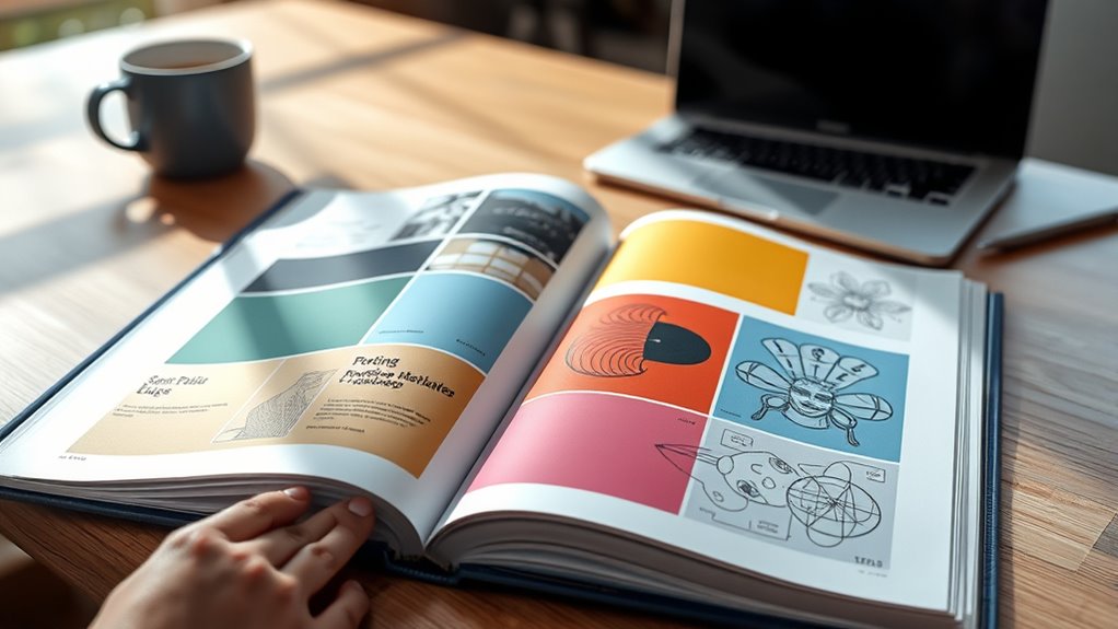
When evaluating a designer’s portfolio, you’re essentially evaluating their skills, creativity, and ability to solve problems through their work. One of the first things to notice is how they handle typography. Typography analysis reveals much about their understanding of visual hierarchy, readability, and mood. Do they choose fonts that complement the message? Are the font sizes and spacing consistent and effective? A well-crafted typography approach demonstrates their grasp of clarity and aesthetic balance. Pay attention to how they pair fonts, use italics or bold, and whether the typography enhances or detracts from the overall design. If the typography feels haphazard or inconsistent, it might indicate a lack of attention to detail or foundational knowledge. Conversely, thoughtful typography choices often signal a strong sense of visual storytelling and user experience. Additionally, observe how their typography choices reflect their awareness of relationships and emotional impact within their designs. Next, focus on the color palette assessment. Colors evoke emotion and set the tone of a project, so observe how the designer selects and applies colors across different pieces. Are the color combinations harmonious, or do they clash? Do they use a limited palette effectively to create emphasis and guide the viewer’s eye? Notice whether the colors align with the brand or project goals—whether they communicate professionalism, playfulness, sophistication, or energy. A good designer understands color theory principles, such as contrast, complementarity, and mood. Their palette should support the message without overwhelming the viewer. An inconsistent or poorly chosen color scheme might suggest a lack of understanding of visual harmony or target audience needs. As you examine the portfolio, consider how typography and color choices work together to create a cohesive look. They should complement each other and reinforce the overall style, whether minimalistic, bold, elegant, or experimental. A strong portfolio displays a deliberate, thoughtful approach to these elements, not just random selections. Also, look for variety—can they adapt their style to different projects? Or do they rely on a single aesthetic? Versatility is a key indicator of a skilled designer capable of solving diverse visual challenges. Ultimately, your goal is to see if their technical skills and creative intuition align with your project needs. By carefully analyzing typography and color palette choices, you’ll gain insight into their design process, attention to detail, and ability to craft compelling, effective visuals that resonate with their audience.

CorelDRAW 2025 USER GUIDE: Master Vector Design, Layout, Typography, and Creative Tools for Professional-Quality Graphics and Illustrations
As an affiliate, we earn on qualifying purchases.
As an affiliate, we earn on qualifying purchases.
Frequently Asked Questions
How Can I Assess a Designer’s Adaptability to Different Brands?
You can assess a designer’s adaptability by examining their work across various brands to see if they maintain brand consistency while demonstrating style evolution. Look for how they tailor their designs to different audiences and brand identities, showing flexibility without losing core elements. A versatile designer adapts seamlessly, balancing originality with brand requirements, which indicates they can handle diverse projects and evolve their style to meet evolving brand needs.
What Should I Look for in a Designer’s Process Documentation?
When reviewing a designer’s process documentation, look for clarity and detail in their creative process. For example, a case study might show sketches evolving into final designs, illustrating their problem-solving steps. Good project documentation should include sketches, iterations, and reasoning behind design choices. This helps you understand how they approach challenges and verify their process aligns with your project needs, giving you confidence in their method.
How Important Is Client Feedback in Evaluating a Portfolio?
Client feedback is vital when evaluating a designer’s portfolio because it shows how well they respond to client needs and adapt their style. Look for client testimonials that highlight their satisfaction and the feedback impact on project outcomes. This gives you insight into their professionalism, communication skills, and ability to incorporate suggestions, ensuring you choose someone who values collaboration and delivers results that meet your expectations.
Can a Diverse Style Indicate Versatility or Lack of Focus?
A diverse style can show versatility, but it may also suggest a lack of focus if there’s no clear style consistency. If you notice a designer easily adapts across niches, it highlights their flexibility. However, if their work jumps between very different styles without a cohesive thread, it might indicate they lack niche specialization. Consider your project needs to decide if a broad or focused portfolio aligns better with your goals.
How Do I Determine if a Designer’s Style Aligns With My Project Goals?
To determine if a designer’s style aligns with your project goals, look for visual consistency in their work that matches your desired aesthetic. Review their portfolio for examples of stylistic evolution, showing they adapt to different needs without losing their core identity. If their style complements your brand’s voice and vision, they’re likely a good fit. Trust your instincts and make certain their approach supports your project’s objectives effectively.

Color Palette Generator
Generate and manage beautiful color
As an affiliate, we earn on qualifying purchases.
As an affiliate, we earn on qualifying purchases.
Conclusion
Remember, reviewing a designer’s portfolio is about more than just aesthetics—look for consistency, creativity, and problem-solving skills. Did you know that 78% of employers prioritize a candidate’s portfolio over resumes? This highlights how vital a well-crafted portfolio is in showcasing your style and abilities. Trust your instincts, but also consider how their work aligns with your project needs. With the right evaluation, you’ll find a designer whose style truly fits your vision.

GENIUS PRO Art Portfolio With an Elegant Design, Folder for Artworks, Adjustable, Padded Shoulder Strap, Art Portfolio Case, Bright Color Impact, Artists Loft Studio
[THE ARTICLE HAS] In Genius Pro Our art portfolio bag has an adjustable padded shoulder strap to facilitate…
As an affiliate, we earn on qualifying purchases.
As an affiliate, we earn on qualifying purchases.

C-Thru B-85 2" x 18" Beveled Plastic Graph Ruler – Clear, Precise & Durable Measuring Tool for Drafting, Sewing, & Crafts
Clear & Precise Measurements – Transparent plastic design ensures easy readability, perfect for drafting, drawing, and crafting.
As an affiliate, we earn on qualifying purchases.
As an affiliate, we earn on qualifying purchases.