
To master color drenching, pick a single hue that reflects the mood you want to create, considering color psychology. Use this color across walls, ceilings, and trim for a cohesive look, ensuring consistent application for visual harmony. Play with different finishes like matte, satin, or gloss to add depth and interest. When done right, this technique produces a stunning, unified space. Keep exploring to uncover tips for perfecting your color drenching style.
Key Takeaways
- Choose a single hue that aligns with the desired mood and complements your overall design theme.
- Apply the same core color consistently on walls, ceilings, and trim to create visual unity.
- Use different paint finishes—matte for walls, semi-gloss for trim—to add subtle depth and interest.
- Consider color psychology to select hues that evoke the desired emotions and atmosphere.
- Maintain precision and harmony in application to achieve a balanced, cohesive look throughout the space.
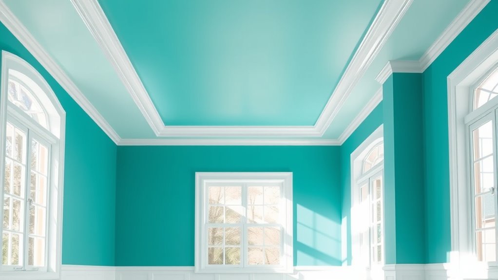
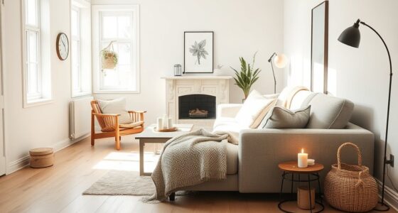
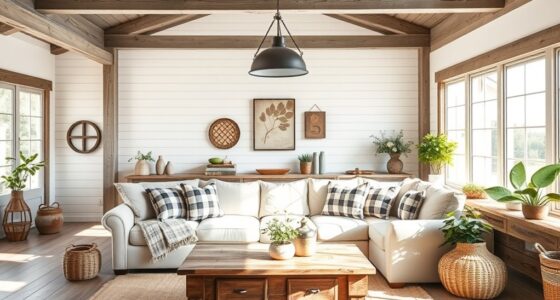
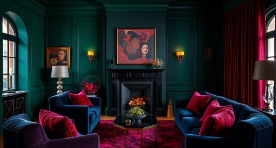
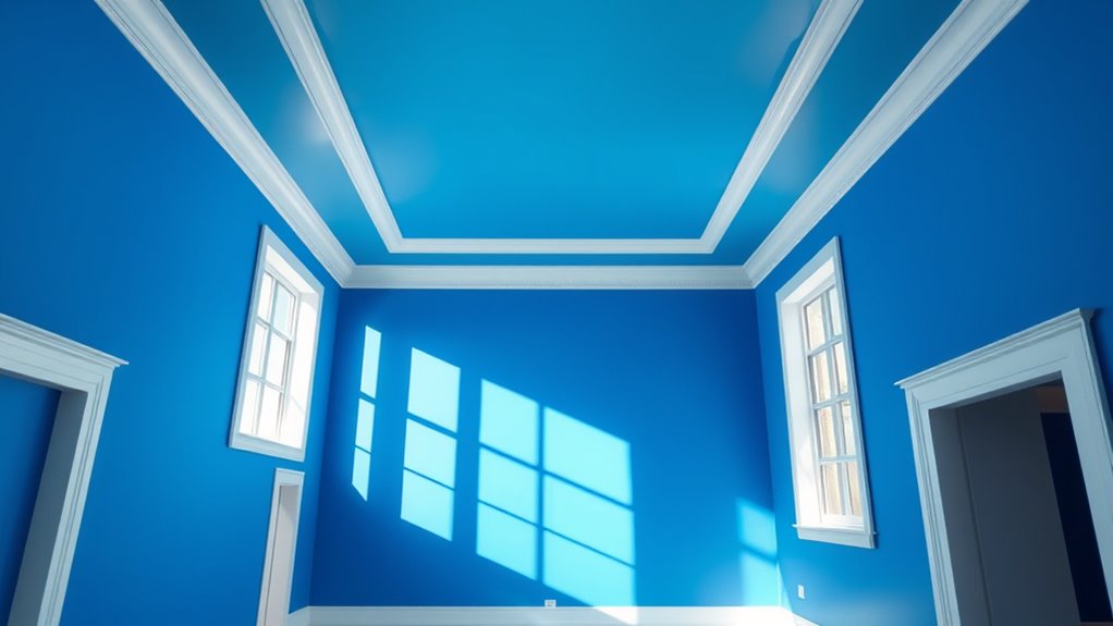
Have you ever wondered how to achieve vibrant, even color on your plants or hair? When it comes to transforming a space with color, understanding how to use one hue consistently across walls, ceilings, and trim can create a stunning, cohesive look. This technique, known as color drenching, relies on your mastery of color psychology and paint finish options to produce a balanced, harmonious environment. By choosing the right shade and finish, you can evoke specific moods while maintaining visual unity.
First, consider the impact of color psychology. Different hues influence emotions and perceptions—blue can promote calmness, red energizes, and green fosters tranquility. When you’re selecting your color, think about the atmosphere you want to create. Using a single hue across multiple surfaces amplifies these effects and ensures a seamless flow from wall to ceiling to trim. For instance, a soft blue with a matte finish on walls paired with semi-gloss trim can evoke serenity, making the space feel open yet cozy. It’s essential to choose a color that resonates with the mood you want to establish, as consistency in hue helps reinforce that feeling throughout the room.
Choosing a single hue with varied finishes creates harmony and mood in your space.
Next, pay attention to paint finish options. Each finish offers a different look and durability, influencing how the color appears and how easy it is to maintain. Flat or matte finishes absorb light, giving walls a smooth, velvety appearance that minimizes imperfections. Satin and semi-gloss finishes reflect more light, making colors appear brighter and more vibrant—perfect for trim and ceilings where you want a bit of sheen. Glossy finishes, although more reflective and eye-catching, tend to highlight surface imperfections and are best used sparingly. When drenching a space in one hue, it’s common to apply a matte or eggshell finish on the walls for a soft background, with semi-gloss or satin on the trim and ceiling to add contrast and interest. This variation in finishes not only enhances the color but also adds depth and dimension to your design.
In practice, start by choosing your core color based on the mood you want to evoke, then select the appropriate finish for each surface. Use consistent color tone across walls, ceilings, and trim, but vary the finish to create subtle distinctions. This approach ensures your space feels unified yet dynamic. Additionally, understanding how color consistency influences visual perception can help you achieve a more balanced and harmonious result. Remember, the key to successful color drenching lies in precision and harmony. When you understand how color psychology influences perception and how different paint finishes can enhance or soften your chosen hue, you’re better equipped to craft a room that’s both visually striking and emotionally resonant.

Country Chic Paint Color Card – 50 Furniture Paint Color Swatches
Paint Swatch Card: our paint color card helps you pick the best paint color for your next DIY…
As an affiliate, we earn on qualifying purchases.
As an affiliate, we earn on qualifying purchases.
Frequently Asked Questions
How Do I Choose the Right Hue for Color Drenching?
To choose the right hue for color drenching, consider hue harmony and color psychology. Pick a hue that complements your space’s mood and existing decor, ensuring it creates a cohesive look. Think about how the color influences emotions—calming blues or energizing reds. Test samples on your walls, observe how they change with light, and select a shade that feels right, enhancing your room’s overall vibe.
Can I Mix Different Shades Within the Same Color Family?
Yes, you can mix different shades within the same color family to create shade variation and add visual interest. To maintain color harmony, choose shades that complement each other and have similar undertones. Experiment with subtle differences to avoid overwhelming the space. This approach brings depth and dimension to your walls, ceilings, and trim, making your color drenching project more dynamic and cohesive.
What Are Common Mistakes to Avoid When Color Drenching?
When color drenching, avoid common mistakes like neglecting to tape edges properly, which can cause color bleeding. Make sure to apply even coats to prevent uneven coverage, especially on large surfaces. Don’t rush the process; patience guarantees better blending and a smooth finish. Also, test your color in a small area first, so you catch any issues with bleeding or unevenness before committing to the entire space.
How Does Lighting Affect the Appearance of the Drench Color?
Lighting effects markedly influence how your drench color appears. Bright, natural light enhances color perception, making hues seem more vibrant and true to their shade. In contrast, dim or artificial lighting can dull or alter the color, sometimes creating unexpected undertones. To achieve your desired look, test your drench under different lighting conditions and adjust your choices accordingly, ensuring the color remains consistent and appealing throughout your space.
Is Color Drenching Suitable for Small or Large Rooms?
Color drenching works well in large rooms because it creates a bold, immersive look that enhances spatial impact and design harmony. In small spaces, it can feel overwhelming or cramped if not balanced properly. Consider your room size and lighting when choosing a drench hue, and use accents or lighter shades to maintain a sense of openness. This technique truly shines when you want a dramatic, cohesive environment.

1/2 pt Minwax 24444 Clear Polycrylic Water-Based Protective Finish Semi-Gloss
PROTECT WOOD SURFACES – Minwax Polycrylic Protective Finish protects and adds beauty to your interior wood projects, including…
As an affiliate, we earn on qualifying purchases.
As an affiliate, we earn on qualifying purchases.
Conclusion
Now that you know how to master color drenching, your space transforms into a vibrant canvas of emotion and personality. Think of your chosen hue as a whisper of your soul, wrapping every wall, ceiling, and trim in a harmonious embrace. With each brushstroke, you’re not just painting a room—you’re creating a sanctuary where color sings, comfort resides, and your unique spirit shines through. Let your walls tell your story in shades of your heart.

DVBOCS A Little Spot And Color Psychology Poster Kid Educational Canvas Print Painting Emotional Management Mental Health Wall Art Decor For Office School Classroom Bedroom Decor 12x16in Unframed
Color Psychology Integration: This unique canvas print leverages the principles of color psychology to engage young minds, making…
As an affiliate, we earn on qualifying purchases.
As an affiliate, we earn on qualifying purchases.
AmazingSpark 318 Pcs Art Painting Party Decorations Classroom Decor Art Birthday Party Supplies Include 6 Paint Buckets 12 Splatter Paint Cutouts 300 Rainbow Balloons for Birthday Back to School
Art Painting Party Decorations Set: our complete party decorations include 6 sturdy plastic paint buckets, 12 colorful splatter…
As an affiliate, we earn on qualifying purchases.
As an affiliate, we earn on qualifying purchases.