
When designing with respect and meaning, it’s crucial to understand that colors have different cultural associations worldwide. For example, white symbolizes purity in Western cultures but mourning in China and India. Red can mean luck and celebration in China but danger elsewhere. Recognizing these differences helps you avoid missteps and create more impactful, respectful visuals. By exploring these regional meanings further, you’ll gain insights to craft designs that truly resonate across cultures.
Key Takeaways
- Understand that color symbolism varies across cultures, influencing perceptions and emotional responses.
- Research regional meanings to ensure color choices align with local traditions and avoid misinterpretation.
- Incorporate cultural context into design to foster respect, authenticity, and meaningful connections.
- Be aware that colors can convey different messages, such as luck, mourning, or danger, depending on the culture.
- Use cultural color symbolism as inspiration to create culturally sensitive and impactful visual communications.
Have you ever wondered how different cultures assign meaning to colors? It’s fascinating to see how a single hue can carry such diverse significance across the globe. When designing with cultural awareness, understanding traditional symbolism and regional interpretations becomes essential. Colors are not just visual elements; they’re deeply rooted in history, beliefs, and societal values, shaping perceptions in unique ways.
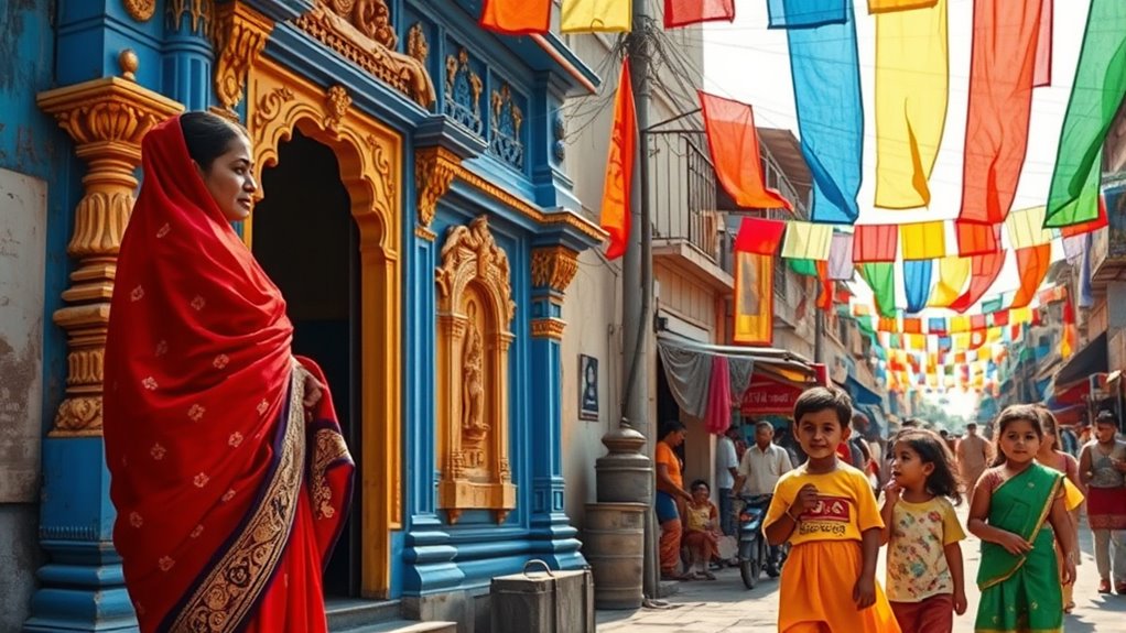
For example, in many Western countries, white often symbolizes purity, innocence, and peace. Think of weddings or religious ceremonies where brides wear white to represent new beginnings. But head east, and the story changes. In countries like China and India, white can be associated with mourning and funerals, representing loss and the cycle of life. Recognizing these traditional symbolism nuances helps you avoid cultural missteps, especially when creating products, branding, or visuals intended for a global audience.
Regional interpretations further complicate these perceptions. Red, for instance, is a powerful color with contrasting meanings depending on where you are. In China, red symbolizes luck, prosperity, and celebration, often used during festivities and weddings. Conversely, in some African cultures, red might signify danger, aggression, or warning. In the United States, red is often linked to love, passion, or urgency — think of Valentine’s Day or sales signs. These regional interpretations are vital because they influence how your message is received and understood.
Understanding these cultural associations also extends to choosing color combinations and contexts. A color palette that feels vibrant and positive in one region might evoke caution or negativity in another. When designing logos, marketing campaigns, or interior spaces, consider how colors will resonate with your target audience’s traditional symbolism and regional interpretations. This awareness shows respect for cultural diversity and helps foster a connection based on shared understanding rather than unintended offense.
Additionally, awareness of cultural color symbolism can inspire more authentic and meaningful design choices that resonate deeply with local audiences.

The Designer's Dictionary of Color
As an affiliate, we earn on qualifying purchases.
As an affiliate, we earn on qualifying purchases.
Frequently Asked Questions
How Do Colors Influence Consumer Purchasing Behavior Across Cultures?
Colors substantially influence your purchasing decisions across cultures by shaping consumer perception. You might notice that color symbolism differences lead to varied emotional responses, prompting shifts in consumer perception. For example, red can evoke excitement in one culture but signify danger in another. Understanding these nuances helps you tailor designs that resonate locally, increasing engagement and sales. By respecting these cultural differences, you guarantee your branding appeals effectively and avoids unintended misunderstandings.
Are There Universal Color Meanings Accepted Worldwide?
Think of color symbolism like a global dance; some moves are universal, but many vary by culture. While red often signals passion or luck worldwide, the meaning of white can differ—pure and peace in the West, mourning in Asia. The evolution of color symbolism shows that no single color holds universal meaning, so you must respect cultural symbolism when designing for diverse audiences to avoid missteps.
How Can Designers Respect Cultural Sensitivities When Choosing Colors?
You can respect cultural sensitivities by researching cultural color symbolism before selecting colors. Understand how different cultures interpret specific hues, avoiding colors that might carry negative or inappropriate meanings. Use respectful color selection by consulting diverse voices and seeking local input when possible. This approach guarantees your design honors cultural differences, fosters inclusivity, and demonstrates cultural awareness, ultimately creating more meaningful and respectful visual communication.
What Role Does History Play in Cultural Color Associations?
History shapes cultural color associations like a river carving its path through land. It provides the foundation of historical symbolism, revealing why certain colors hold specific meanings. You should consider how cultural evolution has transformed these perceptions over time, influencing modern interpretations. Recognizing this history helps you create designs that honor tradition while respecting contemporary sensitivities, ensuring your work resonates meaningfully across diverse audiences.
How Do Color Meanings Evolve Over Time Within Cultures?
You’ll notice that color meanings evolve over time through historical perceptions and cultural shifts. As societies change, new events, values, or influences reshape how colors are perceived, transforming their significance. For example, a color once associated with mourning might become a symbol of celebration later. By understanding these shifts, you can design with awareness and respect, ensuring your use of color aligns with current cultural meanings and avoids unintended offense.

DVBOCS A Little Spot And Color Psychology Poster Kid Educational Canvas Print Painting Emotional Management Mental Health Wall Art Decor For Office School Classroom Bedroom Decor 12x16in Unframed
Color Psychology Integration: This unique canvas print leverages the principles of color psychology to engage young minds, making…
As an affiliate, we earn on qualifying purchases.
As an affiliate, we earn on qualifying purchases.
Conclusion
Understanding cultural associations with color helps you create designs that resonate deeply and respect diverse perspectives. By choosing colors thoughtfully, you show empathy and awareness of different traditions and meanings. Isn’t it worth considering how your choices affect others? When you design with cultural sensitivity, you foster connection and understanding. So, next time you pick a palette, ask yourself: are you honoring the story behind each hue? That small step can make a big difference.

SHANY Ultimate Fusion – 120 Color Highly Pigmented Makeup Palette Long Lasting Blendable Natural Colors Eye shadow Palette Natural Nude and Neon Combination
SHANY Ultimate Fusion Makeup Palette Includes: 120 Neutral and nude eyeshadow colors. Includes 60 nude eyeshadow colors and…
As an affiliate, we earn on qualifying purchases.
As an affiliate, we earn on qualifying purchases.
global branding color kit
As an affiliate, we earn on qualifying purchases.
As an affiliate, we earn on qualifying purchases.