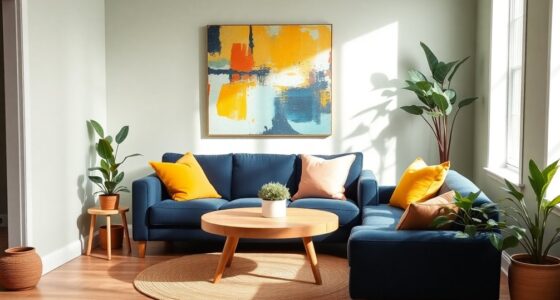

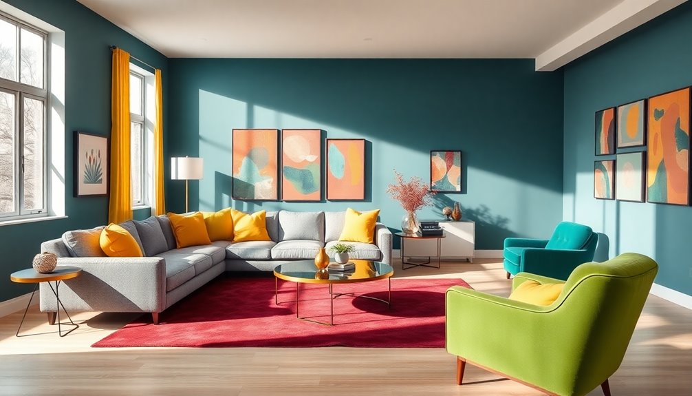
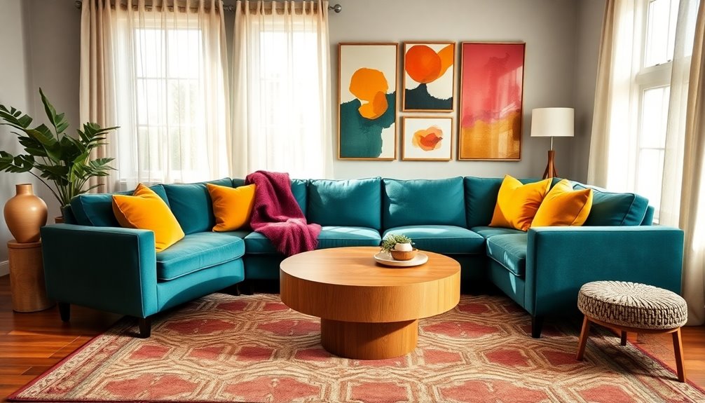
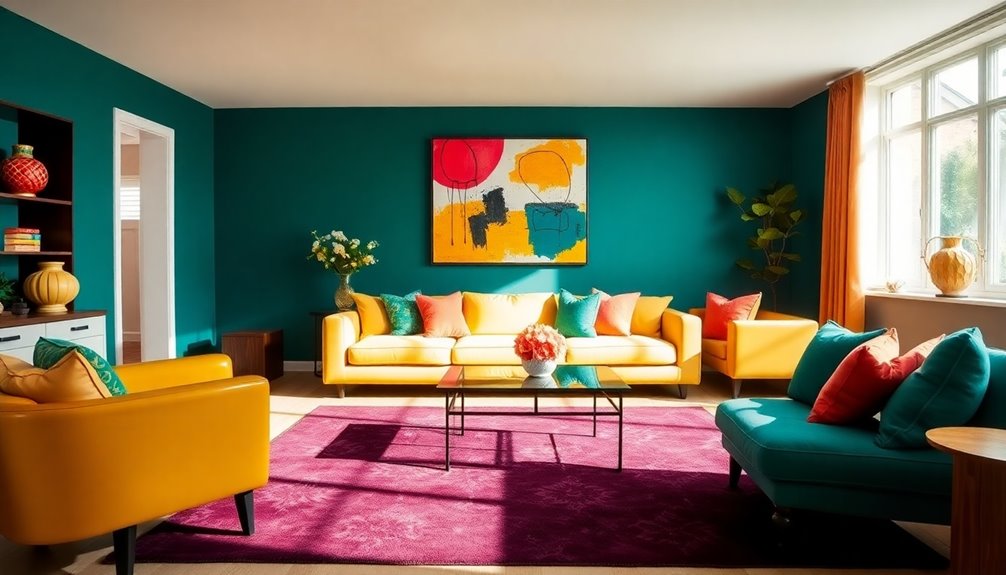
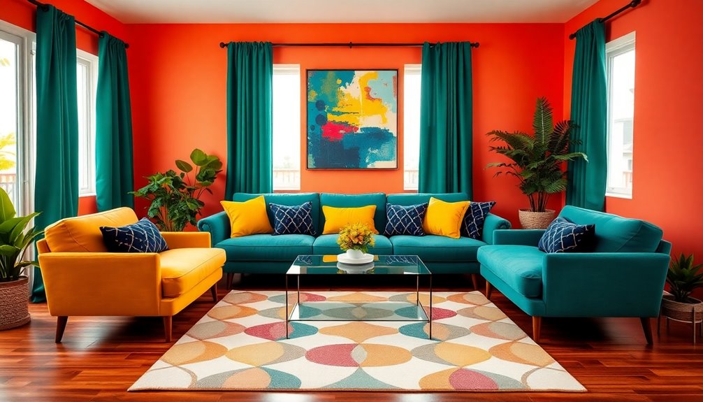
To combine multiple colors in a single room, start by following the 60-30-10 rule: use one dominant color for 60%, a secondary for 30%, and an accent for 10%. Use the color wheel to find complementary or analogous colors that flow together. Balance warm and cool tones to create harmony, and don't be afraid to mix patterns using a lead pattern to anchor your scheme. Stick around to uncover more tips on achieving vibrant color schemes effortlessly!
Key Takeaways
- Start with a cohesive color palette of three main colors that complement each other for a harmonious look.
- Apply the 60-30-10 rule to balance colors: 60% dominant, 30% secondary, and 10% accent colors in the room.
- Use a lead pattern to inspire your color choices, extracting hues for walls, furniture, and decor.
- Mix different patterns by combining small-scale and large-scale designs, ensuring they share common colors.
- Repeat similar shades or materials throughout the space to create seamless transitions and visual flow.
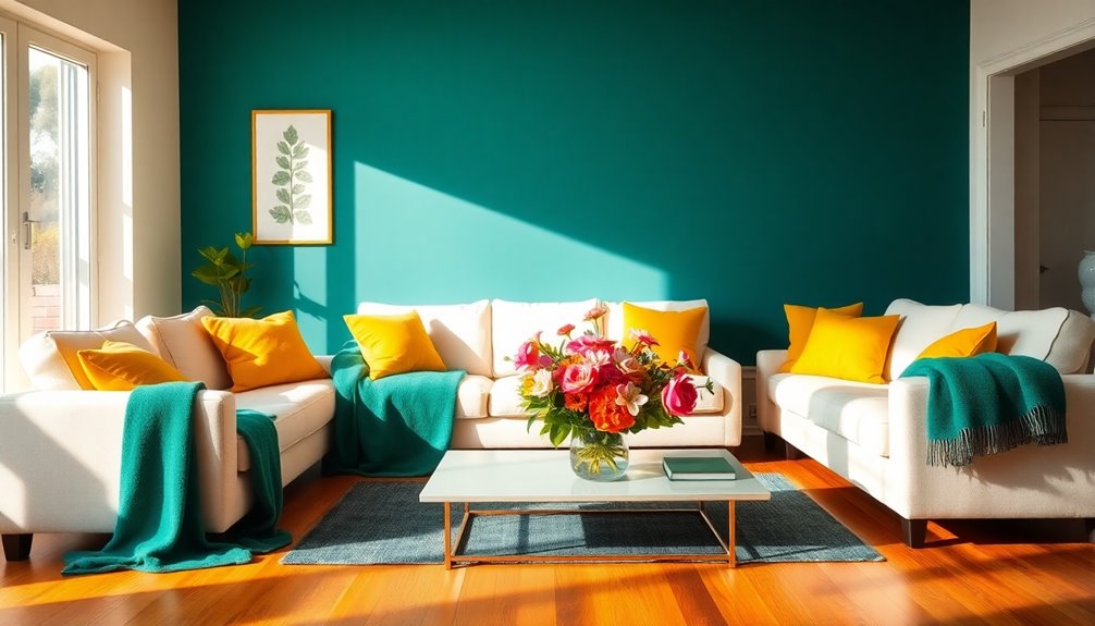
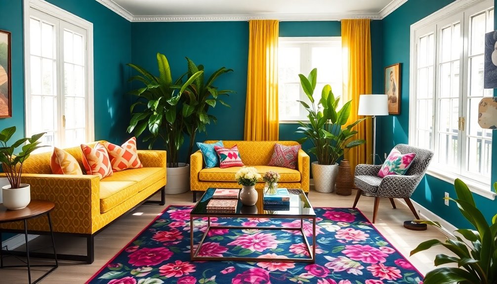
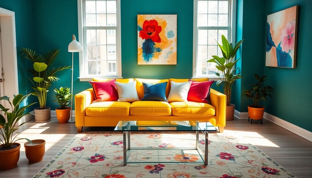
Follow The 60-30-10 Rule
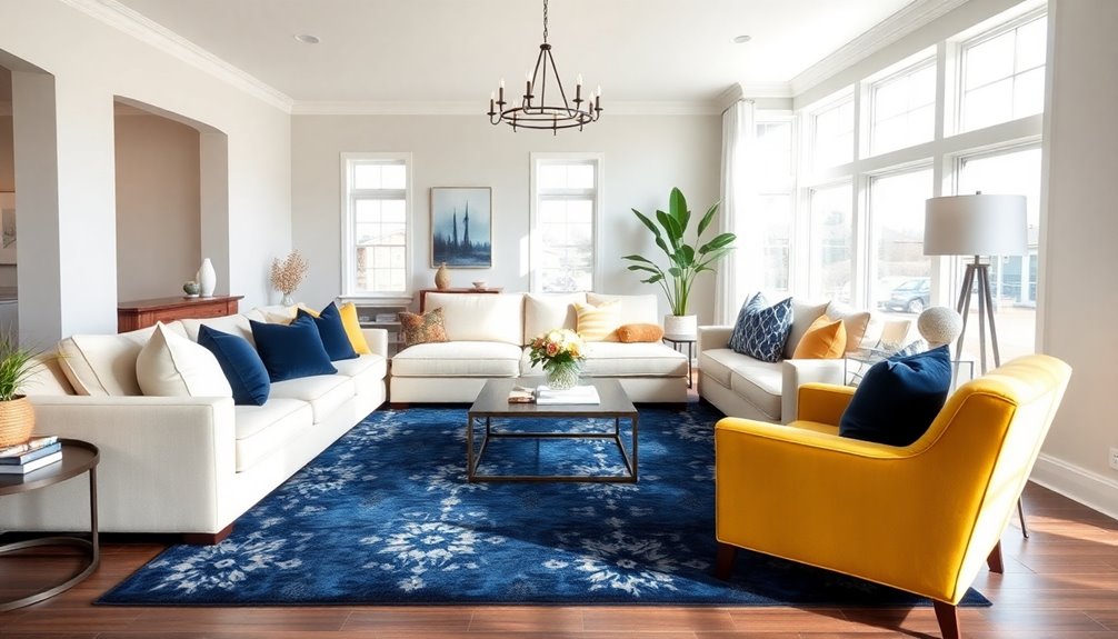
When you're designing a room, following the 60-30-10 rule can make a huge difference in how the space feels.
Start by choosing a dominant color that will cover 60% of the room, typically on the walls or larger furniture pieces. This foundational backdrop sets the tone for your color palette.
Next, incorporate a secondary color, making up 30% of the space, through textiles like curtains or upholstery for a complementary touch.
Finally, dedicate the remaining 10% to accent colors, showcasing them through decorative items like pillows, artwork, and vases.
This structured approach not only adds visual interest and depth but also guarantees no single color overwhelms the space, creating a balanced and harmonious environment.
Keep Your Color Flowing
To keep your color flowing throughout your home, choose a cohesive palette of three main colors that complement each other.
Establish connections by repeating similar shades or materials in textiles and decor, creating a seamless changeover between rooms.
This approach not only harmonizes different themes but also enhances the overall aesthetic of your space. Additionally, incorporating unique textures can further elevate the visual interest and depth of your color scheme.
Cohesive Color Choices
Creating a cohesive color scheme can transform your home into a harmonious retreat. To achieve this, limit your palette to three main colors that complement each other. Use the 60-30-10 rule to distribute these colors effectively, ensuring balance and flow from room to room. Repeating similar colors in adjoining spaces enhances visual continuity and overall aesthetic.
| Color Role | Percentage |
|---|---|
| Dominant Color | 60% |
| Secondary Color | 30% |
| Accent Color | 10% |
| Unifying Element | Trim/Flooring |
Incorporating varying shades of your chosen colors adds depth while maintaining a cohesive color scheme. By thoughtfully selecting and applying these colors, you'll create a unified and inviting atmosphere throughout your home. Additionally, much like in celebrity fashion collaborations, using complementary colors can elevate the overall design and make a striking impression.
Establishing Color Connections
Establishing color connections throughout your home helps maintain a seamless flow that enhances your overall design. To achieve this, choose a limited palette of two to three main colors and repeat them across different rooms. This creates cohesive color schemes that visually tie spaces together.
Use small details like fabrics, window treatments, and accessories to link areas by pulling colors from your main palette. The 60-30-10 rule can guide you in balancing these colors and patterns, ensuring one color dominates while supporting secondary shades.
Additionally, you can play with different values of the same color in adjacent spaces, adding depth while preserving a connected appearance. Consistent unifying elements, like trim color or flooring, will further enhance your home's visual flow.
Harmonizing Room Themes
While you might want each room to have its own personality, keeping a harmonious theme can enhance the overall flow of your home. To achieve this, limit your color palette to three main colors that complement each other.
Use the 60-30-10 rule: designate 60% for a dominant color, 30% for a secondary color, and 10% for accents. This balance keeps the rooms cohesive. You can also repeat specific hues across different spaces for visual continuity.
Consider details like window treatments and fabrics to unify each room's identity. If you're unsure, consult an interior designer who can help you choose the right colors using the color wheel to create a seamless connection throughout your home.
Use The Color Wheel
To effectively combine colors in your room, start by using the color wheel as a visual guide.
It helps you understand the relationships between primary and secondary colors, making it easier to create stunning complementary pairings or cohesive analogous schemes.
Understanding Primary and Secondary
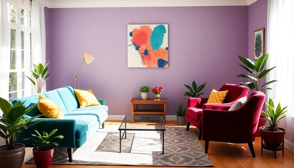
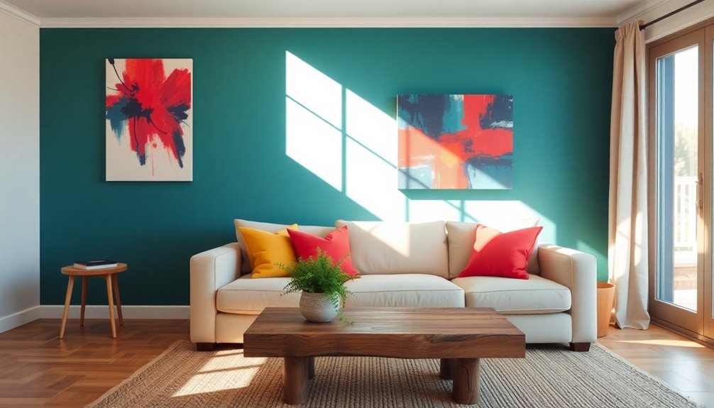
The color wheel is a powerful tool for anyone looking to combine colors in a room effectively. It features primary colors (red, yellow, blue) and secondary colors (green, orange, purple) formed by mixing those primaries. Understanding these relationships enables you to choose complementary colors, which provide striking contrasts. For instance, red paired with green or blue with orange can liven up your space. You can also explore analogous colors, such as blue, blue-green, and green, for a more cohesive look.
| Primary Colors | Secondary Colors | Color Relationships |
|---|---|---|
| Red | Green | Complementary |
| Yellow | Orange | Complementary |
| Blue | Purple | Complementary |
| Red | Orange | Analogous |
| Blue | Green | Analogous |
Complementary Color Pairings
Choosing the right complementary color pairings can transform a room, creating a striking visual impact. Complementary colors, like red and green or blue and orange, offer high contrast and vibrant combinations that draw attention.
To achieve balance, consider the 60-30-10 rule: use one color for dominant elements, another for secondary decor, and a third accent color. Incorporating varying shades and tints can soften the look while maintaining contrast.
Don't forget to include accessories like pillows, artwork, or rugs in these complementary colors; they add depth without overwhelming the space with too many bold colors at once.
Visualizing Color Relationships
Understanding color relationships can elevate your design choices beyond just complementary pairings. The color wheel is your best friend for visualizing these relationships.
Complementary colors, which sit opposite each other, like red and green, create bold contrasts that can energize a space. If you prefer a more harmonious look, consider using analogous colors found side by side, such as blue, blue-green, and green, for a soothing effect.
For a vibrant and balanced palette, try triadic color schemes, selecting three colors evenly spaced around the wheel, like red, yellow, and blue.
Don't forget to factor in color temperature; using cool colors alongside warm colors can help you achieve an inviting atmosphere while maintaining balance throughout the room.
Find Your Balance
Finding balance in your room's color scheme is essential for creating a welcoming atmosphere. To achieve this, balance cool colors like blues and greens with warm colors such as reds and yellows.
Use the 60-30-10 rule: allocate 60% of your space to a dominant color, 30% to a secondary one, and 10% to an accent hue. This approach maintains visual interest without overwhelming the space.
Incorporate varying shades and tones within the same color family to add depth while keeping the overall palette cohesive. Remember the emotional impact of colors—warm tones can energize, while cool tones promote relaxation.
Combining Colors Like A Pro
Once you've established a balanced color foundation in your room, it's time to elevate your design skills by combining colors like a pro.
Start by following the 60-30-10 rule: use 60% of your dominant color on the walls, 30% on furniture and textiles, and reserve 10% for an accent color in small decor items.
Explore the color wheel to find complementary colors, like pairing cool blues with warm oranges.
Don't shy away from mixing patterns; combining florals and stripes can add interest, as long as they share a color scheme.
Incorporating both large-scale and small-scale patterns creates contrast and depth.
Finally, use custom framing for artwork to seamlessly integrate your selected colors and patterns throughout the space.
Starting Point for Mixing Patterns
A solid starting point for mixing patterns in your room is to pinpoint your favorite colors and styles.
Begin by selecting a lead pattern, like a large-scale floral or geometric print. This pattern will serve as the foundation for your overall design and color choices.
Extract colors directly from this lead pattern to create a cohesive color scheme that ties your room together seamlessly.
To add depth and visual interest, incorporate contrasting patterns, such as stripes or polka dots, in smaller items like pillows or throws.
Choose a timeless lead pattern that resonates emotionally with you; this will help guarantee your design feels fresh and inviting for years to come. Additionally, consider incorporating sustainable materials to enhance both the aesthetic and environmental impact of your decor.
Creating a Color Scheme
When you're ready to create a color scheme, start by choosing a lead pattern that resonates with your style, as it sets the tone for the entire room.
Select a large-scale floral or geometric design, which will dictate your color palette. Extract colors directly from this pattern to form a cohesive color scheme, ensuring these colors are reflected in walls, furniture, and decor.
Incorporate complementary colors to enhance your lead pattern, using the 60-30-10 rule: dominate with 60% of one color, 30% of a secondary, and 10% for accents. Don't hesitate to use variations of these colors for added depth.
Finally, aim for balance by mixing different patterns and textures, ensuring no single element overwhelms your space's overall aesthetic.
Mixing Patterns Effectively
Creating a cohesive color scheme sets the foundation for your room, but mixing patterns takes your design to the next level. To achieve a vibrant and inviting space, consider these tips:
- Combine different types of patterns, like stripes, florals, and abstracts.
- Mix small-scale and large-scale patterns for contrast and balance.
- Choose variations in hue and tone instead of exact color matches.
- Trust your intuition and personal taste to guide your choices.
Look to renowned designers like Michelle Nussbaumer for inspiration. Their bold approach to mixing patterns can help you create a unique environment that showcases your personality. Additionally, understanding color palettes can help you select complementary patterns that enhance your overall design.
Examples of Successful Color and Pattern Schemes
Successful color and pattern schemes can transform a room into a dynamic and inviting space. You can create a serene atmosphere using monochromatic designs with varied shades of a single color. Subtle patterns, like soft stripes, can enrich the look without overwhelming it.
| Color Scheme | Pattern Type | Design Example |
|---|---|---|
| Monochromatic | Soft Stripes | Light blue walls, navy stripes |
| Bold & Playful | Floral & Striped | Floral print sofa, striped cushions |
| Neutral Background | Geometric | Beige geometrics with bold accents |
| Contrasting Prints | Large & Small | Large floral with small polka dots |
These successful combinations balance vibrant colors and patterns, creating an organized yet visually interesting space. Embrace these ideas to enhance your room's aesthetic! Additionally, consider incorporating smart bathroom technologies into your design for a modern and functional approach.
Frequently Asked Questions
What Is the 60/30/20 Rule in Decorating?
The 60/30/20 rule in decorating is a guideline to achieve color balance in your space.
You'll use 60% of a dominant color for walls and large furniture, creating a strong foundation.
The secondary color, making up 30%, adds contrast through items like curtains and bedding.
Finally, the accent color, which is 10%, brings in pops of interest through accessories like pillows or artwork.
This structure keeps your room cohesive and visually appealing.
What Is the 70/20/10 Color Rule?
Think of the 70/20/10 color rule like a well-orchestrated symphony, where every hue plays its part.
You'll want 70% of your space in a primary color, setting a strong foundation. Next, add a complementary secondary color that makes up 20%, enhancing the overall look.
Finally, sprinkle in 10% of accent colors through smaller decor items to bring excitement and depth.
This balanced approach creates a harmonious and inviting atmosphere in your room.
What Is the 3 Color Rule in Interior Design?
The 3 Color Rule in interior design helps you create a balanced look in any space.
You'll want to choose three main colors: 60% should be your dominant color, usually for walls and large furniture, 30% as a secondary color for upholstery and curtains, and 10% for accent colors in smaller decor items like pillows or art.
How Do You Paint a Room With Multiple Colors?
To paint a room with multiple colors, start by selecting your dominant color for the walls, covering about 60% of the space.
Next, pick two additional colors for accents, following the 60-30-10 rule.
Use painter's tape for clean edges, and apply lighter colors first, moving to darker shades.
Consider creating an accent wall or color blocks to add dimension.
This approach guarantees a cohesive and visually appealing look in your room.
Conclusion
So, there you have it—mixing colors in a room is as easy as pie, right? Just throw a rainbow together and hope for the best! But in reality, when you skillfully apply the 60-30-10 rule and balance your hues, you'll create a space that's vibrant yet harmonious. Imagine a room that feels like a serene sunset instead of a chaotic paint splatter. With a little thought and creativity, you can transform any space into a colorful masterpiece!