
Lighting greatly influences how you perceive colors and hues. Natural light varies throughout the day, making reds and yellows more vibrant in warm sunlight, while midday light appears cooler and more neutral. Artificial bulbs with different color temperatures can either warm or cool the space, changing how colors look and creating different moods. Understanding these effects can help you control the atmosphere around you, so if you keep exploring, you’ll uncover how to master color perception through lighting.
Key Takeaways
- Natural light varies throughout the day, affecting how colors appear, with warm sunlight enhancing reds and yellows, and neutral midday light providing true-to-life hues.
- Different artificial lighting technologies and their color rendering indexes (CRI) influence how accurately colors are perceived indoors.
- The color temperature of light (measured in kelvins) shifts hues; warm light accentuates warm tones, while cool light makes colors appear sharper and bluer.
- Changing lighting conditions, such as switching from warm to cool light, can significantly alter a space’s mood and the perception of colors within it.
- Strategies like maximizing natural light and selecting appropriate bulb temperatures help control mood and enhance or diminish certain color perceptions.

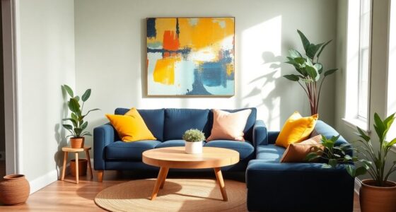
Have you ever noticed how lighting and color can dramatically change the way a space feels? It’s almost like magic how a room can look warm and inviting one moment and cold or sterile the next. The key lies in understanding how natural illumination and color temperature influence our perception of hues. When you pay attention to these elements, you can transform a space effortlessly, making it feel exactly how you want. Natural illumination, which comes from sunlight, varies throughout the day, affecting how colors appear. During the morning or late afternoon, sunlight casts a warm, golden hue that amplifies reds, oranges, and yellows, making everything seem cozy and vibrant. In contrast, midday sunlight tends to be cooler and more neutral, giving a more balanced and true-to-life appearance to colors. This shift in natural illumination is why your home or workspace can seem entirely different depending on the time of day. Additionally, the type of lighting technology, such as LED or incandescent bulbs, can influence the color rendering index and how accurately colors are perceived under different lights. Color temperature plays a significant role in shaping your perception of hues within a space. Measured in kelvins (K), it determines whether the light feels warm or cool. Warm light, typically below 3,500K, produces a yellowish or amber glow that enhances warm tones like reds, browns, and yellows. It creates an inviting, intimate atmosphere, perfect for relaxing areas. Cool light, above 5,000K, emits a bluish tone that makes colors appear sharper and more clinical. It’s often used in workspaces or areas where clarity and alertness are priorities. You’ll notice how changing the color temperature of your lighting can make a room feel drastically different. For instance, switching from warm to cool lighting can transform a cozy lounge into a crisp, energizing environment. When you consider natural illumination and color temperature together, you gain a powerful tool for controlling the mood and perception of your space. During the day, you might choose to maximize natural illumination with large windows or light-colored walls to reflect sunlight, creating a bright, airy feel. In the evening, you can switch to warmer, lower Kelvin bulbs to foster relaxation and intimacy. Understanding how these factors influence hue perception allows you to select lighting that complements your décor and enhances your mood. Whether you want your space to feel lively, calm, or sophisticated, manipulating natural light and color temperature gives you the ability to do so intentionally. It’s not just about visibility; it’s about shaping the way you and others experience your environment. By paying attention to these subtle yet powerful elements, you can make any space feel just right, anytime you want.

Feit Electric A19 LED Light Bulb, 60W Replacement, Dimmable, Selectable Color Temperatures (2700K-5000K), 800 Lumens, General Purpose Light Bulbs, 15,000-Hour Lifetime, OM60DM/5CCTCA/LED/ 10 Pack
CUSTOMIZABLE LIGHTING WITH ADJUSTABLE COLOR TEMPERATURE – Enjoy tailored lighting for every mood and setting with selectable color…
As an affiliate, we earn on qualifying purchases.
As an affiliate, we earn on qualifying purchases.
Frequently Asked Questions
How Does Natural Light Differ From Artificial Light in Color Perception?
Natural light, with its broad light spectrum and variable color temperature, offers a more accurate perception of hues. You notice colors differently under natural light because it changes throughout the day, highlighting true shades. Artificial light, however, often has a limited spectrum and fixed color temperature, which can distort colors. So, you perceive colors more vividly and authentically in natural light, whereas artificial lighting might alter their appearance.
Can Lighting Change the Emotional Impact of a Room’s Color Scheme?
Did you know that lighting can influence your room’s emotional impact by up to 70%? You can use lighting to enhance the ambient mood and reinforce color psychology, making a space feel calm, energetic, or cozy. Bright, cool light often energizes, while warm, dim lighting promotes relaxation. So, adjusting your lighting choices can dramatically change how you perceive and feel about your room’s color scheme.
What Are the Best Lighting Options for Accurate Color Rendering?
You should choose lighting with a high CRI rating, ideally 90 or above, for accurate color rendering. Opt for bulbs with a color temperature between 5000K and 6500K, which mimics natural daylight. This combo guarantees colors look true to life under your lighting, whether you’re working on art, shopping, or just enjoying your space. High CRI and appropriate color temperature make a noticeable difference in how colors appear.
How Does Aging Affect Our Perception of Colors Under Different Lighting?
As you age, your perception of colors shifts due to age-related vision changes and light adaptation. You might notice colors appear less vibrant or slightly altered under different lighting conditions because your eyes adapt differently over time. These changes can make distinguishing hues more challenging, especially in low light or under uneven illumination. To see accurately, guarantee your environment has consistent, well-balanced lighting, and consider regular eye checkups to maintain ideal vision.
Are There Cultural Differences in How Lighting Influences Color Perception?
You’ll notice that cultural color symbolism and regional lighting preferences shape how lighting influences your perception of hues. In some cultures, bright, warm lighting enhances vibrant colors, while others prefer softer, cooler light that alters how you see shades. These differences affect your emotional response and interpretation of colors, making your experience unique based on cultural context and regional lighting choices, which influence how you perceive and appreciate hues daily.
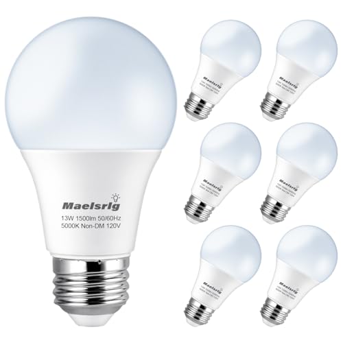
Maelsrlg 100 Watt Light Bulb Equivalent A19 LED – 90 CRI, 13W 1500LM, Daylight 5000K, E26 Base, Non-Dimmable, 120V, Bright White LED Light Bulbs for Home, 6-Pack
【Super Bright 100W Replacement】These A19 LED light bulbs deliver 1500 lumens of crisp brightness using just 13W, replacing…
As an affiliate, we earn on qualifying purchases.
As an affiliate, we earn on qualifying purchases.
Conclusion
As you step into the world of light and color, remember that every hue dances differently under each glow. Light is the painter’s brush, shaping your perception and revealing hidden depths in every shade. By understanding this dance, you hold the power to transform ordinary moments into vibrant masterpieces. So, embrace the play of shadows and brightness—your perception is the canvas, and light is the artist’s touch, forever changing how you see the world around you.

IOHFOI Corner Floor Lamp, LED Floor Lamp, Ambient Lighting Smart Lights with APP and Remote Control, 20 Million Colors & 800+ Modes, Music Sync Led Lights for Bedrooms, Living Rooms and Gaming Rooms
Unleash 20 Million Colors & 800+ Dynamic Effects – Go beyond simple lighting and fully customize your space's…
As an affiliate, we earn on qualifying purchases.
As an affiliate, we earn on qualifying purchases.

LASTAR Sun Lamp, 10,000 Lux Sunlight Lamp with 4 Color Temperatures & 5 Brightness & 1H Timer, Touch Control Daylight Lamp with Memory Function for Home
【10000 Lux SunLamp】This sun lamp mimics the full spectrum of light found in daylight, providing the recommended 10,000lux…
As an affiliate, we earn on qualifying purchases.
As an affiliate, we earn on qualifying purchases.