
When choosing paint undertones, start by testing large swatches in your space at different times of day to see how lighting affects each color. Consider your furniture, flooring, and decor to find complementary tones, whether warm or cool. Pay attention to how colors interact with natural and artificial light to avoid surprises. Patience and observation help you pick the perfect shade that creates harmony and sets the mood. Keep exploring to master the art of color harmony.
Key Takeaways
- Test samples in different lighting conditions to see how undertones shift throughout the day.
- Consider existing furniture, flooring, and decor to choose complementary undertones for harmony.
- Identify if warm or cool undertones suit your desired room ambiance—cozy or calming.
- Observe large swatches on walls to assess how undertones interact with the space before committing.
- Be patient and trust your instincts; choosing colors that feel right ensures a satisfying result.
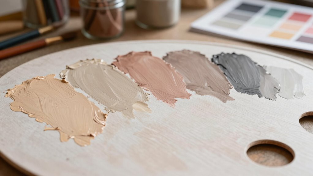
Choosing the right paint undertones can make all the difference in transforming a room from dull to stunning. When selecting a color, it’s not just about the hue you see in the sample; it’s about how that hue interacts with the space’s overall vibe. To get it right, you need to contemplate color harmony—how the undertones complement other colors in the room—and the room’s lighting conditions. These factors work together to determine whether a color looks warm, cool, muted, or vibrant in your space.
Your room’s lighting plays a critical role in how paint undertones appear. Natural sunlight can make a color seem brighter and more vibrant, while artificial lighting, especially warm-toned bulbs, can cast a yellowish hue that alters the undertones. For example, a soft gray might look cool and calming in the morning sunlight but could turn dull or even slightly greenish under incandescent lights. That’s why it’s essential to test paint samples in different lighting throughout the day before making a final decision. Pay close attention to how the undertones shift as the light changes, so you’re not surprised after the paint dries. Additionally, understanding lighting conditions can help you anticipate how your chosen color will look at different times of day.
Lighting dramatically influences paint undertones; test samples at different times to see how colors shift in your space.
Color harmony is also key in creating a cohesive look. When choosing undertones, think about the other elements in your room—furniture, decor, flooring, and even artwork. If you want a serene, monochromatic palette, opt for undertones that blend seamlessly with these elements. For instance, if your furniture has warm wood tones, a paint with warm undertones will create a harmonious environment. Conversely, if your decor features cooler hues, choose undertones with blue or green undertones to maintain balance. Understanding how different undertones interact helps you create a space that feels intentional and visually pleasing.
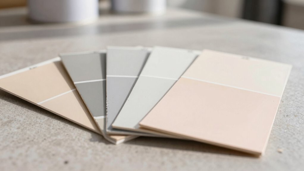
Another tip is to look at the paint color in context, not just on a paint chip. Bring home sample pots and paint large swatches on your walls. Observe how they look at different times of day and how they interact with your room’s lighting and other colors. Lighting can make a subtle undertone pop or fade into the background, so seeing the color in your actual space is essential. Also, consider how your room’s ambiance might influence your choice—warm undertones tend to create cozy, inviting spaces, while cool undertones evoke calmness and sophistication. Understanding how color perception is influenced by lighting conditions can help you make more confident choices.
Ultimately, choosing paint undertones requires patience and observation. You want a color that not only looks good on the chip but also feels right in your space and under your lighting. By paying attention to color harmony and how lighting affects your perception, you’ll select a shade that transforms your room into a beautiful, harmonious sanctuary.

Mighty Board Minis Polystyrene Paint Color Test Panels, 12" x 9", Set of 5, White
- PERFECT SAMPLES: These 12" x 9" white,…
- DURABLE MATERIAL: Made of sturdy styrene, these…
- CONVENIENT SIZING: At 12" x 9", the…
As an affiliate, we earn on qualifying purchases.
As an affiliate, we earn on qualifying purchases.
Frequently Asked Questions
How Do Lighting Conditions Affect Perceived Undertones?
Lighting conditions greatly influence how you perceive paint undertones. Natural light tends to enhance warm or cool tones, making colors appear more vibrant or subtle. Artificial lighting, on the other hand, can cast yellow or blue hues that alter your perception. To get an accurate sense of undertones, view your paint samples in both natural and artificial light at different times of day. This helps guarantee your chosen color looks great everywhere.
Can Undertones Change Over Time?
Undertones can seem to change over time due to factors like paint consistency and lighting, which influence how you perceive color. As paint ages or if the consistency varies during application, the undertone might appear different. Additionally, new paint batches might have slight differences, affecting color matching and making undertones look different. Keep in mind, consistent lighting and careful color matching help maintain the original undertone’s appearance over time.
What’s the Best Way to Test Paint Undertones Before Buying?
Did you know that 85% of paint color mismatches happen due to poor undertone testing? To test paint undertones, you should always compare small paint swatches in different lighting, especially natural light. Use a color matching tool or a neutral background to see how the undertones interact with your room. This process helps with palette coordination and guarantees you pick the perfect shade before committing to a full purchase.
How Do Undertones Impact Interior Design Style?
Undertones greatly influence your interior design style by affecting color coordination and overall harmony. If you choose warm undertones, they create a cozy, inviting atmosphere perfect for rustic or traditional decor. Cool undertones lend a sleek, modern vibe ideal for contemporary spaces. By understanding undertones, you guarantee your colors complement each other, achieving design harmony that reflects your personal style and enhances the room’s ambiance.
Are There Any Common Mistakes to Avoid With Undertones?
Think of undertones as the subtle whispers in your color palette; ignoring them can lead to color clashes. To avoid mistakes, guarantee your undertones create harmony rather than discord. Check for undertone clashes by comparing paint samples in different lighting. Don’t rely solely on small swatches—view them on your walls for full effect. Misjudging undertones disrupts color harmony and can make your space feel off-balance, so proceed with care.
Conclusion
Choosing the right paint undertones is like finding the perfect melody for your favorite song—once it clicks, everything feels harmonious. Trust your instincts, test samples in your space, and observe how different lighting changes the hue. With patience and a keen eye, you’ll create a room that feels just right. Remember, selecting the right undertone isn’t a task to dread but an exciting step toward turning your vision into reality.