Stepping into your living space can make you instantly feel calm, happy, or inspired. The paint designs you pick not only change your walls. They also change the ambiance of your home. Your home becomes a sanctuary that shows off your style. Over the years, many families have shared with me. They say a simple coat of paint brings back memories of joy or a new beginning. As 2025-2026 approaches, we see how color trends change with our lives, making our homes and lives better. Let’s explore how the latest trends from Benjamin Moore and Sherwin Williams can make your home feel new and meaningful.
Key Takeaways
- House painting designs significantly impact your home’s aesthetics and selling price.
- Current color trends feature a blend of earthy tones and vibrant hues, inviting warmth and personality.
- A timeless palette can enhance both the interior and exterior of your living space.
- Understanding the emotional impact of colors can transform your home’s ambiance.
- Utilizing innovative techniques can breathe new life into traditional and modern settings.
Understanding the Importance of Color in Home Design
Colors play a big role in how your home feels. Learning about color psychology helps make your rooms better. The right colors can make you feel different emotions and affect how comfy you feel at home. Picking the right colors can make your mood better and your home look nice.
Primary colors like red, yellow, and blue are the main colors. Mixing them makes secondary colors such as orange, green, and purple. Tertiary colors come from mixing primary and secondary ones. This mix and match is the heart of color theory. It helps you make good design choices.
The color wheel helps you find colors that look great together. Red and green, or yellow and purple, are examples. Split complementary colors add subtlety, creating a nice look. Analogous colors, like blue and green, bring harmony.
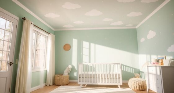
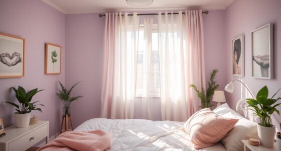
Different colors make us feel different things. Cool colors like blues and greens are calming, great for bedrooms. On the other hand, reds and yellows can make places like kitchens lively, perfect for activities.
In decorating, it’s important to balance colors. Too much of one color can be too much. Neutrals like white and beige are good backdrops. They match well with brighter colors and create a cozy feel. Knowing how colors affect mood is key to good design. It makes your home and life better.
| Color Type | Emotional Response | Ideal Spaces |
|---|---|---|
| Warm Colors | Cozy, Energetic | Kitchens, Living Rooms |
| Cool Colors | Calm, Refreshing | Bedrooms, Bathrooms |
| Neutral Colors | Comforting | All Spaces |
| Vibrant Colors | Invigorating | Home Offices, Creative Spaces |
!["BENJAMIN MOORE" CLASSIC COLORS FAN DECK [CASE OF 1]](https://m.media-amazon.com/images/I/41Xq67AO80L._SL500_.jpg)
"BENJAMIN MOORE" CLASSIC COLORS FAN DECK [CASE OF 1]
Very good condition
As an affiliate, we earn on qualifying purchases.
As an affiliate, we earn on qualifying purchases.
Current Trends in House Painting Designs
House painting keeps changing, bringing new design inspiration for decorating your home. In 2025, we’ll see lots of rich brown colors. These shades, like “Coco” and “Honfleur,” are great because they work well in any light.
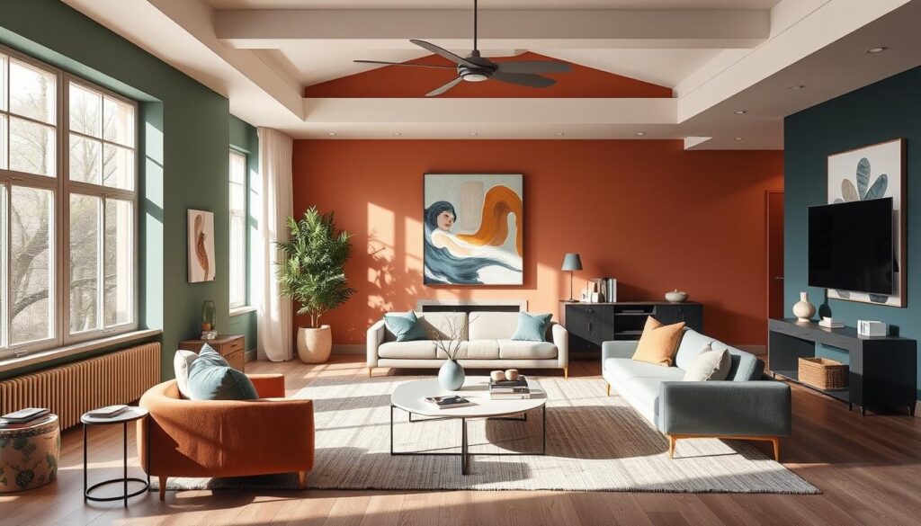
People are loving the limewash look for a soft texture on walls. It’s perfect when you’re using natural materials in your room. The “color drenching” method, painting everything one color, is also getting popular. It makes small spaces seem bigger.
Matte finishes are more durable now, perfect for busy spots in your home. A paint called Scuff X by Benjamin Moore is a good choice. If you match your paint to your wallpaper, it makes the room look better.
Saturated jewel tones will be big in 2025. Colors from Sherwin-Williams’ “Seaworthy” to Benjamin Moore’s “Jojoba” are in. Painting your stairs a bright color is a trend that’s sticking around. It’s a cool way to update your space. Deep purples are getting picked a lot for bold accents.
Using different paint finishes together can make your rooms more interesting. Painting woodwork a contrasting color, like warm taupes against white walls, looks really classy.
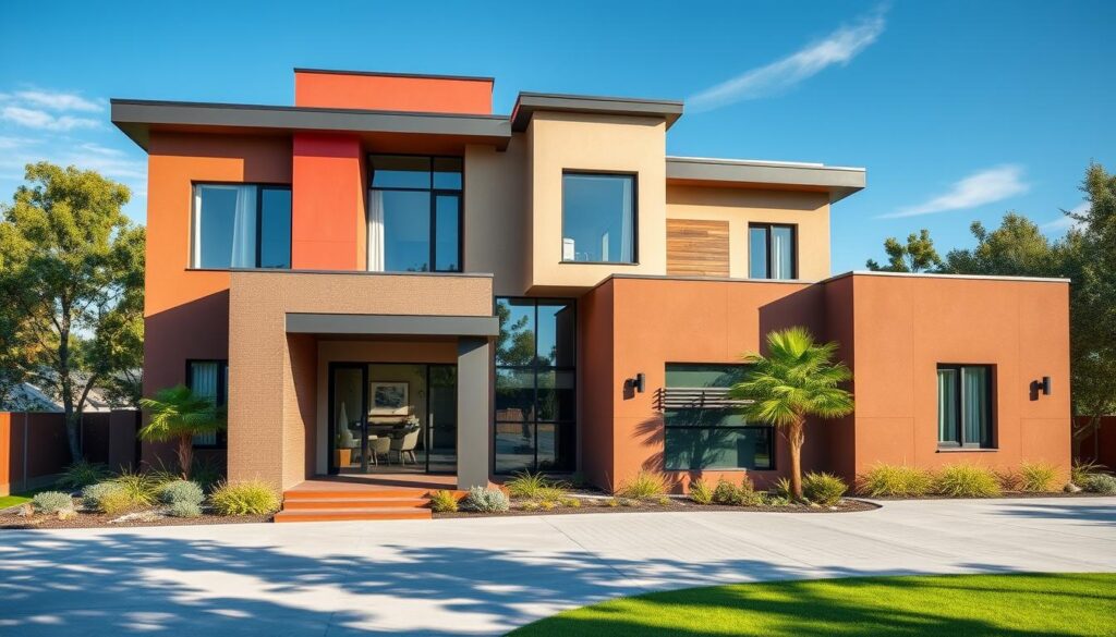
The color of the year for 2025 is “peach fuzz” from Pantone. We’re bringing back ’90s and early 2000s vibes. Look for warm browns and beiges, and soft blues like “Blue Nova” for kitchens and bathrooms. In bedrooms, Behr’s “black pepper” makes a statement, and warmer whites bring a modern yet classic feel.
Color blocking and pairing tones closely is still trending. With all these painting trends, you’re sure to find cool ideas for your place.

PRESTIGE Paints Exterior Paint and Primer In One, 1-Gallon, Semi-Gloss, Comparable Match of Sherwin Williams* Heron Plume*
*Prestige Paints has created a comparable color based on color specifications of the original color using industry leading…
As an affiliate, we earn on qualifying purchases.
As an affiliate, we earn on qualifying purchases.
Popular Color Trends for 2025-2026
The 2025-2026 palette brings a mix of color trends that spice up interior aesthetics. Warm browns and beiges dominate, offering elegance and comfort. The 2025 Color of the Year, Pantone’s Mocha Mousse, is a soft brown. It makes any room feel warm and welcoming.
Blues also make waves, with Dutch Boy’s Mapped Blue leading as 2025’s color. It’s a mid-tone blue with yellow hints, liked by younger people. Durable shades, like Valspar’s Encore navy, make spaces like kitchens and bathrooms cozy.
Darker, bolder colors are also popular. STAINMASTER’s Truffle and Benjamin Moore’s Cinnamon Slate offer deep contrasts. These colors suit those looking for a moody yet inviting look. Krylon’s Hammered Black adds drama to bedrooms, perfect for bold statements.
Don’t miss HGTV Home by Sherwin-Williams’ Quietude, a soothing sage green, and Behr’s Rumors, a vibrant ruby red. These colors promise excitement while ensuring a peaceful home vibe.
| Brand | Color of the Year 2025 | Color Description |
|---|---|---|
| Pantone | Mocha Mousse | Gentle shade of brown, promoting warmth and comfort. |
| Dutch Boy | Mapped Blue | Mid-tone blue with yellow undertones, appealing to younger audiences. |
| Valspar | Encore | Rich navy blue, designed for timelessness. |
| STAINMASTER | Truffle | Rich dark brown, reinforcing moody neutrals. |
| HGTV Home by Sherwin-Williams | Quietude | Cool sage green with blue undertones. |
| Behr | Rumors | Rich ruby red, adding warmth and sophistication. |
Choosing these colors will make your painting projects shine. Your home will look stylish yet remain cozy and inviting.

Meoded Paint & Plaster | Lime Wash | Lime Paint | Natural Matte Finish | Interior & Exterior
Meoded Lime Wash is a unique slaked limestone mineral coating that creates a beautiful weathered plaster-like finish on…
As an affiliate, we earn on qualifying purchases.
As an affiliate, we earn on qualifying purchases.
House Painting Designs and Colors to Elevate Your Home
Choosing the right colors and designs can make your home look better. Rich earth tones like browns and beiges are great for making places cozy. Vibrant blues give kitchens and bathrooms a calm feel. We will give you tips on which colors to use and how to make your home look nice.
Incorporating Browns and Beiges into Your Space
Browns and beiges are becoming popular again, bringing warmth in home design. These colors go well with old and new styles. Pairing brown paint with white or soft pastels keeps things fresh. Here are some design ideas:
- Select shades of beige decor to create a cozy atmosphere.
- Combine brown with natural wood finishes for a harmonious look.
- Use rich cream accents to add contrast and brightness.
Embracing Rich Shades of Blue in Bathrooms and Kitchens
For kitchen paint and bathroom colors, blue tones like cornflower and dusty blue are perfect. They create a relaxing, spa-like feel. Check out these blue integrating tips:
- Choose lighter blues for airy, open kitchen spaces
- Utilize dark blue accents for a sophisticated touch in bathrooms.
- Pair blue tones with neutral fixtures to create balance.
| Color Theme | Best Use Areas | Complementary Colors |
|---|---|---|
| Browns and Beiges | Living Rooms, Bedrooms | Whites, Soft Pastels |
| Cornflower Blue | Kitchens, Bathrooms | Grays, Soft Yellows |
| Dusty Blue | Bathrooms | Whites, Creams |
By carefully choosing colors for your home, you can make it look and feel better. Use these color combinations to show your style and make your home cozy and pretty.

Sundaze Matte White Touch-Up Paint Pen Kit – Wall, Kitchen Cabinet, Furniture, Wood Door Touch Up – 3 Color Shades, Instantly Repair & Restore Scratches, Chips, Stains – Mix to Perfect Color Match
Instant Color Matching (3-Color Shades Kit): This Sundaze 3-pack touch-up paint kit includes 1 fluid ounce bottles of…
As an affiliate, we earn on qualifying purchases.
As an affiliate, we earn on qualifying purchases.
The Comeback of Matte Finishes in Interior Design
Matte finishes are making a big comeback in interior design. They add a sophisticated touch to any room. Modern matte paints are great at hiding light, making spaces warm and welcoming. They now last longer and work well in busy areas, thanks to new paint technology.
Why Matte Paints are Gaining Popularity
Here’s why people love matte finishes:
- They hide wall flaws, perfect for lived-in homes.
- Matte paints have rich colors without the glare of glossy finishes.
- They make fixtures and artwork stand out beautifully.
- Dark colors look softer, creating a cozy atmosphere.
How to Use Matte Finishes for Maximum Effect
Using matte finishes the right way can change your home:
- Try them in big rooms or on accent walls to show off your space.
- Paint doors and trims with matte for an elegant contrast.
- Add excitement with stripes or patterns in different finishes.
- Combine matte walls with bold colors for a trendy vibe.
Choosing matte paints for your home can transform its look. Dive into the matte trend for stunning interior designs.

Exciting Innovations in Limewash Walls
Limewash painting is back in style, gaining popularity among both homeowners and designers. This ancient technique is loved for its beauty and eco-friendly benefits. It now makes up more than 20% of the natural wall paint market.
Limewash adds texture and depth to walls, taking them beyond simple flat surfaces. With 75% of people preferring matte finishes, limewash’s chalky look is in high demand. Sales of pastel-colored limewash jumped 30% in 2022, showing a trend towards cozier home vibes. Neutral colors like whites and soft grays are favorites for 65% of designers. They provide a classy background for any room.
But limewash isn’t just pretty. It also blocks mold, which is great in damp areas. Its high pH levels keep homes healthier. And since it’s free from harmful chemicals, it makes air inside homes cleaner.
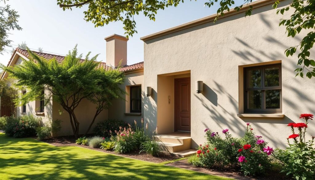
Limewash’s ability to breathe means it doesn’t trap moisture. This helps buildings last longer and stay true to their original look. Using limewash also cuts down CO2 emissions, much like adding plants indoors. With home renovation budgets hitting $420 billion in 2023, eco-friendly limewash is becoming a top choice.
In areas with historic homes, limewash is a preferred option. It lets owners keep their homes’ classic beauty while being good to the planet. Limewash blends old-world charm with modern design, boosting both looks and home values.
Color Drenching: A Trend You Can’t Ignore
Color drenching is gaining ground in interior design. It involves using a single color for walls, ceilings, and fixtures. This method brings a unified look, making spaces inviting and cozy. It also highlights architectural features, like beautiful picture moulding in rooms.
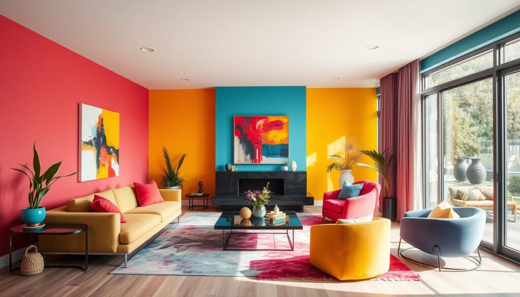
Creating Cohesion with Color Drenching Techniques
Choosing decor before picking a paint color is crucial when color drenching. This ensures all elements blend well together. Mood boards are recommended by experts. They show how colors and decor look side by side.
Applying this technique in small rooms works well, but it’s trickier in open spaces. Here, color changes can clash. Yet, using related colors can create appealing looks without chaos, especially in kitchens and baths.
- Frosted Berry (CC-8) with Muskoka Dusk (CC-6)
- Great Barrington Green (HC-122) with Kennebunkport Green (HC-123)
Tall ceilings and color drenching can make rooms feel bigger and calming. But, dark shades should be used carefully as they might shrink a room’s look. Using different finishes, like matte for ceilings and gloss for trims, adds depth.
Color drenching is shaping future interior trends until 2025. It offers a chance to make vibrant, cohesive spaces that reflect your taste.
Matching Paint Colors to Wallpaper
Making a room look good starts with matching your wallpaper and paint colors well. When you think about how these two elements work together, it gets easier to make the room’s design look unified. Picking paint colors that go well with your wallpaper patterns makes the room look better.
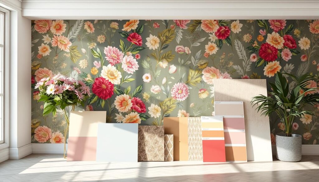
Knowing how to choose paint colors wisely can change the feel of places like bars or bathrooms. You can get a smart look by picking colors that match your wallpaper’s details. This usually involves a few important steps:
- Define your project and imagine what you want it to look like in the end.
- Think carefully about the colors you pick and how they match each other.
- Think about the role of the room’s design in changing its vibe.
Recent data shows that picking the right colors matters a lot. A color-scanning tool at a paint store can really help match your wallpaper to your paint. For instance, a special “leaf green” color was made from a piece of wallpaper, showing how precise you can get.
| Color Name | Matched Element |
|---|---|
| Cedar Grove 444 | Background pattern |
| Lily Pad 480 | Green leaves |
| Paris Green HC-118 | Accent features |
Bright colors can make a room more lively, but using neutral colors is also a big trend among people doing it themselves. This choice helps keep the room from feeling too busy. It’s essential to find how different shades match up to keep the room interesting. Picking color schemes that honor both your wallpaper and paint can transform a room successfully.
Intriguing Paint Techniques: Painted Staircases
Painted staircases can change the way you enter your home. They serve as stunning highlights. You can pick from many techniques to boost your stairway’s look.
One popular trend is painting the risers in bright, bold colors. This method creates a lively rainbow effect. It adds energy to your space. Using soft pastel shades can attract those who like whimsical and retro styles. Gradient painting, like ombre, can make your stairs look calm and sea-inspired.
Choosing the right color mix is key for modern staircases. Dark tones against natural wood make a bold contrast. Pairing deep hues with light-colored risers adds depth. This stylish mix brings out the beauty of stair railings and newel posts.
Texture is also important. Using tiles on stair risers adds beauty and lasts long. Painting balusters in different colors gives a unique touch. About 30% of designers suggest this to update staircases.
Using trompe l’oeil techniques can mimic the look of stair runners. This achieves a high-end look without the cost. Updating stair colors with the latest trends keeps them fresh. Using painter’s tape for patterns adds a personal touch to your project.
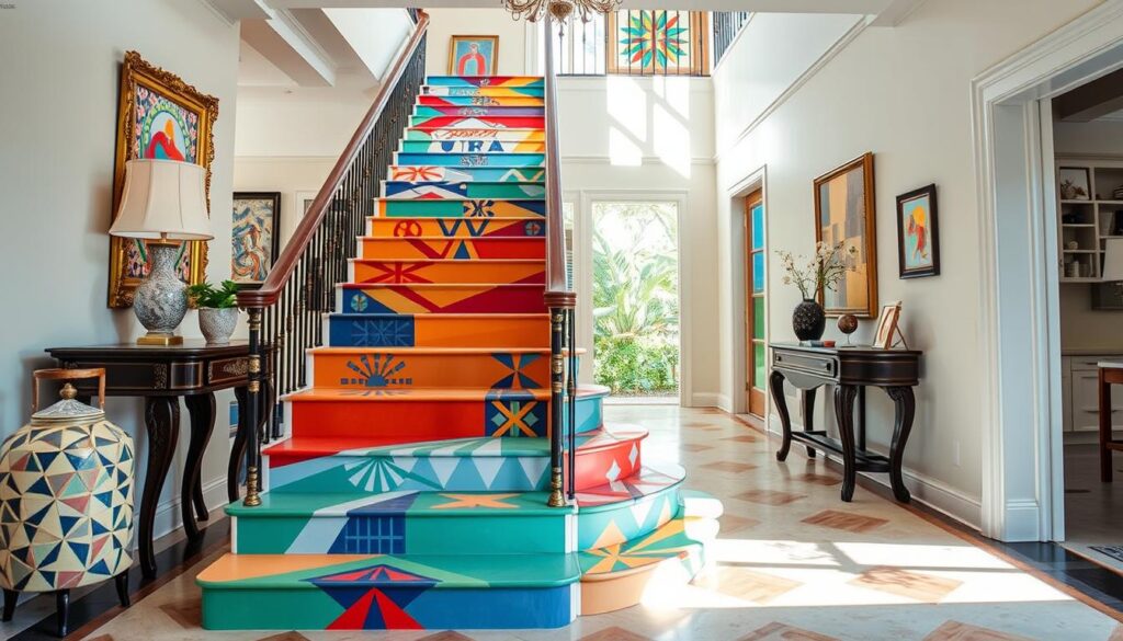
Painted staircases and matching colors in your entryway elevate your home decor. Trying new ideas can make your staircase a highlight. You might need to maintain painted stairs, but the striking results are worth it. They leave a lasting impression on visitors.
Contrasting Paint Finishes for Dimension
Adding different paint finishes to your home can make it look more interesting and classy. Using various finishes in the same color makes a room look special. It highlights the design and divides spaces with modern aesthetics.

A room can feel warmer or more stylish with a textured design. Here are some ways to use contrasting finishes:
- Accent Walls: Use bright colors like royal blue or Dutch orange to add energy and focus.
- Geometric Patterns: Dark colors in patterns like chevron or honeycomb make a strong visual impact, great for formal dining rooms.
- Textured Finishes: Sponging or combing techniques can cover wall flaws and look cool.
- Warm and Cool Neutrals: Use warm colors for cozy places and cool colors for a modern look.
- Bold Contrasts in Trim: Mixing dark and light shades can make trim and moldings pop.
Mixing warm and cool shades with different finishes can make your design stand out. Ceiling colors can make a room’s energy feel higher. Using the same color for walls, ceilings, and trims creates a calm and unified look.
| Technique | Effect | Ideal Spaces |
|---|---|---|
| Accent Walls | Enhances energy and focus | Living rooms, bedrooms |
| Geometric Patterns | High-impact visuals | Formal dining rooms |
| Textured Finishes | Conceals blemishes, creates interest | Entryways, hallways |
| Bold Contrasts in Trim | Dramatic and stylish | Any room needing accentuation |
| Monochromatic Schemes | Smooth, serene feel | Small or low-ceilinged spaces |
Trying out different finishes can give your home a new and exciting look. It shows off your style. Using textures makes each room feel special and welcoming.
Exterior House Painting Colors for 2025
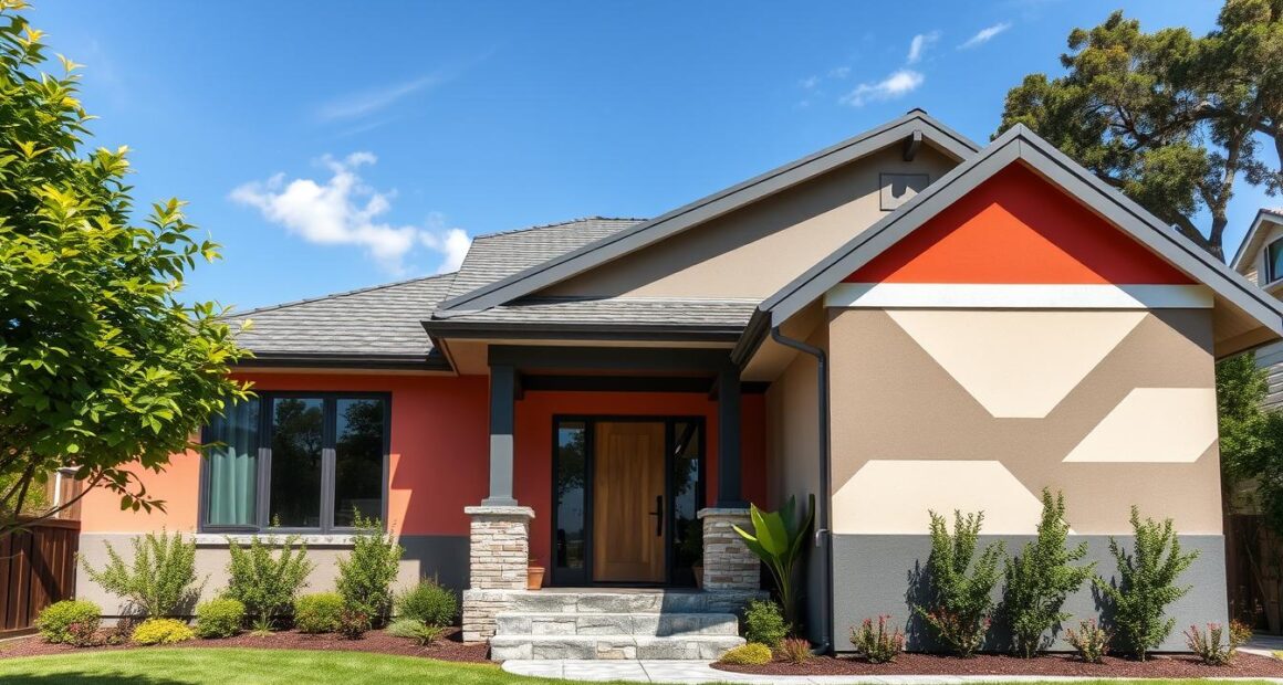
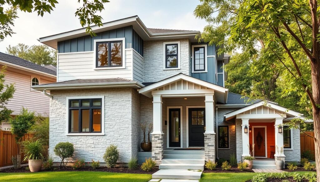
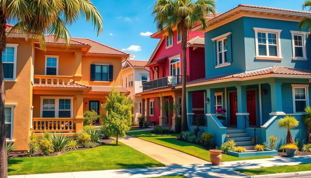
Choosing the right colors for your home’s exterior can really make it stand out. For 2025, a mix of earth tones and bright pops of color are in. We’re going to look at great choices from Benjamin Moore and Sherwin Williams, two of the biggest names in paint.
Top Recommendations from Benjamin Moore
Benjamin Moore is known for colors that work well anywhere and look beautiful. If you want to make your home look better, consider these paints:
- Cloud White – A soft off-white that looks good with many home styles.
- Cheating Heart – A rich, deep gray for a touch of elegance and depth.
- Driftwood – A warm beige that goes nicely with natural elements.
These choices create a peaceful, attractive vibe. They match today’s trend of using colors inspired by nature for exteriors.
Popular Sherwin Williams Options for Your Home
Sherwin Williams offers many shades for boosting your home’s look. For 2026, consider these picks:
- Polo Blue – A cool blue, perfect for homes near the water.
- Baja Dunes – A soft beige that creates a warm welcome.
- Dover White – A timeless white that’s still a favorite for a classic look.
Using these colors can take your exterior paint project to the next level. They align with the trend of creating spaces that feel bright yet calm.
Bulky and Bold: Saturated Colors for a Dramatic Look
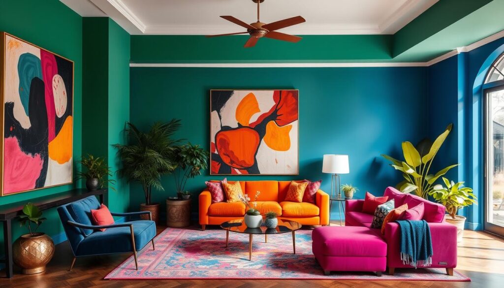
Saturated colors are now a big hit in home decor for 2025. They bring life and drama to any space. Jewel tones are great examples of these bold colors, adding depth and interest.
For a striking design, use vibrant colors like Benjamin Moore’s Wasabi and Hale Navy. They create beautiful contrasts. Sherwin-Williams Cast Iron and Black Beauty also offer a sleek contrast. These color choices add a touch of elegance.
Use the 60-30-10 rule in interior spaces for balance. A key color can lead, with softer hues for accents and big furniture. This keeps your home’s look cohesive and fun.
In outside areas, use colors like Evergreen Fog and Pewter Green for harmony. Combine Newportbury Blue with Alabaster for a modern twist on classic style. These colors make the outside of your home as stylish as the inside.
Try large paint samples from Samplize to see the colors in your home. This helps you see how light and undertones change the look. It’s key for that bold effect you want.
Conclusion
The world of house painting is always changing. This gives you many color options and styles to make your home better. Shades like Agreeable Gray and Feng Shui are popular. They help make beautiful interiors that show off your style and what’s in vogue.
Using different painting techniques and colors can bring new ideas for your home. You might try dark bluish-gray for a bold look or sky blue for calmness. The right paint can make your home and art stand out. Always try paint samples first to make the best choice.
When picking colors, think about how they’ll look with your home’s decor and floors. This will help your home look put together and stylish. With these tips, you’ll be able to update any room confidently. Make your space truly your own.
