
Imagine walking into your living room, surrounded by comforting colors. The right wall color mix can totally change your room’s feel. Warm golden marigold or soft cloudy blue, every color brings its own vibe. They connect with your life, echoing memories and dreams. As you pick colors for stylish walls, think about how each one makes you feel. The perfect color scheme does more than look good. It turns your home into a haven of peace and happiness.
Today, we’ll look at awesome wall color combos that mix trendiness with coziness. Jump into the color adventure with us. Every paint choice is a peek into your style and what’s new in decor.
Key Takeaways
- Consider how wall colour impacts the atmosphere in your living room.
- Chic wall colour combinations can enhance both style and functionality.
- Explore calming tones for a serene space or vibrant hues for energy.
- Incorporate shades inspired by nature for a refreshing aesthetic.
- Two-tone applications add a unique twist to traditional designs.
Understanding the Importance of Wall Colour in Your Living Room
Wall colour is key in designing a living room. It can change how the space looks and feels, impacting moods like calmness, elegance, or excitement. The right colours can make a room feel more welcoming or cozy, based on what you like.
Analogous colours can help mix different furniture styles together. This approach gives your room a unified appearance. For a striking effect, try adding feature walls in bold colours like fuchsia and teal in open spaces.
Bright colours look good with simple decor and white moldings. Colours such as terracotta add a unique feel with their textures. Choosing colours often depends on items you already have to ensure they all blend well together.
Looking at paint samples can help you pick the right wall colour. The 60-30-10 rule can guide your colour distribution: 60% main colour, 30% secondary, and 10% accents. Paint strips offer six shades, giving you plenty of options for your home.
Soft, cool colours are best for bedrooms to help you relax. Warm colours fit kitchens and dining areas as they boost appetite and conversation. Light colours can make small spaces appear bigger and more welcoming.
In open spaces, keeping similar undertones ensures everything looks connected. White walls can make rooms look bigger and brighter. Many people find that wall colour greatly affects how much they enjoy their rooms.
Mood boards are great for planning your living room. An accent wall can make decorating easier and save time on renovations. Rugs and throws are key in bringing your colour theme together, adding emotion to your space.
Choosing the Right Colour Palette for Your Space
When picking colors for your living room, start with its purpose. It’s often the heart of family time and relaxation. Pick colors that fit your life and match your home’s look. Stick to three to five colors. This keeps it interesting but not too much. Less than three colors might seem too samey. More than five can feel chaotic.

Use tools like Coolors and Pantone to pick your palette. They let you start with one color and find others that go well with it. This ensures balance. The 60-30-10 rule is a good guide. It means use 60% as the main color, 30% as secondary, and 10% for accents. This usually makes the room look good together.
Try mixing warm and cool colors for balance. For example, soft grays with warm oranges create a cozy yet stylish space. It’s important to see how colors look in different lights. This can change how they look in your main living area.
| Colour Type | Examples | Effect on Mood |
|---|---|---|
| Warm Tones | Red, Orange, Yellow | Energetic, Inviting |
| Cool Tones | Blue, Green, Purple | Calm, Serene |
| Neutrals | Gray, Beige, White | Expansive, Balanced |
| Earth Tones | Brown, Taupe, Olive | Grounded, Natural |
Use these tips in your living room for a well-designed look. Balancing colors makes it not just pretty but also affects how it feels. A smart color choice makes your space welcoming for everyone.
Warm and Retro Colour Combinations
Creating a warm, inviting living room is easy with the right colors. Marigold and brown make a cozy pair, bringing comfort and a homey feel. Together, they make a perfect setting that combines old-style charm with modern touches.
Marigold and Brown Accents
The vibrant marigold and deep brown create a cozy, inviting space. Using these colors can make any room feel like a welcoming haven. Add soft pillows and warm blankets to really bring out their beauty, making a place where everyone wants to relax.
Adding Hints of Gray-Blue
Gray-blue adds a cool touch to the warm colors, making an interesting mix. It deepens the look while keeping the bright marigold and rich brown in harmony. Gray-blue in accessories or art makes the room stylish yet comfortable.

Subtle Jewel Tones for a Sophisticated Look
Using jewel tones in your living room makes it more sophisticated and welcoming. Colors like deep ruby and bright sapphire add luxury. They also give depth and richness to your decor. These colors look great with white walls, creating a stylish contrast.
Incorporating Ruby and Sapphire
For a classy decor, add ruby and sapphire touches. You can use these colors in many ways, like with soft velvet pillows or beautiful art. Performance velvet is popular for its durability and luxury look. Mixing vintage items with jewel tones can also add character to your space.
Balancing with Crisp White Walls
White walls are great for highlighting jewel tones. They make colors stand out and the room feel bigger. Designers suggest painting ceilings in light shades to make the room seem taller. Adding natural fiber rugs and textured whites can also brighten up the space while keeping it cozy.

By adding these elements thoughtfully, your living room becomes stylish and cozy. A mix of color and texture turns the area into a calm space full of elegance and comfort.
Moody Modern Aesthetics for a Unique Vibe
Making your home moody and elegant is easy with the right touches. You can create a living room that feels modern and unique. Using cool grays and blacks helps make a space inviting yet dramatic.
Using Cool Gray and Black
Cool gray on the walls makes a room feel plush and moody, especially with black added. This mix brings depth and keeps things stylish. Here are some ways to get this look:
- Dark velvet sofas, like in deep teal, become the room’s star against gray walls. They add texture and interest.
- Burgundy velvet curtains with black walls give a bold contrast. They add elegance while keeping things cozy.
- Rich textures in furniture, like cognac leather, mix well. They complement dark wood for a moody vibe.
- Layered lighting from amber-glass fixtures brings warmth. This enhances the feel without too much.
- Botanical elements, big plants against dark colors, add nature’s touch. They balance the sophisticated style.

Adding these elements makes a living room both stylish and comfortable. Texture and the right lighting are key for a moody, modern look.
Cozy Cottage Style with Warm Tones
Creating a cozy cottage style in your living room makes it a warm, welcoming spot. Combine warm colours like camel with soft blue shades. This mix brings a relaxed vibe, inviting family and friends with open arms. It feels just like the calm of the countryside. Carefully picked decor adds whimsy and character, making it special.
Combining Camel and Shades of Blue
Camel and blue together create a lively yet balanced setting. Warm camel tones bring coziness, while soft blues bring calmness. This blend fits cottage decor perfectly, making a relaxing scene. Add layers of linen and cotton for comfort and a touch of nature. This enhances the cottage look wonderfully.
Floral Patterns for Added Charm
Floral patterns give a delightful charm to your space. Use them on upholstery, curtains, or wallpaper for the cozy cottage vibe. Combine them with warm colours for a unified look. It makes the room more quaint. Adding personal items like family photos and handmade crafts brings your own charm. It makes the room feel uniquely yours.

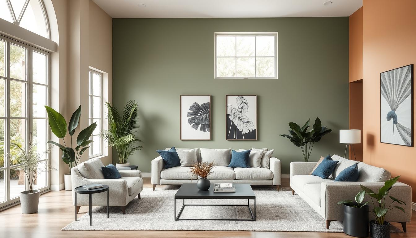
Exploring Forest Floor Colour Combos
Warm brown and olive green in your living space hint at the forest floor’s tranquility. These natural shades make any room feel calm and welcoming. Including colors from the outdoors brings peace to your home. High-quality products from brands like Benjamin Moore or Sherwin-Williams add real beauty and appeal.
Warm Brown and Olive Green
Warm brown and olive green capture nature’s vibe. Earthy browns remind us of tree trunks and fertile soil. Olive green reflects the lush leaves in the woods.
Together, they create a cozy, natural atmosphere. This combo is great for a welcoming living room.
Crisp White for Balance
Adding crisp white balances the forest palette’s deep tones. It brightens the space and lets earth tones pop without overwhelming. Use white in furniture or decor for a light, breezy effect among rich colors.

Beachy Vibes: Coastal Neutrals
Turn your living room into a peaceful place that reminds you of the beach with coastal neutrals. This look is all about the soothing colors of the sea and sand. Soft whites and blues make a peaceful background. Then, add bright colors like those from the ocean and beach for extra fun.
Classic White and Blue-Grey Combination
A mix of white and blue-grey brings the calmness of the sea into any room. It makes spaces look bigger and brighter. Add materials like wood and linen to make your beach decor richer. Bright colors like green or beige give the room life and make it look more like the coast.
- Soft Neutrals: Clean white, warm beige, and weathered gray
- Vibrant Accents: Sunshine yellow, ocean blue, sandy tan
- Layering textures: Wood and linen for warmth
Coastal neutrals work well with many styles. A room with all blues or greens feels calm and peaceful. Using colors close to each other like turquoise and seafoam makes everything blend well and is pleasing to the eye.
To add beachy vibes, try contrasting colors. Navy and coral can highlight certain spots, like a wall or furniture. Using colors like gray and taupe brings out the beauty of the beach.

| Color | Effect | Recommended Use |
|---|---|---|
| Soft White | Brightens and expands | Walls and Trim |
| Blue-Grey | Calming and serene | Accent Walls |
| Sandy Beige | Earthy and grounding | Upholstery and Rug |
| Deep Navy | Bold focal point | Furniture and Decor |
| Coral | Vibrant energy | Pillows and Artwork |
With the perfect mix of coastal colors and accents, you can make your living room cozy and stylish. It’s a great way to relax and feel like you’re at the beach without leaving home.
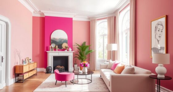
Bright Colour Combinations for a Vibrant Feel
Adding bright colours to your living area can make it lively and inviting. Such a fantastic mix is pink and orange in the living room. It brings fun and energy to the space. This decor suits those who love bold styles.
Looking at Pink and Orange Pairings
Pink and orange together make your living room warm and welcoming. These colours add charm when used in art or cushions. Combine them with soft neutrals for a balanced, vibrant look. This keeps your space unified while showcasing bright colours.
Using Coral for a Touch of Whimsy
Coral is great for adding whimsy without overwhelming. Use it on pillows or vases to boost the room’s vivacity. This colour complements pink and orange, maintaining cohesion. Your living room becomes a showcase of bright, playful colours.

High-Contrast Cool for an Edgy Touch
Want to make your living room edgy? Use high-contrast decor for a bold look. Cool colors can give your room a modern feel. Mixing warm ivory with aquamarine creates a lively yet soothing vibe.
This combo lights up the room but keeps things calm. It’s perfect for making a statement.
Warm Ivory with Aquamarine Accents
Start with warm ivory for a cozy base. Then, add aquamarine through cushions, art, or decor for eye-catching color.
This mix brightens up your space and makes it welcoming. It’s great for having friends over or just relaxing.
Dusty Purple and Brown for Depth
Combine dusty purple with rich brown for elegance. This pairing adds depth to your edgy living room.
Dusty purple and brown together create a cozy, modern look. Add different textures with furniture or art to enhance the style.

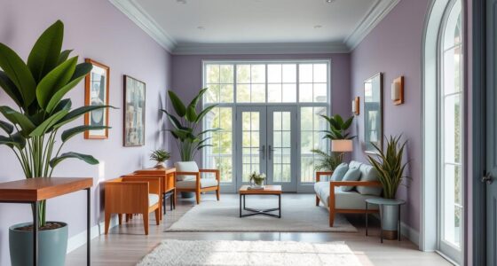
Transitional Colors from Year to Year
Using transitional color schemes in your living room invites an ever-changing vibe that matches the seasons. These palettes mix flexibility with unity, making it simple to update your room. They blend warm and cool shades, so changing decorations is easy without a full redo.
Relaxing colors like Wedgewood Gray and Quiet Moments turn your home into a calm haven. Then, neutral tones like Edgecomb Gray and Metropolitan pair well with bold shades, giving a classy feel. Adding pops of mustard yellow or lavender keeps things balanced and lively.
Blue’s versatility shines by being both calm and a solid base for exciting rooms. Mixing light and dark blue tones works with your color scheme to bring peace and balance. Adding green and purple adds fun contrasts, making your room stand out.
To go for a timeless yet trendy look, mix grey, white, black, and brown leather. This backdrop is perfect for adding seasonal touches and new decorations. Transitional colors are a smart, striking way to keep your home looking great.

Utilizing Natural Hues Inspired by the Outdoors
Using colors inspired by nature in your living room invites calmness, making it a relaxing space. Shades of green along with creamy whites blend perfectly, bringing peace and a link to nature. These colors make your space feel grounded and like a nurturing escape.
Shades of Green and Creamy Whites
Imagine combining fresh greens with soft creamy whites to create a soothing environment. Olive tones add a luxurious touch while keeping the space welcoming. Try adding minty greens for a spark of interest that complements your decor without overwhelming it. For a refreshing touch, include pale sky-blue or deep indigo accents.
- Earthy greens bring calmness and a sense of luxury.
- Creamy whites make your space feel lighter and more open.
- Blue accents add a serene feeling, like looking at clear skies.
Incorporating natural textures like wood, jute, or stone enhances your space. Adding plants not only boosts the natural vibe but also cleans the air. It connects your indoors with the outdoors. Nature-inspired shades, such as Benjamin Moore’s Natural Linen and Lichen by Farrow & Ball, ground your design and add timeless beauty.

| Colour | Description | Uses in Living Room Design |
|---|---|---|
| Olive Green | A deep, luxurious hue representing wealth | Accent walls, upholstery, and decor |
| Creamy White | A warm, inviting neutral | Wall color, trim, and ceilings |
| Pale Sky-Blue | A calming, refreshing shade | Throw pillows, art pieces, and accessories |
| Minty Green | A light tone that still commands attention | Accent details such as vases or wall art |
By choosing a palette inspired by the beauty of nature, your living room becomes a peaceful retreat. It’s perfect for both relaxing and refreshing yourself.
Minimalist Designs with Neutral Earth Tones
Minimalist decor leads to a world filled with neutral earth tones. These tones range from soft beiges to muted browns and grays. They make a space welcoming while keeping it clean and simple. Adding subtle textures to furniture can make your space stand out without being too much.
Subtle Textures for Added Interest
For a calming home, choose materials like leather, rattan, jute, and shearling. These fit well with neutral colors and make your space feel warm. Using colors like Sherwin Williams’ Hopsack (SW 6109) and Sable (SW 6083), you create a solid foundation. Then, you can add more textures on top.
Decor in earth tones brings joy to many homeowners. It includes items with natural elements, connecting the indoors with nature. With many earthy combinations to choose from, creating a peaceful atmosphere is easy. Earthy designs help make your living area a calm place to unwind.

Combining Patterns with Colour
Mixing patterns and colors can make your living room come alive. It adds visual interest and shows off your style. Use the rule of three to mix patterns well. This means combining small, medium, and large patterns for balance.
Pattern intensity is key in design. Colorful and complex patterns can be the main focus. Many people love big, colorful prints like florals. Starting with one main pattern lets you add 5-7 secondary patterns. This makes the room feel rich and layered.

When mixing patterns, keep the look unified. Balance bold patterns with solid colors. Rooms with different shades of one color are popular. This approach lets you add textures without clutter. Think about using fabrics, wallpapers, and pillows to add layers.
Try different patterns like stripes, florals, and animal prints to make your space stand out. Unique designs show your personality and add eclectic style. Careful mixing leads to a cozy, inspiring living room.
Utilizing Two-Tone Techniques for Dramatic Effect
Two-tone walls bring excitement and character to your living space. Combining earthy tones with crisp accents can make a big impact. This method highlights features and creates beautiful contrasts.
Earthy Tones with Crisp Accents
Two-tone walls typically use a darker shade below and a lighter one above. This approach makes rooms feel bigger and ceilings appear higher. The common dividing line is about 120 cm (47 inches) off the ground. Grey, beige, and black are top choices for stylish two-tone walls.
Here are some cool two-tone design ideas:
- Bold Color Combinations: Mix unique colors like Dulux’s “Blue Glaze” and “Wild Wonder” for a striking effect.
- Natural Shades: Use peaceful greens or calm blues to add a serene vibe to your space.
- Textural Variations: Try paints with different finishes; a satin finish lets in more light than a flat finish, adding brightness.
- Double Drenching: Combine two similar colors for an experience that grabs the senses.
- Color Testing: Always check your colors in different lights to make sure they look perfect.
Using two-tone techniques can make your living area up to 75% more interesting. This style is not just pretty but also welcoming. Dive into two-tone walls and let your imagination run wild.

| Technique | Description | Benefits |
|---|---|---|
| Two-Tone Walls | Combining two distinct colors on a wall. | Increases visual interest and emphasizes height. |
| Monochromatic Schemes | Using shades of the same hue. | Create a serene and cohesive look. |
| Complementary Colors | Bold colors paired with subdued tones. | Offers vibrant contrasts without overwhelming the space. |
| Double Drenching | Applying two related colors throughout the room. | Creates an immersive, powerful visual impact. |
| Preparation Techniques | Using painter’s tape and cleaning before painting. | Ensures crisp lines and a professional finish. |
Wall Colour Combination for Living Room: A Creative Approach
Choosing the right wall colors can make your living room pop. If you’re bold, mix bright mustard yellow with deep blue. This pair brings life and character to any space.
Bright Mustard Yellow with Deep Blue
This color mix brightens the room with a touch of tradition. Mustard yellow adds warmth, while deep blue brings calm. Together, they make the room welcoming and perfect for both chill and party times.
Mixing Velvet and Matte Finishes
Texture is key to a great living space. Try velvet and matte together for an eye-catching look. Use mustard yellow velvet touches on matte blue walls for a room full of depth and appeal.

| Colour Pairing | Effect | Usage Tips |
|---|---|---|
| Bright Mustard Yellow | Vibrant energy | Use as an accent wall or in décor items |
| Deep Blue | Calming balance | Apply on larger surfaces for grounding |
| Velvet Textures | Luxury and comfort | Incorporate in cushions and upholstery |
| Matte Finishes | Subtle elegance | Perfect for walls and larger furniture |
Conclusion
Looking at different wall color mixes for your living room opens up many design paths. You can choose chic wall colors that add warmth or go for a modern look that brings sophistication. By carefully choosing your living room colors, you can make a welcoming space that shows your style.
Warm colors can make a place feel cozy, while cool colors can make it feel calm. Remember, contrasting colors can be bold, and matching shades can make a place peaceful. Try out color samples before you decide. This lets you see how each color looks with the natural light in your room.
The perfect home decor can make your living room look better and more comfortable. As you start decorating, use these ideas. Find out how the right colors can change your room into a place perfect for relaxing and being creative.