TL;DR

Get furniture and decor delivered free with Prime
- Fast, free delivery on millions of items
- Prime Video, Amazon Music and more included
- Member-only deals all year
Spooky Halloween wall art ranges from friendly ghosts and vintage pumpkin prints to shadowy gothic scenes, so choose a mood before you shop or print. Repeat a small set of colors or motifs, size the art for the wall, use hanging methods suited to the surface and artwork, and keep decorations away from heat sources. A few coordinated pieces can make a room feel Halloween-ready without covering every inch of wall.
A single black cat print can change the mood of a room faster than a box of plastic cobwebs. Spooky Halloween wall art gives you a way to turn a blank wall into a seasonal scene, whether you want a friendly family room or a hallway that feels like a moonlit old manor.
The choices range from playful illustrations to shadowy gothic scenes, with posters, framed prints, paper decorations, canvas pieces, and digital downloads in between. This guide will help you choose a mood, build a display that feels intentional, print and hang art with care, and store it so you can bring it back next October.
Choose the room’s mood first: friendly, vintage, gothic, or more frightening.
Repeat a color, frame style, subject, or visual era to connect different prints.
Measure the wall and check digital file dimensions before choosing a print size.
Use hanging products made for the artwork’s weight and the wall surface, and keep decor away from heat sources.
Store prints flat and dry, and save a photo of a display you want to recreate.
Choose a Halloween mood before you buy a single print
Spooky Halloween wall art works best when you choose the mood first, because one clear direction makes different prints feel like part of the same room. Decide whether you want cute, vintage, gothic, supernatural, minimalist, or graphic horror before you pick subjects and colors. A friendly ghost in a pastel frame can look charming on its own but out of place beside a blood-red horror poster.
Think of your wall as a small stage: the art is the cast, and its style tells the audience what kind of story they have entered. For a family room, smiling pumpkins, round-eyed bats, and a black cat with a crooked grin create a soft, playful scene. For an entryway, a moonlit haunted house, a raven silhouette, and faded spellbook lettering bring more mystery without relying on graphic imagery.
Start with the people who use the room. If young children pass through a hallway at bedtime, silhouettes, fog, and moonlight can feel spooky without becoming upsetting. If you are decorating a party room for adults, you can lean into darker imagery and dramatic reds. The same Halloween theme can feel welcoming or unsettling depending on the faces, contrast, and amount of shadow.
That choice is also a practical one: bold, dark art tends to command attention, while lighter or simpler images blend more easily with everyday decor. A dramatic focal point can make a sparse wall feel intentional, but several high-contrast images may compete with furniture, lighting, and conversation. If you want the room to feel seasonal rather than transformed, use the mood as a boundary—perhaps one eerie centerpiece with gentler supporting prints.
Try gathering images before you commit: place a few printouts or paper color swatches on the floor and compare them in daylight and lamplight. A cream-and-sepia vintage set may glow warmly at night, while glossy black designs can disappear in a dim corner. That quick check helps you choose art that fits the actual room, not just a product photo. It also reveals whether the mood shifts under your usual lighting, before you spend money on frames or prints.
As an affiliate, we earn on qualifying purchases.
Build a cohesive gallery wall with one repeated detail
Spooky Halloween wall art looks cohesive when you repeat one or two visual details, such as a limited palette, frame finish, subject, or artistic era. Your pictures do not have to match exactly; they need a shared thread that helps the eye move from one piece to the next. A black frame repeated around a ghost, a haunted house, and a moon makes varied subjects feel like a collection.
Use familiar imagery as your starting point: pumpkins, bats, black cats, witches, ravens, skeletons, haunted houses, and moonlit landscapes all read quickly as Halloween. Then add one less expected piece, perhaps an eerie botanical illustration or a faux-spellbook page. Think of the familiar motifs as a chorus and the unusual image as a solo; the contrast keeps the wall from feeling like a row of identical decorations.
For example, imagine a narrow dining-room wall with three prints: a sepia pumpkin advertisement, a black cat silhouette, and a small botanical drawing of thorny vines. Repeat cream backgrounds and black frames, then vary the print sizes. The display feels collected rather than bought as a set, even though each piece tells a slightly different story. Repeating two details instead of many also leaves room for an odd-size print or a handmade accent without making the arrangement feel accidental.
There is a tradeoff between variety and repetition. Matching every frame and image can look polished, but too much uniformity may feel like a packaged set; too many unrelated styles can make the wall feel busy. Choose one dominant anchor, such as frame color, and one softer link, such as a shared palette. That hierarchy gives the eye something reliable to follow while letting the artwork retain its differences.
Before hanging anything, arrange the art on the floor. Keep the gaps consistent—roughly two to three inches often looks tidy—and check the group from the doorway, where visitors will first see it. A gallery wall is like a conversation: if every picture shouts, none stands out. One larger central print can anchor the arrangement while smaller pieces add texture around it. If the wall is narrow, a simple vertical arrangement may read more clearly than a wide cluster that competes with nearby doors or furniture.
Match print size and color to the wall you actually have
The right scale and palette make Halloween art visible without crowding the room. A large statement piece can anchor an empty wall, while a group of smaller prints can suit a narrow passage or the space above a console table. Keep the main artwork visible from the room’s entrance, and leave enough breathing room around it for the image to register. Scale affects more than appearance: a print that is too small can seem lost, while an oversized one may dominate the room and limit where furniture or other decor can go.
Measure the wall before ordering or printing. As a practical starting point, a single picture above a piece of furniture often looks balanced when it spans about two-thirds of the furniture’s width; treat that as a visual guide, not a strict rule. For instance, above a 48-inch console, a print or grouped display around 32 inches wide may feel connected to the furniture without swallowing the wall. Also consider the space around the display: a proportionally sized piece can still feel cramped if it sits close to a doorway, switch, or ceiling line.
Color changes the feeling just as much as size. Black and orange deliver classic Halloween contrast, while purple and deep red add a theatrical note. Cream, muted green, dusty rose, and sepia soften the effect and work well with wood, warm lighting, or vintage furniture. A few colors repeated across frames and prints usually feel calmer than a jumble of every seasonal shade. The tradeoff is that a restrained palette may look more integrated with the room but less immediately vivid; use one brighter accent if you want the display to read clearly from across the space.
Remember that the same image can look different on matte paper, glossy paper, canvas, or behind glass. A glossy print may catch bright reflections opposite a window; matte paper can keep fine lettering readable under a lamp. If you are styling a dim hallway, choose strong silhouettes and clear shapes rather than a dark image filled with tiny details that vanish at night. In a bright room, subtle details may show well, but reflections can obscure them when the print is framed behind glass—so consider both the artwork and where light will fall during the hours you use the room.
| Look | Colors and imagery | Works well in |
|---|---|---|
| Playful | Orange, cream, smiling ghosts and pumpkins | Family rooms and kids’ spaces |
| Vintage | Sepia, muted green, old advertisements | Dining rooms and cozy corners |
| Gothic | Black, deep red, ravens and moonlit scenes | Entryways and party spaces |
Print digital Halloween art without blurry surprises
Digital Halloween art prints clearly only when the file supports the size you choose. Before you send a download to a printer, check its listed dimensions and resolution, then compare those details with the paper size you want. Enlarging a small image too far can turn crisp lettering into fuzzy edges and make a raven’s feathers look like a dark smudge. This matters especially for art with fine lines or text: blur can make a design feel less like an atmospheric old print and more like a low-quality enlargement.
Here is a simple example: you find a charming ghost design intended for a small print, but want it as a large poster for a party wall. Open the file details first and check the creator’s recommended print sizes. If the file does not support the poster dimensions, print it smaller, choose a higher-resolution version, or use it as part of a gallery wall instead of forcing it to fill the space. The smaller-print option preserves detail, while a larger format offers more impact; choosing a group of prints can balance both without sacrificing clarity.
Paper finish affects the result. Matte paper reduces glare and suits vintage illustrations or fine text; a smoother finish can make bright orange and purple colors appear punchier. If you plan to frame the work behind glass, a matte surface can help keep reflections from competing with the image. For a quick seasonal display, inexpensive ready-made frames make it easy to swap prints when October ends. The tradeoff is that budget frames may have simpler finishes or less protective backing, so consider whether you value easy seasonal changes or a more durable, display-ready piece.
Printable art is convenient, but the file’s license may limit how you can use it, especially for a shop or event. Read the seller’s terms before printing several copies or using a design commercially. When you preview the file, look at it at the size you plan to print; that is when tiny details reveal whether they will stay sharp or disappear. A test print can also expose color differences before you commit to a larger, more expensive version.
Hang seasonal art securely and protect your walls
Safe Halloween wall art starts with a hanging method suited to the artwork’s weight and your wall surface. Lightweight paper prints, framed glass, and canvas do not all need the same support. Check the product instructions for your hanging hardware, follow its weight limits, and pay attention to whether it suits painted drywall, wallpaper, tile, or another finish. A method that holds well on one surface can fail or damage another, so the convenience of a quick adhesive is worth weighing against the artwork’s value and how difficult the wall will be to repair.
For example, a paper bat cutout may stay up with a gentle, wall-compatible adhesive, while a heavy framed poster may need a more robust hanging method. Test temporary adhesive carefully, particularly on delicate paint or wallpaper, and remove it as directed rather than tugging at a corner. If you are decorating a rental, check your lease or building rules before using nails or making other changes. For valuable or heavy pieces, secure support is more important than avoiding every small mark; for a temporary paper display, a non-invasive option may be a better balance.
Placement matters in busy rooms. Hang pieces where people will not bump them while carrying food or squeezing past a party crowd, and keep walkways clear of dangling decorations. A framed picture above a buffet can look polished, but a low-hanging frame near a serving area may catch a sleeve or get knocked loose. Think about the room at its busiest, not just when it is empty: seasonal decor should not create a new obstacle in a route people use often.
Keep Halloween art and paper decorations away from candles, heaters, and other heat sources. A glowing candle may make a print look atmospheric, but paper, fabric, and many decorations can catch fire.
Wall art does not normally involve electrical work, but seasonal displays often include string lights. Use lights according to their labels, inspect cords for damage, and keep them away from flammable materials. If your setup calls for wiring or a new electrical outlet, leave that work to a licensed electrician and follow applicable safety requirements. The visual effect of lights is not worth blocking ventilation, straining cords, or placing heat near paper and fabric.
Make a spooky wall display on a small budget
You can make a memorable Halloween wall on a budget by mixing a few printed images with simple paper decorations. A small group of coordinated prints often gives a room more character than a large collection of unrelated items. Choose one main image, add two or three smaller pieces, and repeat a color or subject to hold the display together. Limiting the number of purchases also makes each choice more visible, so a strong focal image can do more work than a wall crowded with low-cost pieces.
For example, print a vintage haunted-house illustration at home, place it in an inexpensive frame, and surround it with paper bats cut from black cardstock. The bats can travel across the wall toward the picture, creating movement without requiring many purchases. Before attaching cutouts, make sure the hanging material suits your wall finish and test it in a less visible spot. Handmade accents are inexpensive and easy to customize, though they may take more time and can look less uniform than store-bought decorations; a repeated shape or tidy spacing helps them feel intentional.
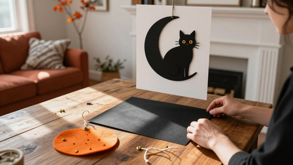
Another low-cost approach is to reuse frames you already own. Swap out family photos for temporary seasonal prints, or cover a backing board with orange paper and add a simple black cat silhouette. A few carefully chosen pieces can change the atmosphere of a room without replacing furniture or filling every available surface. Reusing a frame saves money and reduces clutter, but check that its size and color suit the new art; a frame that feels too formal or bulky can distract from a simple paper print.
Keep an eye on how each piece relates to the others. If you have a bright orange poster, let it be the focal point and use quieter cream or black accents nearby. The goal is not to spend more; it is to make each color and image feel as though it belongs. That restraint gives even inexpensive decorations a finished look and makes the display easier to store or adapt next year.
Store your favorite prints so they return next October
Careful storage protects seasonal wall art from moisture, fading, creases, and bent corners. Remove paper prints gently, keep them flat when possible, and store them in a dry place away from direct sunlight. A sturdy folder or portfolio can protect unframed artwork, while framed pieces should sit somewhere they will not be knocked over. Storage conditions matter because small flaws—like a crease or damp mark—can become much more noticeable once a print is back on the wall.
Say you have a set of sepia prints that looks perfect in October but gets shoved into a damp basement box after the party. By next year, the paper may curl or develop marks that show through the frame. A dry closet shelf is a better home, and a sheet of clean protective paper between unframed prints helps prevent scuffs and ink transfer. The tradeoff is that careful flat storage takes space; if that is not practical, use a rigid portfolio or another protective option rather than folding or loosely rolling prints that could crease.
Digital downloads make it easy to print art again, but save the original file and the seller’s size recommendations together. Label the folder with the print dimensions you used, such as “8 by 10 inches,” so you do not have to guess next year. If you liked the display, take a quick photo before dismantling it; the image becomes a simple map for rebuilding the arrangement. Saving this information also lets you decide whether to reproduce the same look or change one piece without starting the planning process over.
Reusable frames, stored prints, and a few paper accents can turn one October purchase into a seasonal collection. When you bring the pieces back, check for loose backing, damaged glass, or fading before rehanging. A little care now means next year’s display can go from storage box to finished wall without a frantic shopping trip. It also gives you a chance to retire or replace anything damaged before it becomes part of the new arrangement.
Frequently Asked Questions
What are some popular spooky Halloween wall-art ideas?
Haunted houses, moonlit forests, bats, black cats, ghosts, witches, and vintage Halloween posters are familiar choices. For a less character-focused look, try eerie typography, dark botanicals, or a faux-spellbook design.
How can I make a Halloween gallery wall look cohesive?
Repeat one or two details, such as black frames, sepia tones, or moon-and-raven imagery, while varying the print sizes. Arrange the pieces on the floor first and keep the spacing consistent so the group feels planned rather than crowded.
Can I use spooky wall art in a child’s room?
Yes. Choose friendly ghosts, smiling pumpkins, and gentle illustrations instead of graphic or frightening scenes. If your child is sensitive to dark images, try cream backgrounds and soft colors, then ask how the display feels before adding more.
How do I hang Halloween art without damaging walls?
Choose a hanging product designed for the artwork’s weight and your wall type, and follow the manufacturer’s directions. Test carefully on delicate paint or wallpaper, and check rental or building rules before using nails.
How should I print a digital Halloween download?
Check the file’s dimensions, resolution, and recommended print sizes before choosing paper. Matte paper can reduce glare on vintage art and lettering, while the right size helps prevent small files from looking blurry when enlarged.
When should I put up Halloween wall art?
Many people decorate in early or mid-October, but you can put art up whenever you want to enjoy it. If you are hosting a party, hang and check the display ahead of time so you can adjust spacing and secure anything that feels loose.
Conclusion
Choose one clear mood, repeat a few colors or motifs, and let your wall breathe. A moonlit house, a little flock of paper bats, and one warm lamp can make October feel present without turning your living room into a prop closet.
Start with the wall guests see first, then build a display you will be happy to unpack again next year. The best spooky art leaves just enough shadow for your imagination to do the rest.
Halloween Picks
halloween
As an affiliate, we earn on qualifying purchases.