To add more contrast without harsh colors, focus on subtle techniques like using textured layers, shading, and adjusting values and saturation. Incorporate gradient backgrounds or overlays to create visual separation without overpowering the design. Play with white space around important elements and vary the size and placement to guide focus naturally. By combining harmony with thoughtful adjustments, you’ll achieve a balanced, refined contrast that enhances clarity. Keep exploring for more on creating sophisticated contrast techniques.
Key Takeaways
- Incorporate subtle shading and layered textures to create depth without relying on bold colors.
- Use white space strategically around key elements to enhance visual separation and focus.
- Adjust saturation and brightness levels of existing colors for refined, natural contrast.
- Utilize transparency overlays and layered effects to add contrast softly.
- Manipulate element size and placement to emphasize importance and guide viewer attention.

Adding contrast to your designs doesn’t mean you have to rely on bold or harsh colors. Instead, you can use principles rooted in color theory and visual hierarchy to create distinctiveness without overwhelming the viewer. Understanding how color interacts and how your elements are arranged allows you to craft designs that are engaging yet gentle on the eyes.
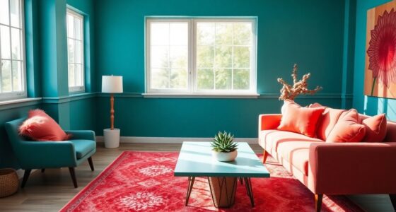
Color theory provides essential insights into how different hues work together. By choosing colors that are next to each other on the color wheel—think of analogous color schemes—you can build harmony while still emphasizing differentiation. For instance, pairing soft blues with muted greens creates a subtle distinction that’s easy to look at but still guides the viewer’s eye. Conversely, complementary colors, like blue and orange, can be used sparingly to add pops of contrast without resorting to harsh shades. The key is to adjust saturation and brightness levels. Dimming the intensity of bold colors can help you achieve contrast that feels natural and sophisticated, rather than jarring.
Choosing harmonious hues and adjusting saturation creates subtle, sophisticated contrast that guides the eye naturally without harsh colors.
Visual hierarchy plays a pivotal role in guiding attention through your design. You can establish this hierarchy by manipulating size, spacing, and positioning rather than relying solely on color contrast. For example, making the most important element larger or more prominent naturally draws the eye, even if it shares a similar color palette with surrounding elements. Using white space effectively around key areas also creates separation and focus, emphasizing contrast through layout rather than color. When your design has clear levels of importance, viewers instinctively know where to look first, second, and so on, creating a sense of balance and clarity. Additionally, understanding color interaction can help you select harmonious hues that work well together to enhance contrast subtly. Exploring visual hierarchy principles further allows you to structure your layouts with clarity and purpose, ensuring that your message remains accessible and engaging. Incorporating subtle shading and layered textures can also add depth and visual interest without overwhelming the senses. For instance, a slightly darker background behind a light-colored text block can make the text stand out while maintaining a soft overall aesthetic. Moreover, using layered textures or subtle gradients can create depth and visual separation without harsh color shifts. Additionally, employing transparency and overlays can create layered contrasts that are intriguing yet gentle.
Ultimately, mastering how to add contrast without harsh colors involves understanding how to leverage color theory and visual hierarchy effectively. By carefully selecting harmonious hues, adjusting their saturation, and thoughtfully organizing your layout, you create designs that are both striking and refined. The goal is to guide the viewer’s focus naturally, ensuring your message is clear without sacrificing elegance or comfort.

Stencils for Crafts Reusable Texture Stencils for Painting 8"x4"
- Package Includes: 18 reusable texture stencils
- Stencil Size: 8.6×4.7 inches each
- Pattern Designs: Brick, leopard, geometric, damask
As an affiliate, we earn on qualifying purchases.
As an affiliate, we earn on qualifying purchases.
Frequently Asked Questions
Can Texture or Patterns Increase Contrast Effectively?
Yes, texture and patterns can effectively increase contrast in your design. By adding texture depth, you create visual interest that makes elements stand out without harsh colors. Incorporate pattern variation to introduce subtle differences, which guides the eye and enhances contrast naturally. You leverage these techniques to create a layered, dynamic look, ensuring your design feels engaging and balanced, all while maintaining a soft, refined aesthetic.
How Does Lighting Influence Perceived Contrast in Design?
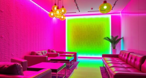
Lighting dramatically influences perceived contrast in your design by highlighting or softening elements. Ambient illumination sets the overall mood, while shadow play creates depth and visual interest. You can use varied lighting intensities to emphasize certain areas or details, making contrasts feel more natural and subtle. Properly managed lighting guides viewers’ focus, enhances textures, and adds dimension without relying on harsh colors, creating a balanced, engaging space.
Are There Specific Color Combinations That Naturally Enhance Contrast?
You’ll find that complementary palettes, like blue and orange, naturally boost contrast without harshness, making designs pop subtly. Monochrome variations, such as different shades of gray or beige, also create depth through tonal differences. Juxtaposing light and dark versions of the same hue keeps your design engaging without overwhelming. These combinations draw attention and add visual interest while maintaining harmony, perfect for adding contrast smoothly and effectively.
How Can Contrast Be Balanced With Overall Visual Harmony?
To balance contrast with overall visual harmony, you should use subtle gradations of color and value to create a harmonious balance. Pay attention to how different elements interact, ensuring they complement rather than clash. Incorporate soft shifts and maintain a consistent color palette, which helps emphasize contrast without overwhelming the viewer. This approach keeps your design engaging and balanced, allowing for visual interest while preserving a cohesive, pleasing aesthetic.
What Role Does Typography Play in Creating Contrast?
Typography acts like a guiding melody in your design, shaping contrast through font pairings and typographic hierarchy. You highlight important elements by varying font weights, sizes, or styles, creating visual rhythm. Think of bold headers as the deep drumbeats and body text as the steady rhythm. By skillfully balancing these elements, you craft a harmonious contrast that draws attention without harshness, making your message clear and engaging.
Conclusion
By subtly tweaking your shades, you can create a striking contrast without the jarring effect of harsh colors. Think of it as a gentle whisper instead of a shout—where softness enhances clarity. When you master this balance, your designs become both eye-catching and inviting, proving that contrast isn’t about loudness but about thoughtful harmony. So, embrace nuance, and let your work speak softly but powerfully, capturing attention without overwhelming.